Spring is nearly upon us, or at least we can hope. Let’s examine how housing activity typically rounds into shape as the weather warms up. We’ll make some fun plots with R.
Seasonality in housing data
Housing market activity in the United States is highly seasonal. Consider this animated plot.
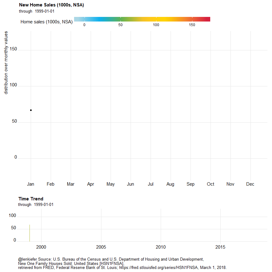
This plot shows U.S. new home sales. Often the data are presented seasonally adjusted, but this plot is for non seasonally adjusted data. The top panel shows the distributions over monthly values, while the bottom panel is a time trend. Due to the shape of the plot I’ve taken to calling it a dadbodplot plot.
Let’s make it.
Prepare data
We’ll gather our data via FRED. See here for more on using the quantmod and tidyquant packages to work with FRED data.
This code follows the pattern described in the post on charting housing starts to prepare our data.
#####################################################################################
## Step 0: Load Libraries ##
#####################################################################################
library(tidyquant)
library(tidyverse)
library(cowplot)
library(lubridate)
library(scales)
library(ggridges)
library (cowplot)

#####################################################################################
## Step 1: Prepare for data  ##
#####################################################################################

tickers=data.frame(# variable symbols/mnemonics
  symbol = c("HOUSTNSA",
             "HSN1FNSA",
             "MORTGAGE30US"),
  # variable names
  varname = c("Total housing starts (NSA)",
              "New Home Sales (NSA)",
              "30-year fixed mortgage rate")) %>%
  map_if(is.factor,as.character) %>% # strings as characters
  as.tibble()                        # make a tibble


#####################################################################################
## Step 2: Pull data  ##
#####################################################################################

tickers$symbol %>% tq_get(get="economic.data", from="1990-01-01") -> df

#####################################################################################
## Step 3: Organize data  ##
#####################################################################################

df<-merge(df,tickers,by="symbol")
df %>% mutate( year=year(date),
               month=month(date),
               mname=forcats::fct_reorder(as.character(date, format="%b"),month)) %>%
  group_by(year,symbol) %>% arrange(date,symbol) %>%
  mutate(cs = cumsum(price), # get yearly cumulative sum, number of obs
         id = row_number(),
         yearf= factor(year)) %>% ungroup() -> df
Now that we have our data we can start to build our plot. But first, let’s play with colors.
Make some colors
For this post, I want to use a custom color palette.Not because it’s a good idea, colors can go wrong in so many ways, but because it is fun. We’ll follow this post by Simon Jackson on Twitter that describes how to create custom color palettes for ggplot2.
# Create custom palettes
# follows: https://drsimonj.svbtle.com/creating-corporate-colour-palettes-for-ggplot2
my_colors <- c(
  "green"      = rgb(103,180,75, maxColorValue = 256),
  "green2"      = rgb(147,198,44, maxColorValue = 256),
  "lightblue"  =  rgb(9, 177,240, maxColorValue = 256),
  "lightblue2" = rgb(173,216,230, maxColorValue = 256),
  'blue'       = "#00aedb",
  'red'        = "#d11141",
  'orange'     = "#f37735",
  'yellow'     = "#ffc425",
  'gold'       = "#FFD700",
  'light grey' = "#cccccc",
  'dark grey'  = "#8c8c8c")

my_cols <- function(...) {
  cols <- c(...)
  if (is.null(cols))
    return (my_colors)
  my_colors[cols]
}


my_palettes <- list(
  `main`  = my_cols("blue", "green", "yellow"),
  `cool`  = my_cols("blue", "green"),
  `hot`   = my_cols("yellow", "orange", "red"),
  `mixed` = my_cols("lightblue", "green", "yellow", "orange", "red"),
  `mixed2` = my_cols("lightblue2","lightblue", "green", "green2","yellow","gold", "orange", "red"),
  `mixed3` = my_cols("lightblue2","lightblue", "green", "yellow","gold", "orange", "red"),
  `grey`  = my_cols("light grey", "dark grey")
)

my_pal <- function(palette = "main", reverse = FALSE, ...) {
  pal <- my_palettes[[palette]]

  if (reverse) pal <- rev(pal)

  colorRampPalette(pal, ...)
}

scale_color_mycol <- function(palette = "main", discrete = TRUE, reverse = FALSE, ...) {
  pal <- my_pal(palette = palette, reverse = reverse)

  if (discrete) {
    discrete_scale("colour", paste0("my_", palette), palette = pal, ...)
  } else {
    scale_color_gradientn(colours = pal(256), ...)
  }
}

scale_fill_mycol <- function(palette = "main", discrete = TRUE, reverse = FALSE, ...) {
  pal <- my_pal(palette = palette, reverse = reverse)

  if (discrete) {
    discrete_scale("fill", paste0("my_", palette), palette = pal, ...)
  } else {
    scale_fill_gradientn(colours = pal(256), ...)
  }
}
By running this code we’ve created two functions scale_color_mycol() and scale_fill_mycol() that allow us to call up our custom color palettes.
Rock that dadbod (plot)
Let’s build up our complex plot (and eventually animate it).We’ll build the plot one component at a time, starting with the top panel. This plot shows the distribution of home sales by month using the ggridges geom_density_ridgeline(), formerly known as joyplots.
#####################################################################################
## filter data for just sales
#####################################################################################
df.sales<-filter(df,symbol=="HSN1FNSA")

#####################################################################################
## make plot
#####################################################################################

g.dadbod<-
  ggplot(data=df.sales, aes(x=price,y=mname))+
  geom_density_ridges_gradient(alpha=0.85,scale=0.85,rel_min_height=.01,aes(fill=..x..))+
  coord_flip()+
  # use custom palette
  #scale_fill_mycol(palette="mixed3",discrete=F,name="Home sales (1000s, NSA)",limits=c(-10,175))+
  scale_fill_mycol(palette="mixed3",discrete=F,name="Home sales (1000s, NSA)")+
  geom_point(alpha=0,aes(fill=..x..))+
  geom_point(color="darkgray",alpha=0.65,size=2)+
  geom_point(data=filter(df.sales,date==max(df.sales$date)),color="black",size=2)+
  geom_label(data=filter(df.sales,date==max(df.sales$date)),color="black",size=2, label="Jan 2018",nudge_y=0.4)+
  theme_ridges()+
  theme(legend.position="top",
        plot.title=element_text(hjust=0,face="bold",size=18),
        plot.subtitle=element_text(hjust=0,face="italic",size=14),
        plot.caption=element_text(hjust=0),
        legend.key.width=unit(3,"cm"))+
  labs(y="",title="Dadbod plot",
       subtitle="New Home Sales (1000s, NSA) Jan 1990-Jan 2018",x="distribution over monthly values",
       caption="@lenkiefer Source: U.S. Bureau of the Census and U.S. Department of Housing and Urban Development,\nNew One Family Houses Sold: United States [HSN1F],\nretrieved from FRED, Federal Reserve Bank of St. Louis; https://fred.stlouisfed.org/series/HSN1FNSA, March 3, 2018.")

g.dadbod
## Picking joint bandwidth of 10.5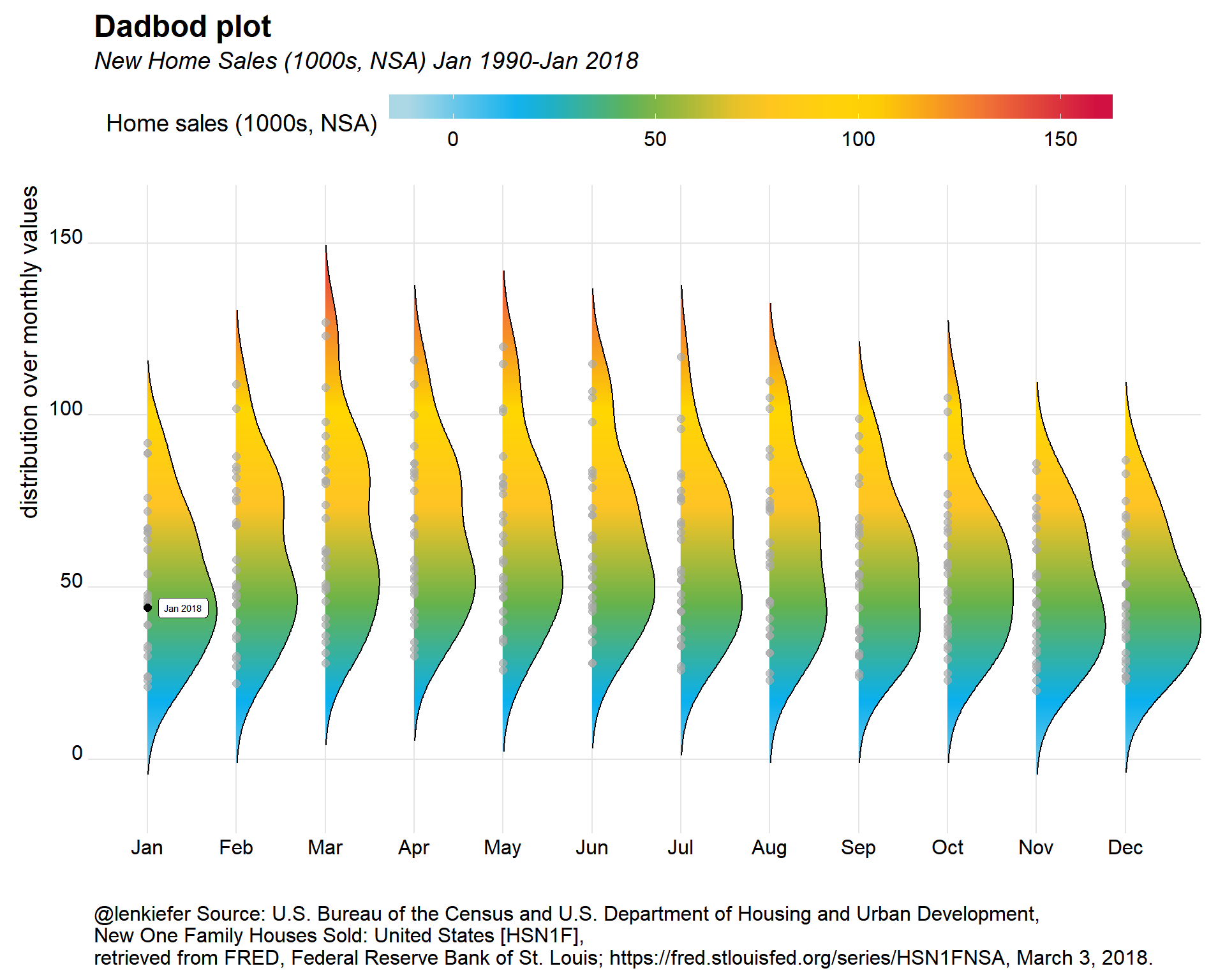 What’s going on with this plot? Each dot represents one observation of home sales from Janauary 1990 through January 2018. The curves are a density fit over monthly values. This enables you to see the seasonality in home sales. Spring and summer tend to have more activity than fall and winter. We also can see that January 2018 is fairly low as January goes.Let’s add a time trend to the plot.
Normally the plot is oreinted left to right, but I used coord_flip() to have it run up down. This gives us our dadbod shape.
glin<-
  ggplot(data=df.sales,
         aes(y=0,height=price,x=date,fill=price))+
  geom_ridgeline_gradient()+
  scale_fill_mycol(palette="mixed3",discrete=F,name="Home sales (1000s, NSA)",limits=c(-10,175))+
  theme_ridges()+
  theme(legend.position="none",
        plot.caption=element_text(hjust=0),
        legend.key.width=unit(1.25,"cm"))+
  labs(y="",title="Time Trend",x="",
       caption="@lenkiefer Source: U.S. Bureau of the Census and U.S. Department of Housing and Urban Development, \nNew One Family Houses Sold: United States [HSN1FNSA],\nretrieved from FRED, Federal Reserve Bank of St. Louis; https://fred.stlouisfed.org/series/HSN1FNSA, March 3, 2018.")

g2<-cowplot::plot_grid(g.dadbod+theme(plot.caption=element_blank()),glin,rel_heights=c(5,2),ncol=1)
## Picking joint bandwidth of 10.5g2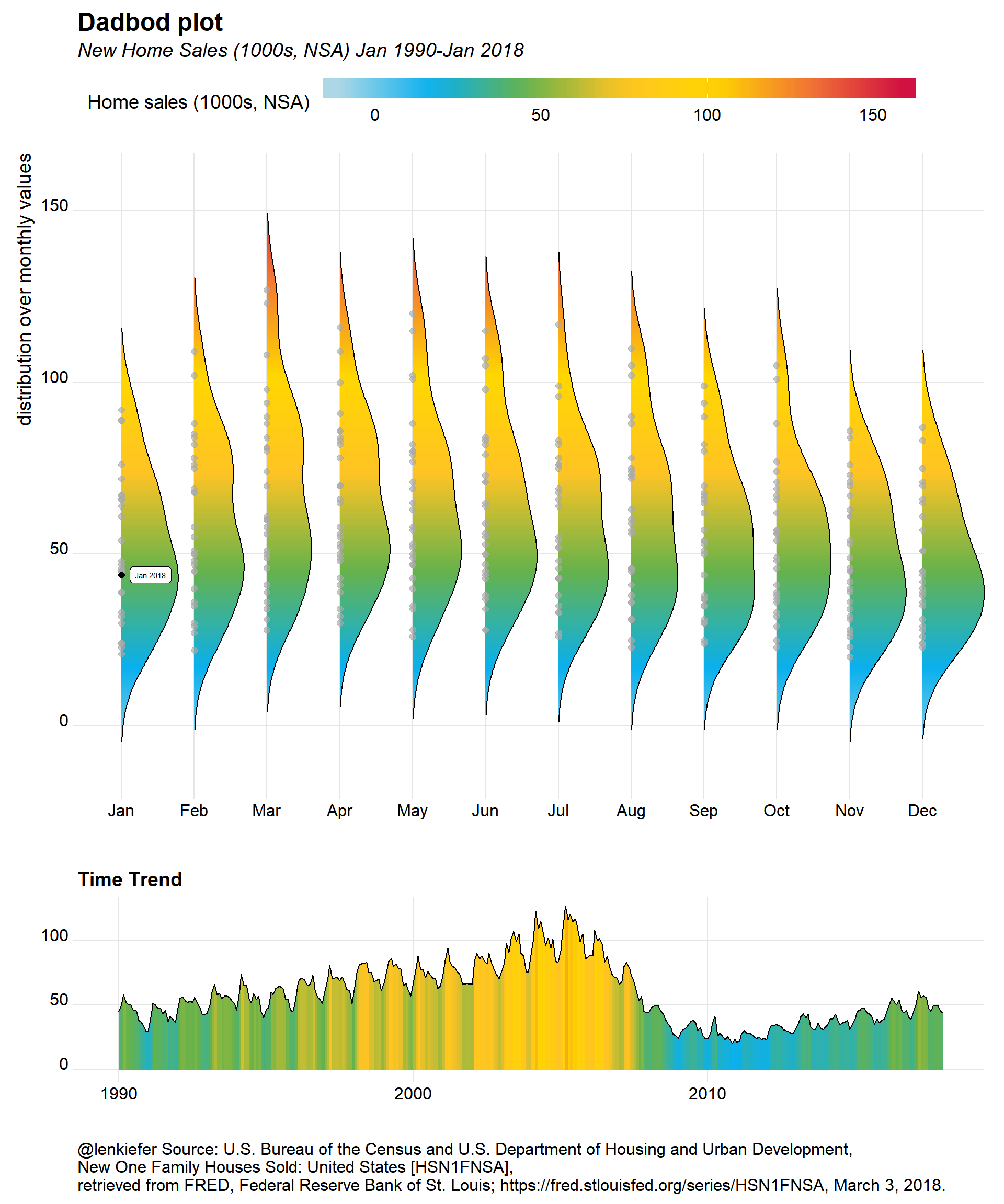
This plot adds a time trend below the dadbod plot. I’ve also used ggridges::geom_ridgeline_gradient() to apply the same gradient shading to the line plot.
Animate it
If you wanted, you could animate this plot like we did at the start. Just set mydir to point to a directory where you want to save image files and run the following.
See this post for more on my animation workflow: SIMPLE ANIMATED LINE PLOT WITH R
mydir<-'WHERE_YOU_WANT_TO_SAVE_PICTURES'
dlist<-unique(df.sales$date)  #gets a list of dates
Nmax<- lenght(dlist)          # number of images
myplotf<-function(i=1){

  # Function for saving images

  g<-
  ggplot(data=filter(df.sales,date<=dlist[i]), aes(x=price,y=mname))+
    geom_density_ridges(data=df.sales,alpha=0,color=NA,scale=0.85,rel_min_height=.01)+ # Add an invisible layer to the plot
    geom_density_ridges_gradient(alpha=0.85,scale=0.85,rel_min_height=.01,aes(fill=..x..))+
    coord_flip()+
    scale_fill_mycol(palette="mixed3",discrete=F,name="Home sales (1000s, NSA)",limits=c(-10,175))+
    geom_point(alpha=0,aes(fill=..x..))+
    geom_point(color="darkgray",alpha=0.65,size=2)+
    geom_point(data=filter(df3,date==dlist2[i]),color="black",size=2)+
    #scale_fill_mycol(palette="mixed",discrete=F)+
    theme_ridges()+
    theme(legend.position="top",
          plot.caption=element_text(hjust=0),
          legend.key.width=unit(3,"cm"))+
    labs(y="",title="New Home Sales (1000s, NSA)",x="distribution over monthly values",
         subtitle=paste("through ",dlist2[i]),
         caption="@lenkiefer Source: U.S. Bureau of the Census and U.S. Department of Housing and Urban Development, New One Family Houses Sold: United States [HSN1F],\nretrieved from FRED, Federal Reserve Bank of St. Louis; https://fred.stlouisfed.org/series/HSN1F, March 1, 2018.")
  glin<-
    ggplot(data=filter(df.sales,date<=dlist[i]),
           aes(y=0,height=price,x=date,fill=price))+
    geom_ridgeline_gradient(data=df3,fill=NA,color=NA,alpha=0)+
    geom_ridgeline_gradient()+
    scale_fill_mycol(palette="mixed3",discrete=F,name="Home sales (1000s, NSA)",limits=c(-10,175))+
    theme_ridges()+
    theme(legend.position="none",
          plot.caption=element_text(hjust=0),
          legend.key.width=unit(1.25,"cm"))+
    labs(y="",title="Time Trend",x="",
         subtitle=paste("through ",dlist2[i]),
         caption="@lenkiefer Source: U.S. Bureau of the Census and U.S. Department of Housing and Urban Development, \nNew One Family Houses Sold: United States [HSN1FNSA],\nretrieved from FRED, Federal Reserve Bank of St. Louis; https://fred.stlouisfed.org/series/HSN1FNSA, March 1, 2018.")
  g3<-cowplot::plot_grid(g+theme(plot.caption=element_blank()),glin,rel_heights=c(5,2),ncol=1)
  file_path = paste0(mydir, "/plot-",5000+i ,".png")  # add 5000 to the index so images are in order (otherwise 1 and 10 get confused)
  ggsave(file_path, g3, width = 12, height = 12 , units = "cm",scale=2.5,dpi=75)
  return(g3)
}

myplotf3(length(dlist))

purrr::walk(seq(1,length(dlist),1), myplotf)

# Navigate to YOURDIRECTORY and run  the following via command line/terminal to create gif
# (you need ImageMagick to run this)
# magick convert -delay 10 loop -0 *.png  dadbod.gif
Other series
We went and got housing starts data, let’s see how they look.
#####################################################################################
## filter data for just starts
#####################################################################################
df.starts<-filter(df,symbol %in% c("HOUSTNSA"))

#####################################################################################
## make plot
#####################################################################################

g2.dadbod<-
  ggplot(data=df.starts, aes(x=price,y=mname))+
  geom_density_ridges_gradient(alpha=0.85,scale=0.85,rel_min_height=.01,aes(fill=..x..))+
  coord_flip()+
  # use custom palette
  scale_fill_mycol(palette="mixed3",discrete=F,name="Housing starts (1000s, NSA)")+
  geom_point(alpha=0,aes(fill=..x..))+
  geom_point(color="darkgray",alpha=0.65,size=2)+
  geom_point(data=filter(df.starts,date==max(df.starts$date)),color="black",size=2)+
    geom_label(data=filter(df.starts,date==max(df.starts$date)),color="black",size=2, label="Jan 2018",nudge_y=0.4)+
  theme_ridges()+
  facet_wrap(~varname, scale="free_y", ncol=1)+
  theme(legend.position="top",
        plot.title=element_text(hjust=0,face="bold",size=18),
        plot.subtitle=element_text(hjust=0,face="italic",size=14),
        plot.caption=element_text(hjust=0),
        legend.key.width=unit(3,"cm"))+
  labs(y="",title="Dadbod plot",
       subtitle="Housing starts (1000s, NSA) Jan 1990-Jan 2018",x="distribution over monthly values",
       caption="@lenkiefer Source: U.S. Bureau of the Census and U.S. Department of Housing and Urban Development,\nHousing Starts: Total: New Privately Owned Housing Units Started,\nretrieved from FRED, Federal Reserve Bank of St. Louis; https://fred.stlouisfed.org/series/HOUSTNSA, March 3, 2018.")

g2.dadbod
## Picking joint bandwidth of 15.7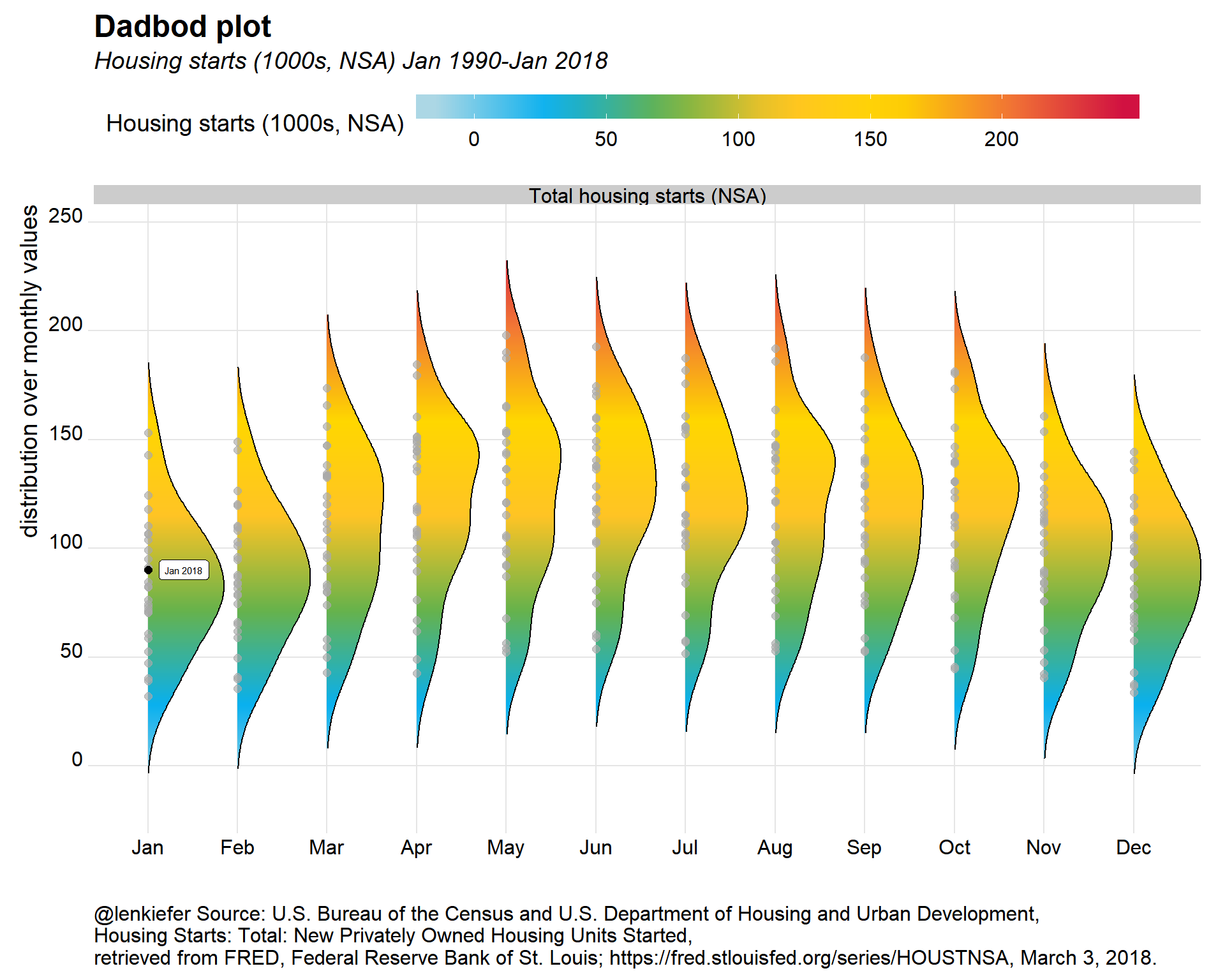
glin2<-
  ggplot(data=df.starts,
         aes(y=0,height=price,x=date,fill=price))+
  geom_ridgeline_gradient()+
  scale_fill_mycol(palette="mixed3",discrete=F,name="Housing starts (1000s, NSA)")+
  theme_ridges()+
  theme(legend.position="none",
        plot.caption=element_text(hjust=0),
        legend.key.width=unit(1.25,"cm"))+
  labs(y="",title="Time Trend",x="",subtitle="Housing starts (1000s,NSA)",
       caption="@lenkiefer Source: U.S. Bureau of the Census and U.S. Department of Housing and Urban Development,\nHousing Starts: Total: New Privately Owned Housing Units Started,\nretrieved from FRED, Federal Reserve Bank of St. Louis; https://fred.stlouisfed.org/series/HOUSTNSA, March 3, 2018.")

g3<-cowplot::plot_grid(g2.dadbod+theme(plot.caption=element_blank()),glin2,rel_heights=c(5,2),ncol=1)
## Picking joint bandwidth of 15.7g3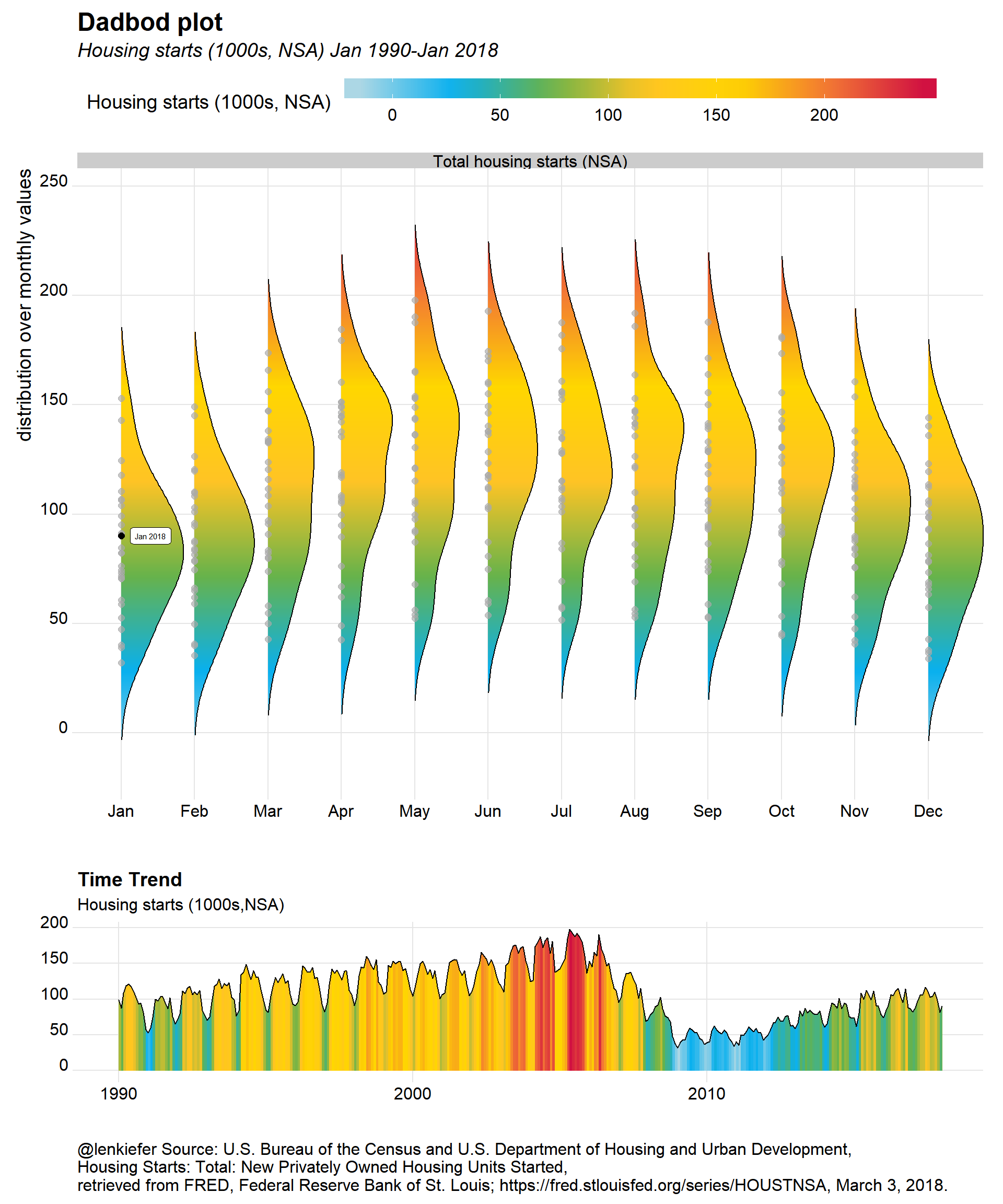
Mortgage rates
Finally, we can use this approach to plot mortgage rate trends. In this case, I’m not going to flip the density plot. Essentially, this is a riff on my majestic mortgage rate plot with a time trend added below.
df.rate<-filter(df,symbol=="MORTGAGE30US")

g.dens<-
ggplot(data=filter(df.rate, year(date)>2009),
       aes(y=forcats::fct_reorder(yearf,-year),x=price,color=price,fill=..x..))+

  geom_density_ridges_gradient(rel_min_height=0.01,alpha=0.75)  +
  #scale_fill_viridis(option="C",name="30-year fixed mortgage rate (%)")+
  #scale_color_viridis(option="C")+
  #scale_fill_mycol(palette="mixed3",discrete=F)+
  scale_fill_mycol(palette="mixed3",discrete=F,name="30-year fixed mortgage rate (%)")+
  guides(color=F)+
  #geom_quasirandom(color="white",alpha=0.5,shape=21,size=1.1, groupOnX=F)+
  geom_point(color="black",size=1,alpha=0.75)+
  theme_ridges()+
  theme(legend.position="top",
        plot.caption=element_text(hjust=0),
        legend.key.width=unit(1.25,"cm"))+
  labs(x="30-year fixed mortgage rate",y="Year",
       title="Distribution of U.S. average weekly mortgage rates",
       subtitle=paste("through ",as.character(max(df$date))),
       caption="@lenkiefer Source: Freddie Mac Primary Mortgage Market Survey")

g.trend<-
ggplot(data=filter(df.rate, year(date)> 2009),
       aes(x=date,y=0,height=price,fill=price))+
  geom_line()+geom_ridgeline_gradient()+
  scale_fill_mycol(palette="mixed3",discrete=F,name="30-year fixed mortgage rate (%)")+
  theme_ridges()+
  theme(legend.position="none",
        plot.caption=element_text(hjust=0),
        legend.key.width=unit(1.25,"cm"))+
  labs(y="",subtitle="30-year fixed mortgage rate (%)",x="",
       title="Time trend",
       xsubtitle=paste("through ",as.character(max(df$date))),
       caption="@lenkiefer Source: Freddie Mac Primary Mortgage Market Survey")

cowplot::plot_grid(g.dens,g.trend,rel_heights=c(3,1),ncol=1)
## Picking joint bandwidth of 0.0986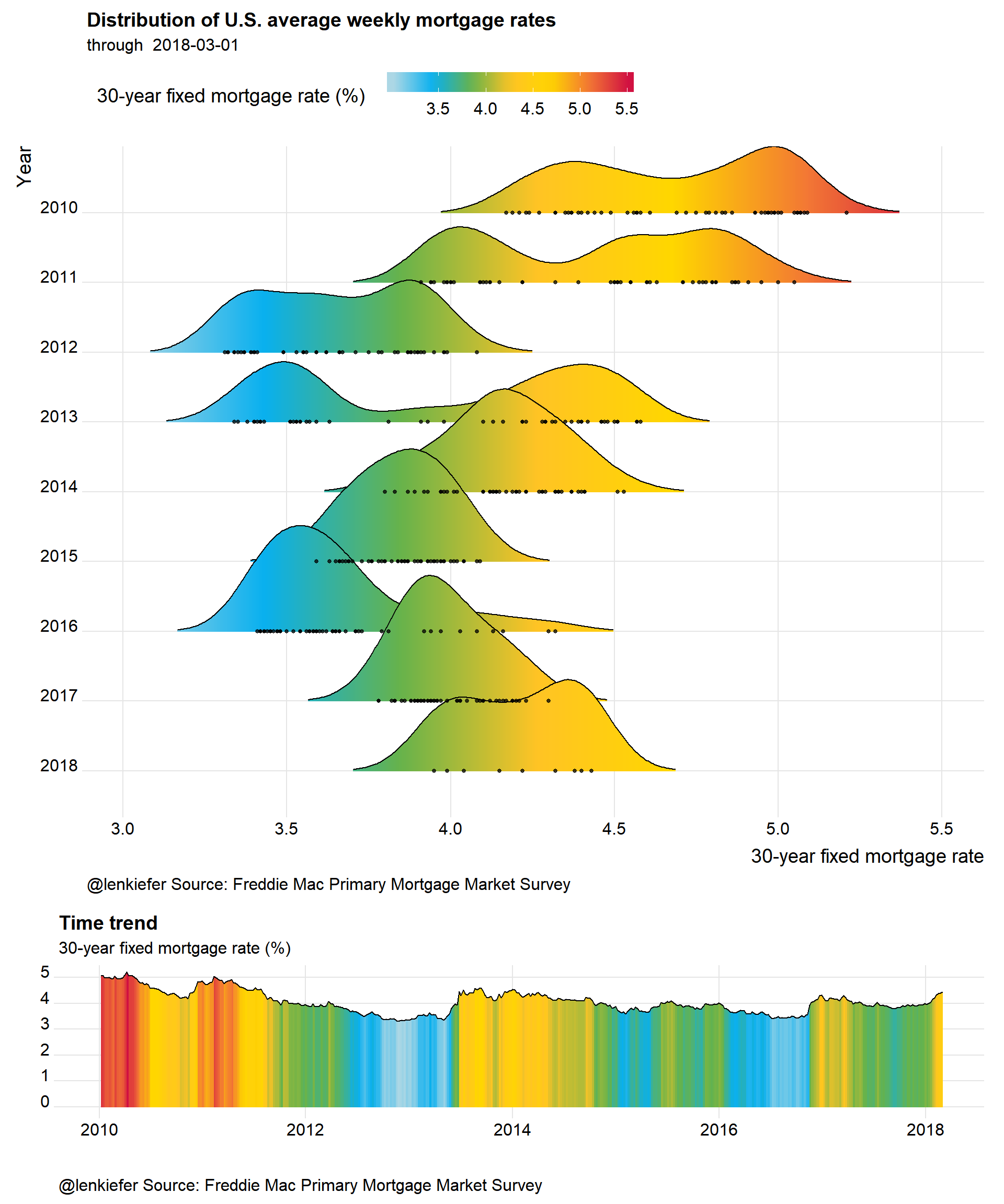
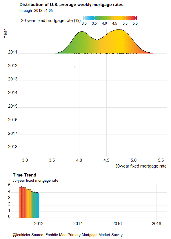
And following the steps above, we could animate it:
Rounding into shape
With spring nearly upon us, U.S. housing markets are set to round into shape. Activity naturally picks up in the springtime, but we’ll have to see if higher mortgage rates dampens activity this year. In any case, these fun plots might help us track trends in the market.