COME AND MAKE A MAJESTIC MORTGAGE RATE PLOT WITH ME.
We’ll use R to plot a few visualizations of mortgage rates.
I recently gave a number of talks about the economic outlook and housing. One point I like to make is that mortgage rates are low. I’ve shown this through a variety of visualizations. But one of my favorites looks like this:
Let’s make it.
Data
We’ll plot mortgage rates using the Freddie Mac Primary Mortgage Market Survey.
We’ll get the mortgage rates data via the Saint Louis Federal Reserve’s FRED database. If you followed my post from back in April you know what we can do if we combine FRED with the quantmod package. It gets even easier if we use tidyquant like we did here.
#####################################################################################
## Load libraries ----  ##
#####################################################################################
library(tidyverse)
library(readxl)
library(tidyquant)
library(tibbletime)
library(ggridges)
library(viridis)
library(cowplot)
library(ggbeeswarm)

#####################################################################################
## Get mortgage data ---- ##
# Can also get direct here: http://www.freddiemac.com/pmms/docs/historicalweeklydata.xls
#####################################################################################

df<- tq_get("MORTGAGE30US",get="economic.data",from="1971-04-01")
knitr::kable(tail(df))| date | price |
|---|---|
| 2017-10-12 | 3.91 |
| 2017-10-19 | 3.88 |
| 2017-10-26 | 3.94 |
| 2017-11-02 | 3.94 |
| 2017-11-09 | 3.90 |
| 2017-11-16 | 3.95 |
Our data is quite simple, with the date stored in date and the U.S. weekly average 30-year fixed mortgage rate in the price variable.
Plots
In order to make this plot we’ll use the ggridges (formerly known as ggjoy) and ggbeeswarm package along with viridis for the colors.
df$year<-year(df$date)
df$yearf<-as.factor(df$year)
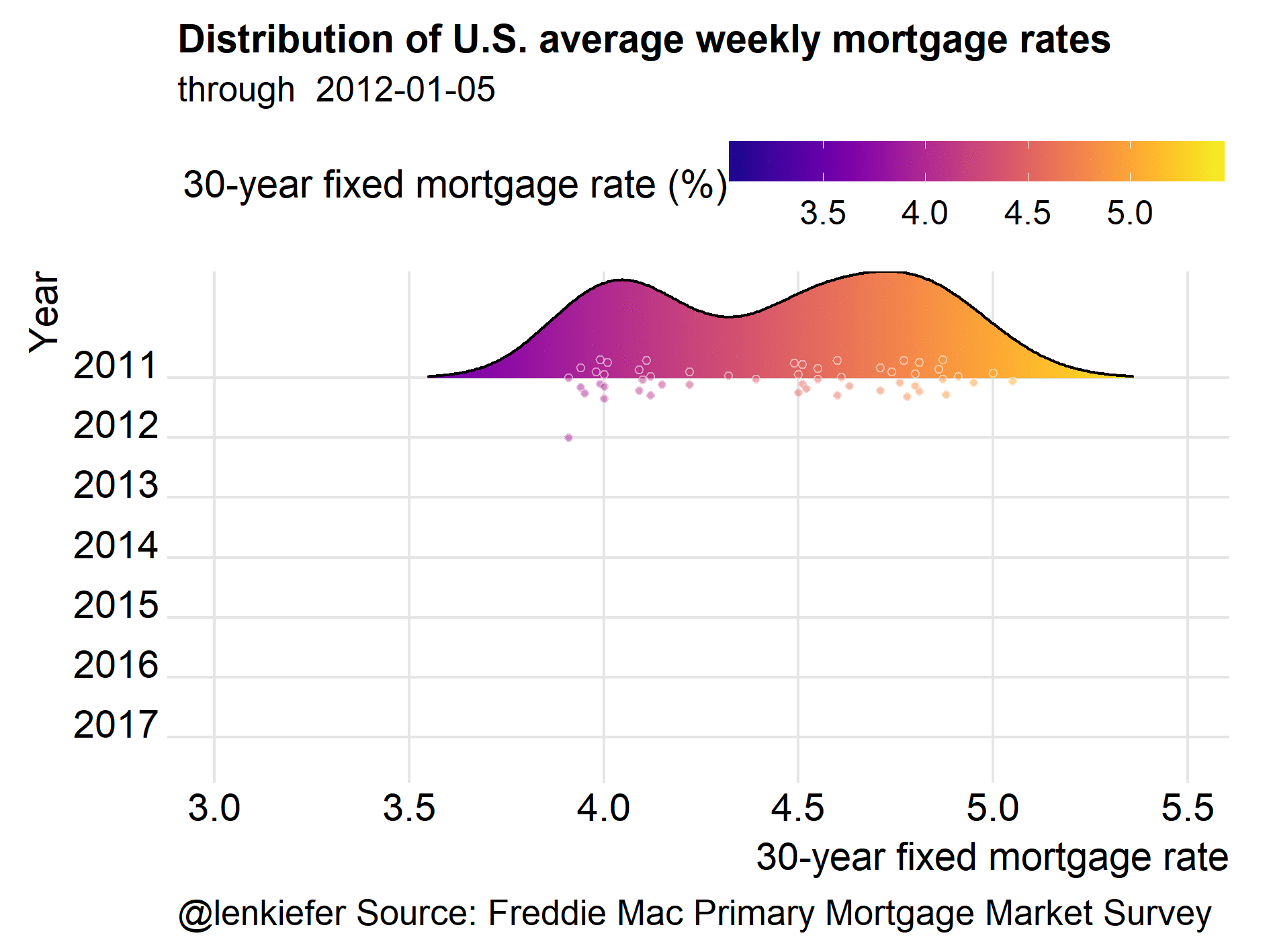
ggplot(data=filter(df, year(date)>2009),
aes(y=forcats::fct_reorder(yearf,-year),x=price,color=price,fill=..x..))+
geom_density_ridges_gradient(rel_min_height=0.01,alpha=0.75) +
scale_fill_viridis(option="C",name="30-year fixed mortgage rate (%)")+
scale_color_viridis(option="C")+
guides(color=F)+
geom_quasirandom(color="white",alpha=0.5,shape=21,size=1.1, groupOnX=F)+
theme_ridges()+
theme(legend.position="top",
plot.caption=element_text(hjust=0),
legend.key.width=unit(1.25,"cm"))+
labs(x="30-year fixed mortgage rate",y="Year",
title="Distribution of U.S. average weekly mortgage rates",
subtitle=paste("through ",as.character(max(df$date))),
caption="@lenkiefer Source: Freddie Mac Primary Mortgage Market Survey")
This plot illustrates that by the standards of recent years, mortgage rates are low, but not super-low. However, if we zoom out and look at more history we will find rates are quite low.
ggplot(data=df,
           aes(y=forcats::fct_reorder(yearf,-year),x=price,color=price,fill=..x..))+
    geom_density_ridges_gradient(rel_min_height=0.01,alpha=0.75)  +
    scale_fill_viridis(option="C",name="30-year fixed mortgage rate (%)")+
    scale_color_viridis(option="C")+
    guides(color=F)+
    geom_quasirandom(color="white",alpha=0.5,shape=21,size=1.1, groupOnX=F)+
    theme_ridges(font_size=10)+
    theme(legend.position="top",
          plot.caption=element_text(hjust=0),
          legend.key.width=unit(1.25,"cm"))+
    labs(x="30-year fixed mortgage rate",y="Year",
         title="Distribution of U.S. average weekly mortgage rates",
         subtitle=paste("through ",as.character(max(df$date))),
         caption="@lenkiefer Source: Freddie Mac Primary Mortgage Market Survey")
This plot helps to illustrate just how low recent mortgage rates are relative to historical averages. Though the U.S. weekly average 30-year fixed mortgage hasn’t been above 5 percent since 2011, rates are extremely low by historical standards.
Animate it
This post wouldn’t really be fun, or at least not fun enough, if we didn’t animate the plot.
mydir<- YOURDIRECTORY # place you want to put images
dlist<-unique(df$date)  # list of dates
N<-length(dlist)        # length of dlist

# Function for plotting images
myf.joy <- function(i, imax=N)
{
  file_path = paste0(mydir, "plot-",5000+i ,".png")
  i<-min(i,imax)
  g<-
    ggplot(data=df,
           aes(y=forcats::fct_reorder(yearf,-year),x=rate,color=rate,fill=..x..))+
    geom_density_ridges_gradient(fill=NA,color=NA,alpha=0)+       # add transparent plot
    geom_density_ridges_gradient(data=filter(df, date<=dlist[i]), #filter data
                                 rel_min_height=0.01,alpha=0.75)  +
    scale_fill_viridis(option="C",name="30-year fixed mortgage rate (%)")+
    scale_color_viridis(option="C")+
    guides(color=F)+
    geom_quasirandom(data=filter(df, date<=dlist[i]),
                     color="white",
                     alpha=0.5,shape=21,size=1.1,
                     groupOnX=F)+
    theme_ridges()+
    theme(legend.position="top",
          plot.caption=element_text(hjust=0),
          legend.key.width=unit(1.25,"cm"))+
    labs(x="30-year fixed mortgage rate",y="Year",
         title="Distribution of U.S. average weekly mortgage rates",
         subtitle=paste("through ",as.character(dlist[i])),
         caption="@lenkiefer Source: Freddie Mac Primary Mortgage Market Survey")

     ggsave(file_path, g, width = 8, height = 6 , units = "cm",scale=2)
  return(g)
}

# animate, using (only using every 4th week here)
purrr::map(c(seq(53,N,4), seq(N- N%%4,N), seq(N+1,N+10,1)), myf.joy)
If you run this code, you’ll have a bunch of .png files in YOURDIRECTORY (replace with path to real directory). Then you can navigate to YOURDIRECTORY and run magick convert -delay 10 loop -0 *.png majestic.gif. Note you’ll need to have IMAGEMAGICK for this to work.
The magick package for R looks like it could help here, but I haven’t quite figure it out yet. If I figure it out I’ll add a post telling you about it.