IN THIS POST I WANT TO SHARE R code for a simple animated line plot using ggplot2.
In the past I’ve shared similar code, but over time my workflow has evolved. So I thought it would be good to post an updated bit of code. We’ll use economic data from the St. Louis Federal Reserve Economic Database (FRED). See for example this post for more on using FRED with the tidyquant package.
Get data
We’ll follow our earlier post and use tidyquant to download some economic data straight from FRED. For this example, we’ll plot the Consumer Price Index (CPI) (see on FRED) which comes from the U.S. Bureau of Labor Statistics (BLS). In a post last year we covered how to get CPI data straight from flat files on the BLS webpage.
#####################################################################################
## Step 1: Load Libraries ###
#####################################################################################
library(tidyverse)
library(tidyquant)
library(scales)
library(tibbletime)

#####################################################################################
## Step 2: get data from FRED ###
#####################################################################################

#####################################################################################
## Step 2: go get data ###
#####################################################################################

# Set up tickers
tickers<- c("CPIAUCSL") # Consumer Price Index for All Urban Consumers: All Items (CPIAUCSL) 1982-1984 =100

# download data via FRED
df<-tq_get(tickers,                         # get selected symbols
            get="economic.data",             # use FRED
            from="2007-01-01")               # go from 2007 forward
To make things easier, we will use the quantmod::Delt function to append the 12-month percent change in the index to our dataframe using mutate like so:
# add 12-month percent change

df<- mutate(df, d12=quantmod::Delt(price, k=12)) %>% filter(!is.na(d12)) # drop missing obs (first 12 months)
First, let’s just plot the 12-month percent change in the CPI. We’ll use ggplot2, see here for making animations with base R.
# Make plot

ggplot(data=df,aes(x=date,y=d12))+
  geom_line(color="royalblue") +
  scale_y_continuous(label=scales::percent, breaks=seq(-.04,.05,.01),
                     sec.axis=dup_axis())+
  scale_x_date(date_breaks="1 years",date_labels="%Y")+
  theme_minimal()+
  labs(x="",y="",title="U.S. Consumer Price Inflation",
       subtitle="12-month percent change in Consumer Price Index for All Urban Consumer: All Items",
       caption="@lenkiefer Source: U.S. Bureau of Labor Statistics, Consumer Price Index for All Urban Consumers: All Items [CPIAUCSL],\nretrieved from FRED, Federal Reserve Bank of St. Louis; https://fred.stlouisfed.org/series/CPIAUCSL, January 17, 2018.")+
  theme(plot.title=element_text(face="bold",size=16),
        plot.subtitle=element_text(face="italic",size=12),
        plot.caption=element_text(hjust=0,size=8))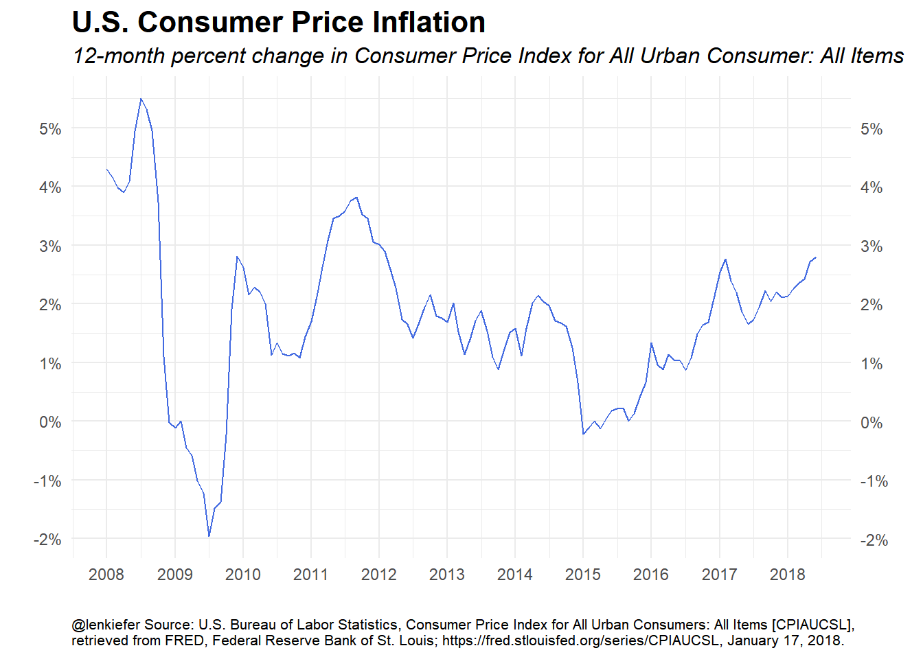
Now let’s make a function to plot the 12-month percent change in the consumer price index up to a particular data. That date will be the input of our function. This will help with the animation step.
plotf<-function(dd=max(df$date)){

ggplot(data=filter(df, date<=dd), # drop missing obs, only plot if date <=dd
       aes(x=date,y=d12))+

 #####################################################################################
 ## This put invisible (alpha=0) layer on so axis stays fixed,
 ## Alternatively you could manually fix the axis, or maybe let them expand (e.g. http://lenkiefer.com/2017/02/11/expanding-axis/)
    geom_line(data=df,color="royalblue", alpha=0) +
 #####################################################################################
   geom_line(data=filter(df, date<=dd),color="royalblue") +
  scale_y_continuous(label=scales::percent, breaks=seq(-.04,.05,.01),
                      sec.axis=dup_axis())+
   scale_x_date(date_breaks="1 years",date_labels="%Y")+
   theme_minimal()+
   labs(x="",y="",title="U.S. Consumer Price Inflation",
        subtitle="12-month percent change in Consumer Price Index for All Urban Consumer: All Items",
        caption="@lenkiefer Source: U.S. Bureau of Labor Statistics, Consumer Price Index for All Urban Consumers: All Items [CPIAUCSL],\nretrieved from FRED, Federal Reserve Bank of St. Louis; https://fred.stlouisfed.org/series/CPIAUCSL, January 17, 2018.")+
  theme(plot.title=element_text(face="bold",size=16),
        plot.subtitle=element_text(face="italic",size=12),
        plot.caption=element_text(hjust=0,size=8))

}
Now let’s test it out setting the input date (dd) to January 1, 2012:
plotf("2012-01-01")
Make the animation
Now we can make our animation. You might try gganimate but I’m going to create it manually. I’m going to save a bunch of images into an image directory as .png files. Then I will call Imagemagick from the command line (via Rstudio Terminal).
# get a list of dates
dlist<-unique(df$date)
N<- length(dlist)

mydir<-"YOURDIRECTORY"
#  Set YOURDIRECTORY equal to the place where you want to save image files

# Loop through images
#  could also use purrr::walk()
for (i in 1:(N+10)) {
  file_path = paste0(mydir, "/plot-",4000+i ,".png")
  g<-plotf(dlist[min(i,length(dlist))])
  ggsave(file_path, g, width = 10, height = 8, units = "cm",scale=2)

  print(paste(i,"out of",length(dlist)))
}

# Navigate to YOURDIRECTORY and run  the following to create gif
# (you need ImageMagick to run this)
# magick convert -delay 10 loop -0 *.png  cpi.gif
Running this should give you something like this:
Wrapping up
We’ve done all these things before in this space, but I thought it would be useful to post a relatively simple example showing my current workflow. I look at a lot of time series data, and sometimes animating a line plot can be helpful.