IN THIS POST I WANT TO SHARE SOME R CODE to create charts of U.S. housing starts we studied last week.
Get data
We’ll use tidyquant (see e.g. this post for more) to go get our data from the St. Louis Federal Reserve Economic Database (FRED). We’ll also use cowplot to arrange multiple ggplot2 graphs on one page.
Let’s load libraries and grab the data.
#####################################################################################
## Step 0: Load Libraries ##
#####################################################################################
library(tidyquant)
library(tidyverse)
library(cowplot)
library(lubridate)
library(scales)
library(ggridges)  # replaces ggjoy

#####################################################################################
## Step 1: Prepare for data  ##
#####################################################################################

tickers=data.frame(# variable symbols/mnemonics
                   symbol = c("HOUST",
                              "HOUST1F",
                              "HOUST5F",
                              "CNP16OV",
                              "HOUSTNSA",
                              "HOUST1FNSA",
                              "HOUST5FNSA"),
                   # variable names
                   varname = c("Total housing starts",
                               "1 unit housing starts",
                               "5+ unit housing starts",
                               "population",
                               "Total housing starts (NSA)",
                               "1 unit housing starts (NSA)",
                               "5+ unit housing starts (NSA)")) %>%
  map_if(is.factor,as.character) %>% # strings as characters
  as.tibble()                        # make a tibble

knitr::kable(tickers)| symbol | varname |
|---|---|
| HOUST | Total housing starts |
| HOUST1F | 1 unit housing starts |
| HOUST5F | 5+ unit housing starts |
| CNP16OV | population |
| HOUSTNSA | Total housing starts (NSA) |
| HOUST1FNSA | 1 unit housing starts (NSA) |
| HOUST5FNSA | 5+ unit housing starts (NSA) |
Now we can make some plots.
#####################################################################################
## Step 2: Pull data  ##
#####################################################################################

tickers$symbol %>% tq_get(get="economic.data", from="1960-01-01") -> df

#####################################################################################
## Step 3: Organize data  ##
#####################################################################################

df<-merge(df,tickers,by="symbol")
df %>% mutate( year=year(date),
               month=month(date),
               mname=forcats::fct_reorder(as.character(date, format="%b"),month)) %>%
  group_by(year,symbol) %>% arrange(date,symbol) %>%
  mutate(cs = cumsum(price)) -> df
Make a plot
First, we can recreate our simple line plot for U.S. total housing starts.
#####################################################################################
## Step 4: Make plots  ##
#####################################################################################

ggplot(data=filter(df,symbol=="HOUST"), aes(x=date,y=price))+theme_minimal()+geom_line(color="royalblue")+
  labs(x="",y="",
       title="U.S. housing starts low relative to history",
       subtitle="Monthly U.S. housing starts (1000s seasonally adjusted annual rate)",
       caption="@lenkiefer Source: Source: U.S. Census Bureau and Department of Housing and Urban Development")+
  theme(legend.position="none",plot.caption=element_text(hjust=0))+
  scale_y_continuous(labels=scales::comma,sec.axis=dup_axis())+
  scale_x_date(date_breaks="5 years",date_labels="%Y")
We can also try out the tidyquant::theme_tq() for our plot. I am going to modify the theme slightly so that the panel background color is royal blue to match the theme here.
Facet line plot
First we’ll make a simple faceted plot comparing single family (1-unit structures) starts to multifamily (5+ unit structures) starts at a seasonally adjusted annual rate.
 ggplot(data=dplyr::filter(df, symbol %in%
                      c("HOUST1F","HOUST5F")),
           aes(x=date,y=price,group=varname))+
  geom_line(color="royalblue")+
  facet_wrap(~varname,scales="free",ncol=1)+
  scale_x_date(date_breaks="5 years",date_labels="%Y")+
  scale_y_continuous(sec.axis=dup_axis())+
  theme_tq()+
  theme(strip.background=element_rect(fill="royalblue"))+
  labs(y="",x="",
       title="Housing starts: multifamily leads, single family lags ",
       subtitle="U.S. Housing Starts (1000s, SAAR)",
       caption="@lenkiefer Source: Source: U.S. Census Bureau and Department of Housing and Urban Development")+
  theme(plot.caption=element_text(hjust=0))
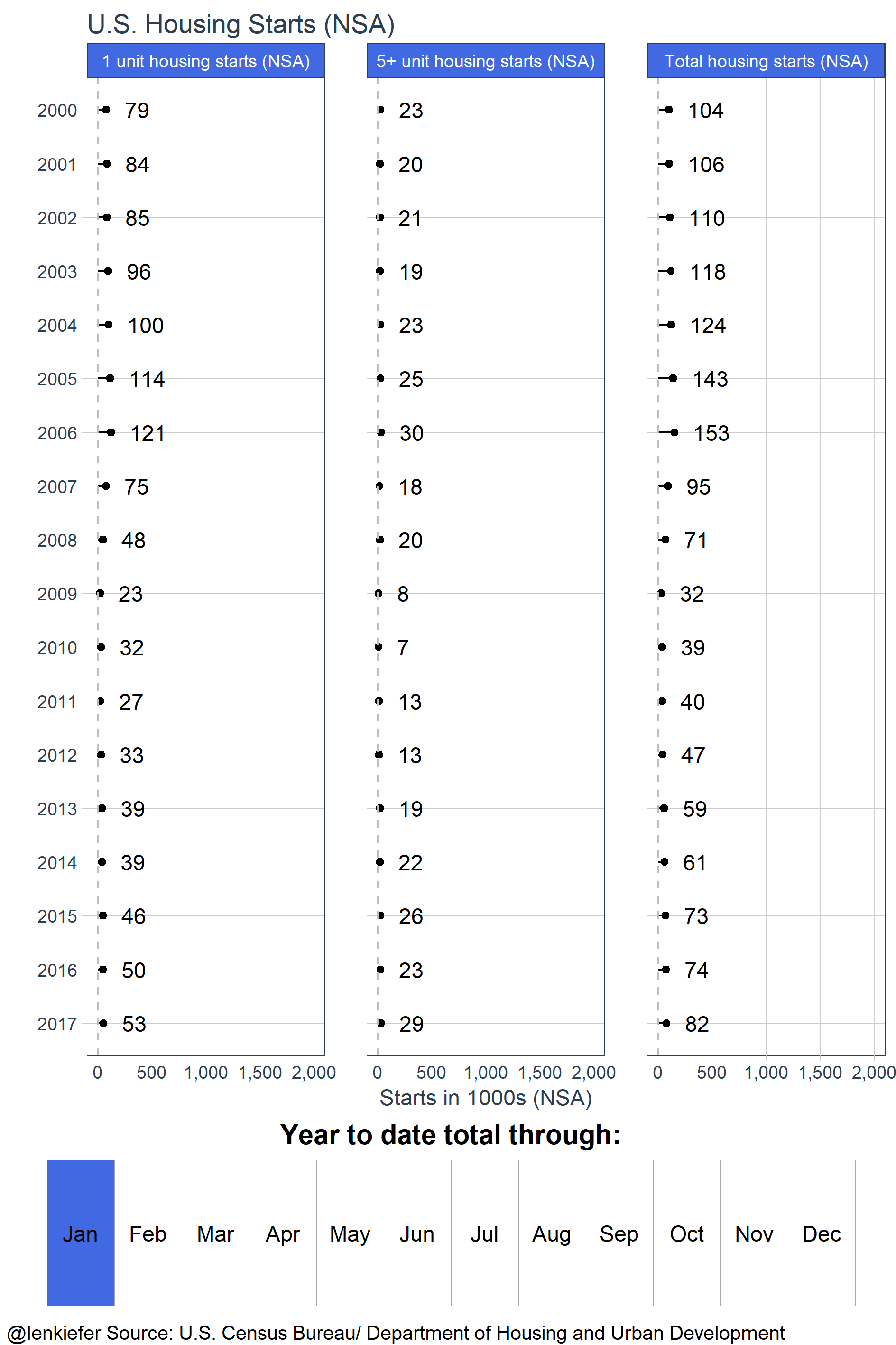
Lollipop chart
And a plot comparing cumulative starts on a year-to-date basis (not seasonally adjusted) with a lollipop chart.
ggplot(data=filter(df,symbol %in% c("HOUSTNSA","HOUST1FNSA","HOUST5FNSA") &
                         month==8 & year >1999),
           aes(x=cs,y=factor(year,levels=seq(2017,2000,-1)),
               group=varname, label=paste("  ",comma(round(cs,0)))))+
  geom_point()+
  facet_wrap(~varname,scales="free_y")+
  geom_segment(aes(xend=0,yend=factor(year)))+
  theme_tq()+geom_text(hjust=0)+
  theme(strip.background=element_rect(fill="royalblue"))+
  labs(y="",x="Starts in 1000s (NSA)",
         title="Year-to-date housing starts on track for best year since 2007",
         subtitle="Year-to-date through August U.S. Housing Starts (1000s, NSA)",
         caption="@lenkiefer Source: U.S. Census Bureau/ Department of Housing and Urban Development")+
  theme(plot.caption=element_text(hjust=0))+
  scale_x_continuous(labels=scales::comma, limits=c(0,2000))
Combining line and tile
Finally, let’s recreate the combined line and tile chart gif here. That version used the viridis color scheme, but we’ll remake it here using our cool blue colors.
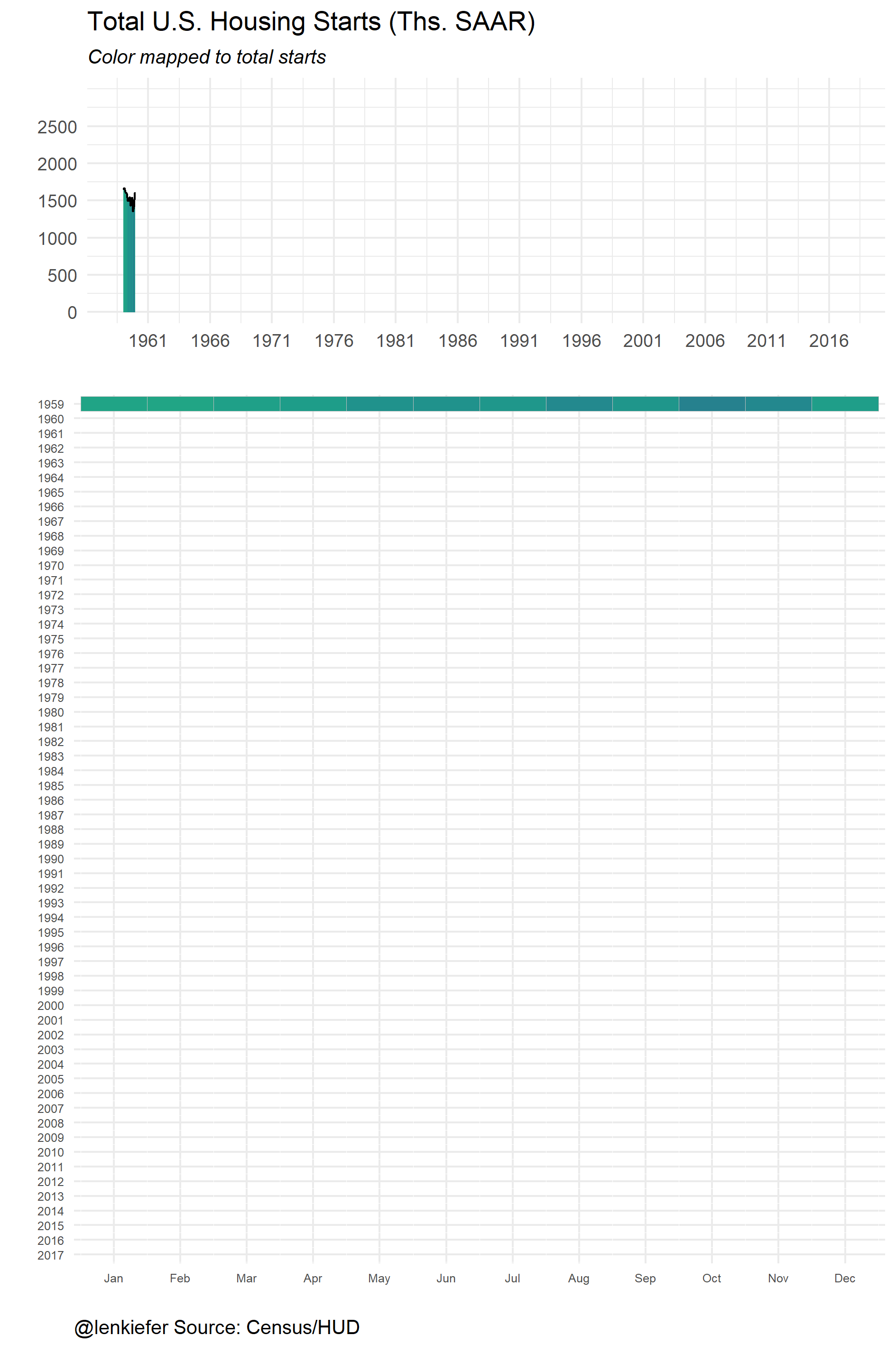
First as a static plot.
# Data for plots
sdata <- filter(df, symbol %in% c("HOUST")) %>% mutate(yearf=factor(year(date),levels=seq(2017,1959,-1)))

# make line plot with gradient shading
g.line2<-
  ggplot(data=sdata,aes(x=date,y=price,fill=price-1500))+
  geom_ridgeline_gradient(data=sdata,aes(y=0,height=price))+
  geom_line(alpha=0)+
  scale_fill_gradient(low="aliceblue",high="royalblue")  +
  scale_y_continuous(breaks=seq(0,2500,500),limits=c(0,3000))+
  theme_minimal()+
  labs(x="",y="",title="Total U.S. Housing Starts (Ths. SAAR)",
       subtitle="Color mapped to total starts")+
  theme(legend.position="none",plot.subtitle=element_text(face="italic"))+
  scale_x_date(date_breaks="5 years",date_labels="%Y")

# tile plot

g.tile<-
  ggplot(data=sdata,aes(x=reorder(as.character(date,format="%b"),month),
                        y=factor(yearf),fill=price))+
  geom_tile(color="gray")+
  scale_fill_gradient(low="aliceblue",high="royalblue")  +
  theme_minimal()+
  labs(x="",y="",
       caption="@lenkiefer Source: Census/HUD")+
  theme(legend.position="none",plot.caption=element_text(hjust=0))+
  theme(axis.text.y=element_text(size=6),
        axis.text.x=element_text(size=6))

g<-plot_grid(g.line2,g.tile, rel_heights=c(2,5),ncol=1)
g
Animated combo plot
Then, if we wanted to make an animation we could do the following:
mydir<-'YOURDIRECTOR'  # Set to your directory where you store images

# get list of dates
dlist<- unique(sdata$date)
N <- length(dlist) # number of periods
# Function to make plots:

myf<- function(i=N,
               imax=N  # cap imax at N, but allow i to run beyond
                       # by letting i > N you can pause animation at end
               ){
  file_path = paste0(mydir, "/plot-",5000+i ,".png")
  i<-min(i,imax)
  g.line2<-
    ggplot(data=sdata,aes(x=date,y=price,fill=price-1500))+
    geom_ridgeline_gradient(data=sdata[date<=dlist[i]],aes(y=0,height=price))+
    geom_line(alpha=0)+
    scale_fill_gradient(low="aliceblue",high="royalblue")  +
    scale_y_continuous(breaks=seq(0,2500,500),limits=c(0,3000))+
    theme_minimal()+
    labs(x="",y="",title="Total U.S. Housing Starts (Ths. SAAR)",
         subtitle="Color mapped to total starts")+
    theme(legend.position="none",plot.subtitle=element_text(face="italic"))+
    scale_x_date(date_breaks="5 years",date_labels="%Y")

  g.tile<-
    ggplot(data=sdata,
           aes(x=reorder(as.character(date,format="%b"),month),
               y=factor(yearf),fill=price))+
    geom_tile(alpha=0,color="white")+
    geom_tile(data=sdata[date<=dlist[i]],color="gray")+
    scale_fill_gradient(low="aliceblue",high="royalblue")  +
    theme_minimal()+labs(x="",y="",
                         caption="@lenkiefer Source: Census/HUD")+
    theme(legend.position="none",plot.caption=element_text(hjust=0))+
    theme(axis.text.y=element_text(size=6),
          axis.text.x=element_text(size=6))

  g<-plot_grid(g.line2,g.tile, rel_heights=c(2,5),ncol=1)
  ggsave(file_path, g, width = 8, height = 12 , units = "cm",scale=2)
  return(g)
}

# Get a nice list of dates (N %% 12 gives remainder after dividing by 12)
#  c(seq(1,N,12),seq(N- (N %% 12), N,1))
purrr::map(c(seq(12,N,12),seq(N- (N %% 12)+1, N+5,1)), myf)
Finally, after saving your images in YOURDIRECTORY you can navigate there and run this from the command line (assuming you have imagemagick installed):
magick convert -delay 10 loop -0 *.png awesomeplot.gif
Lollipop gif
Finally, we can animate the lollipop chart above (see here).
This gif uses a little animation progress bar like we discussed here.
myf3 <- function(mm=8){
  file_path = paste0(mydir, "/plot-",5000+mm ,".png")
  mm<-min(mm,8)  # like above we use min to pause at end (8 months/Aug here)
  gs<-
    ggplot(data=filter(df,symbol %in% c("HOUSTNSA","HOUST1FNSA","HOUST5FNSA") &
                         month==mm & year >1999),
           aes(x=cs,y=factor(year,levels=seq(2017,2000,-1)),
               group=varname, label=paste("  ",comma(round(cs,0)))))+
    geom_point()+facet_wrap(~varname)+
    geom_segment(aes(xend=0,yend=factor(year)))+
    geom_vline(xintercept=0,linetype=2,color="gray")+
    theme_tq()+geom_text(hjust=0)+
    theme(strip.background=element_rect(fill="royalblue"))+
    labs(y="",x="Starts in 1000s (NSA)",title="U.S. Housing Starts (NSA)")+
    scale_x_continuous(labels=scales::comma, limits=c(0,2000))

  # Create an animation progress bar
  gc<-
    ggplot(data=dc, aes(x=month,y="A",label=mname))+
    geom_tile(data=filter(dc,month<=mm), fill="royalblue")+
    geom_tile(alpha=0,color="darkgray")+
    theme_void()+
    geom_text()+guides(fill=F)+
    labs(title="Year to date total through:",
         caption="@lenkiefer Source: U.S. Census Bureau/ Department of Housing and Urban Development")+
    theme(plot.caption=element_text(hjust=0))

  g<-plot_grid(gs,gc, rel_heights=c(5,1),ncol=1)
  print(g)
  ggsave(file_path, g, width = 8, height = 12 , units = "cm",scale=2)
  }
purrr::map(seq(1,14),myf3)
Follow the pattern above and you can create a gif from these images. Be sure you run each animation loop in a directory clear of other images of the type you are trying to convert to a gif (e.g. .png files).
Could you use this?