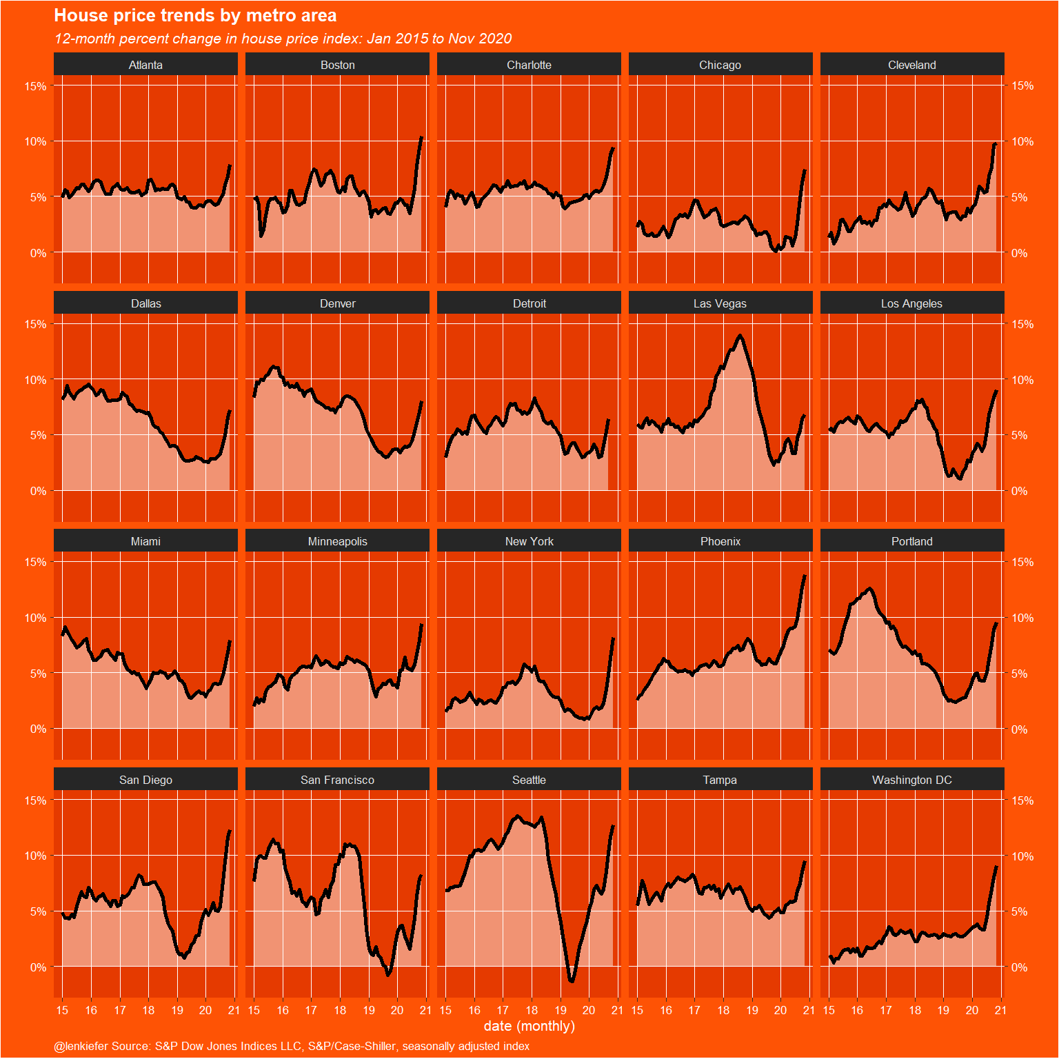
Earlier today I tweeted out a chart of house prices using my inari color theme.
House price growth lifting off pic.twitter.com/TvNJcOZrTF
— 📈 Len Kiefer 📊 (@lenkiefer) January 26, 2021
Below is the R code to generate the plot.
# load libraries
library(tidyquant)
library(tidyverse)
# list of FRED Tickers
tickers<- c("LXXRSA","SPCS20RSA","LVXRSA","SEXRSA",
"SFXRSA","NYXRSA","BOXRSA","SDXRSA","CHXRSA",
"DNXRSA","PHXRNSA","DAXRNSA","WDXRSA",
"ATXRNSA","MIXRNSA","POXRSA","MNXRSA","DEXRNSA","TPXRSA","CRXRSA","CEXRSA")
# list of city names
cities <- c("Los Angeles","20-city","Las Vegas","Seattle",
"San Francisco","New York","Boston","San Diego","Chicago",
"Denver","Phoenix","Dallas","Washington DC",
"Atlanta","Miami","Portland","Minneapolis","Detroit","Tampa","Charlotte","Cleveland")
df.all <-
data.frame(symbol = tickers,
city = cities,
stringsAsFactors = FALSE)
# get data from FRED
hpi.all <- tq_get(tickers,
get = "economic.data",
from = "2000-01-01")
df.out2 <-
hpi.all %>%
left_join(df.all, by = "symbol") %>%
group_by(symbol, city) %>%
mutate(price = 100 * price / price[date == "2000-01-01"]) %>%
ungroup %>%
select(-symbol) %>%
group_by(date) %>%
tidyr::pivot_wider(names_from = city,
values_from = price,
id_cols = date) %>%
filter(year(date) > 1989) %>%
ungroup()
df_plot <-
df.out2 %>% tidyr::pivot_longer(-date, names_to = "city", values_to = "price") %>%
filter(city != "20-city") %>%
group_by(city) %>% mutate(hpa = price / lag(price, 12) - 1) %>% ungroup() %>%
filter(year(date) > 2014)
# define colors
inari <- "#fe5305"
inari1 <- "#e53a00"
inari2 <- "#a90000"# make plot 1
df_plot %>%
ggplot(aes(
x = date,
y = hpa,
ymin = 0,
ymax = hpa
)) +
geom_ribbon(alpha = 0.45,
color = NA,
fill = "white") +
geom_line(size = 1.01, color = "black") + facet_wrap( ~ city) +
scale_y_continuous(
sec.axis = dup_axis(),
#labels=scales::percent,
breaks = c(0, .05, 0.1, 0.15),
labels = c("0%", "5%", "10%", "15%"),
limits = c(-0.02, .15)
) +
theme_dark(base_size=8) +
theme(
plot.caption = element_text(hjust = 0),
plot.title = element_text(face = "bold"),
plot.subtitle = element_text(face = "italic")
) +
labs(
y = "",
x = "date (monthly)",
title = "House price trends by metro area",
subtitle = "12-month percent change in house price index: Jan 2015 to Nov 2020",
caption = "@lenkiefer Source: S&P Dow Jones Indices LLC, S&P/Case-Shiller, seasonally adjusted index"
) +
scale_x_date(date_breaks = "1 years", date_labels = "%y") +
theme(
plot.background = element_rect(fill = inari),
text = element_text(color = "white"),
axis.text = element_text(color = "white"),
panel.grid.major = element_line(color = "white", size = 0.25),
plot.title = element_text(face = "bold"),
panel.grid.minor = element_blank(),
plot.caption = element_text(hjust = 0),
panel.background = element_rect(fill = inari1)
)
# make plot 2
df.out2 %>% pivot_longer(-date, names_to = "city", values_to = "price") %>%
filter(city != "20-city") %>%
group_by(city) %>% mutate(hpa = price / lag(price, 12) - 1) %>% ungroup() %>%
filter(year(date) > 1989) %>%
ggplot(aes(
x = date,
y = hpa,
ymin = 0,
ymax = hpa
)) +
geom_ribbon(alpha = 0.95,
color = NA,
fill = inari1) +
geom_line(size = 1.01, color = inari2) +
facet_wrap( ~ city) +
scale_x_date(date_breaks = "2 years", date_labels = "%y") +
scale_y_continuous(sec.axis = dup_axis(), labels = scales::percent) +
theme_dark(base_size=8) +
theme(plot.caption = element_text(hjust = 0),
plot.title = element_text(face = "bold"),
plot.subtitle = element_text(face = "italic")
) +
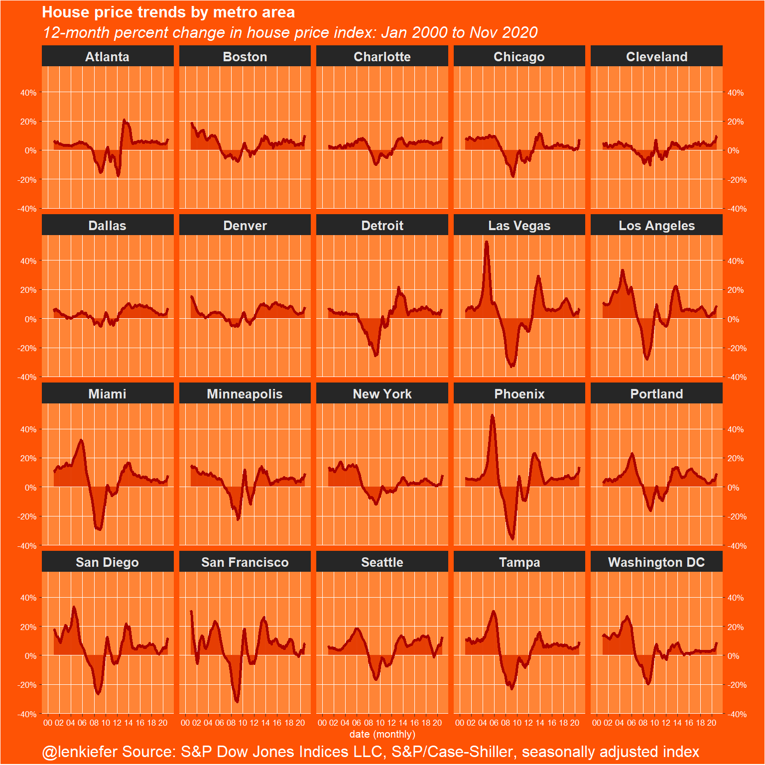
labs(
y = "",
x = "date (monthly)",
title = "House price trends by metro area",
subtitle = "12-month percent change in house price index: Jan 2000 to Nov 2020",
caption = "@lenkiefer Source: S&P Dow Jones Indices LLC, S&P/Case-Shiller, seasonally adjusted index"
) +
theme(
plot.background = element_rect(fill = inari),
text = element_text(color = "white"),
strip.text = element_text(face = "bold", size = rel(1.2)),
axis.text = element_text(color = "white"),
panel.grid.major = element_line(color = "white", size = 0.25),
plot.title = element_text(face = "bold", size = rel(1.5)),
plot.subtitle = element_text(face = "italic", size = rel(1.5)),
panel.grid.minor = element_blank(),
plot.caption = element_text(hjust = 0, size = rel(1.5)),
panel.background = element_rect(fill = "#ff8436")
)## Warning: Removed 12 row(s) containing missing values (geom_path).