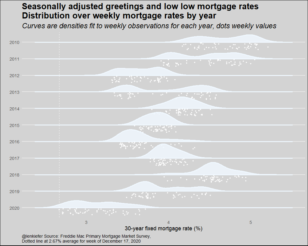
Seasonally adjusted greetings to you and yours. For you I have an animated chart, a variation on our rate cloud with a wintry theme.
R code below.
We’ll grab mortgage rate data, make a few new variables and then plot the chart using ggridges::geom_density_ridges2. Using the raincloud option for the poisition argument in ggridges::geom_density_ridges2 places the individual data points below the density plots. Using various shades of white we can turn the rain cloud into a snow cloud. Then with a little animation we can create a snowfall effect.
# replace with path to save your files
mydir <- FILEPATH


#####################################################################################
# load libraries----
#####################################################################################
library(data.table)
library(ggridges)
library(tidyverse)
library(gganimate)
library(lubridate)


# replace with path to save your files
mydir <- FILEPATH

#####################################################################################
# get data ----
#####################################################################################
df <- fread("http://www.freddiemac.com/pmms/docs/PMMS_history.csv")
df$date <- as.Date(df$date,format="%m/%d/%Y")
df <- mutate(df,year=year(date),
             yearf=fct_reorder(factor(year(date)),-year))


#####################################################################################
# make plot ----
#####################################################################################
a <-
  ggplot(
    data = bind_rows(
      df %>% filter(year > 2009) %>% mutate(mycolor = "white"),
      df %>% filter(year > 2009) %>% mutate(mycolor =
                                              "aliceblue"),
      df %>% filter(year > 2009) %>% mutate(mycolor =
                                              "ghostwhite")
    ),
    aes(
      y = forcats::fct_reorder(yearf, -year),
      x = pmms30,
      group = year,
      fill = mycolor,
      color = mycolor
    )
  ) +
  geom_density_ridges2(
    size = 1.2,
    alpha = 0.85,
    scale = 0.85,
    position = "raincloud",
    point_color = "white",
    jittered_points = TRUE
  ) +
  scale_color_identity() +
  scale_fill_identity() +
  theme_minimal(base_size = 18) +
  theme(
    panel.grid.minor = element_blank(),
    plot.background = element_rect(fill = "lightgray"),
    plot.title = element_text(size = rel(1.5), face = "bold"),
    plot.subtitle = element_text(size = rel(1.3), face = "italic"),
    plot.caption = element_text(hjust = 0),
    panel.grid.major.x = element_blank()
  ) +
  geom_vline(
    data = . %>% filter(date == max(date)),
    linetype = 2,
    color = "white",
    aes(xintercept = pmms30)
  ) +
  labs(
    x = "30-year fixed mortgage rate (%)\n",
    y = "",
    caption = paste0(
      "@lenkiefer Source: Freddie Mac Primary Mortgage Market Survey,",
      "\nDotted line at ",
      df[df$date == max(df$date), ]$pmms30,
      "% average for week of ",
      as.character(max(df$date), format = "%B %d, %Y")
    ),
    title = "Seasonally adjusted greetings and low low mortgage rates\nDistribution over weekly mortgage rates by year",
    subtitle = "Curves are densities fit to weekly observations for each year, dots weekly values"
  )


# animate
a <- a+ transition_states(mycolor,wrap=TRUE)
animate(a,nframes=60,  width=1000,height=800,end_pause=0,fps=40)

# save animation
gganimate::anim_save(paste0(mydir,"rate_cloud.gif"))