Over the summer I spent a few weeks in Asia. One of the places I visited was Fushimi Inari-taisha in Kyoto, Japan. This shrine is situated on a beautiful mountain. What really struck me about this place was the vibrant colors used in the Torii gates and to decorate some of the fox statues like these:

The color got stuck in my head, so I decided to look up the hex code here and created a modified ggplot2 theme using the color.
# load libraries
library(tidyverse)

# define colors
inari  <- "#fe5305"
inari1 <- "#e53a00"
inari2 <- "#a90000"
Make a plot using economic data. I decided to plot 1-unit housing starts which I could get from FRED. Then I modified the theme components so the background was inari flavored orange.
df_starts <- tidyquant::tq_get("HOUST1F",get="economic.data",from="2010-01-01")

ggplot(data=df_starts, aes(x=date,y=price))+
  geom_path(color="black", size=1.5)+
  theme_dark(base_size=14)+
  geom_hline(data=. %>% filter(date==max(date)),
             aes(yintercept=price),linetype=2,size=1.5,color="white", alpha=0.75)+
  scale_x_date(date_breaks="2 year",date_labels="%b-%Y")+
  theme(plot.background=element_rect(fill=inari),
        text=element_text(color="white"),
        axis.text=element_text(color="white"),
        panel.grid.major=element_line(color="white",size=0.25),
        plot.title=element_text(face="bold"),
        panel.grid.minor=element_blank(),
        plot.caption=element_text(hjust=0),
        panel.background=element_rect(fill=inari1)
  )+
  labs(x="date (daily)",y="",
       title="U.S. Privately Owned Housing Starts: 1-Unit Structures",
       subtitle="1000s, seasonally adjusted annual rate",
       caption="@lenkiefer Source: U.S. Census Bureau and U.S. Department of Housing and Urban Development,\nPrivately Owned Housing Starts: 1-Unit Structures [HOUST1F],\nretrieved from FRED, Federal Reserve Bank of St. Louis;\nDotted line value for August 2019")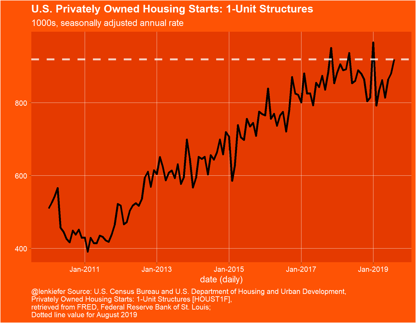
Might be too intense for regular use. But I’ve been using a less intense version in data visualizations like the ones in this thread:
#mortgage rates tick up this weekhttps://t.co/bpUsGTfeaK
— 📈 Len Kiefer 📊 (@lenkiefer) September 12, 2019
charts!
1/ pic.twitter.com/DiHgZnOydn