LET’S TAKE A LOOK AT RECENT TRENDS IN CONSUMER PRICES AND HOUSEHOLD DEBT. Along the way we’ll refresh some visualizations of consumer prices (see here) and household debt (see here) we made last year, as well as think up some new ones.
As usual we’ll use R to generate the plots and I’ll share the code below. But before we get into the details of constructing the charts, let’s just look at two plots to help set the stage.
Two possibly related charts
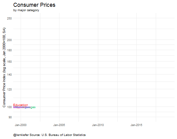
First, let’s examine trends in U.S. consumer prices since the year 2000. We’ll get into the data details later, but these data are from the U.S. Bureau of Labor Statistics BLS.gov. The Consumer Price Index (CPI) LINK tracks “changes in the prices paid by urban consumers for a representative basket of goods and services”.
The BLS provides very detailed measures (it’s 5 o’clock somewhere so feel free to read) down to individual price categories. They also aggregate into various aggregate categories.
Let’s look at a few of them:

These data are normalized so that January 2000 is equal to 100. The trend lines compare how the seasonally-adjusted price indices have evolved since then. In case you didn’t notice, I’ve made the education line thicker to call attention to it. From January 2000 to April 2017 (latest data available) the CPI for all items was up 44 percent (144 in the chart) vs 129 percent (229 in the chart) for the education index.
There are important niceties see again the BLS about how the index is constructed and what it really measures. The important point is education costs are up a lot more than overall prices since 2000.
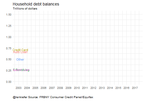
On a possibly related note, consider this chart showing household debt trends using data from the New York Federal Reserve Bank/Equifax’s consumer credit panel LINK.

Got it? Price up, debt up. Let’s start building some more visualizations of these data and explore these trends in more detail.
Step 1: get the data
The data for these plots are conveniently made available by the BLS and the New York Fed.
A quick note on data manipulation. I have been cycling between using a data.table based approach for data wrangling and a dplyr/tidyverse based approach. Both seem to work. For the CPI data I’ll mostly use data.table and for the household debt data I’ll mostly use dplyr.
Consumer price data
First, we’ll follow my CPI post to get the Consumer Price data.
###############################################################################
#### Load libraries
###############################################################################
library(data.table,quietly=T,warn.conflicts=F)
library(tidyverse,quietly=T,warn.conflicts=F)

###############################################################################
#### Read in data from BLS
#### See: for readme https://download.bls.gov/pub/time.series/cu/cu.txt
###############################################################################

# get data
cpi1<-fread('http://download.bls.gov/pub/time.series/cu/cu.data.2.Summaries')

# Get item names
cpi.item<-fread("http://download.bls.gov/pub/time.series/cu/cu.item",
                header=FALSE,col.names=c("item.code","item.name","display.level",
                                         "selectable","sort.sequence","blank"))
# get series info
cpi.series<-fread("http://download.bls.gov/pub/time.series/cu/cu.series",
                  col.names=c("series_id","area_code","item_code","seasonal",
                              "periodicity_code","base_code","base_period",
                            "footnote_codes","begin_year","begin_period",
                            "end_year","end_period","blank"),header=F)
# merge
cpi2<-merge(cpi.item,cpi.series,by.x="item.code",by.y="item_code")

setkeyv(cpi1,"series_id")
setkeyv(cpi2,"series_id")
cpi3<-cpi2[cpi1]
# create date
cpi3<-cpi3[,month:=as.numeric(substr(cpi3$period,2,3))]
cpi3$date<- as.Date(ISOdate(cpi3$year,cpi3$month,1) )

# subset data
cpi4<-cpi3[area_code=="0000" & seasonal=="S" & item.code!= "SAA1" & item.code !="SAA2"]
# get January 2000 data
bdata<-cpi4[year==2000 & month==1,]
bdata<-dplyr::rename(bdata, value00=value)
bdata<-bdata[, c('value00','series_id'), with = FALSE]
cpi5<-merge(cpi4,bdata,by="series_id")

# reindex data so that 2000 = 100
cpi5<-cpi5[,cpi00:=100*value/value00]
cpi6<-cpi5[year>1999]
xlim<-c(min(cpi6$date),max(cpi6$date))
dd<-unique(cpi6$date)


# Originally, had Education combined with communication (as BLS reports it)
# let's just get education
# Series id: CUSR0000SAE1

  cpi.ed<-fread("http://download.bls.gov/pub/time.series/cu/cu.data.17.USEducationAndCommunication")
  cpi.ed[,month:=as.numeric(substr(cpi.ed$period,2,3))]
  cpi.ed$date<- as.Date(ISOdate(cpi.ed$year,cpi.ed$month,1) )
  cpi.ed$item.name<-"Education"
  cpi.ed<-cpi.ed[series_id=="CUSR0000SAE1"]
  bdata.ed<-cpi.ed[year==2000 & month==1,]
  bdata.ed<-dplyr::rename(bdata.ed, value00=value)
  bdata.ed<-bdata.ed[, c('value00','series_id'), with = FALSE]
  cpi.ed<-merge(cpi.ed,bdata.ed,by="series_id")
  cpi.ed[,cpi00:=100*value/value00]
Household debt data
The household debt data is available in an Excel spreadsheet. We’ll have to use readxl (see this post for more on wrangling Excel data with R). Let’s start by assuming that you have downloaded the latest credit panel summary data (available here .xlsx file) and saved it as HHD_C_Report_2017Q1.xlsx in a data directory.
Now in order to get this data useable, we have to use readxl to reach into the files and extract the useful information. I had originally been doing some manual manipulation in Excel, but ewww gross, let’s try to do it all with R.
It’s going to involve understanding the structure of the Excel file and using some of readxl’s nice features.
This spreadsheet is-sigh-well, set up like spreadsheets are wont to be. The data we want is in the “Page 3 Data” sheet, organized with variables in rows and data in columns. The row titles we want are not contiguous with the data (there’s a gap of a couple columns). We’ll have to import the data and try to beat it into tidy submission so we can actually work with it.
# We'll use the tidyverse here
library(readxl,quietly=T,warn.conflicts=F)
library(tidyr,quietly=T,warn.conflicts=F)
library(dplyr,quietly=T,warn.conflicts=F)
library(purrr,quietly=T,warn.conflicts=F)

# data is range D4: BH10, we'll get the data values from row 3
# the row titles are in column A, so we'll get it and then delete blanks

df<-read_excel("data/HHD_C_Report_2017Q1.xlsx",
               sheet = "Page 3 Data",  # name of sheet
               range="A3:BH10" )        # range where data lives

## we've got blank columns in positions 2 & 3 (drop them)
## then we'll gather the data and rename X__1 as "type"

df2<-df %>% select(-X__2,-X__3) %>% gather(datec,debt,c(2:58)) %>% rename(type=X__1)

#now create a date variable using the datec string:

df2<- df2 %>%
  mutate(year=2000+as.numeric(substr(datec,1,2)),
         month=as.numeric(substr(datec,5,5))*3) %>%
  # create date variable
  mutate(date=as.Date(ISOdate(year,month,1))) %>%
  # drop unneeede variables
  select(type,date,debt)
Hey, not so bad. Let’s make a table looking at the last quarter of data (2017 Q1).
# Make a table for 2017 Q1:

htmlTable(
  df2 %>% filter(date=="2017-03-01") %>%
    arrange(-debt) %>%
    map_if(is.numeric,scales::dollar) %>% as.data.frame(),
  col.rgroup = c("none", "#F7F7F7"),
  caption="Aggregate Household Debt ($ Trillions, 2017 Q1)",
tfoot="Source: FRBNY Consumer Credit Panel/Equifax")| Aggregate Household Debt ($ Trillions, 2017 Q1) | |||
| type | date | debt | |
|---|---|---|---|
| 1 | Total | 2017-03-01 | $12.72 |
| 2 | Mortgage | 2017-03-01 | $8.63 |
| 3 | Student Loan | 2017-03-01 | $1.34 |
| 4 | Auto Loan | 2017-03-01 | $1.17 |
| 5 | Credit Card | 2017-03-01 | $0.76 |
| 6 | HE Revolving | 2017-03-01 | $0.46 |
| 7 | Other | 2017-03-01 | $0.37 |
| Source: FRBNY Consumer Credit Panel/Equifax | |||
Step 2: make some awesome charts
Now that we’ve got our data, we can start making some awesome charts. Or maybe I should say continue making awesome charts, because we never really stop do we?
Let’s get to it.
Venerable line charts
We’ll get crazy I promise but let’s start simple with the venerable line chart. The code below will recreate the plots we started with.
CPI line chart
library(ggrepel,quietly=T,warn.conflicts=F) # for the labels (avoid overplotting)


# dd is a list of dates, we'll set i = max date for labels
xlim<-c(min(cpi6$date),max(cpi6$date))
dd<-unique(cpi6$date)
i<- length(dd)

ggplot(data=cpi6[
  #drop some items for clarity
  ! (item.name %in% c("Other goods and services","Services",
                      "Education and communication"))],
  aes(x=date,y=cpi00,color=item.name))+
  geom_line()+
  theme_minimal()+   theme(legend.justification=c(0,0), legend.position="none")+
  scale_y_log10(limits=c(90,250),breaks=c(90,100,120,140,160,180,200,250))+
  geom_line(data=cpi.ed[ year>1999],size=1.5,color="red")+
  scale_x_date(labels= date_format("%b-%Y"),
               limits = as.Date(c('2000-01-01','2018-12-31')))+
  geom_text_repel(
    data = cpi6[date==dd[i] &
                  ! (item.name %in% c("Other goods and services","Services",
                                      "Education and communication"))],
    aes(label = item.name), size = 3.5, nudge_x = 1) +
  geom_text(
    data = cpi.ed[date==dd[i]],color="red",
    aes(label = item.name),
    size = 3.5,nudge_x = 1,nudge_y=.01) +
  labs(x="", y="Consumer Price Index (log scale, Jan 2000=100, SA)",
       title="Consumer Prices",
       subtitle="by major category",
       caption="@lenkiefer Source: U.S. Bureau of Labor Statistics")+
  theme(plot.title=element_text(size=18),
        plot.caption=element_text(hjust=0,vjust=1),
        plot.margin=unit(c(0.25,0.25,0.25,0.25),"cm"))
Household debt line chart
ggplot(data=filter(df2,type!="Total" & type !="Mortgage"),
       aes(x=date,y=debt,color=type,label=type))+
  geom_line(size=1.2)+theme_minimal()+
  geom_text(data=tail(filter(df2,type!="Total" & type !="Mortgage"),5),
            nudge_x=10,nudge_y=.025)+
  coord_cartesian(xlim=c(as.Date("2003-01-01"),as.Date("2017-12-31")), y=c(0,1.5))+
  theme(plot.title=element_text(size=14),
        plot.caption=element_text(hjust=0,vjust=1),
        legend.position="none")+
  labs(title="Household debt",subtitle="Trillions of dollars",x="",y="",
       caption="@lenkiefer Source: FRBNY Consumer Credit Panel/Equifax")
Inflation line chart
The CPI line chart compares price changes over a long horizon. Let’s focus on more recent changes. The code below generates a plot of monthly price inflation by category.
# stack education with full data
cpi7<-rbind(cpi6,cpi.ed,fill=T)

# construct monthly inflation metrics
cpi7 <- cpi7[order(series_id,date),]
cpi7<-cpi7[, cpi.inf:= value/shift(value,1,fill=NA)-1, by=series_id]

# plot data
ggplot(data=cpi7[
  #drop some items for clarity
  ! (item.name %in% c("Other goods and services","Services",
                      "Education and communication"))],
  aes(x=date,y=cpi.inf,color=item.name))+
  geom_line()+
  geom_hline(yintercept=0,linetype=2,color="darkgray")+
  scale_y_continuous(label=scales::percent)+
  theme_minimal()+   theme(legend.justification=c(0,0), legend.position="none")+
  scale_x_date(labels= date_format("%Y"),
               limits = as.Date(c('2000-01-01','2017-12-31')))+
  geom_text_repel(
    data = cpi7[date==dd[i] &
                  ! (item.name %in% c("Other goods and services","Services",
                                      "Education and communication"))],
    aes(label = item.name), size = 3.5, nudge_x = 1) +
  labs(x="", y="Consumer Price Inflation (Monthly % change, SA)",
       title="Consumer Price Inflation (m/m %)",
       subtitle="by major category",
       caption="@lenkiefer Source: U.S. Bureau of Labor Statistics")+
  theme(plot.title=element_text(size=18),
        plot.caption=element_text(hjust=0,vjust=1),
        plot.margin=unit(c(0.25,0.25,0.25,0.25),"cm"))
Wow, that’s pretty ugly, transportation is volatile and it’s hard to see what’s going on in the plot. Let’s use faceting to make a small multiple (also, let’s drop volatile transportation/commodities and recreation so we have 6 categories). Let’s also zoom in on trends since 2010.
# plot data
ggplot(data=cpi7[
  #drop some items for clarity
  ! (item.name %in% c("Other goods and services","Services",
                      "Education and communication", "Transportation",
                      "Commodities","Recreation"))],
  aes(x=date,y=cpi.inf,color=item.name))+
  geom_line()+
  geom_hline(yintercept=0,linetype=2,color="darkgray")+
  scale_y_continuous(label=scales::percent)+
  theme_minimal()+   theme(legend.justification=c(0,0), legend.position="none")+
  scale_x_date(labels= date_format("%Y"),
               limits = as.Date(c('2010-01-01','2017-12-31')))+
  facet_wrap(~item.name)+
  labs(x="", y="Consumer Price Inflation (monthly % change, SA)",
       title="Consumer Price Inflation (m/m %)",
       subtitle="by major category",
       caption="@lenkiefer Source: U.S. Bureau of Labor Statistics")+
  theme(plot.title=element_text(size=18),
        plot.caption=element_text(hjust=0,vjust=1),
        plot.margin=unit(c(0.25,0.25,0.25,0.25),"cm"))
Getting better. Still quite a bit of noise in some of the monthly measures. Let’s try looking at year-over-year percent changes to smooth out some of that noise.
# get 12 month inflation
cpi7<-cpi7[, cpi.inf12:= value/shift(value,12,fill=NA)-1, by=series_id]

# plot data
ggplot(data=cpi7[
  #drop some items for clarity
  ! (item.name %in% c("Other goods and services","Services",
                      "Education and communication", "Transportation",
                      "Commodities","Recreation"))],
  aes(x=date,y=cpi.inf12,color=item.name))+
  geom_line()+
  geom_hline(yintercept=0,linetype=2,color="darkgray")+
  scale_y_continuous(label=scales::percent)+
  theme_minimal()+   theme(legend.justification=c(0,0), legend.position="none")+
  scale_x_date(labels= date_format("%Y"),
               limits = as.Date(c('2010-01-01','2017-12-31')))+
  facet_wrap(~item.name)+
  labs(x="", y="Consumer Price Inflation (12-month % change, SA)",
       title="Consumer Price Inflation (y/y %)",
       subtitle="by major category",
       caption="@lenkiefer Source: U.S. Bureau of Labor Statistics")+
  theme(plot.title=element_text(size=18),
        plot.caption=element_text(hjust=0,vjust=1),
        plot.margin=unit(c(0.25,0.25,0.25,0.25),"cm"))
Now we have a clearer picture of recent trends. Overall inflation has been rising over the past year or so (thanks largely to recovering energy prices). Both Medical Care and Education are rising at a level well above general inflation, but seem to be trending down. Housing, which measures rents and owner’s equivalent rent not house prices (see for example question 2 here), is on the upswing.
Horizon charts
Let’s build some horizon charts (see my horizon chart post for everything you want, everything you need) to analyze inflation trends. Making horizon charts was only possible due to code from [@timelyportfolio](https://twitter.com/timelyportfolio), lots of cool stuff over at his page.
# subset data
df.cpi<-cpi7[ year(date)>2009 &  !
                (item.name %in% c("Other goods and services",
                                  "Services","Education and communication",
                                  "Transportation","Recreation")), c("date","item.name","cpi.inf12"),
  with=F]
############# magic! ##############################################################

library(htmltools)
library(DT)
library(d3horizonR)


myf3<-function (s="Ohio"){
  d.out<- filter(df.cpi,item.name==s)$cpi.inf12
  return(d.out)
}
dt3 <- data.frame(item.name=unique(df.cpi$item.name))

dt4 <- dt3 %>%
  mutate(x = lapply(item.name, myf3 ) )  %>%
  mutate(x = lapply(x, function(dat) {
    d3horizon_chr(
      list(dat),
      options = d3horizonOptions(height=20),
      width = 400
    )
  }) )

m<-
datatable(
  dt4,
    caption = 'Annual growth in consumer prices',
  escape = FALSE,
  colnames=c("Item","12-month % change\n in prices"),
  options = list(
    columnDefs = list(list(width="400px", targets = 2:2)),
    fnDrawCallback = htmlwidgets::JS()
  )
) %>%
  tagList(htmlwidgets::getDependency("d3horizon", "d3horizonR")) %>%
  browsable()

# save m
library(htmlwidgets)
saveWidget(m, file="m.html")
These widgets are cool, but I’m not doing much with them here. We’ll do more later.
Lollipops
Lollipop charts have been under fire recently, but I still like them. See here for a more spirited defense of the chart type from Andy Cotgreave.
We’ll just go ahead and make one. If you don’t like them, the nice thing about ggplot2 is it’s pretty easy to just swap in a bar.
Let’s make one.
library(viridis) # for the colors!
ggplot(data=cpi7[date==dd[i] & item.name != "Education and communication",],
       aes(xend=100,x=cpi00,
           yend=reorder(item.name,cpi00),y=reorder(item.name,cpi00),
           color=cpi00,
           label=paste(" ",item.name," ")))+
    geom_segment(size=0.25,linetype=2)+geom_point(size=3)+
  scale_x_log10(limits=c(75,250),breaks=seq(100,250,25))+
  theme_minimal()+
  geom_text(aes(hjust=ifelse(cpi00>100,0,1)))+
  scale_color_viridis(name="Price Index",option="C",end=0.85)+
  labs(y="", x="Consumer Price Index (log scale, Jan 2000=100, SA)",
       title="Consumer Prices",
       subtitle=paste("by major category through",as.character(dd[i],format="%b-%Y")),
       caption="@lenkiefer Source: U.S. Bureau of Labor Statistics")+
  theme(plot.title=element_text(size=18),
        legend.position="none",
        axis.text.y=element_blank(),
        panel.grid.major.y=element_blank(),
        panel.grid.minor.y=element_blank(),
        plot.caption=element_text(hjust=0))
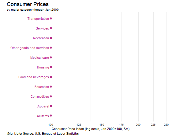
This plot compares how much prices have risen relative to 2000. Essentially, this is just the endpoint of the line plot.
State debt trends
Let’s move over to the household debt data and look at state debt trends. In the same data file (different) worksheet we got from the New York Fed we can get a time series of per capita debt levels for the U.S. and some large states.
# data is range A3: BH10, we'll get the date values from row 3
# the row titles are in column A

df.state<-read_excel("data/HHD_C_Report_2017Q1.xlsx",
               sheet = "Page 20 Data",  # name of sheet
               range="A3:BF15" )        # range where data lives

## we've got blank columns in positions 2 & 3 (drop them)
## then we'll gather the data and rename X__1 as "state"

df.state2<-df.state %>% gather(datec,pcdebt,c(2:58)) %>% rename(state=X__1)

#now create a date variable using the datec string:

df.state2<- df.state2 %>%
  mutate(year=2000+as.numeric(substr(datec,1,2)),
         month=as.numeric(substr(datec,5,5))*3) %>%
  # create date variable
  mutate(date=as.Date(ISOdate(year,month,1))) %>%
  # drop unneeede variables
  select(state,date,pcdebt)

#plot debt balance per capita

ggplot(data=df.state2,aes(x=date,y=pcdebt,color=state,
                          label=round(pcdebt,0)))+geom_line(size=1.2)+theme_minimal()+
  geom_text_repel(data=filter(df.state2,date=="2017-03-01"),
                  nudge_x=10,nudge_y=.025)+
    facet_wrap(~state,ncol=3)  +
  scale_y_log10(limits=c(20,90),breaks=seq(25,90,15))+
    theme(plot.title=element_text(size=14))+theme(plot.caption=element_text(hjust=0,vjust=1,margin=margin(t=10)))+
    theme(plot.margin=unit(c(0.25,0.25,0.25,0.25),"cm"))+
      coord_cartesian(xlim=c(as.Date("2003-01-01"),as.Date("2017-12-31")))+
    theme(legend.position="none")+
    labs(title="Per capita household debt",
         subtitle="Thousands of dollars, (Based on the population with a credit report) ",
         x="",y="per capita debt (Ths $, log scale)",caption="@lenkiefer Source: FRBNY Consumer Credit Panel/Equifax")
Debt levels are starting to rise, but remain (on a per capita basis) below pre-Great Recession levels.
State delinquency trends
Let’s look at consumer delinquency trends by state. These data are in another worksheet in the same spreadsheet. Our mastery of a couple readxl tricks is paying off bigtime!
# data is range A3: BH10, we'll get the date values from row 3
# the row titles are in column A

df.statedq<-read_excel("data/HHD_C_Report_2017Q1.xlsx",
               sheet = "Page 23 Data",  # name of sheet
               range="A3:BF15" )        # range where data lives

## we've got blank columns in positions 2 & 3 (drop them)
## then we'll gather the data and rename X__1 as "state"

df.state3<-df.statedq %>% gather(datec,dqdebt,c(2:58)) %>% rename(state=X__1)

#now create a date variable using the datec string:

df.state3<- df.state3 %>%
  mutate(year=2000+as.numeric(substr(datec,1,2)),
         month=as.numeric(substr(datec,5,5))*3) %>%
  # create date variable
  mutate(date=as.Date(ISOdate(year,month,1))) %>%
  # drop unneeede variables
  select(state,date,dqdebt)

#plot delinquency rates

ggplot(data=df.state3,aes(x=date,y=dqdebt,color=state,
                          label=round(dqdebt,1)))+
  geom_line(size=1.2)+theme_minimal()+
  geom_text_repel(data=filter(df.state3,date=="2017-03-01"),
                  nudge_x=10,nudge_y=.025)+
    facet_wrap(~state,ncol=3)  +
     theme(plot.title=element_text(size=14),
           plot.caption=element_text(hjust=0))+
  coord_cartesian(xlim=c(as.Date("2003-01-01"),as.Date("2017-12-31")))+
  theme(legend.position="none")+
labs(title="Percent of Balance 90+ Days Late by State",
     subtitle="Based on the population with a credit report",
     x="",y="Percent of Balance 90+ Days Late",
     caption="@lenkiefer Source: FRBNY Consumer Credit Panel/Equifax")
After rising very high during the Great Recession and its aftermath, delinquency rates are coming down. Let’s try to rework this line chart as a dot chart.
State delinquency dot chart
First, we’ll compute the max and min delinquency rate for each state, and then plot the 2017Q1 value as a dot with markers to indicate the min/max. We’ll also add the U.S. state="ALL"" in our data as another reference. I’ve done these calculations before, usually the data.table way, but we’ll do it the dplyr way here.
df.state3b<-df.state3 %>%
# group by states
group_by(state) %>%
# compute state specific min/max
mutate(dq.max=max(dqdebt),
dq.min=min(dqdebt)) %>%
# ungroup
ungroup() %>%
# compute US average,
group_by(date) %>%
mutate(dq.US=dqdebt[state=="ALL"]) %>%
ungroup() %>%
# compute max and min
mutate(dq.USmax=max(dqdebt[state=="ALL"]),
dq.USmin=min(dqdebt[state=="ALL"])
)
ggplot(data=filter(df.state3b,date=="2017-03-01"),
aes(x=dqdebt,y=state,
color=(dqdebt-dq.min)/(dq.max-dq.min),
label=state))+
geom_point(size=3)+
geom_segment(aes(xend=dq.min,x=dq.max,yend=state),size=2,alpha=0.5)+
scale_color_viridis(option="D",direction=-1,
name="Delinquency rate relative\nto state min/max\n1=max,0=min max",
end=0.95,limits=c(0,1))+
theme_minimal()+
theme(legend.position="top",
plot.title=element_text(size=14),
plot.caption=element_text(hjust=0),
legend.key.width=unit(3,"line")) +
geom_vline(aes(xintercept=dq.US),linetype=2,color="black")+
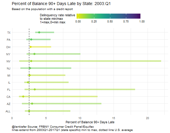
labs(title="Percent of Balance 90+ Days Late by State: 2017Q1",
subtitle="Based on the population with a credit report",
y="",x="Percent of Balance 90+ Days Late",
caption="@lenkiefer Source: FRBNY Consumer Credit Panel/Equifax\nlines extend from 2003Q1-2017Q1 (state specific) min to max, dotted line U.S. average")
Improving the plot with reordering
Ooh, I learned something else I should share. The data below are ordered according alphabetically, which isn’t the best way. Let’s reorder the data based on the current value. We can do it easily thanks to the forcats fct_reorder function.
ggplot(data=filter(df.state3b,date=="2017-03-01"),
       aes(x=dqdebt,
           # use fct_reorder, we want the US (state=="ALL") at the bottom,
           # so use ifelse() statement
           y=forcats::fct_reorder(state,ifelse(state=="ALL",-100,dqdebt)),
           color=(dqdebt-dq.min)/(dq.max-dq.min),
           label=state))+
  geom_point(size=3)+
  geom_segment(aes(xend=dq.min,x=dq.max,yend=state),size=2,alpha=0.5)+
  scale_color_viridis(option="D",direction=-1,
                      name="Delinquency rate relative\nto state min/max\n1=max,0=min max",
                      end=0.95,limits=c(0,1))+
    theme_minimal()+
  theme(legend.position="top",
        plot.title=element_text(size=14),
        plot.caption=element_text(hjust=0),
        legend.key.width=unit(3,"line")) +
  geom_vline(aes(xintercept=dq.US),linetype=2,color="black")+
  labs(title="Percent of Balance 90+ Days Late by State: 2017Q1",
     subtitle="Based on the population with a credit report",
     y="",x="Percent of Balance 90+ Days Late",
     caption="@lenkiefer Source: FRBNY Consumer Credit Panel/Equifax\nlines extend from 2003Q1-2017Q1 (state specific) min to max, dotted line U.S. average")
In this plot we can compare more easily than with the small multiple lines. Notice that the range of variation is quite different depending on which state you are looking at. Nevada (NV) had delinquency rates reach over 20 percent. Ohio (OH) on the other hand, never saw delinquency rates over 10 percent. We can also see that while the level of delinquency has declined, it’s not at a minimum for any of the states tracked.
Movie versions
These data lend themself to animations.
Here’s some animated gifs of some of the plots:
Wrapping up
Time to wrap up for today. We refreshed some old charts and introduced a couple new ones. We did some data wrangling with data.table() and dplyr. We used readxl to reach into Excel files and get our data. And we tried out forcats to reorder labels in our chart. All this enabled us wrangle our data and get it ready to use ggplot2 to visualize trends in consumer prices and household debt.
Hope you found this useful. How could these code snippets and data visualizations work for you?