IN THIS POST I WANT TO REWORK SOME VISUALIZATIONS we’ve already made.
Inspired by this compendium of clean graphics in R, I want to remake some of visualizations we made earlier this year in a low-key manner.
Sometimes the visualizations we make here can be pretty intense. Sometimes they are quite intricate, or use animation, or have a lot going on with them. But sometimes you need a simple, low-key visualization to make your point. Sometimes, after being overstimulated a low-key visualization can be a welcome sight.
For this post, we’ll revisit the house price visualizations we made in this post earlier this month.
Like in that post, we’ll use the Freddie Mac House Price Index (link to source) data. For all the details on data wrangling check out that post.
This post assumes we downloaded the state and U.S. data available here in .xls format and saved it in your data directory.
#####################################################################################
## Load Libraries ##
#####################################################################################
library(tidyverse)
## Loading tidyverse: ggplot2
## Loading tidyverse: tibble
## Loading tidyverse: tidyr
## Loading tidyverse: readr
## Loading tidyverse: purrr
## Loading tidyverse: dplyr## Conflicts with tidy packages ----------------------------------------------## filter(): dplyr, stats
## lag(): dplyr, statslibrary(scales)##
## Attaching package: 'scales'## The following object is masked from 'package:purrr':
##
## discard## The following object is masked from 'package:readr':
##
## col_factorlibrary(readxl)
library(data.table)##
## Attaching package: 'data.table'## The following objects are masked from 'package:dplyr':
##
## between, first, last## The following object is masked from 'package:purrr':
##
## transpose#####################################################################################
## Load data ##
#####################################################################################
df<-read_excel("data/states.xls",
sheet = "State Indices",
range="B6:BB516" )
df$date<-seq.Date(as.Date("1975-01-01"),as.Date("2017-06-01"),by="1 month")
#####################################################################################
## Manipulate data data ##
#####################################################################################
df.state<-df %>% gather(geo,hpi,-date) %>% mutate(type="state",state=geo) %>%
group_by(geo) %>%
mutate(hpa=hpi/lag(hpi,12)-1) %>% ungroup() %>%
group_by(date) %>%
mutate(us.hpa=hpa[geo=="United States not seasonally adjusted"],
us.hpi=hpi[geo=="United States not seasonally adjusted"]) %>%
ungroup() %>% mutate(up=ifelse(hpa>us.hpa,hpa,us.hpa),
down=ifelse(hpa<=us.hpa,hpa,us.hpa),
dlabel=paste(as.character(date,format="%B-%Y")," \n ")) %>%
ungroup() %>%
filter( !( state %in% c("United States not seasonally adjusted",
"United States seasonally adjusted"))) %>%
group_by(state) %>% mutate(id = row_number()) %>% ungroup()
#####################################################################################
## Create U.S. only data ##
#####################################################################################
df.us<-df %>% select("United States seasonally adjusted",date) %>%
gather(geo,hpi,-date) %>% mutate(type="US",state=geo) %>%
mutate(hpa=hpi/shift(hpi,12)-1, hpa1=hpi/shift(hpi,1)-1)Let’s make a simple plot of the U.S. house price index level.
We’ll first make it using ggplot2 like we did last time.
plot.hpa<-
  ggplot(data=filter(df.us,year(date)>1999), aes(x=date,y=hpa,label=round(hpa,0)))+
  geom_line()+theme_minimal()+
  scale_y_continuous(labels=percent)+
  labs(x="", y="",
       title="12-month percent change",
       subtitle="U.S. House price index",
       caption="@lenkiefer Source: Freddie Mac House Price Index (SA)")+
  theme(plot.title=element_text(size=14,face="bold"),
        plot.subtitle=element_text(size=10,face="italic"),
        plot.caption=element_text(hjust=0,size=8),
        axis.ticks.length=unit(0.25,"cm")) +
  geom_point(data=tail(df.us,1),color="red",size=3,alpha=0.82)+
    geom_hline(yintercept=tail(df.us,1)$hpa,color="red",linetype=2)+
    geom_hline(yintercept=0,color="black",linetype=2)
plot.hpa
Now let’s make a similar plot using base R. This will require us to add elements one at a time.
# subset data
df.plot<-filter(df.us, year(date)>1999)
# set ticks at min and max of x axis
ticks <- c(min(df.plot$date),max(df.plot$date))
# set up graph parameters
par(cex.main = 1.5, mar = c(6, 6, 6, 6) + 0.1,
      mgp = c(3.5, 1, 0), cex.lab = 1,
      font.lab = 2, cex.axis = 1.3, bty = "n", las = 1)
# start making our plot
plot(df.plot$date, df.plot$hpa, type="l",  xaxt = "n",yaxt="n",
     xlab="",ylab="12-month % change", lwd=2,
     ylim=c(min(pretty(df.plot$hpa)), max(pretty(df.plot$hpa))))
# Add x axis
axis(1, at=ticks, labels = as.character(ticks,format="%b-%Y"),hadj=0.5)
# Add y axis
axis(2, at=pretty(df.plot$hpa), labels=percent(pretty(df.plot$hpa)))
# Add secondary Y axis
axis(4, at=pretty(df.plot$hpa), labels=percent(pretty(df.plot$hpa)))
# Add secondary Y axis label
mtext("12-month % change",side=4,line=4,las=0,font=2)
# Add shading under curve
polygon(c(df.plot$date,rev(df.plot$date)),
        c(rep(0,length(df.plot$hpa)),rev(df.plot$hpa)),
        col=rgb(0, 0, 0,0.05), border=NA)
abline(h=0,lty=2,col="gray")
# add title, and caption (called sub in base R)
title(main="U.S. House Price Trends",
      sub="@lenkiefer Source: Freddie Mac House Price Index (SA)\n", adj=0)
mtext("12-month percent change in house prices",adj=0)
We can create a function to filter states and plot individual ones. Here we look at California and Texas.
#####################################################################################
## Base R function for line plot ##
#####################################################################################

myplot<- function (s="CA", ymin=2008){
  df.plot<-filter(df.state,state==s,year(date)>=ymin)
  ticks <- c(min(df.plot$date),max(df.plot$date))
  par(cex.main = 1.5, mar = c(6, 6, 6, 6) + 0.1,
      mgp = c(3.5, 1, 0), cex.lab = 1,
      font.lab = 2, cex.axis = 1.3, bty = "n", las = 1)
plot(df.plot$date, df.plot$hpa, type="l",  xaxt = "n",yaxt="n",
     xlab="",ylab="12-month % change", lwd=2,
     ylim=c(min(pretty(df.plot$hpa)), max(pretty(df.plot$hpa))))
axis(1, at=ticks, labels = as.character(ticks,format="%b-%Y"),hadj=0.5)
axis(2, at=pretty(df.plot$hpa), labels=percent(pretty(df.plot$hpa)))
axis(4, at=pretty(df.plot$hpa), labels=percent(pretty(df.plot$hpa))     )
mtext("12-month % change",side=4,line=4,las=0,font=2)

polygon(c(df.plot$date,rev(df.plot$date)),
        c(rep(0,length(df.plot$hpa)),rev(df.plot$hpa)),
        col=rgb(0, 0, 0,0.05), border=NA)
abline(h=0,lty=2,col="gray")
title(main=paste(s,"House Price Trends"),
      sub="@lenkiefer Source: Freddie Mac House Price Index (NSA)\n", adj=0)
mtext("12-month percent change in house prices",adj=0)
}
myplot(s="CA")
myplot(s="TX")
We could also animate it.
myplot2<- function (dmax=dlist[1],s="CA", ymin=1999){

  df.plot<-filter(df.state,state==s,year(date)>=ymin)
  df.plot2<-filter(df.state,state==s,year(date)>=ymin & date<=dmax)

  ticks <- c(min(df.plot2$date),max(df.plot2$date))
  par(cex.main = 1.5, mar = c(6, 6, 6, 6) + 0.1,
      mgp = c(3.5, 1, 0), cex.lab = 1,
      font.lab = 2, cex.axis = 1.3, bty = "n", las = 1)
plot(df.plot$date, df.plot$hpa, type="l",  xaxt = "n",yaxt="n",
     xlab="",ylab="12-month % change", lwd=0,col=NA,
     ylim=c(min(pretty(df.plot$hpa)), max(pretty(df.plot$hpa))))

lines(df.plot$date, df.plot$hpa, type="l", col=NA)
lines(df.plot2$date, df.plot2$hpa, type="l",   lwd=2)

axis(1, at=ticks, labels = as.character(ticks,format="%b-%Y"),hadj=0.5)
axis(2, at=pretty(df.plot$hpa), labels=percent(pretty(df.plot$hpa)))
axis(4, at=pretty(df.plot$hpa), labels=percent(pretty(df.plot$hpa))     )
mtext("12-month % change",side=4,line=4,las=0,font=2)

polygon(c(df.plot2$date,rev(df.plot2$date)),
        c(rep(0,length(df.plot2$hpa)),rev(df.plot2$hpa)),
        col=rgb(0, 0, 0,0.05), border=NA)
abline(h=0,lty=2,col="gray")
title(main=paste(s,"House Price Trends"),
      sub="@lenkiefer Source: Freddie Mac House Price Index (NSA)\n", adj=0)
mtext("12-month percent change in house prices",adj=0)
}
#  Set YOURDIRECTORY equal to the place where you want to save image files
# Base R seems much faster than ggplot2

mydir<-"YOURDIRECTORY"

myf<- function (i=1){
  file_path = paste0(mydir, "/plot-",4000+i ,".png")
  png(filename=file_path)
  myplot2(dlist[i])
  dev.off()
}

# loop for making dataviz, also could use purrr::map()

N<-length(dlist)
for (i in 1:(N+10)) {
  file_path = paste0(mydir, "/plot-",4000+i ,".png")
  png(filename=file_path, width = 600, height = 480, units = "px")
  myplot2(dlist[min(i,length(dlist))],ymin=1995)
  dev.off()
  print(paste(i,"out of",length(dlist)))
}

# Navigate to YOURDIRECTORY and run  the following to create gif
# (you need ImageMagick to run this)
# magick convert -delay 10 loop -0 *.png  hpi.gif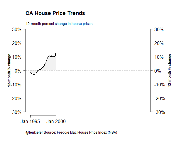
Or arrange multiple plots into one:
# get a list of dates
dlist<-unique(filter(df.state,year(date)>1999)$date)
N<-length(dlist)

myplot3<- function (dmax=dlist[N],s="CA", ymin=1999){

  df.plot<-filter(df.state,state==s,year(date)>=ymin)
  df.plot2<-filter(df.state,state==s,year(date)>=ymin & date<=dmax)

  ticks <- c(min(df.plot2$date),max(df.plot2$date))

  plot(df.plot$date, df.plot$hpa, type="l",  xaxt = "n",yaxt="n",
       xlab="",ylab="12-month % change", lwd=0,col=NA,
       ylim=c(min(pretty(df.plot$hpa)), max(pretty(df.plot$hpa))))

  lines(df.plot$date, df.plot$hpa, type="l", col=NA)
  lines(df.plot2$date, df.plot2$hpa, type="l",   lwd=2)

  axis(1, at=ticks, labels = as.character(ticks,format="%b-%Y"),hadj=0.5)
  axis(2, at=pretty(df.plot$hpa), labels=percent(pretty(df.plot$hpa)))
  polygon(c(df.plot2$date,rev(df.plot2$date)),
          c(rep(0,length(df.plot2$hpa)),rev(df.plot2$hpa)),
          col=rgb(0, 0, 0,0.05), border=NA)
  abline(h=0,lty=2,col="gray")
  title(main=paste(s,"12-month percent change in house prices"),
        sub="@lenkiefer Source: Freddie Mac House Price Index (NSA)\n12-month percent change in house prices", adj=0)
}
par(cex.main = 1, mar = c(3, 3, 3, 3) + 0.1,
    mgp = c(3.5, 1, 0), cex.lab = 0.75,
    font.lab = 2, cex.axis = 0.75, bty = "n", las = 1)
par(mfrow=c(3,2),oma=c(0,0,2,0))
myplot3(s="CA")
myplot3(s="NY")
myplot3(s="FL")
myplot3(s="TX")
myplot3(s="OH")
myplot3(s="WA")
title("State house price trends\n@lenkiefer Source: Freddie Mac House Price Index",
      cex=3,outer=T)
Low-key dataviz
It turns out creating these visualizations wasn’t as low-key as I originally thought. I had forgotten most of my base R graphing syntax so I had to look it back up. Fortunately the documentation is pretty good and I could remember the basics pretty quickly (Quick R was helpful here).
At this point, I find a lot of graphical tasks much easier with ggplot2 compared with base R, so I’ll probably stick with ggplot2 for most things I want to do. Still, I like the component wise build that you have to do with using base R. It forces you to think carefully about the visualization you want to build.
Jon Schwabish (on Twitter and PolicyViz blog) gave a talk at the NBER summer institute link to Video describing ways to better communicate data. He had a lot of useful things to say, but one thing I particularly liked that he said was “when you make your visualization start with gray”. He was talking about colors, but it applies even more generally.
Starting with a blank visualization and adding one element at a time, like you do with base R graphics, forces you to think carefully about what you are adding.
I often think about the early pioneers of data visualization. In the old days, creating charts and graphs was incredibly difficult. Despite the costs, there are some incredible early data visualizations. See for example Graphic Presentation from 1939. Sometimes forcing simplicity or constraints on yourself can help drive creativity.
Also see Nathan Yau (on Twitter) at Flowing Data (blog) with an extensive comparison of base R to ggplot2.