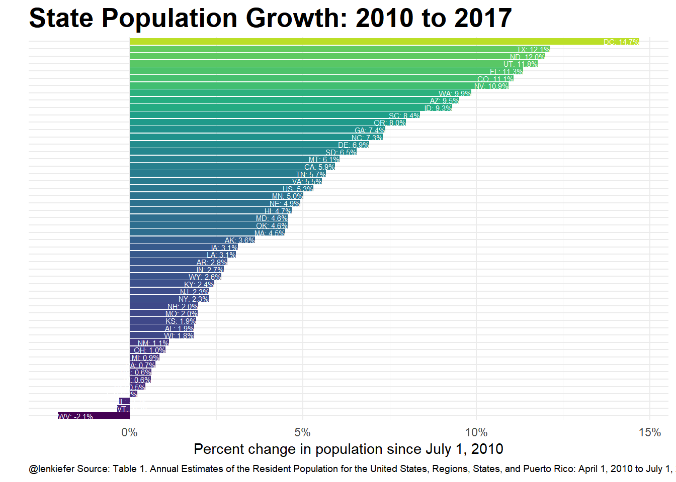
EARLIER TODAY THE U.S. CENSUS BUREAU released new estimates of population for U.S. states from 2010 through 2017. Let’s see how population trends look compared to recent house price growth.
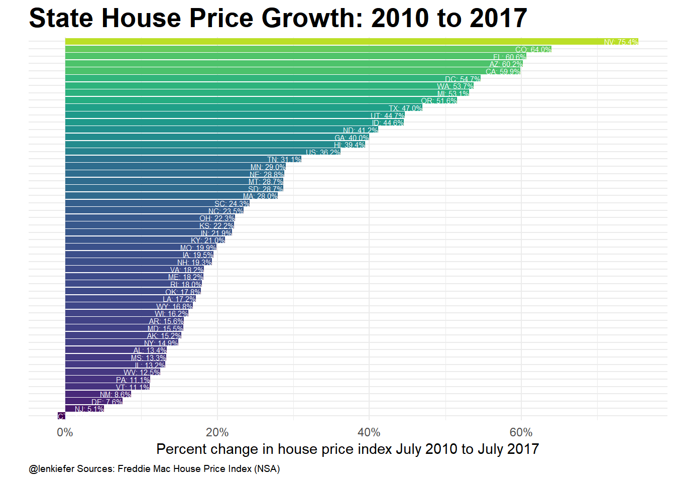
We’ll combine the Census estimates for state population with the Freddie Mac House Price Index.
The chart below plots population growth rates by state from July of 2010 to July of 2017 against house price appreciation rates over that same period. States with higher population growth rates have tended to have higher house price appreciation rates.
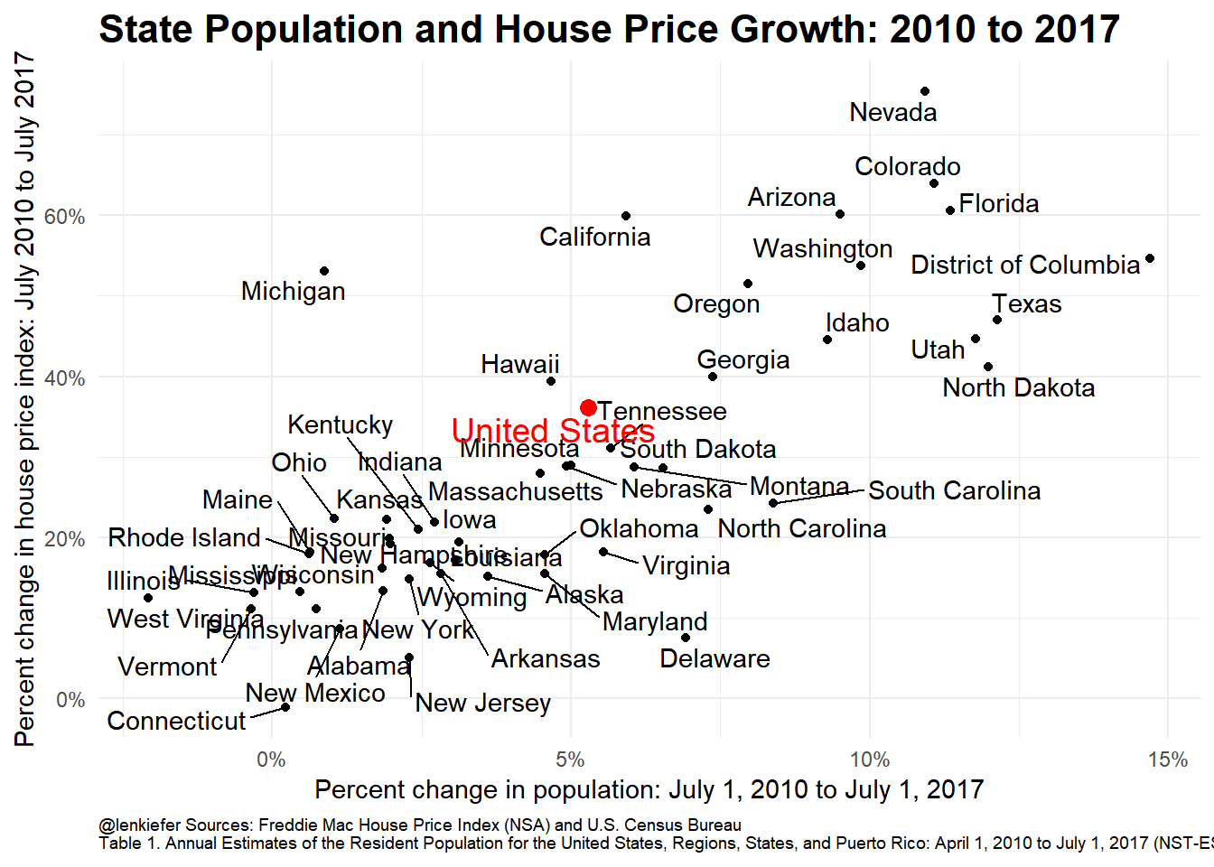
Here we can see a strong correlation between states with higher population growth rates and states with higher house price appreciation.
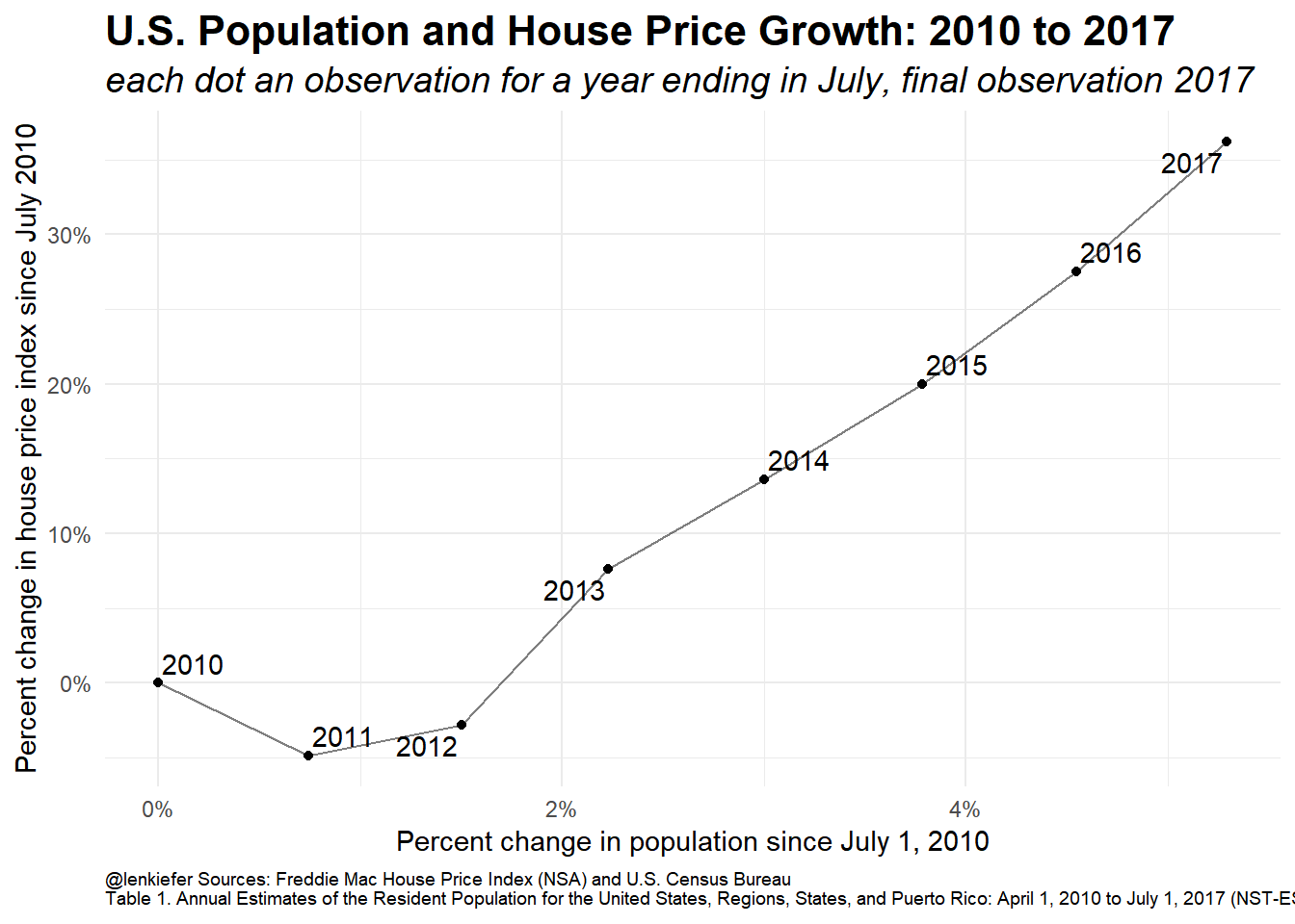
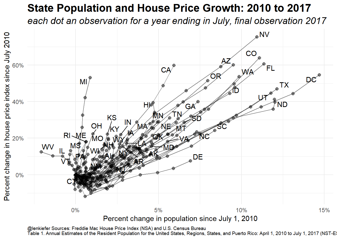
It’s also intersting to look at the time series trends via a connected scatterplot. The plot below shows the cumulative percent change since 2010 for population and house prices for the Uniteted States.
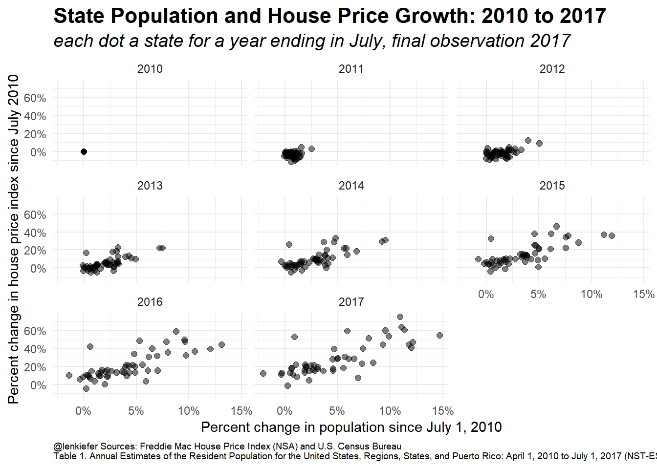
Another way to show it is to use a small multiple of scatterplots:
Another way to look at these data is to use a bar plot.
Discussion
Correlation does not equal causastion, though there’s good reason to believe that population growth is driving house price gains in markets that have struggled to increase housing supply. See for example this post with an interactive Tableau dashboard showing state and metro trends with data through 2016.