As a mental exercise, each week I make a new chart using same data, mortgage rates.
Sometimes I try to make something awesome, other times to stretch the imagination I try to make the most awful chart possible. You can learn a lot from that, but I’ll never tell you which is which!
Making an awful chart is an art unto itself. Sure you could fire up your favorite software and just take the defaults, odds are they would be reasonably awful though defaults are generally less awful these days.
But to really take awfulness to the next level you have to hit that uncanny valley between a good chart, and the true Eldritch horror chart.
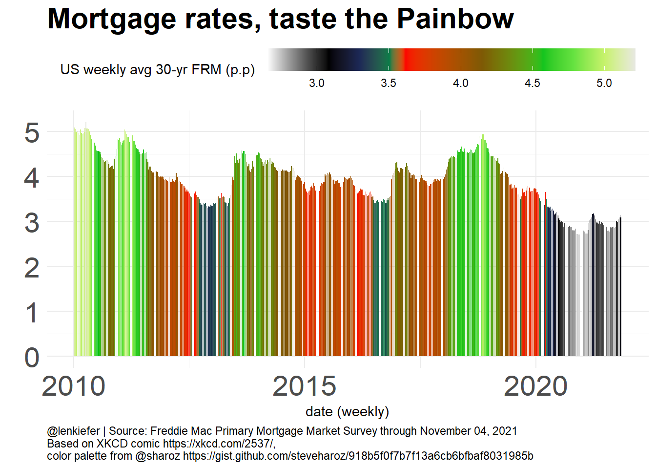
Using R code posted by Steve Haroz, I used the XKCD inspired Painbow color scheme to create this monstrosity. Though Steve makes some good points suggesting maybe this color scheme could be useful, see this twitter thread. In this case, I’ll tip my hand. I don’t think my chart is very good. In fact, it is pretty clearly evil.
Behold, the Painbow!
library(data.table)
library(tidyverse)
# Steve Haroz's estimate of the XKCD colormap
xkcd = tribble(
  ~color, ~value,
  "#E7E8E1", 120,
  "#C6F26B", 110,
  "#66E240", 100,
  "#11C51E", 90,
  "#7E5905", 70,
  "#FD0000", 45,
  "#037D47", 40,
  "#1C2856", 30,
  "black", 20,
  "white", 0
) %>%
  mutate(value = value/max(value))

# get data
df <- fread("http://www.freddiemac.com/pmms/docs/PMMS_history.csv")
df$date <- as.Date(df$date,format="%m/%d/%Y")
mydate <- format(max(df$date),"%B %d, %Y")
df <- unique(df)

# unleash the pain
gpain <-
ggplot(data=filter(df,year(date)>2009), aes(x=date,y=pmms30,fill=pmms30))+geom_col()+
  scale_fill_gradientn(name="US weekly avg 30-yr FRM (p.p) ",colors=xkcd$color, values=xkcd$value)+
  theme_minimal()+
  theme(legend.position="top",
        legend.key.width=unit(2,"cm"),
        plot.caption=element_text(hjust=0),
        axis.text=element_text(size=rel(2)),
        plot.background = element_rect(fill="white",color=NA),
        panel.background = element_rect(fill="white",color=NA),
        plot.subtitle=element_text(face="italic",size=rel(1.5)),
        plot.title=element_text(size=rel(2),face="bold"))+
  labs(x="date (weekly)",
       y="",
       title="Mortgage rates, taste the Painbow",
       caption=paste0("@lenkiefer | Source: Freddie Mac Primary Mortgage Market Survey through ",mydate,
       "\nBased on XKCD comic https://xkcd.com/2537/, \ncolor palette from @sharoz https://gist.github.com/steveharoz/918b5f0f7b7f13a6cb6bfbaf8031985b"))

gpain