Over on Twitter Bill McBride points out a note on house prices from Goldman
“The supply-demand picture that has been the basis for our call for a multi-year boom in home prices remains intact. … Our model now projects that home prices will grow a further 16% by the end of 2022.”
Goldman: "The supply-demand picture that has been the basis for our call for a multi-year boom in home prices remains intact. ... Our model now projects that home prices will grow a further 16% by the end of 2022."
— Bill McBride (@calculatedrisk) October 11, 2021
That call seems to be a bit high compared to recent consensus forecasts for house prices. However, it’s not that extreme as we’ll show with a couple graphs.
R code for these charts will be at the bottom.
Note these are my own views and do not necessarily reflect those of my employer or colleagues. They certainly do not amount to any official view on house prices.
First let’s compare the 16% through the end of 2022 to the current rate of house price growth. The latest available house price data for the Freddie Mac House Price Index is available through August 2021 . I’m not sure if this is exactly the same index Goldman uses for their forecast (I know they look at it for some purposes), but it should be close in terms of growth rates. From August 2021 through the end of 2022 is a period of 16 months.
What has house price growth looked like over the past 16 months and how does that compare to the forecast?
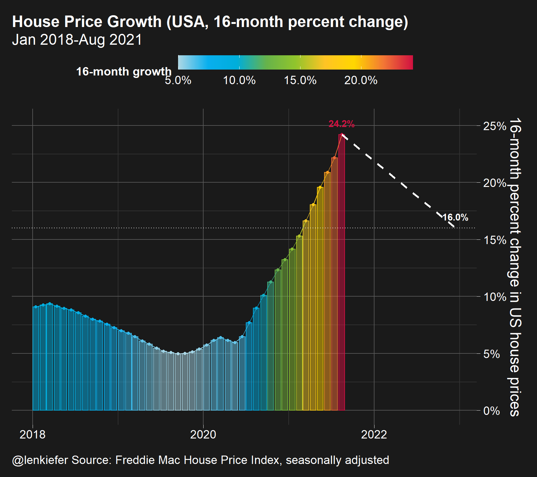
This plot compares the 16-month rate of house price growth in recent months. In the latest data (as of writing) the 16-month growth rate in house prices has been 24 percent. While 16% is high, it’s a deceleration of about 8 percentage points.
To help see how reasonable that is, let’s look over a longer time series.
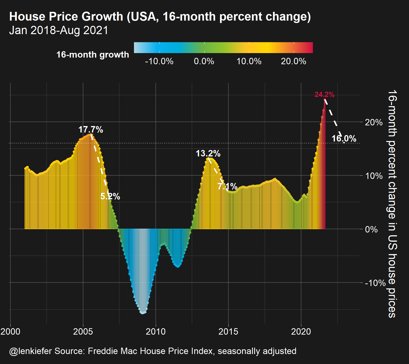
By looking back to the early 2000s we see two periods when house prices decelerated. The first period was after prices peaked in 2005, while the second period was around the Taper Tantrum in 2013. In the 2005 period house prices were on their way toward substantial declines in the level of prices. From July of 2015 through November of 2005 16-month price growth decelerated from 17.7% to 5.2%. From August of 2013 through December of 2014 16-month house price growth decelerated from 13.2% to 7.1%.
Whether or not either of these periods is exactly analogous to the current period is highly unlikely. But we might consider them as useful references when trying to form an opinion of the current rate of growth. We’re coming off a crazy high rate of house price growth, so there’s no real history to draw from you have to have some way to separate transitory COVID-19 effects from the longer-run trend, but it’s essentially impossible to do right now.
For more on house prices, see my presentation on recent housing market dynamics.
R code for plots
#####################################################################################
# load libraries----
#####################################################################################
library(darklyplot) # for theme_dark2() function
# see http://lenkiefer.com/2020/07/03/using-darklyplot/
library(data.table)
library(tidyverse)
library(lubridate)

my_colors <- c(
  "green"      = rgb(103,180,75, maxColorValue = 256),
  "green2"      = rgb(147,198,44, maxColorValue = 256),
  "lightblue"  =  rgb(9, 177,240, maxColorValue = 256),
  "lightblue2" = rgb(173,216,230, maxColorValue = 256),
  'blue'       = "#00aedb",
  'red'        = "#d11141",
  'orange'     = "#f37735",
  'yellow'     = "#ffc425",
  'gold'       = "#FFD700",
  'light grey' = "#cccccc",
  'purple'     = "#551A8B",
  'dark grey'  = "#8c8c8c")


my_cols <- function(...) {
  cols <- c(...)
  if (is.null(cols))
    return (my_colors)
  my_colors[cols]
}


my_palettes <- list(
  `main`  = my_cols("blue", "green", "yellow"),
  `cool`  = my_cols("blue", "green"),
  `cool2hot` = my_cols("lightblue2","lightblue", "blue","green", "green2","yellow","gold", "orange", "red"),
  `hot`   = my_cols("yellow", "orange", "red"),
  `mixed` = my_cols("lightblue", "green", "yellow", "orange", "red"),
  `mixed2` = my_cols("lightblue2","lightblue", "green", "green2","yellow","gold", "orange", "red"),
  `mixed3` = my_cols("lightblue2","lightblue", "green", "yellow","gold", "orange", "red"),
  `mixed4` = my_cols("lightblue2","lightblue", "green", "green2","yellow","gold", "orange", "red","purple"),
  `mixed5` = my_cols("lightblue","green", "green2","yellow","gold", "orange", "red","purple","blue"),
  `mixed6` = my_cols("green", "gold", "orange", "red","purple","blue"),
  `grey`  = my_cols("light grey", "dark grey")
)


my_pal <- function(palette = "main", reverse = FALSE, ...) {
  pal <- my_palettes[[palette]]

  if (reverse) pal <- rev(pal)

  colorRampPalette(pal, ...)
}


scale_color_mycol <- function(palette = "main", discrete = TRUE, reverse = FALSE, ...) {
  pal <- my_pal(palette = palette, reverse = reverse)

  if (discrete) {
    discrete_scale("colour", paste0("my_", palette), palette = pal, ...)
  } else {
    scale_color_gradientn(colours = pal(256), ...)
  }
}


scale_fill_mycol <- function(palette = "main", discrete = TRUE, reverse = FALSE, ...) {
  pal <- my_pal(palette = palette, reverse = reverse)

  if (discrete) {
    discrete_scale("fill", paste0("my_", palette), palette = pal, ...)
  } else {
    scale_fill_gradientn(colours = pal(256), ...)
  }
}
#####################################################################################
# data stuff ----
#####################################################################################
dt <- fread("http://www.freddiemac.com/fmac-resources/research/docs/fmhpi_master_file.csv")

#####################################################################################
# define variables ----
#####################################################################################
dt <- data.table(dt)[,":="(hpa16 = (Index_SA/shift(Index_SA,16)) -1 , # 16-month growth rate
                     hpa12=Index_SA/shift(Index_SA,12)-1,
                     hpa3 = (Index_SA/shift(Index_SA,3))**4 -1 ),
                     .(GEO_Type,GEO_Name)
]

# create date variable mid-month (day=15)
dt[,date:=as.Date(ISOdate(Year,Month,15))]


#reference data frame for annotations
df_ref=data.frame(date=c(max(dt$date), max(dt$date) %m+% months(16)), hpa16=c(dt[GEO_Name=="USA" &date==max(date),]$hpa16,.16))

df_ref3=data.frame(date=c(as.Date("2013-08-15"),as.Date("2013-08-15") %m+% months(16)),
                   hpa16=c(dt[GEO_Name=="USA" &date=="2013-08-15",]$hpa16,
                           dt[GEO_Name=="USA" &date=="2014-12-15",]$hpa16
                   ))


df_ref2=data.frame(date=c(as.Date("2005-07-15"),as.Date("2005-07-15") %m+% months(16)),
                   hpa16=c(dt[GEO_Name=="USA" &date=="2005-07-15",]$hpa16,
                           dt[GEO_Name=="USA" &date=="2006-11-15",]$hpa16
                   ))


gbar1 <-
ggplot(data=dt[GEO_Name=="USA" & Year>2017,]
       , aes(y=hpa16,x=date,color=hpa16,fill=hpa16))+
  geom_col(alpha=0.5)+
  geom_path()+
  geom_point()+
  geom_text(data= .%>% filter(date==max(date)),
            nudge_y=.01,fontface="bold",size=4,
            aes(label=percent(hpa16,.1)))+
  scale_y_continuous(labels=scales::percent_format(accuracy=1),
                     #limits=c(-0.1,.4),breaks=seq(-0.1,.4,.1),
                     position="right")+
  labs(x="",
       y="16-month percent change in US house prices",
       title="House Price Growth (USA, 16-month percent change)",
       caption="@lenkiefer Source: Freddie Mac House Price Index, seasonally adjusted",
       subtitle=paste0(format(min(dt[GEO_Name=="USA" & Year>2017,]$date),"%b %Y"),"-",format(max(dt$date),"%b %Y")))+
  theme_dark2(base_family="Arial",base_size=18)+
  theme(legend.position="top",legend.direction = "horizontal",
        legend.key.width=unit(2,"cm"),
        plot.title=element_text(size=rel(1.75),face="bold"),
        #axis.text.y=element_blank(),
        #axis.ticks.y=element_blank()
        #,panel.grid.major.y=element_blank()
  )+
  scale_color_mycol(palette="cool2hot",
                    discrete=FALSE,label=scales::percent,name="16-month growth")+
  scale_fill_mycol(palette="cool2hot",
                   discrete=FALSE,label=scales::percent,name="16-month growth")+
  geom_path(data=df_ref,linetype=2,color="white",size=1.1)+
  geom_text(data=tail(df_ref,1),          nudge_y=.01,fontface="bold",size=4,
            aes(label=percent(hpa16,.1)),color="white")+
  geom_hline(yintercept=0.16,color="white",linetype=3)

gbar2 <-
  ggplot(data=dt[GEO_Name=="USA" & Year>2000,]
         , aes(y=hpa16,x=date,color=hpa16,fill=hpa16))+
  geom_col(alpha=0.5)+
  geom_path()+
  geom_point()+
  geom_text(data= .%>% filter(date==max(date)),
            nudge_y=.01,fontface="bold",size=4,
            aes(label=percent(hpa16,.1)))+
  scale_y_continuous(labels=scales::percent_format(accuracy=1),
                     #limits=c(-0.1,.4),breaks=seq(-0.1,.4,.1),
                     position="right")+
  labs(x="",
       y="16-month percent change in US house prices",
       title="House Price Growth (USA, 16-month percent change)",
       caption="@lenkiefer Source: Freddie Mac House Price Index, seasonally adjusted",
       subtitle=paste0(format(min(dt[GEO_Name=="USA" & Year>2017,]$date),"%b %Y"),"-",format(max(dt$date),"%b %Y")))+
  theme_dark2(base_family="Arial",base_size=18)+
  theme(legend.position="top",legend.direction = "horizontal",
        legend.key.width=unit(2,"cm"),
        plot.title=element_text(size=rel(1.75),face="bold"),
        #axis.text.y=element_blank(),
        #axis.ticks.y=element_blank()
        #,panel.grid.major.y=element_blank()
  )+
  scale_color_mycol(palette="cool2hot",
                    discrete=FALSE,label=scales::percent,name="16-month growth")+
  scale_fill_mycol(palette="cool2hot",
                   discrete=FALSE,label=scales::percent,name="16-month growth")+geom_path(data=df_ref,linetype=2,color="white",size=1.1)+
  geom_text(data=tail(df_ref,1),          nudge_y=.01,fontface="bold",size=5,
            aes(label=percent(hpa16,.1)),color="white")+
  geom_hline(yintercept=0.16,color="white",linetype=3)+
  geom_path(data=df_ref2,linetype=2,color="white",size=1.1)+
  geom_text(data=tail(df_ref2,2),          nudge_y=.01,fontface="bold",size=5,
            aes(label=percent(hpa16,.1)),color="white")+
  geom_path(data=df_ref3,linetype=2,color="white",size=1.1)+
  geom_text(data=tail(df_ref3,3),          nudge_y=.01,fontface="bold",size=5,
            aes(label=percent(hpa16,.1)),color="white")