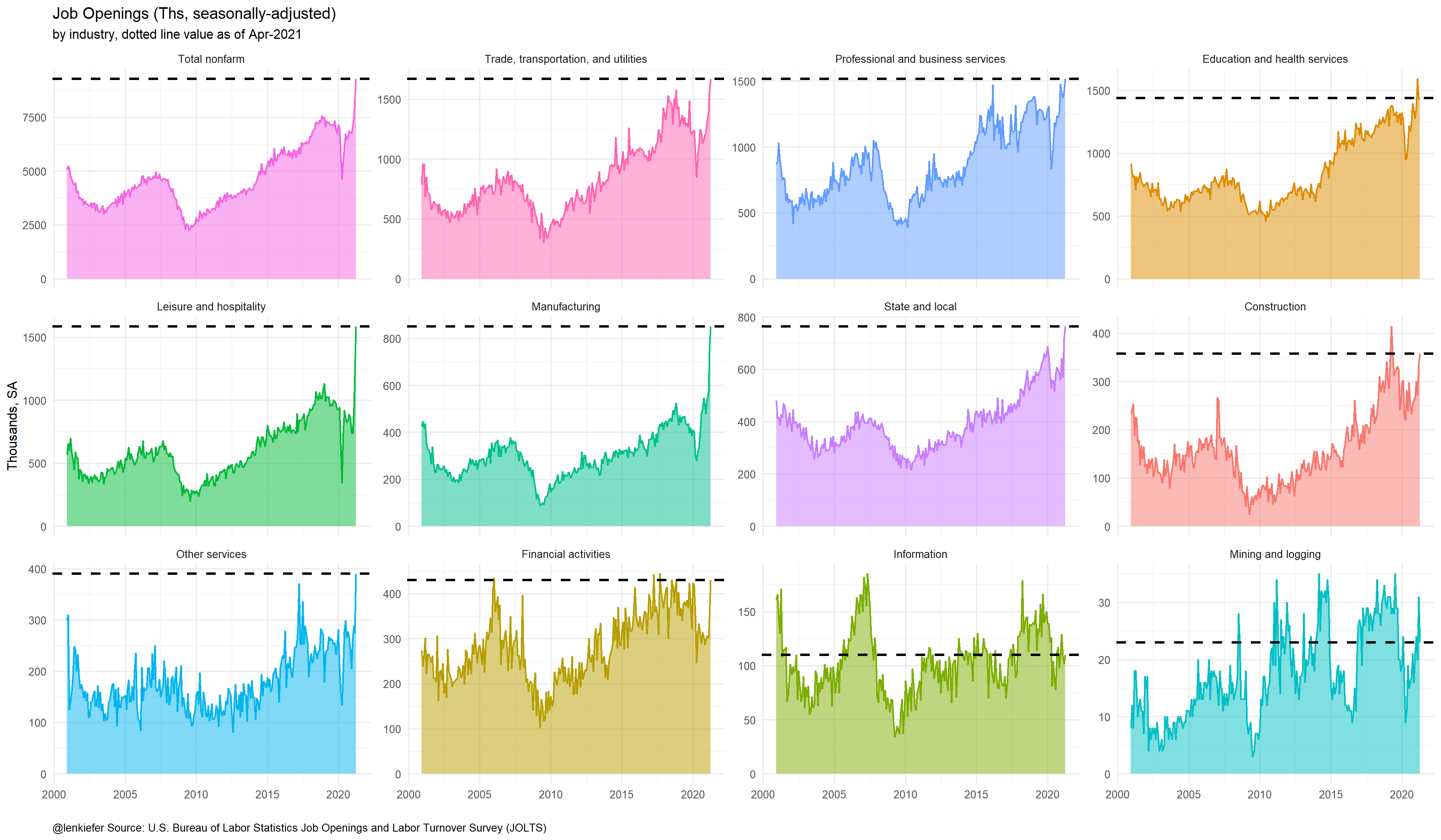
This morning the U.S. Bureau of Labor Statistics reported record high job openings in the JOLTS data. Using the code in this post I tweeted out this chart showing job openings are at a record high in the US.
With so many job openings you might be curious to ask whether or not the recession that started last year is well and truly over. Many indicators certainly seem to say say. But the arbiter of recessions that most point to, the National Bureau of Economic Research (NBER), has not yet made an annoucement about the end of the current recession.
That’s quite common, usually the NBER waits to make a pronouncement. How long? Let’s make a couple graphs. R code at bottom.
We’ll use the annoucement dates available here along with the business cycle dates available here.
First we’ll compare the timing of NBER business cycle dates with the announcements. For example, on June 8, 2020 the NBER announced the US business cycle peaked in February of 2020. Thus, there was a few months (March through May) when the economy was in recession by the NBER’s reckoning, but the announcement was not made.
Let’s compare the periods of expansion and recession to periods either before or after a buinsess cycle turning point. We’ll also plot a time series of US nonfarm employment as a broad measure of economic activity and see how it compares.
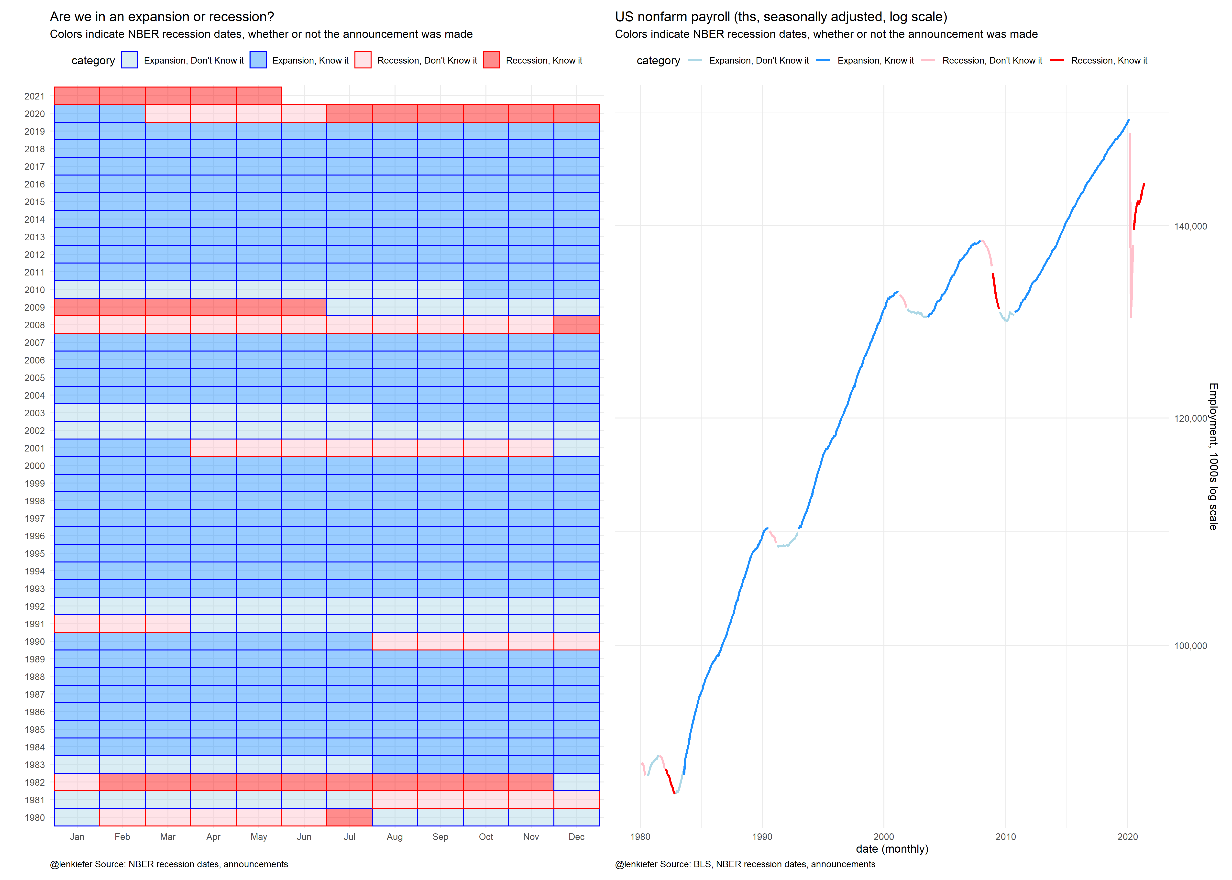
This chart shows that there tends to be an extended period around business cycle turning points (denoted by the lighter shaded boxes/lines in the plot) when the status is not known. Ex post of course, it’s easier to see that things have turned around. And the NBER looks at a lot more than just employment. Nevertheless, there’s a very good chance that when the NBER does make a pronouncement we’ll learn that the coronavirus recession has been long over.
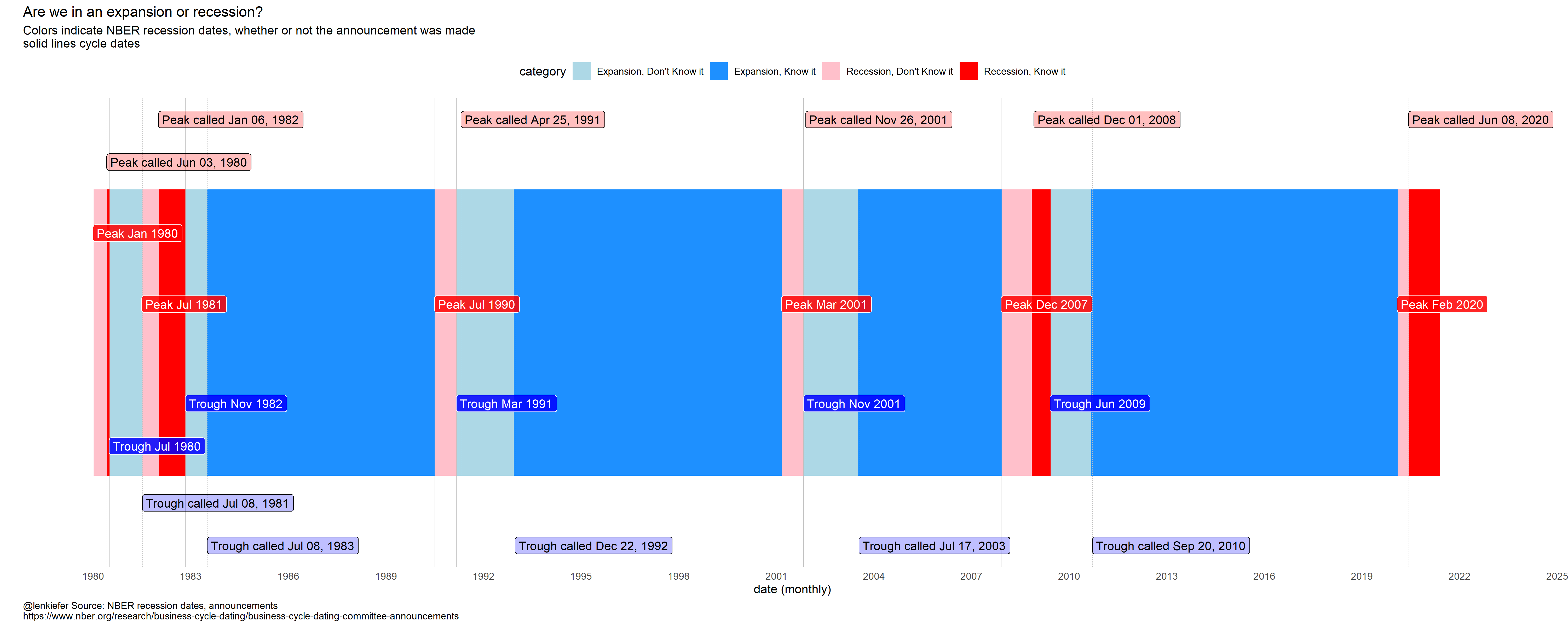
Here’s an additional chart with the timeline annotated:
R code
Data Prep
library(lubridate)
library(data.table)
library(tidyverse)
library(sqldf)
library(patchwork)

# note I don't have the NBER calls for recessions prior to 1980, but put in a dummy value of 1900-01-01 for the first row, I end up dropping it
recessions.df = read.table(textConnection(
  "Peak, Trough, Call_peak, Call_trough
  1973-11-01, 1975-03-01, 1900-01-01, 1900-01-01
  1980-01-01, 1980-07-01, 1980-06-03, 1981-07-08
  1981-07-01, 1982-11-01, 1982-01-06, 1983-07-08
  1990-07-01, 1991-03-01, 1991-04-25, 1992-12-22
  2001-03-01, 2001-11-01, 2001-11-26, 2003-07-17
  2007-12-01, 2009-06-01, 2008-12-01, 2010-09-20
  2020-02-01, NA, 2020-06-08, NA"), sep=',',
  colClasses=c('Date', 'Date','Date','Date'), header=TRUE)

recession.df <-
  mutate(
    recessions.df,
    peak_trough = interval(Peak, Trough) %/% months(1),
    trough_peak = interval(lag(Trough), Peak) %/% months(1),
    peak_peak = -interval(Peak, lag(Peak)) %/% months(1) + 1,
    trough_trough = -interval(Trough, lag(Trough)) %/% months(1) +
      1,
    trough_call = interval(Trough, Call_trough) %/% months(1),
    peak_call = interval(Peak, Call_peak) %/% months(1)
  )[-1, ]


rdf <- recession.df %>%
  mutate(
    TroughLag  = lag(Trough),
    # find last trough
    PeakLag    = lag(Peak),
    PeakLead   = lead(Peak),
    TroughLead = lead(Trough)

  )


# get employment data
df2 <-
  tidyquant::tq_get("PAYEMS", get = "economic.data", from = "1980-01-01") %>%
  mutate(dj = price - lag(price))

output <- sqldf("select * from df2 left join rdf
                 on
                 (df2.date>rdf.Peak and df2.date <= rdf.Trough or
                (df2.date > rdf.Trough and df2.date <= rdf.PeakLead)) ")


outdf <- mutate(output,
                expand=case_when(is.na(Peak) & year(date)<2020 ~ "Expansion",
                                 date>Trough & date>=Peak~"Expansion",
                                 date>=Peak & date<=Trough~"Recession",
                                 date>"2020-03-01" ~ "Recession")

                ,
                d1=as.Date(ifelse(expand=="Recession",
                                  Peak %m+% months(1),
                                  TroughLag %m+% months(1)),
                           "1970-01-01"),
                d2=as.Date(ifelse(expand=="Recession",Trough,
                                  Peak), "1970-01-01")
) %>%
  mutate(name=paste0(expand, " ",
                     as.character(d1, format="%b %Y"), " : ",
                     as.character(d2, format="%b %Y")
  )) %>%
  # relabel the last row to say :present
  mutate(name=ifelse(date>"2020-02-01",
                     "March 2020: Present", name))  %>%
  mutate(expand=ifelse(is.na(expand),"Recession",expand)) %>%
  mutate(Call_peak=as.Date(ifelse(name=="March 2020: Present",as.Date('2020-06-08'),Call_peak),origin="1970-01-01"))

outdf <-
  mutate(outdf,
         category=case_when(expand=="Recession" & date>=Call_peak ~"Recession, Know it",
                            expand=="Recession" ~ "Recession, Don't Know it",
                            expand=="Expansion" & date>=Call_trough~ "Expansion, Know it",
                            T ~ "Expansion, Don't Know it"))
Chart 1 Composite Chart grid and employment timeline
g1 <-
ggplot(data = outdf, aes(
x = fct_reorder(format(date, "%b"), month(date)),
y = factor(year(date)),
fill = category
)) +
geom_tile(alpha = 0.45, color = NA) +
geom_tile(aes(color = category), size = .5, fill = NA) +
scale_color_manual(values = c("blue", "blue", "red", "red")) +
scale_fill_manual(values = c("lightblue", "dodgerblue", "pink", "red")) +
theme_minimal() +
theme(legend.position = "top",
plot.caption = element_text(hjust = 0)) +
labs(
title = "Are we in an expansion or recession?",
subtitle = "Colors indicate NBER recession dates, whether or not the announcement was made",
y = "",x = "",
caption = "@lenkiefer Source: NBER recession dates, announcements"
)


g2 <-
ggplot(data = outdf,
aes(
x = date,
y = price,
color = category,
group = paste0(name, category),
fill = category
)) +
geom_path(size = 1.05) +
scale_color_manual(values = c("lightblue", "dodgerblue", "pink", "red")) +
scale_y_log10(position = "right", label = scales::comma) +
theme_minimal() +
theme(legend.position = "top",
plot.caption = element_text(hjust = 0)) +
labs(
title = "US nonfarm payroll (ths, seasonally adjusted, log scale)",
subtitle = "Colors indicate NBER recession dates, whether or not the announcement was made",
y = "Employment, 1000s log scale",
x = "date (monthly)",
caption = "@lenkiefer Source: BLS, NBER recession dates, announcements"
)

g1+g2
Chart 2 Timeline
ggplot(
  data = filter(outdf, year(date) >= 1980),
  aes(
    x = date,
    y = 1,
    color = category,
    group = paste0(name, category),
    fill = category
  )
) +
  geom_col(size = 1.05) +
  scale_color_manual(values = c("lightblue", "dodgerblue", "pink", "red")) +
  scale_fill_manual(values = c("lightblue", "dodgerblue", "pink", "red")) +
  theme_minimal() +
  labs(
    title = "Are we in an expansion or recession?",
    subtitle = "Colors indicate NBER recession dates, whether or not the announcement was made\nsolid lines cycle dates",
    x = "date (monthly)",
    y = "",
    caption = "@lenkiefer Source: NBER recession dates, announcements\nhttps://www.nber.org/research/business-cycle-dating/business-cycle-dating-committee-announcements"
  ) +
  theme(
    plot.caption = element_text(hjust = 0),
    axis.text.y = element_blank(),
    panel.grid.major.y = element_blank(),
    panel.grid.minor.y = element_blank(),
    panel.grid = element_blank(),
    legend.position = "top"
  ) +
  scale_x_date(date_breaks = "3 years",
               date_labels = "%Y",
               limits = as.Date(c("1980-01-01", "2022-12-31"))) +
  scale_y_continuous(limits = c(-0.25, 1.25)) +
  geom_vline(
    data = rdf,
    size = 0.15,
    color = "gray",
    inherit.aes = FALSE,
    aes(
      xintercept = Call_peak,
      xend = Call_peak,
      y = 0,
      yend = 1.15
    ),
    linetype = 2
  ) +
  geom_vline(
    data = rdf,
    size = 0.15,
    color = "gray",
    inherit.aes = FALSE,
    aes(
      xintercept = Call_trough,
      xend = Call_trough,
      y = 0,
      yend = 1.45
    ),
    linetype = 2
  ) +
  geom_vline(
    data = rdf,
    size = 0.15,
    color = "gray",
    aes(xintercept = Peak, ),
    linetype = 1
  ) +
  geom_vline(
    data = rdf,
    size = 0.15,
    color = "gray",
    aes(xintercept = Trough),
    linetype = 1
  ) +
  geom_label(
    data = rdf,
    segment.alpha = 0,
    hjust = 0,
    fill = "red",
    alpha = 0.25,
    aes(
      x = Call_peak,
      y = ifelse(Peak == "1980-01-01", 1.1, 1.25),
      label = paste0("Peak called ", format(Call_peak, "%b %d, %Y"))
    ),
    color = "black",
    inherit.aes = FALSE
  ) +
  geom_label(
    data = rdf,
    segment.alpha = 0,
    hjust = 0,
    fill = "red",
    alpha = 0.85,
    aes(
      x = Peak,
      y = ifelse(Peak == "1980-01-01", 0.85, 0.6),
      label = paste0("Peak ", format(Peak, "%b %Y"))
    ),
    color = "white",
    inherit.aes = FALSE
  ) +
  geom_label(
    data = rdf,
    segment.alpha = 0,
    hjust = 0,
    fill = "blue",
    alpha = 0.85,
    aes(
      x = Trough,
      y = ifelse(Trough == "1980-07-01", 0.1, 0.25),
      label = paste0("Trough ", format(Trough, "%b %Y"))
    ),
    color = "white",
    inherit.aes = FALSE
  ) +


  geom_label(
    data = rdf,
    hjust = 0,
    fill = "blue",
    alpha = 0.25,
    aes(
      x = Call_trough,
      y = ifelse(Peak == "1980-01-01", -0.1,-0.25),
      label = paste0("Trough called ", format(Call_trough, "%b %d, %Y"))
    ),
    color = "black",
    inherit.aes = FALSE
  )