As an economist and all-around friend of strictly positive numbers I often use the log function. The natural logarithm of course, need I specify it? Apparently in certain spreadsheet software you do.
In this note I just wanted to write down a couple of observations about how to generate mean or median forecasts of a variable \(y\) given the model is fit in \(log(y)\). Of course, I am going to borrow heavily from Rob Hyndman’s blog, where he coverse this. But I also want to add in some code for a simulation from a seasonal arima model (also covered by Rob).
R code to follow
A simple ARIMA model
Let’s fit a seasonal ARIMA model with drift to quarterly house price index for the state of California from the FHFA. The FHFA provides a nice flat text file that we can read straight into our computer:
Set up libraries
library(data.table)
library(tidyverse)
library(forecast)
library(matrixStats)
# colors (http://lenkiefer.com/2019/09/23/theme-inari/)
inari  <- "#fe5305"
inari1 <- "#e53a00"
inari2 <- "#a90000"
Import data
# read in file
dt <- fread("https://www.fhfa.gov/DataTools/Downloads/Documents/HPI/HPI_PO_state.txt")

# construct  a times series
ts1 <- ts(dt[state=="CA",]$index_nsa ,start=1991,frequency=4)

autoplot(ts1,color=inari,size=1.1)+
  theme_minimal()+
  theme(plot.caption=element_text(hjust=0))+
  labs(x="date (quarterly)",y="",
                   title="California House Price Index (NSA)",
                   subtitle="Index (NSA, 1991Q1 = 100)",
                   caption="@lenkiefer Source: FHFA Purchase-only House Price Index")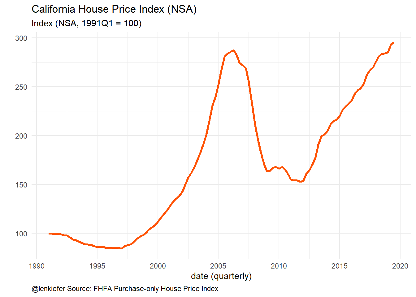
Figure 1: House Price Index
Let’s fit a simple seasonal ARIMA model to this index using forecast::auto.arima. Note this isn’t necessarily a great model, or useful for anything. It’s just a pretty standard benchmark.
(fit <- auto.arima(ts1,lambda=0,allowdrift=TRUE))## Series: ts1
## ARIMA(2,1,1)(2,0,0)[4]
## Box Cox transformation: lambda= 0
##
## Coefficients:
## ar1 ar2 ma1 sar1 sar2
## 1.5855 -0.6934 -0.5263 0.3849 0.3375
## s.e. 0.1522 0.1272 0.1824 0.0958 0.0965
##
## sigma^2 estimated as 0.0001513: log likelihood=340.19
## AIC=-668.38 AICc=-667.59 BIC=-651.96fit1 <- Arima(ts1,model=fit)Construct foreasts:
# forecast horizon = 12 quarters
h <- 12

g1 <-
autoplot(forecast(fit1,h),color=inari,size=1.1,fcol=inari)+
  theme_minimal()+
  theme(plot.caption=element_text(hjust=0))+
  labs(x="date (quarterly)",y="",
                   title="California House Price Index (NSA)",
                   subtitle="Index (NSA, 1991Q1 = 100)\nforecasts from ARIMA model",
                   caption="@lenkiefer Source: FHFA Purchase-only House Price Index")

g1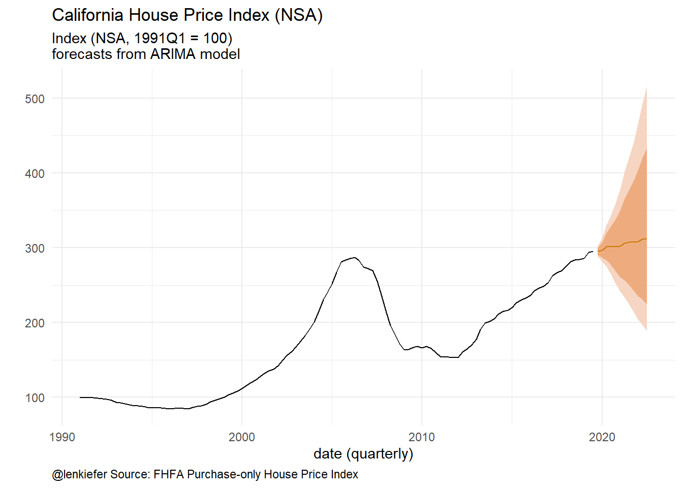
Figure 2: Forecasts from ARIMA
Note that the default parameter setting for forecast::forecast has biasadj=FALSE, which means the default forecast (the line in the plot above) is the median. If we want the mean forecast we can set biasadj=TRUE or just do it ourselves:
fc <- forecast(fit,h, level=95)
# as in https://robjhyndman.com/hyndsight/backtransforming/
fvar <- ((BoxCox(fc$upper,fit$lambda) -
                    BoxCox(fc$lower,fit$lambda))/qnorm(0.975)/2)^2

fc$mean_log <- fc$mean * (1+0.5*fvar)
colnames(fc$mean_log) <-  "mean_log"
g1+autolayer(fc$mean_log, linetype=2,color=inari2)+scale_x_continuous(limits=c(2018,2022))+
  labs( subtitle="Index (NSA, 1991Q1 = 100)\nforecasts from ARIMA model\ndotted line mean forecast, solid line median")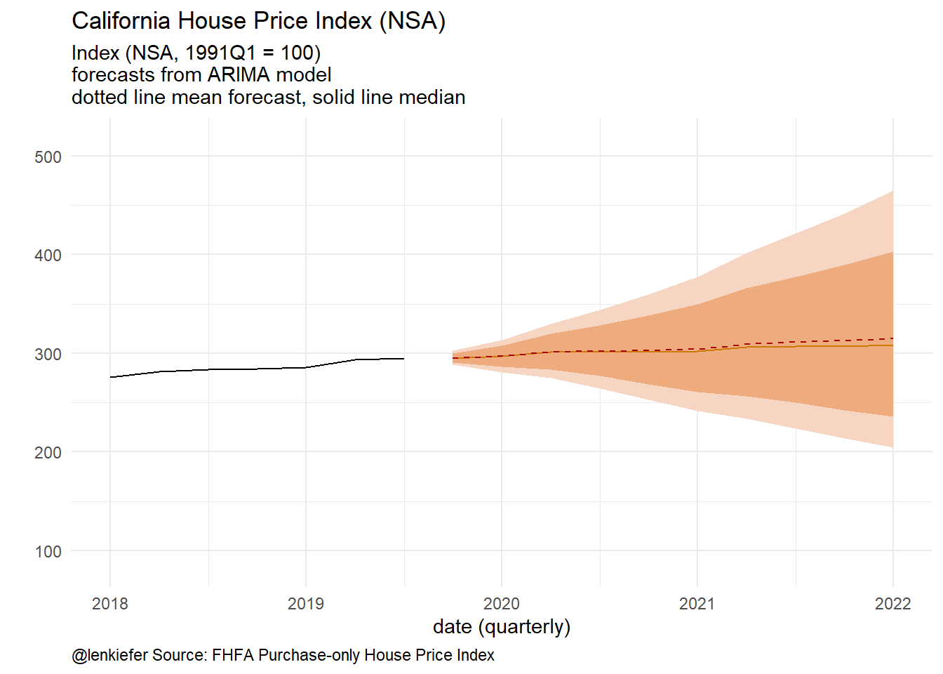
Figure 3: Mean and median forecasts
A simulation
It’s always nice to check our results against a simulation.
# simulate from ARIMA https://robjhyndman.com/hyndsight/simulating-from-a-specified-seasonal-arima-model/
Nsim=5000
h <- 12
ts_sim=array(dim=c(Nsim,h))

for (i in 1:Nsim){
  ts_sim[i,] <- simulate(fit1,nsim=h)
}

# create ts object
ts_sim <- ts(t(ts_sim),start=start(fc$mean),frequency=frequency(fc$mean))
colnames(ts_sim) <- paste0("sim_",1:Nsim)


# construct simulation means and medians
fc_median <- ts(rowMedians(ts_sim),start=start(fc$mean),frequency=frequency(fc$mean))
fc_mean <- ts(rowMeans(ts_sim),start=start(fc$mean),frequency=frequency(fc$mean))
And make a plot:
# combine into data frame/tibble
df_plot <- tibble(tt=as.numeric(time(fc$mean)),
                  analytic_median=fc$mean,
                  simulation_median=fc_median,
                  simulation_mean=fc_mean,
                  analytic_mean=fc$mean_log[,1])

# make plot
df_plot %>%
  pivot_longer(-tt) %>%
  mutate(type=ifelse(grepl("sim",name),"simulation","analytic")) %>%
  ggplot(aes(x=tt,y=value,color=name,linetype=type))+
  geom_line(size=1.1)+
  scale_color_manual(values=c("black",inari,"darkgray",inari2))+
  theme_minimal()+
  theme(plot.caption=element_text(hjust=0))+
  labs(x="",y="House Price Index",
       title="ARIMA Forecasts",
       subtitle="solid line: analytical mean/median\ndotted line: mean/median from 5000 simulations",
       caption="@lenkiefer")
Figure 4: Simulation Comparison
As time series go this is pretty straightforward stuff. I am just putting this down here so future me can reference this as needed.