Economist Play-in Round
Bracket madness is about the descend on us. Before we get to March Madness we’ll have to suffer through a different kind of madness: the Neoliberal Shill Bracket. This year the Neoliberal project has succumbed to inflation and has expanded the field. This year features a play-in round.
In this post we analyze the Economist Play-in:
Economist Play-in (8)
— Neoliberal 🌐🇺🇦 (@ne0liberal) February 7, 2020
---@mioana @imbernomics @stanveuger @jodiecongirl @cblatts @jonathaneyer @R_Thaler @florianederer pic.twitter.com/dvE7JkcqIw
https://twitter.com/ne0liberal/status/1225851574465048577?s=20
As we get ready to break it down, let me ask you to consider the following questions.
Do you like following the crowd?
Are you a morning or a night person?
What kinds of topics should your shill be shilling about?
How do you feel about #hashtags?
Should a true shill stick close to the Neoliberal line, or do you prefer originality?
Is the The Sveriges Riksbank Prize in Economic Sciences in Memory of Alfred Nobel a real Nobel prize?
Do you have excellent judgement and exquisite taste?
In the Economist Play-in round there are 8 handles matched up. How do these prospective shills stack up? Let’s take a look.
For this article I pulled data from the Twitter API as of about 2pm eastern on February 8, 2020. I pulled the last 1,000 tweets (or all if less than 1,000 existed) and the summary statistics for each of the prospective shills.
Follower count and primary influence
We first might want to know how popular these accounts are. The easiest statistic to track is the number of followers. But follower count only gives a rough approximation of influence. We might also be interested in there reach. One way to calculate that is to determine the number of followers of followers.
The table below displays the number of followers and primary influence metric for each shill. Followers is the number of direct followers, while primary influence is the number of followers of followers. So while @R_Thaler has the most followers at over 161,000 he does not have the greatest primary influence. That title goes to @stanveuger whose primary influence is over 43 million!
How is that possible? We can look at the full distribution of followers of followers in the histograms below. We use a log scale because number of followers is so skewed. We see that @R_Thaler has a lot of followers with fewer than 100 followers, while @stanveuger has several followers with over 1 million followers.
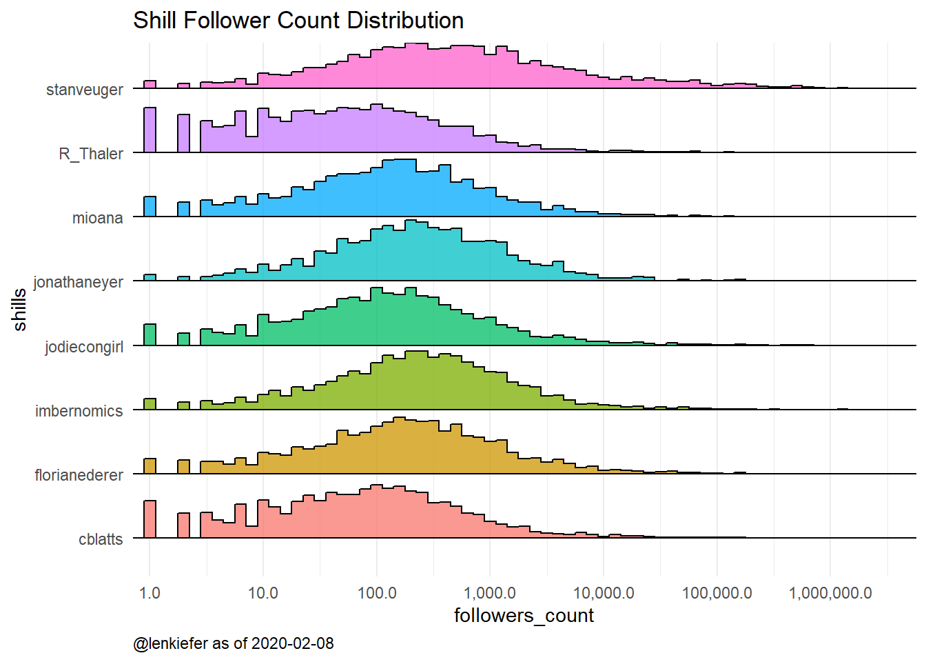
Figure 1: Histogram of shill twitter followers # of followers
These results indicate that if you care about direct influence @R_Thaler is your shill, but if you care about reach, @stanveuger is the shill for you.
Tweet timing
What about timing of tweets? Maybe you are a morning person and want to see the best tweets right when you get up. Or perhaps you are a night owl and what the hottest takes late at night. What about weekdays vs weeknights? Let’s take a look at the timing of tweets by our would be shills.
The chart below shows the share of each shills last 1000 tweets that were made based on day of the week and 3 hour blocks. We see that for the most part our shills are active during the week and business hours.
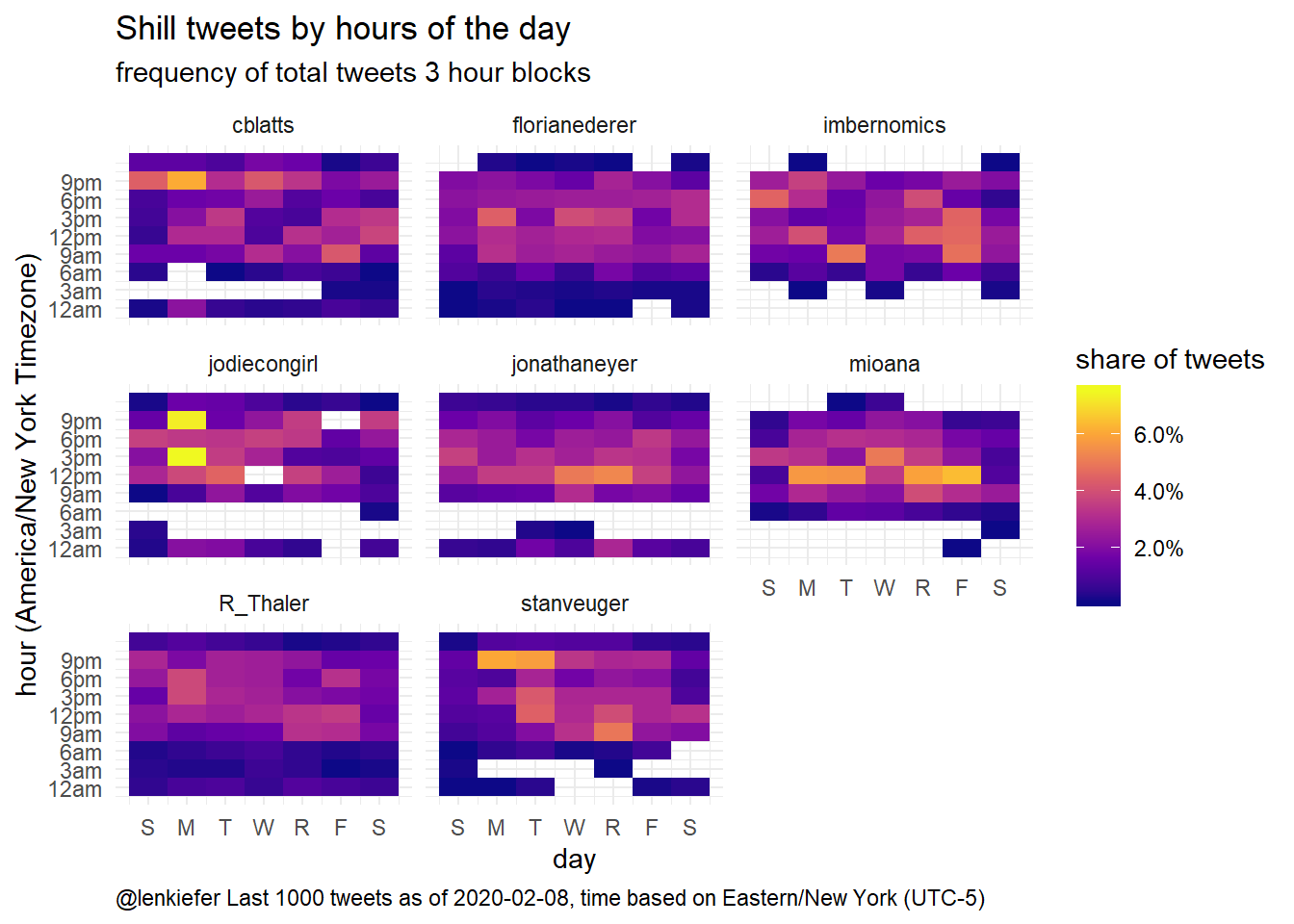
Figure 2: Shill tweets by day and time
The table below matches you to your shill based on weekend/weekday and time: (before 10am), business hours (10am-5pm), or evening (after 5pm). If you are a morning person @florianederer just might be your shill. But if you prefer the night (I have kids so after 5 == night for me) then either @stanveuger or @jodieecongirl give you the most intense tweets. If you shill 9-5 on the weekdays then @mioana fits best. If you are chaotic business (business hours but weekend) then perhaps @imbernomics should be your shill.

Figure 3: Morning, noon, night, shilling full time
What they shill about
Perhaps it is quality of tweets that matters most. Quality is subjective, but we can use text mining tools to examine what topics our shills are shilling on about. The chart below shows the tf-idf statistic: term frequency and inverse document frequency for each prospective shill. The tf-idf statistic will decrease the weight on very common words and increase the weight on words that only appear in a few tweets. In essence, we extract what’s special about each prospective shill’s tweets.
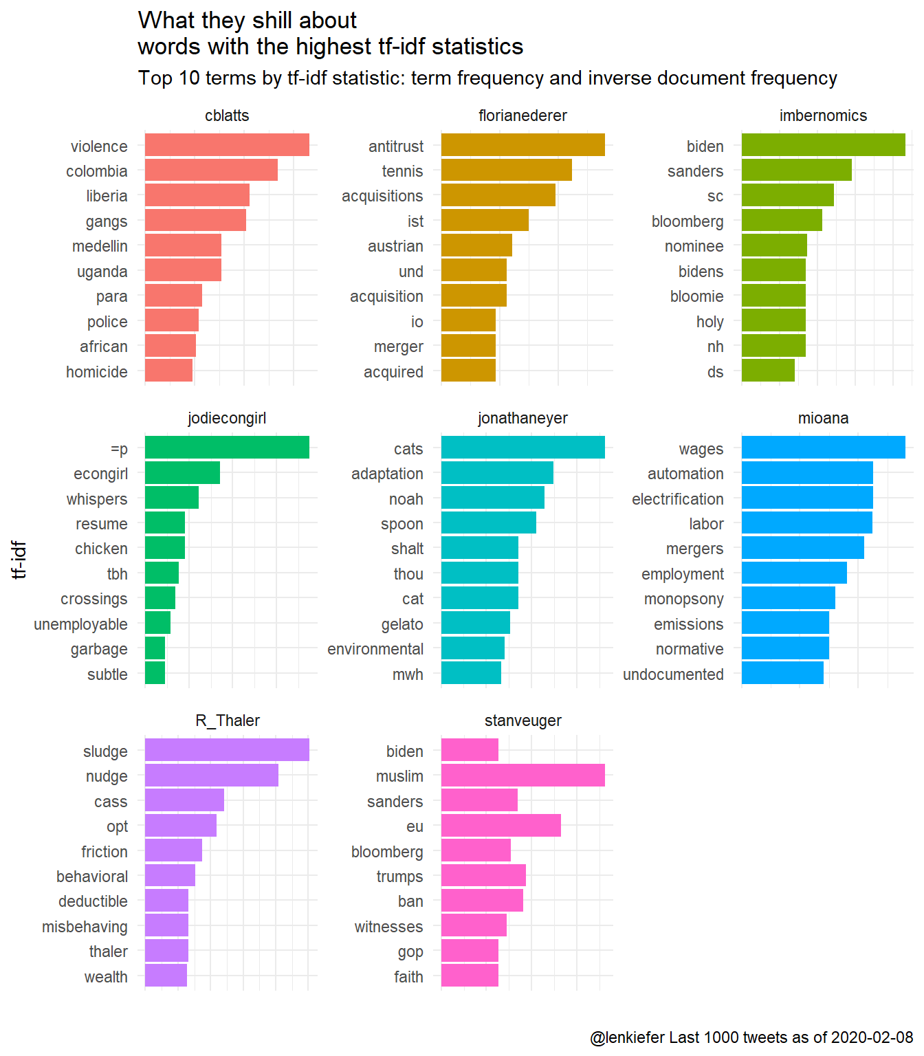
Figure 4: What these shills tweet about
As you might suspect there is a good deal of politics, but also some quite idiosyncratic terms show up.
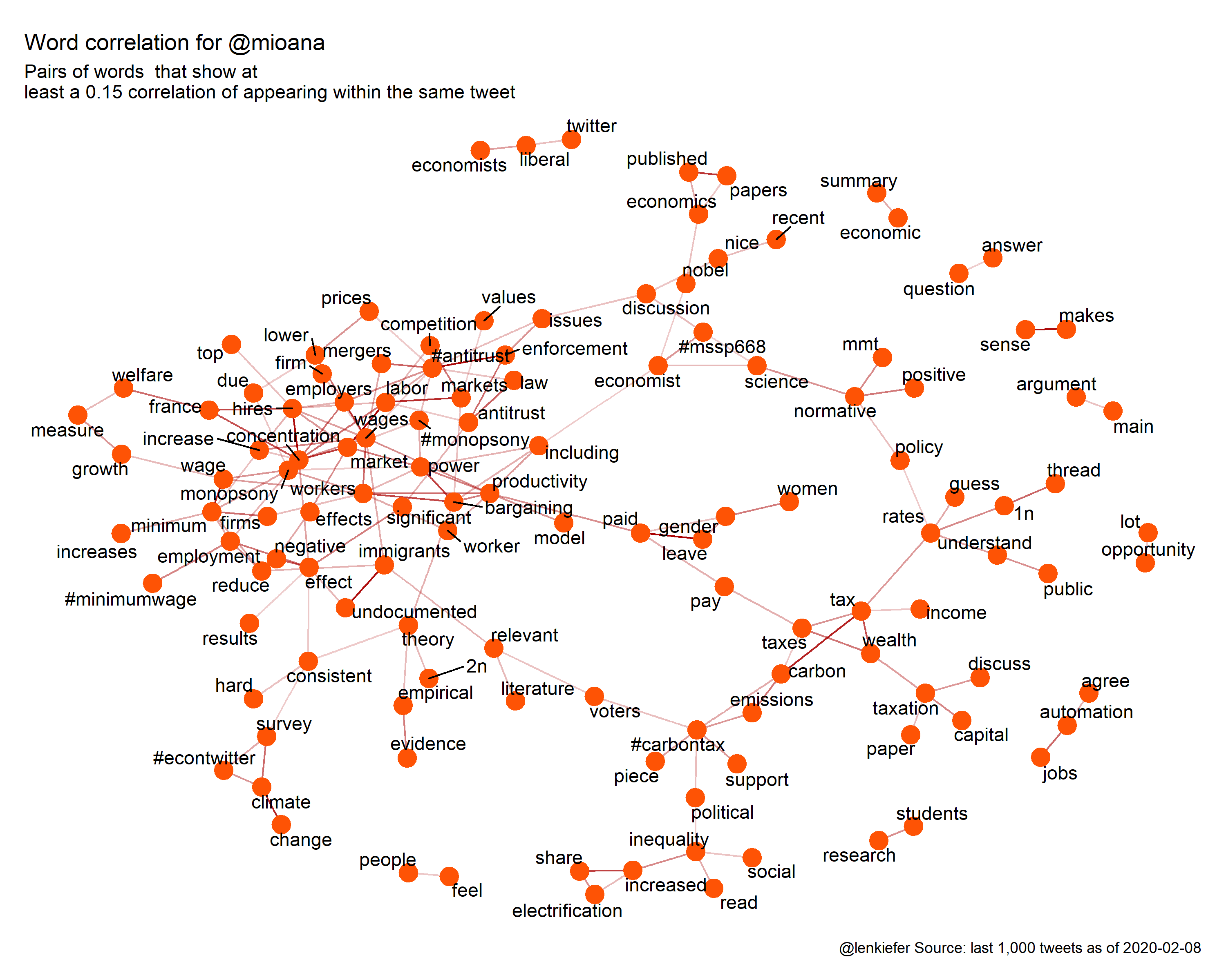
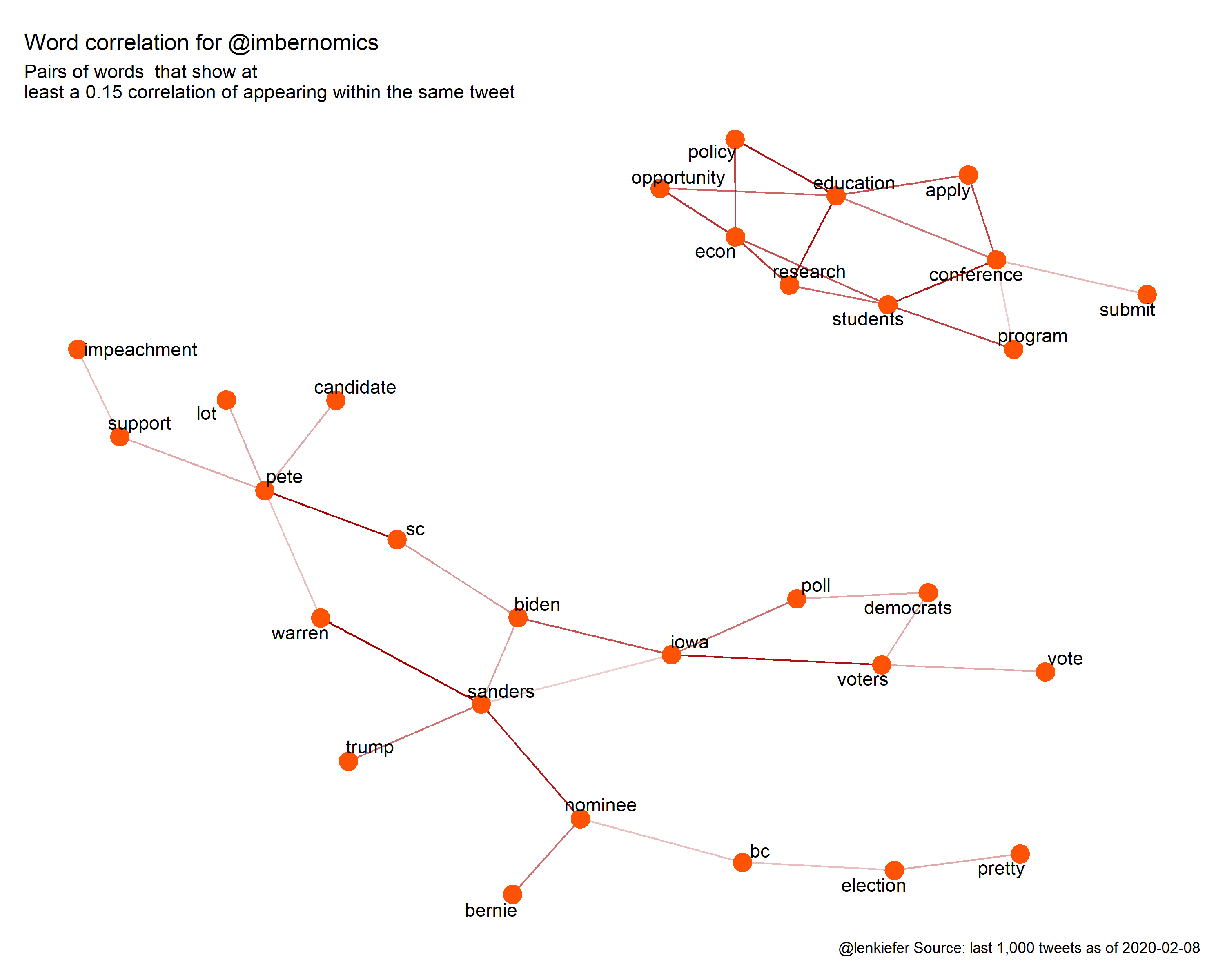
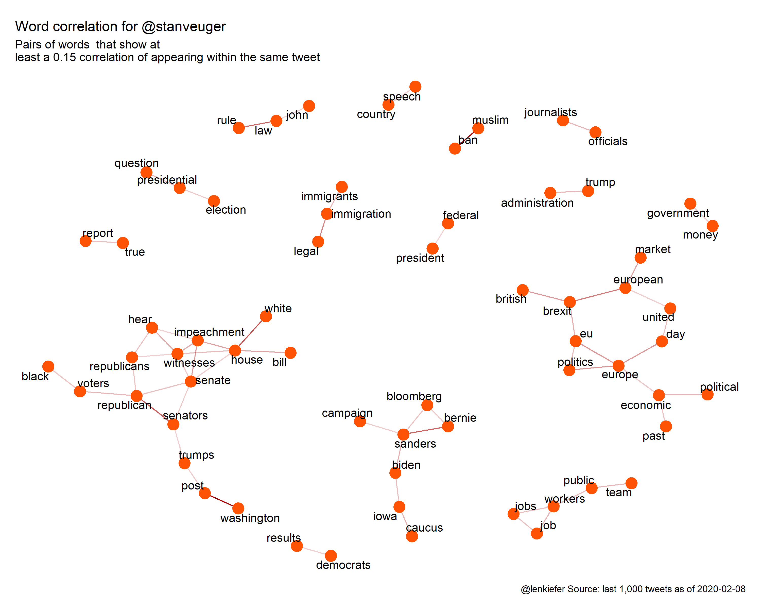
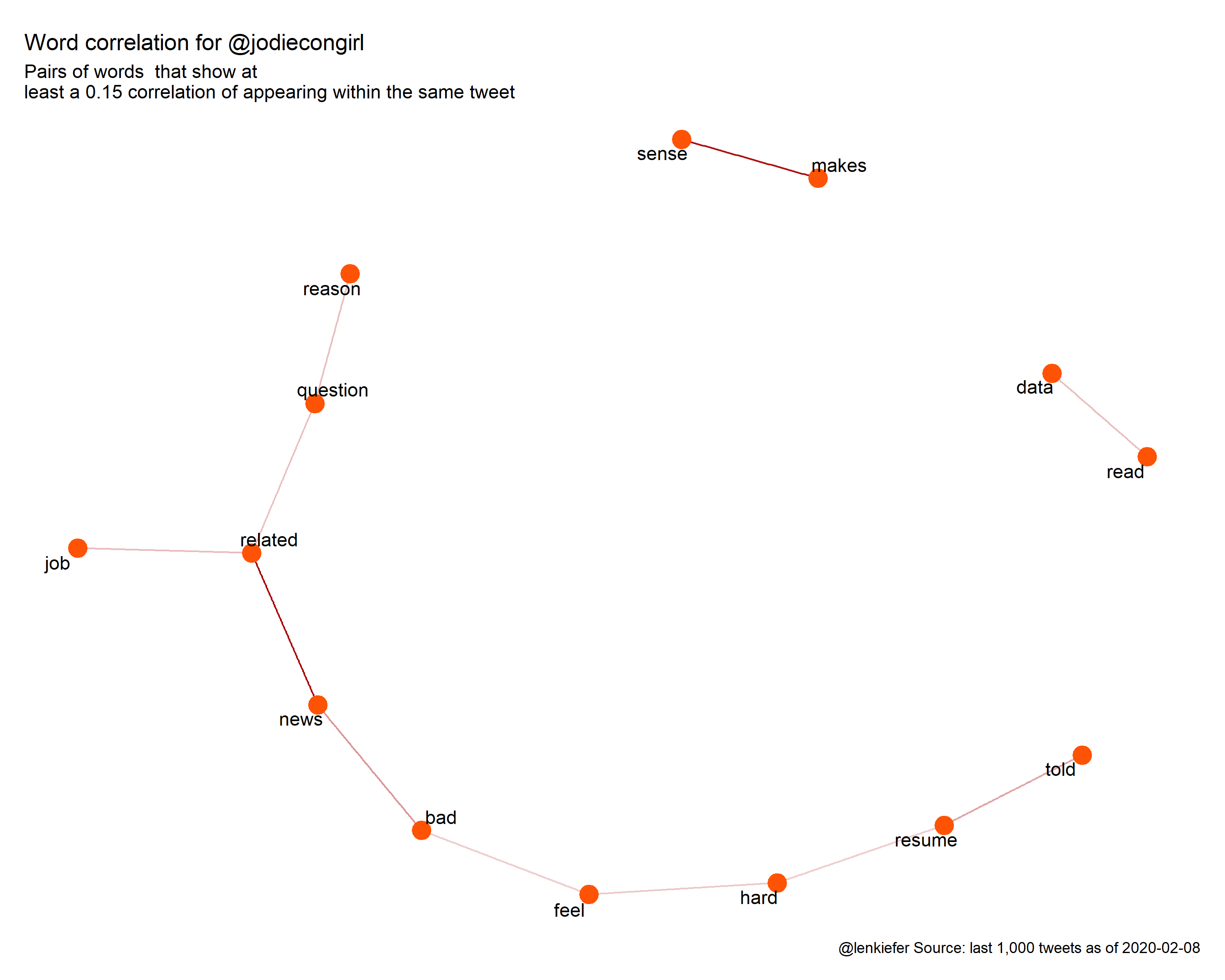
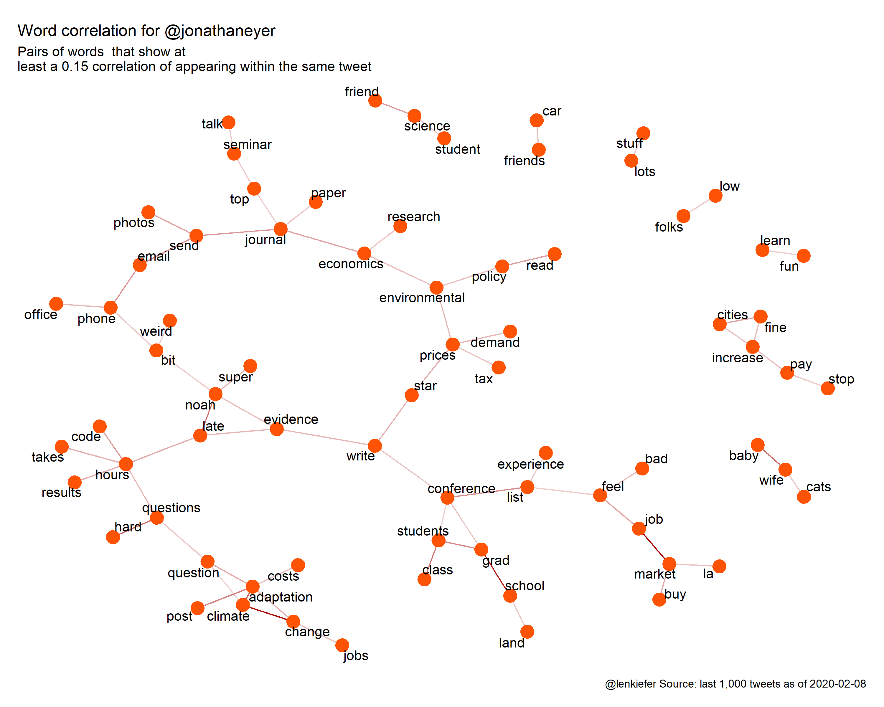
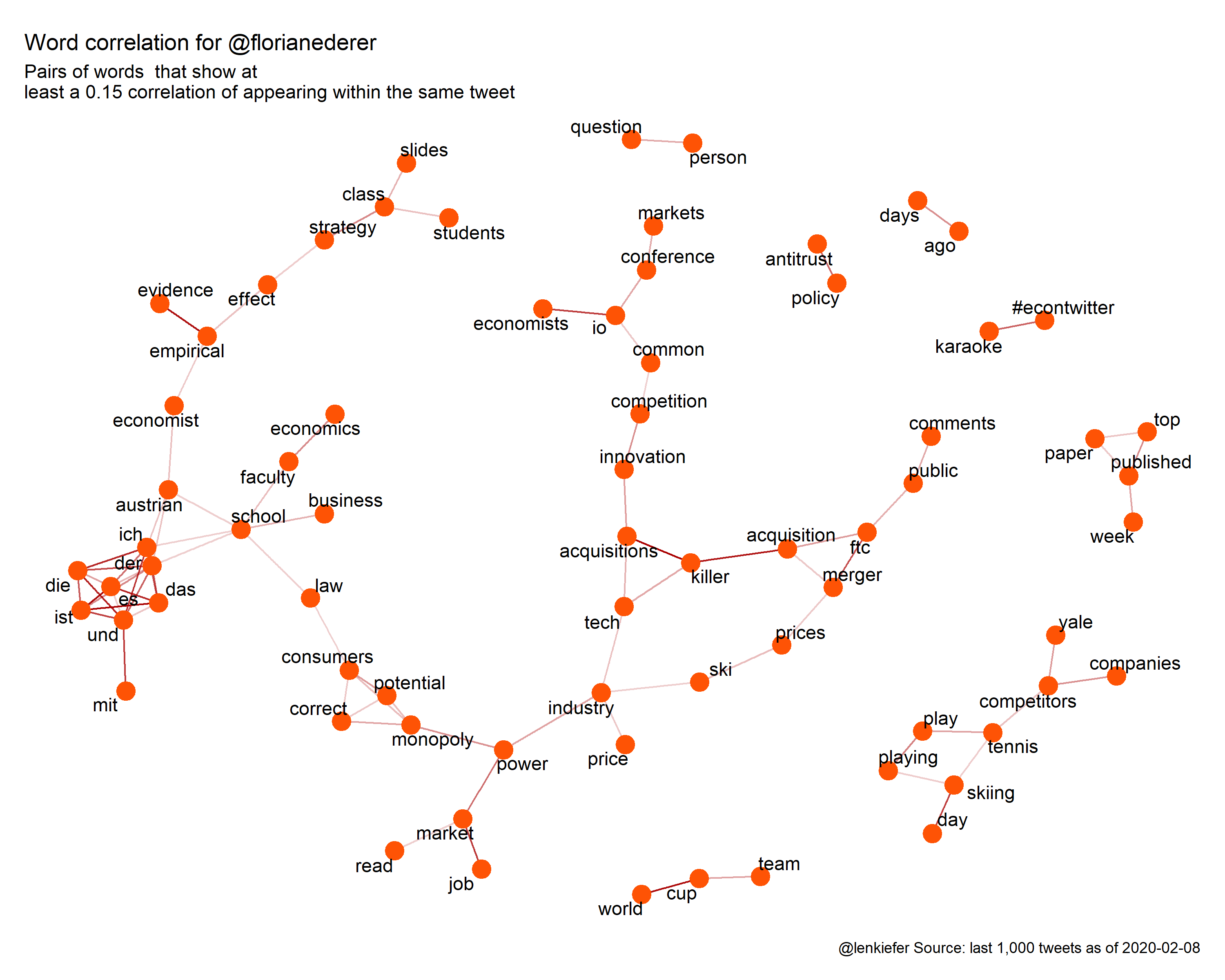
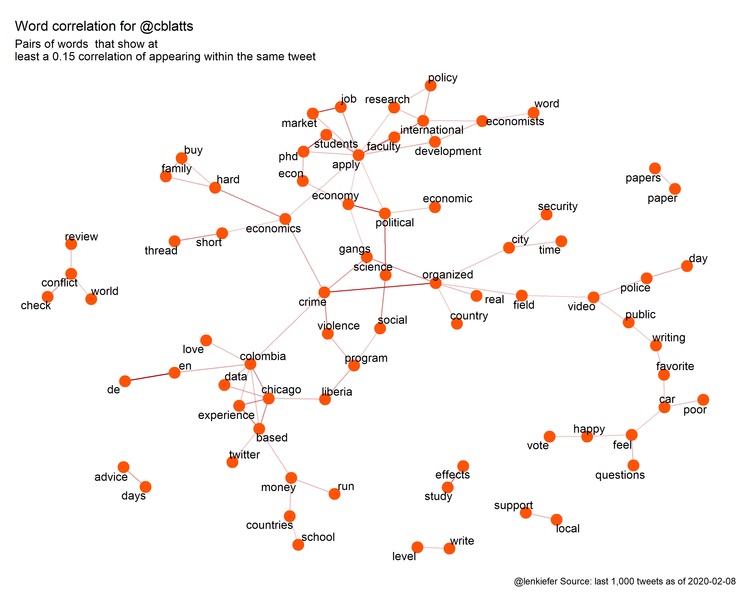
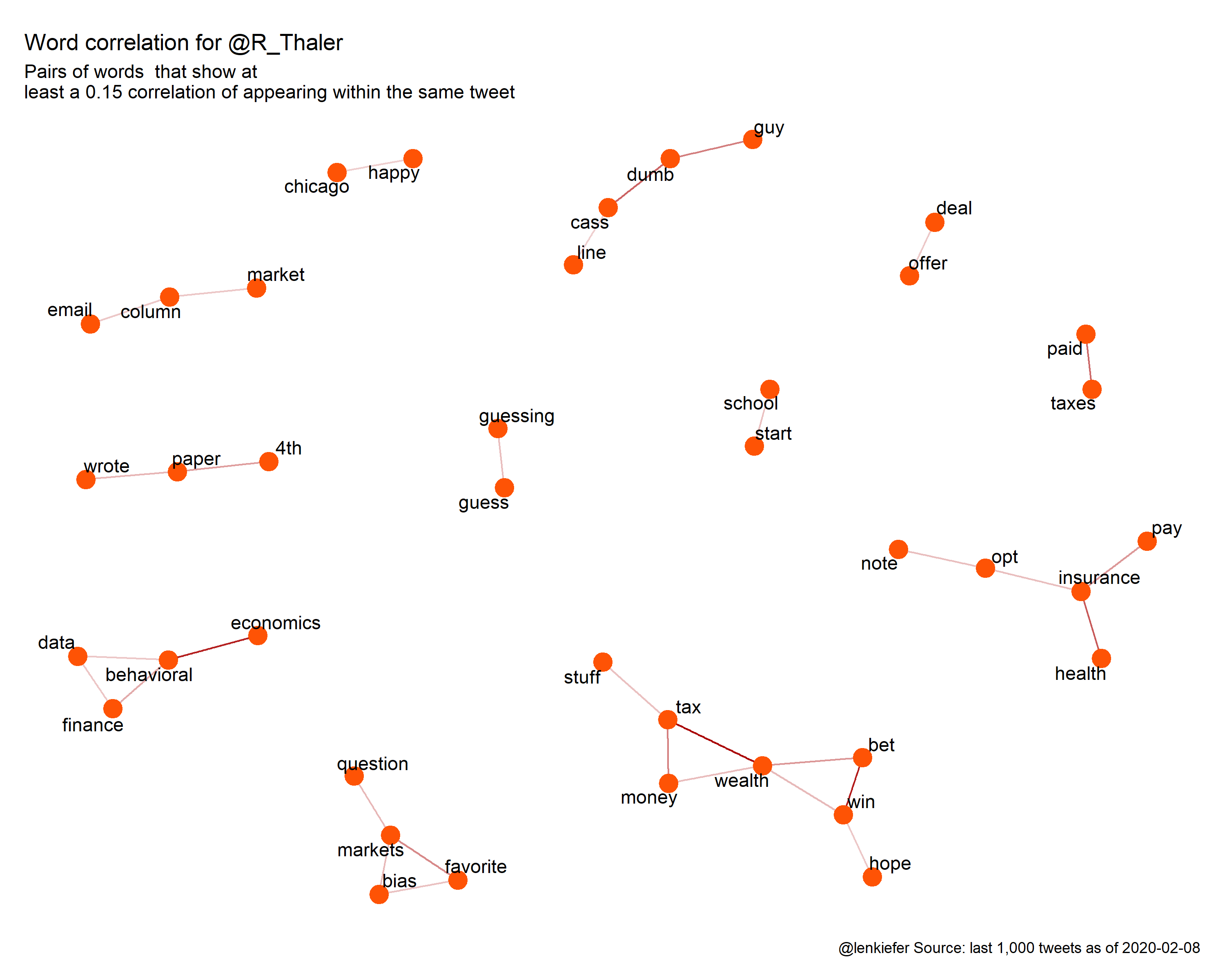
We can also plot a word correlation diagram. We’ll compute pairwise word correlations and then construct a graph representing those correlations.
There’s quite a few graphics, so I’ve hidden them in the tab. Click to expand.
Click for word correlation diagrams
How do you feel about hashtags?
If you like hashtags the table below shows the hashtags with the highest tf-idf (term frequency inverse document frequency) for each shill.
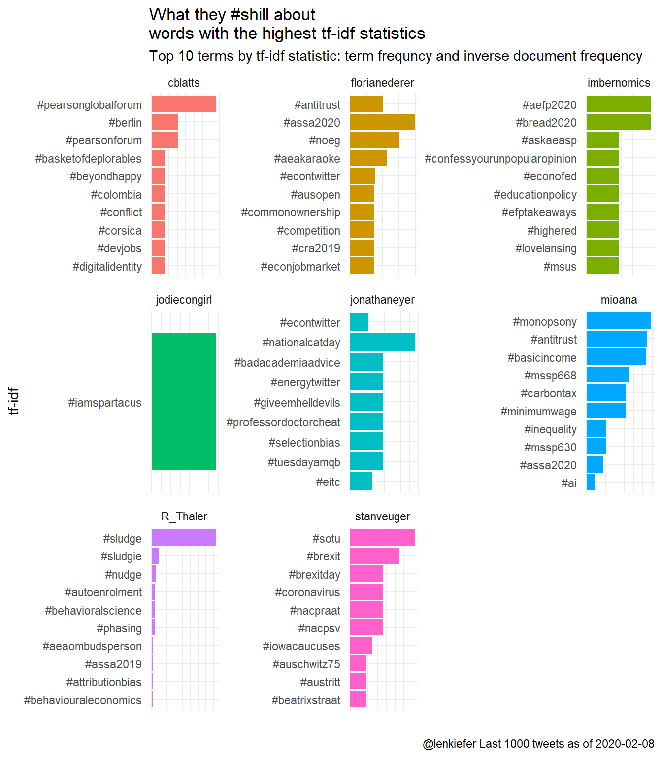
Figure 5: What these #shills tweet about
Who tweets like @ne0liberal?
Perhaps when deciding the best shill, we need to consider who is closest to the ne0liberal account in terms of tweets. We can compute a cosine similiarity metric ( see http://text2vec.org/similarity.html#cosine_similarity and https://www.brodrigues.co/blog/2019-06-04-cosine_sim/ ) to compare how similar the tweets are among our shills.
To give some comparison I also pulled in tweets from the @ne0liberal account, my own account @lenkiefer and @Wikipedia and @weatherchannel. Finally I also included tweets from @dril.
Warning! @dril is not a family-friendly twitter account. When I computed the tf-idf statistic for @dril relative to our prospective shill all the top terms were either profanities, scatological, body parts, or combinations of all three.
The matrix below displays the cosine similarity measure for our prospective shills and the comparison groups. The diagonal are by definition equal to 1. Everyone is perfectly similar to themselves. The darker orange the square, the more similar the two tweet timelines. The shills cblatts and jonathaneyer have the strongest relationship.
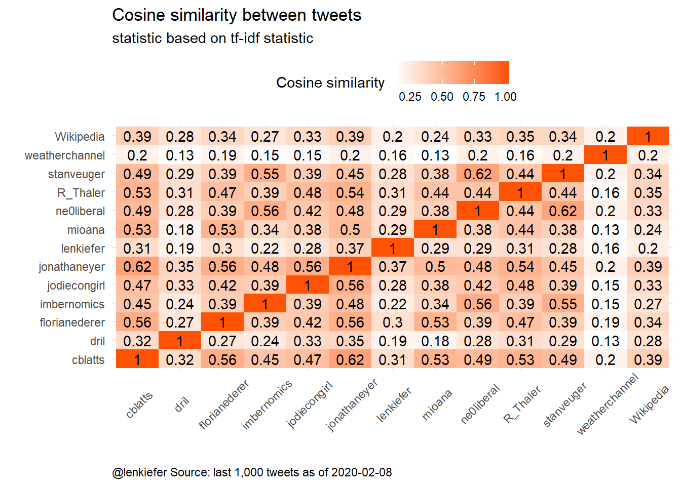
Figure 6: Cosine Similarity
The charts below contain the same information as the graphic above, but might be easier to read.
which shill is most ne0liberal?
First, who is the most @ne0liberal? The shills @stanveuger and @imbernomics are the most similar. The @weatherchannel and @dril (reassuringly) are the least similar.
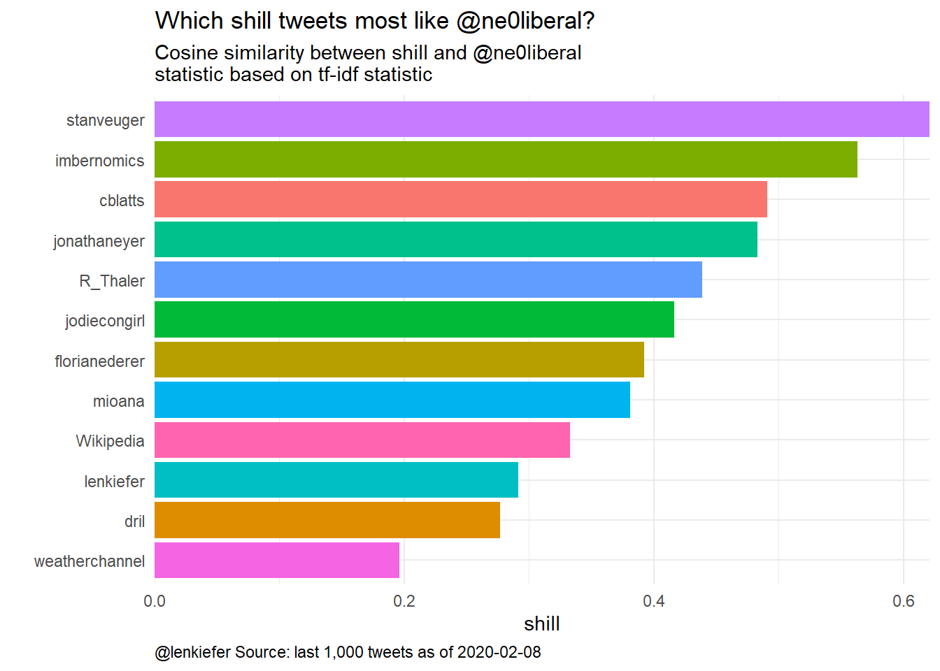
Figure 7: Like a ne0liberal
Who is most similar to me, @lenkiefer? That would be @jonathaneyer and @R_Thaler.
which shill is most like @lenkiefer
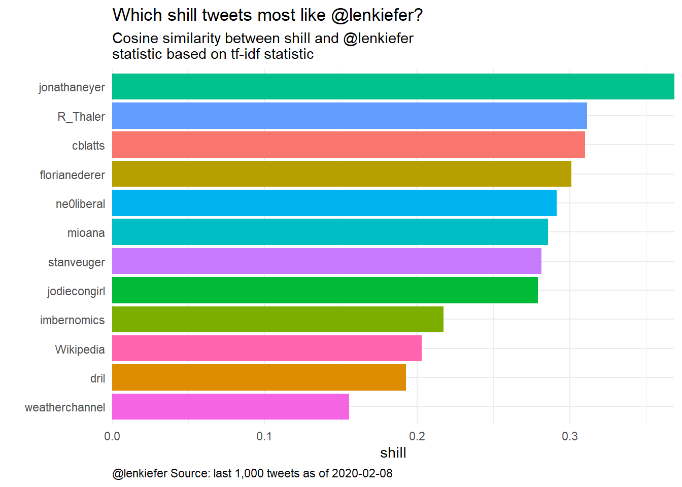
Figure 8: Like lenkiefer
which shill is most like @dril
How about @dril?
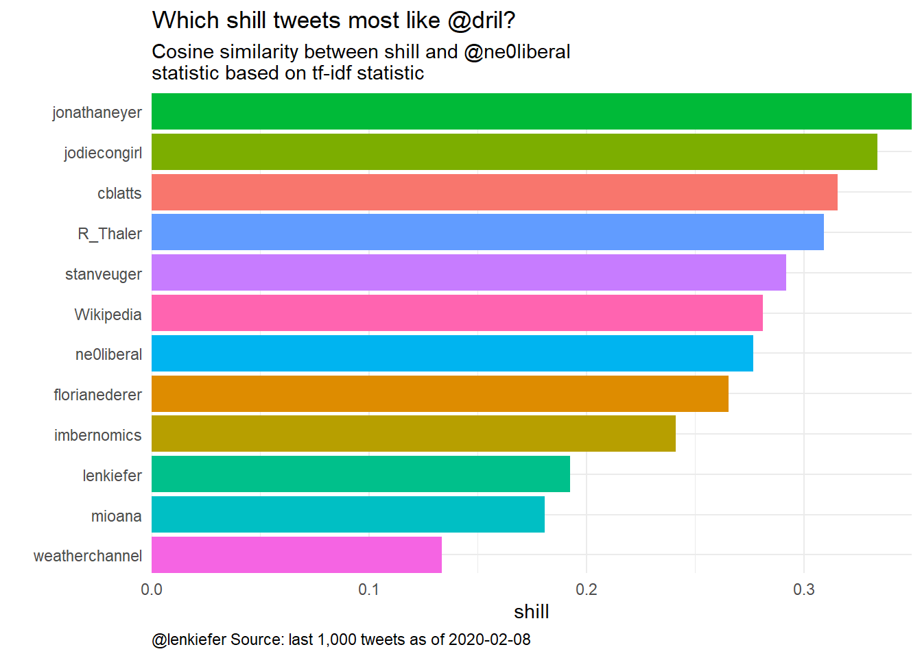
Figure 9: Like dril
The prospective shills @jonathaneyer and @jodiecongirl have that distinction.
Nobel prizes
At the moment only @R_Thaler has a he Sveriges Riksbank Prize in Economic Sciences in Memory of Alfred Nobel.
Do they have great taste?
I’ve presented a variety of statistics and analytics around the various candidate shills. For me there is statistic that I will rely on for my vote. Only @jodiecongirl has demonstated the good judgement and excellent taste required to follow @lenkiefer.
R code
All the analysis, charting, and this blog post were made with R. I may post code at a future date. Most of it follows the steps laid out in my earlier post Beige-ian Statistics.