Supply and demand, isoquants, indifference, the lists goes on. Economists love curves. One attracting extra attention these days is the Phillips curve. Last week I was in Boston for the annual meeting of the National Association for Business Economics (NABE). The overall conference was quite good, and certainly one of the highlights was a lunchtime speech by Federal Reserve Chairman Jerome Powell.
You can find the speech here (pdf).
In this post I want to replicate Powell’s Figure 5, which presents evidence of the evolution of the Phillips Curve. Per usual we will make our graphics with R.
The Phillips Curve
The Phillips curve captures the relationship between the rate of inflation (typically a core measure stripping away volatile food and energy) and a measure of slack (often an unemployment rate gap). Because the Phillips curve may represent possible policy tradeoffs, say for example inflation and unemployment, it attracts a lot of attention.
There’s been a lot of debate about the flattening of the Phillips curve or a reduced sensitivity of inflation to unemployment. Let’s take a look. We are replicating Powell (2018) who specified the Phillips curve as:
\[Inflation(t)=-B Slack(t) + C Inflation(t-1) + Other(t)\] Inflation is a core measure and the Slack term is the unemployment gap, the difference between the unemployment rate and an estimate (the Congressional Budget Office (CBO) here) of the natural rate of unemployment. We plotted the unemployment gap in this post.
Get data
We’ll get data via the Federal Reserve Bank of St. Louis FRED database. See for example this post for more on using FRED with R. We’ll also create a little dataframe by hand to capture NBER Recession Date.
## Step 1: Load Libraries ----
library(tidyverse)
library(tidyquant)
library(scales)
library(tibbletime)
library(cowplot)


## Step 2: go get data ----


# Recession indicators via NBER http://www.nber.org/cycles.html

recessions.df = read.table(textConnection(
  "Peak, Trough
  1948-11-01, 1949-10-01
  1953-07-01, 1954-05-01
  1957-08-01, 1958-04-01
  1960-04-01, 1961-02-01
  1969-12-01, 1970-11-01
  1973-11-01, 1975-03-01
  1980-01-01, 1980-07-01
  1981-07-01, 1982-11-01
  1990-07-01, 1991-03-01
  2001-03-01, 2001-11-01
  2007-12-01, 2009-06-01"), sep=',',
  colClasses=c('Date', 'Date'), header=TRUE)


# Set up tickers
tickers<- c("PCEPILFE", # core pce
            "UNRATE", # unemployment rate
            "EMRATIO", # employment-to-population ratio
            "LNS12300060", # prime (25-54) employment-to-population ratio
            "NROU"  ) # estimate of natural rate of unemployment from U.S. Congressional Budget Office
mynames <- c("Core PCE",
             "Unemploymen Rate",
             "Employment-to-Population Ratio",
             "Prime Working Age Employment-to-Population Ratio",
             "Natural Rate of Unemployment")

mytickers<- data.frame(symbol=tickers,varname=mynames,  stringsAsFactors =FALSE)


# download data via FRED
df<-tq_get(tickers,                         # get selected symbols
           get="economic.data",             # use FRED
           from="1958-01-01")               # go from 1954 forward

df <- left_join(df, mytickers, by="symbol")
Now that we have a our data we can do some data preparation, converting the data to quarterly and making some transformations:
## Step 3: get data ready for analysis----

df %>% select(-varname) %>%
  spread(symbol,price) -> df2


# Convert monthly to quarterly data
dfq <-
  df2 %>%
  mutate(month=month(date),
         qr=(month+2) %/% 3, #quarter
         yr= year(date) ) %>%
  group_by(yr,qr) %>%
  summarize(
    date=first(date),  # first month of quarter
    epop=mean(LNS12300060),
    nrou=mean(NROU,na.rm=T),
    unrate=mean(UNRATE,na.rm=T),
    pce=mean(PCEPILFE,na.rm=T)
    ) %>%
  ungroup() %>%
  mutate(pce_inf= 100*(pce/lag(pce,n=4)-1),  # 4-quarter core inflation rate
         slack= unrate-nrou,                  # unemployment gap
         pce_lag= lag(pce_inf,n=4),
         slack_lag=lag(slack,n=4))
Let’s start by (mostly) replicating Figure 3 in Powell (2018). This shows trends in core inflation and the slack measure (unemployment gap).
g1<-
ggplot(data=filter(dfq,yr<1985,yr>1959), aes(x=date,y=slack))+theme_gray()+
  geom_rect(data=filter(recessions.df,year(Peak)>1959, year(Peak)<1985),
            inherit.aes=F, aes(xmin=Peak, xmax=Trough, ymin=-Inf, ymax=+Inf), fill='darkgray', alpha=0.5) +
  geom_line(color="blue")+
  geom_line(color="red",linetype=2,aes(y=pce_inf))+
  geom_text(data= .%>% filter(date=="1973-01-01"), color="blue",aes(label="Slack"))+
  geom_text(data= .%>% filter(date=="1973-01-01"), color="red",aes(label="Inflation",y=pce_inf))+

  theme(plot.caption=element_text(hjust=0))+
  labs(x="date (quarterly)",
       y="percent",
       title="Labor Market Slack and Core Inflation Rate",
       subtitle="1960-1984",
       caption="@lenkiefer Note: Labor market slack is unemployment rate gap: the difference between the U.S. unemployment rate and the \nCBO estimate of the natural rate. \nCore Inflation is the four-quarter percent change in the price index fore consumption expenditures(PCE) less food and energy.\nshaded areas are NBER recession dates \nretrieved from FRED, Federal Reserve Bank of St. Louis; https://fred.stlouisfed.org October 8, 2018.")

g2<-
ggplot(data=filter(dfq,yr>1995), aes(x=date,y=slack))+
  theme_gray()+
  geom_rect(data=filter(recessions.df,year(Peak)>1994),
            inherit.aes=F, aes(xmin=Peak, xmax=Trough, ymin=-Inf, ymax=+Inf), fill='darkgray', alpha=0.5) +
  geom_line(color="blue")+
  geom_line(color="red",linetype=2,aes(y=pce_inf))+scale_y_continuous(limits=c(-3,12))+
  geom_text(data= .%>% filter(date=="2000-01-01"), color="blue",aes(label="Slack"))+
  geom_text(data= .%>% filter(date=="2000-01-01"), color="red",aes(label="Inflation",y=pce_inf))+

  theme(plot.caption=element_text(hjust=0))+
  labs(x="date (quarterly)",
       y="percent",
       title="Labor Market Slack and Core Inflation Rate",
       subtitle="1995-2018",
       caption="@lenkiefer Note: Labor market slack is unemployment rate gap: the difference between the U.S. unemployment rate and the \nCBO estimate of the natural rate. \nCore Inflation is the four-quarter percent change in the price index fore consumption expenditures(PCE) less food and energy.\nshaded areas are NBER recession dates \nretrieved from FRED, Federal Reserve Bank of St. Louis; https://fred.stlouisfed.org October 8, 2018.")


g1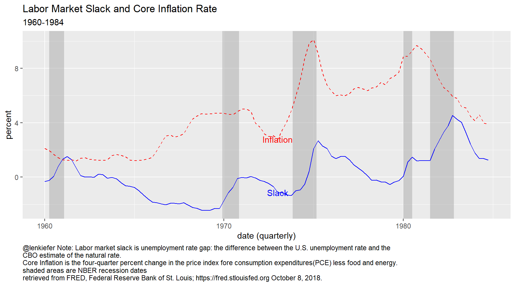
g2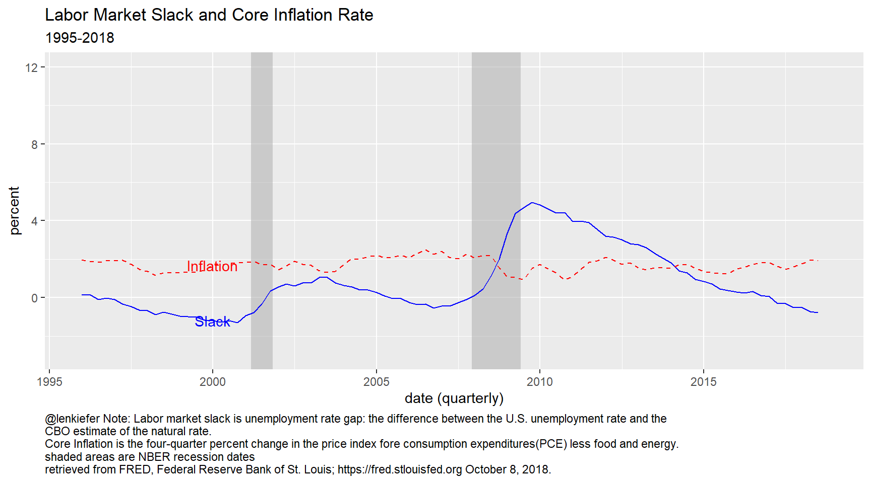
To replicate Figure 5 in Powell (2018) we need to run a rolling regression. We can do that with the rollify function from the tibbletime package, see this vignette. Also see this post for other rolling regressions.
rolling_lm <- rollify(.f = function(pce_inf,slack,pce_lag ){
  lm(pce_inf ~ pce_lag + I(-slack))
},
window = 80,
unlist = FALSE)

df_reg <-
  mutate(dfq, roll_lm=rolling_lm(pce_inf,slack,pce_lag ))%>%
  filter(!is.na(roll_lm)) %>%
  mutate(tidied = purrr::map(roll_lm, broom::tidy, conf.int = TRUE)) %>%
  unnest(tidied) %>%
  select(date, term, estimate, std.error, statistic, p.value, conf.low,conf.high)

df_reg$termf <- factor(df_reg$term)
levels(df_reg$termf)=c(
  "Intercept",
  "Slope of the Phillips Curve" ,
  "Persistence of Inflation"
 )


ggplot(data=filter(df_reg,term != "(Intercept)"), aes(x=date,y=estimate))+
  geom_ribbon(aes(ymin=conf.low,ymax=conf.high), alpha=0.25)+
  geom_line(color="black")+
  facet_wrap(~termf,ncol=2)+
  theme_gray()+
  theme(plot.caption=element_text(hjust=0))+
  labs(x="date (quarterly)",
       y="",
       title="Evolution of Estimates of the Slope and Persistence Parameters of the Phillips Curve",
       caption="@lenkiefer Note Panels show estimate of the coefficients of B and C from the equation\nInflation(t) = -B slack(t) + C Inflation(t-1) + Other(t)\nwhere Inflation is core (pce) inflation and Slack in the unemployment gap.\nReplication (using quarterly instead of annual data) of Powell (2018) Figure 5:\n https://www.federalreserve.gov/newsevents/speech/files/powell20181002a.pdf")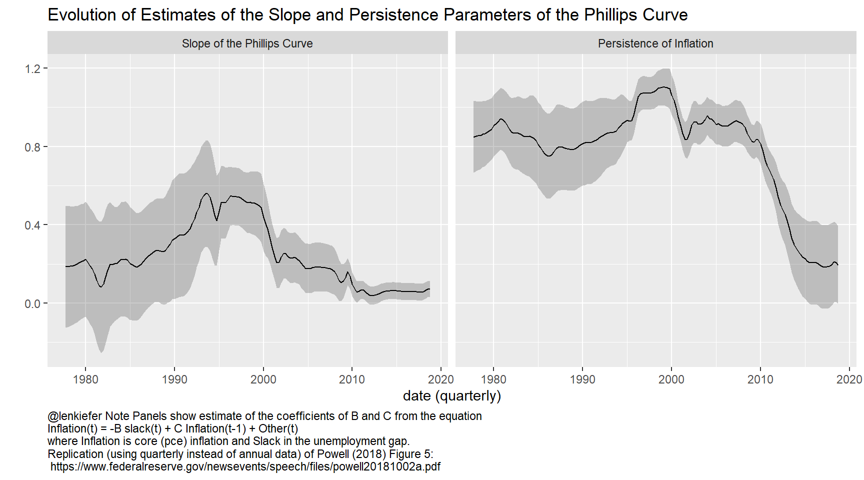
We can see just what Powell remarked on in his speech. Using this specification of the Phillips curve the coefficient on slack is nearly zero. In recent data the correlation between the unemployment gap and inflation is basically nonexistant. Another way of seeing it is to draw a scatterplot.
ggplot(data=dfq, aes(x=slack, y=pce_inf, color=year(date)<1985))+
  geom_point()+theme_gray()+
  scale_color_viridis_d(option="C",name="Before 1984?", begin=0.15, end=0.85)+
  stat_smooth(linetype=2, fill=NA, method="lm")+
    theme(plot.caption=element_text(hjust=0))+
  labs(x="Slack: Unemployment Gap (percent)",
       y="Core Inflation (4-quarter percent change price index)",
       title="A Flatter Phillips Curve?",
       subtitle="Relationship between slack and inflation in two periods (each dot a quarterly observation)",
              caption="@lenkiefer Note: Labor market slack is unemployment rate gap: the difference between the U.S. unemployment rate and the \nCBO estimate of the natural rate. \nCore Inflation is the four-quarter percent change in the price index fore consumption expenditures(PCE) less food and energy.\nretrieved from FRED, Federal Reserve Bank of St. Louis; https://fred.stlouisfed.org October 8, 2018.")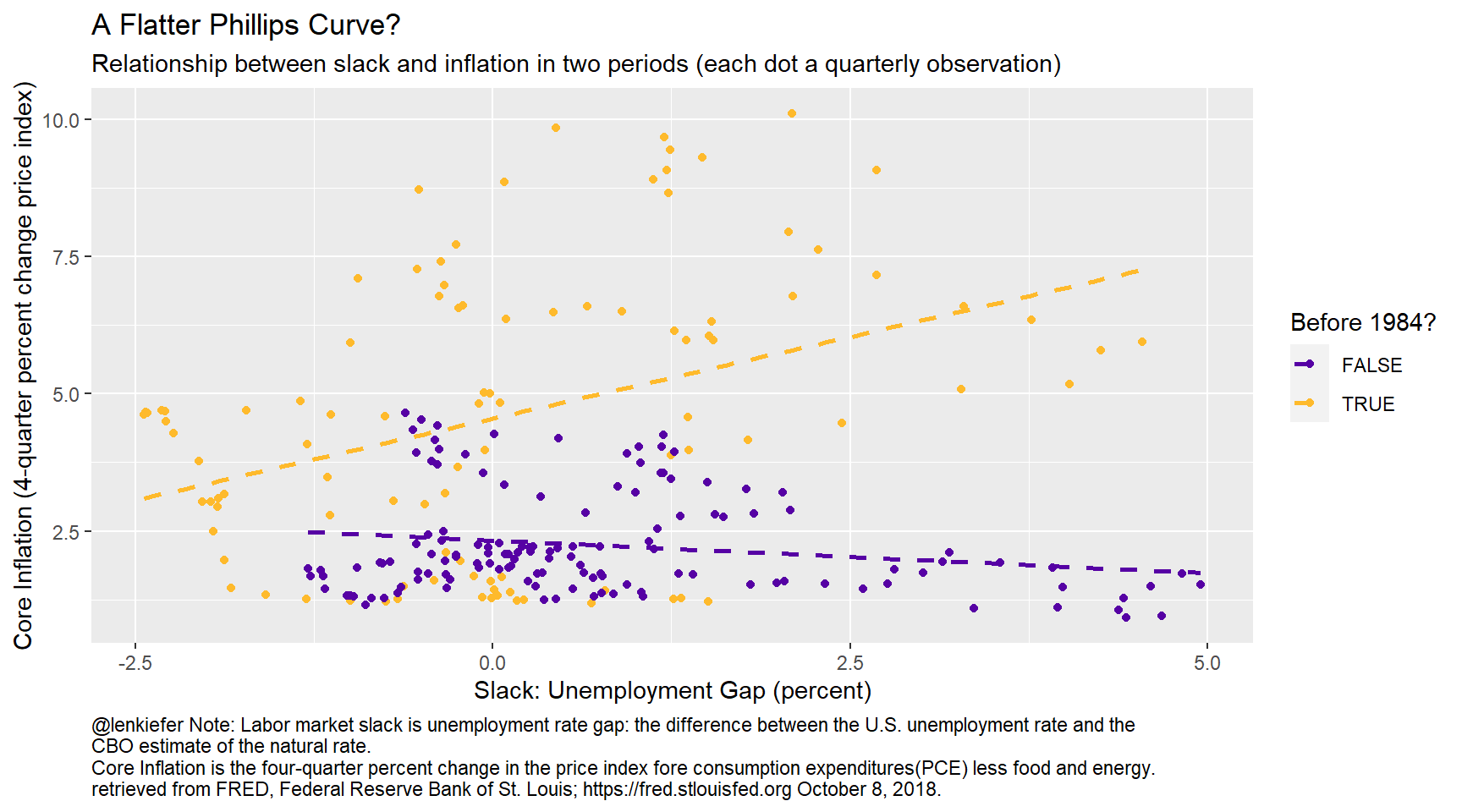
There are of course, many interpretations for what is going on here.One interesting suggestion at the NABE conference was by Robert Gordon who suggested a revenge of the Phillips curve (Powell’s term not Gordon’s) type scenario where inflation accelerates in the near future effectively implying a steepening of the Phillips curve. In particular Gordon said (see presentation here under Gordon) “Inflation has been quiescent but it’s not dead yet.”