LAST FRIDAY WAS JOBS FRIDAY, the day when the U.S. Bureau of Labor Statistics (BLS) releases its monthly employment situation report. This report is blanketed with media coverage and economist and financial analysts all over the world pay close attention to the report. The employment situation gives a read on trends in the world’s largest economy’s labor market. It also provides a clue about how monetary policy might unfold, affecting bond yields around the world.
In this post I want to share some code to plot trends from the report with R. Note that true Jobs Friday aficionados will have to modify this code, because the data is only updated with a lag. With so many folks dissecting the reports, speed might be desired and so you’d have to modify this approach to have the freshest charts ready to go in time to join the resonance room.
Data
We’ll use data form two sources. As we have in recent posts (see for example here), we’ll gather data via FRED. See here for more on using the quantmod and tidyquant packages to work with FRED data.
But we’ll also go straight to the BLS webpage BLS.gov and grab data directly from some flat files they provide. That will be similar to what we did in this post on the JOLTS data. Certain data we want isn’t available in FRED (at least not that I could find). Fortunately the text files from BLS are easy to work with.
Get data
The code below will get our data from FRED. This is a straightforward application of the tidyquant approach, see the posts above for more details.
#####################################################################################
## Step 1: Load Libraries ###
#####################################################################################
library(tidyverse)
library(tidyquant)
library(scales)
library(tibbletime)
library(data.table)
library(cowplot)


#####################################################################################
## Step 2: go get data ###
#####################################################################################

# Set up tickers
tickers<- c("PAYEMS", # nonfarm payroll employment
            "UNRATE", # unemployment rate
            "CIVPART", # civilian labor force pariticipation rate
            "EMRATIO", # employment-to-population ratio
            "NROU"  ) # estimate of natural rate of unemployment from U.S. Congressional Budget Office
mynames <- c("Nonfarm Payroll Employment",
            "Unemploymen Rate",
            "Labor Force Participation Rate",
            "Employment-to-Population Ratio",
            "Natural Rate of Unemployment")

mytickers<- data.frame(symbol=tickers,varname=mynames,  stringsAsFactors =FALSE)


# download data via FRED
df<-tq_get(tickers,                         # get selected symbols
            get="economic.data",             # use FRED
            from="1948-01-01")               # go from 1954 forward

df <- left_join(df, mytickers, by="symbol")


#####################################################################################
## Step 3: get data ready for analysis ###
#####################################################################################

df %>% select(-varname) %>%
  spread(symbol,price) -> df2


# Convert quarterly naturla rate (NROU) data to monthly data by "filling down" using na.locf

df2 %>%
  mutate(NROU2=na.locf(NROU,na.rm=F)) %>%
  mutate(UGAP2=UNRATE-NROU2,
         dj=c(NA,diff(PAYEMS)),
         # create indicators for shaded plot
         up=ifelse(UNRATE>NROU2,UNRATE,NROU2),
         down=ifelse(UNRATE<NROU2,UNRATE,NROU2)) -> df2

# Set up recession indicators

recessions.df = read.table(textConnection(
  "Peak, Trough
  1948-11-01, 1949-10-01
  1953-07-01, 1954-05-01
  1957-08-01, 1958-04-01
  1960-04-01, 1961-02-01
  1969-12-01, 1970-11-01
  1973-11-01, 1975-03-01
  1980-01-01, 1980-07-01
  1981-07-01, 1982-11-01
  1990-07-01, 1991-03-01
  2001-03-01, 2001-11-01
  2007-12-01, 2009-06-01"), sep=',',
  colClasses=c('Date', 'Date'), header=TRUE)
Now we can make some plots.
Employment growth
Let’s start by looking at monthly nonfarm job gains.
#####################################################################################
## Step 4: make some plots ###
#####################################################################################


ggplot(data=filter(df2,year(date)>1949),
       aes(x=date,y=dj,
           color=ifelse(dj>0,"up m/m",
                        ifelse(dj==0,"no change", "down m/m")),
           fill=ifelse(dj>0,"up m/m",
                       ifelse(dj==0,"no change", "down m/m"))))+
  geom_col(alpha=0.85,color=NA)+
  #eom_rug()+
  scale_y_continuous(labels=scales::comma,sec.axis=dup_axis())+
  theme_minimal()+
  scale_color_manual(values=c("#d73027","#4575b4"),
                     name="Monthly change")+
  scale_fill_manual(values=c("#d73027","#4575b4"),
                    name="Monthly change")+
  geom_rug(sides="b")+
  scale_x_date(lim=as.Date(c("1950-01-01","2018-12-31")),date_breaks="5 years",date_labels="%Y")+
  #scale_x_date(date_labels="%Y",date_breaks="1 year")+
  theme(legend.position="none",
        plot.caption=element_text(hjust=0),
        plot.subtitle=element_text(size=14,face="italic",color="darkgray"),
        plot.title=element_text(size=14,face="bold",color="black"))+
  labs(x="",y="",
       title="89 consecutive months of positive month-over-month job growth",
       subtitle="Monthly change in U.S. nonfarm employment (1000s, SA)",
       caption="@lenkiefer Source: U.S. Bureau of Labor Statistics")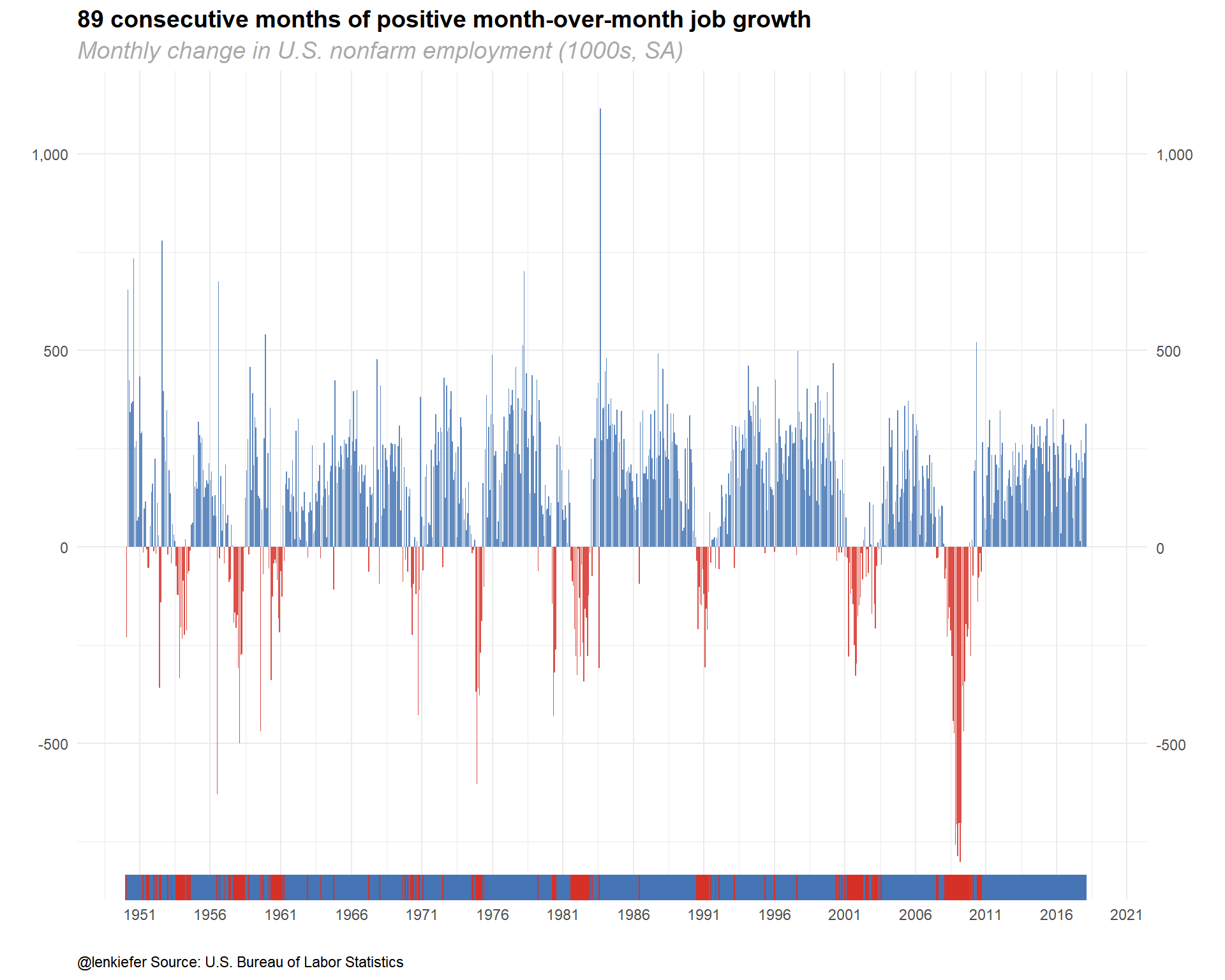
Unemployment rate
Now let’s chart the unemployment rate relative to the Congressional Budget Office’s estimate of the long-term natural rate of unemployment.
ggplot(data=filter(df2,!is.na(NROU2)),aes(x=date,y=UNRATE))+
  geom_rect(data=recessions.df, inherit.aes=F, aes(xmin=Peak, xmax=Trough, ymin=-Inf, ymax=+Inf), fill='darkgray', alpha=0.5) +
  geom_line(color="black")+
  geom_line(linetype=2,aes(y=NROU2))+
  geom_ribbon(aes(ymin=UNRATE,ymax=down),fill="#d73027",alpha=0.5)+
  geom_ribbon(aes(ymin=UNRATE,ymax=up),fill="#4575b4",alpha=0.5)  +
  scale_x_date(date_breaks="5 years",date_labels="%Y")+
  scale_y_continuous(sec.axis=dup_axis())+
  theme_minimal(base_size=8)+
  theme(legend.position="top",
        plot.caption=element_text(hjust=0),
        plot.subtitle=element_text(face="italic"),
        plot.title=element_text(size=16,face="bold"))+
  labs(x="",y="Percent",
       title="U.S. Unemployment Rate vs Natural Rate of Unemployment",
       subtitle="Solid line Unemployment Rate, dotted line Long-term Natural Rate of Unemployment",
       caption="@lenkiefer Data Source: U.S. Bureau of Labor Statistics, U.S. Congressional Budget Office,shaded bars NBER Recessions\nNatural Rate of Unemployment (Long-Term) retrieved from FRED, Federal Reserve Bank of St. Louis; https://fred.stlouisfed.org/series/NROU, March 10, 2018")+
  geom_rug(aes(color=ifelse(UNRATE<=NROU2,"Below or Equal","Above")),sides="b")+
  scale_color_manual(values=c("#d73027","#4575b4"),name="Unemployment Rate Above/Below Natural Rate ")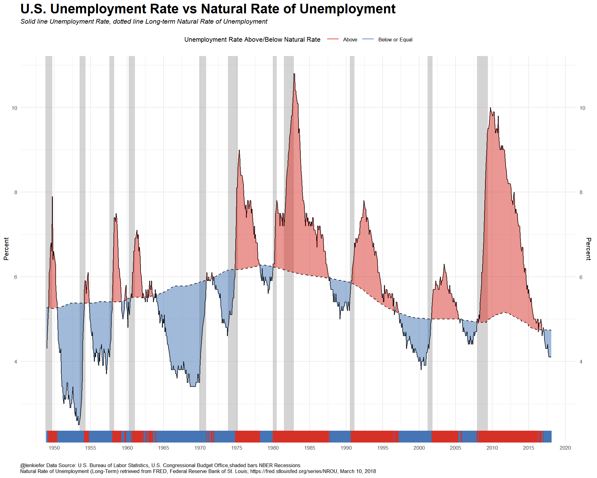
The unemployment rate is below the CBO’s estimate natural rate of unemployment, but wage growth has been tepid. What’s going on? Let’s look at the labor force participation rate and the employment-to-population ratio
ggplot(data=df2, aes(x=date,y=CIVPART,label=CIVPART))+
  geom_rect(data=recessions.df, inherit.aes=F, aes(xmin=Peak, xmax=Trough, ymin=-Inf, ymax=+Inf), fill='darkgray', alpha=0.5) +
  geom_line(size=1.05)+theme_minimal()+
  geom_point(data=filter(df2,date==max(dfp$date)),size=2,alpha=0.75)+
  geom_text(data=filter(df2,date==max(dfp$date)),fontface="bold",size=4,nudge_y=.15)+
  scale_x_date(date_breaks="1 years",date_labels="%Y")+
  scale_y_continuous(sec.axis=dup_axis())+
  theme(legend.position="none",
        plot.caption=element_text(hjust=0),
        plot.subtitle=element_text(face="italic"),
        plot.title=element_text(size=16,face="bold"))+
  labs(x="",y="",title="Labor Force Participation Rate",
       subtitle="in percentage points (seasonally adjusted)",
       caption="@lenkiefer Source: U.S. Bureau of Labor Statistics, shaded bars NBER Recessions\nCivilian Labor Force Participation Rate [CIVPART], retrieved from FRED, Federal Reserve Bank of St. Louis; \nhttps://fred.stlouisfed.org/series/CIVPART, March 11, 2018.")+
  coord_cartesian(xlim=as.Date(c("2000-01-01","2018-03-01")),ylim=c(62,68))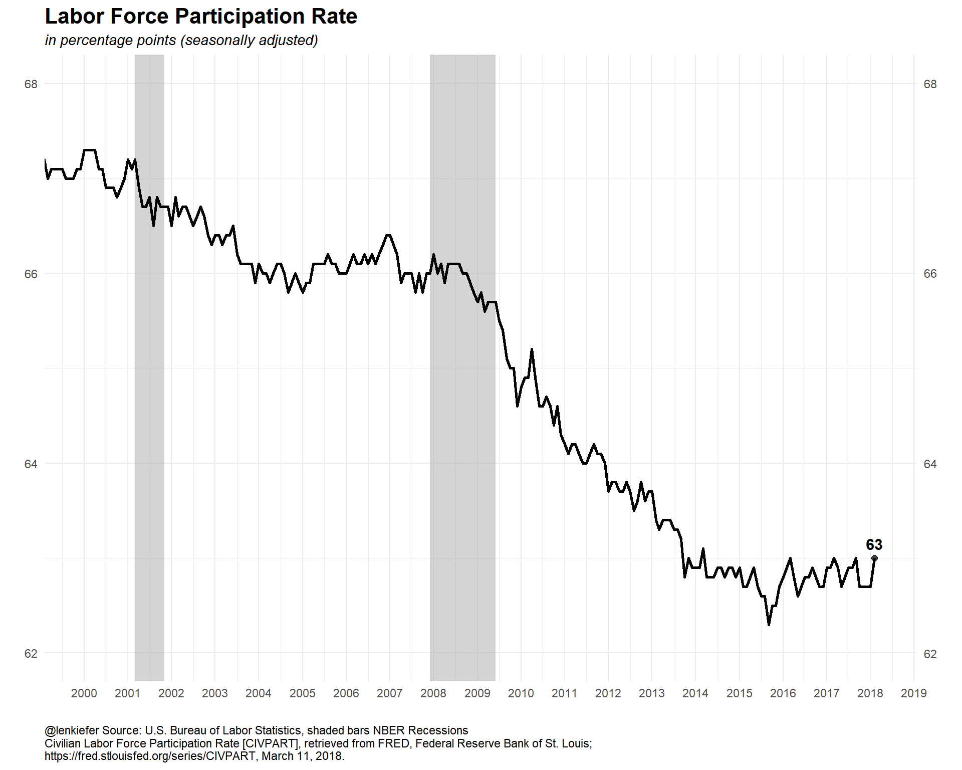
ggplot(data=df2, aes(x=date,y=EMRATIO,label=EMRATIO))+
  geom_rect(data=recessions.df, inherit.aes=F, aes(xmin=Peak, xmax=Trough, ymin=-Inf, ymax=+Inf), fill='darkgray', alpha=0.5) +
  geom_line(size=1.05)+theme_minimal()+
  geom_point(data=filter(df2,date==max(dfp$date)),size=2,alpha=0.75)+
  geom_text(data=filter(df2,date==max(dfp$date)),fontface="bold",size=4,nudge_y=.25)+
  scale_x_date(date_breaks="1 years",date_labels="%Y")+
  scale_y_continuous(sec.axis=dup_axis())+
  theme(legend.position="none",
        plot.caption=element_text(hjust=0),
        plot.subtitle=element_text(face="italic"),
        plot.title=element_text(size=16,face="bold"))+
  labs(x="",y="",title="Employment-to-Population Ratio ",
       subtitle="in percentage points (seasonally adjusted)",
       caption="@lenkiefer Source: U.S. Bureau of Labor Statistics, shaded bars NBER Recessions\nEmployment-Population Ratio [EMRATIO], retrieved from FRED, Federal Reserve Bank of St. Louis;\nhttps://fred.stlouisfed.org/series/EMRATIO, March 11, 2018.")+
  coord_cartesian(xlim=as.Date(c("2000-01-01","2018-03-01")),ylim=c(58,65))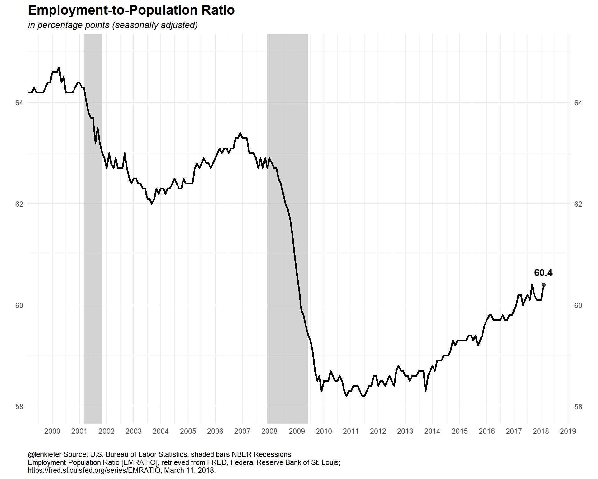
The participation ratio is partially affected by an aging population. It might better to restrict our attention to the prime working age population, those ages 25 to 54. We can get that data from FRED but I want to compare Men and Women. I couldn’t find that data in FRED, but the BLS has it. Let’s go get it from a flat file.
There is a file containing all the series_id for all the variables the BLS provides. It’s a large file, but I just want to find Participation Rates, so I’ll use a regular expression and some variable codes
#####################################################################################
## Step 4: get data direct from BLS ###
#####################################################################################

dfs<-fread("https://download.bls.gov/pub/time.series/ln/ln.series")

codes<-dfs[grepl("Participation Rate", series_title) &   # use regular expression
             ages_code==33 &                             # only ags 25 to 54
             periodicity_code =="M" &                    # only monthly frequence
             seasonal=="S"                               # only Seasonally adjusted
           ]
codes$var <- c("All","Men","Women")
codes <- select(codes, series_id, series_title, var)

# get all data (large file)
df.all<-fread("https://download.bls.gov/pub/time.series/ln/ln.data.1.AllData")

# filter data
dfp<-df.all[series_id %in% codes$series_id,]
#create date variable
dfp[,month:=as.numeric(substr(dfp$period,2,3))]
dfp$date<- as.Date(ISOdate(dfp$year,dfp$month,1) ) #set up date variable

dfp$v<-as.numeric(dfp$value)
# join on variable names, drop unused variables, convert to data.table
left_join(dfp, select(codes, series_id,series_title,var), by="series_id") %>%  select(series_id,series_title,var,date,v) %>% data.table() -> dfp
Let’s take a look at our cleaned up data.
str(dfp)## Classes 'data.table' and 'data.frame': 2526 obs. of 5 variables:
## $ series_id : chr "LNS11300060" "LNS11300060" "LNS11300060" "LNS11300060" ...
## $ series_title: chr "(Seas) Labor Force Participation Rate - 25-54 yrs." "(Seas) Labor Force Participation Rate - 25-54 yrs." "(Seas) Labor Force Participation Rate - 25-54 yrs." "(Seas) Labor Force Participation Rate - 25-54 yrs." ...
## $ var : chr "All" "All" "All" "All" ...
## $ date : Date, format: "1948-01-01" "1948-02-01" ...
## $ v : num 64.2 64.6 64.3 64.8 64.3 65 65.4 65 65.4 65 ...
## - attr(*, ".internal.selfref")=<externalptr>Now we can plot it. Both recently…
ggplot(data=dfp, aes(x=date,y=v,color=var, label=var))+
  geom_rect(data=recessions.df, inherit.aes=F, aes(xmin=Peak, xmax=Trough, ymin=-Inf, ymax=+Inf), fill='darkgray', alpha=0.5) +
  geom_line(size=1.05)+theme_minimal()+
  geom_point(data=filter(dfp,date==max(dfp$date)),size=2,alpha=0.75)+
  geom_text(data=filter(dfp,date==max(dfp$date)),fontface="bold",size=4,nudge_y=1)+
  scale_x_date(date_breaks="1 years",date_labels="%Y")+
  scale_y_continuous(sec.axis=dup_axis())+
  theme(legend.position="none",
        plot.caption=element_text(hjust=0),
        plot.subtitle=element_text(face="italic"),
        plot.title=element_text(size=16,face="bold"))+
  labs(x="",y="",title="Labor Force Participation Rate: Prime Working Age (25-54)",
       subtitle="in percentage points (seasonally adjusted)",
       caption="@lenkiefer Source: U.S. Bureau of Labor Statistics, shaded bars NBER Recessions")+
  coord_cartesian(xlim=as.Date(c("2000-01-01","2018-03-01")),ylim=c(70,95))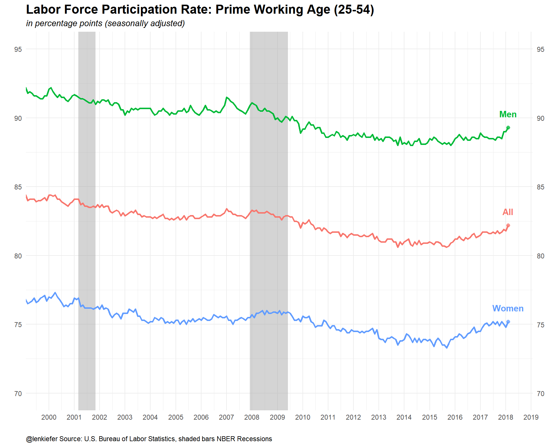
…and over history.
ggplot(data=dfp, aes(x=date,y=v,color=var, label=var))+
  geom_rect(data=recessions.df, inherit.aes=F, aes(xmin=Peak, xmax=Trough, ymin=-Inf, ymax=+Inf), fill='darkgray', alpha=0.5) +
  geom_line(size=1.05)+theme_minimal()+
  geom_point(data=filter(dfp,date==max(dfp$date)),size=2,alpha=0.75)+
  geom_text(data=filter(dfp,date==max(dfp$date)),fontface="bold",size=4,nudge_y=2)+
  scale_x_date(date_breaks="5 years",date_labels="%Y")+
  scale_y_continuous(sec.axis=dup_axis())+
  #scale_color_mycol(palette="main",discrete=T,name="Labor force participation rate (%)")+
  theme(legend.position="none",
        plot.caption=element_text(hjust=0),
        plot.subtitle=element_text(face="italic"),
        plot.title=element_text(size=16,face="bold"))+
  labs(x="",y="",title="Labor Force Participation Rate: Prime Working Age (25-54)",
       subtitle="in percentage points (seasonally adjusted)",
       caption="@lenkiefer Source: U.S. Bureau of Labor Statistics, shaded bars NBER Recessions")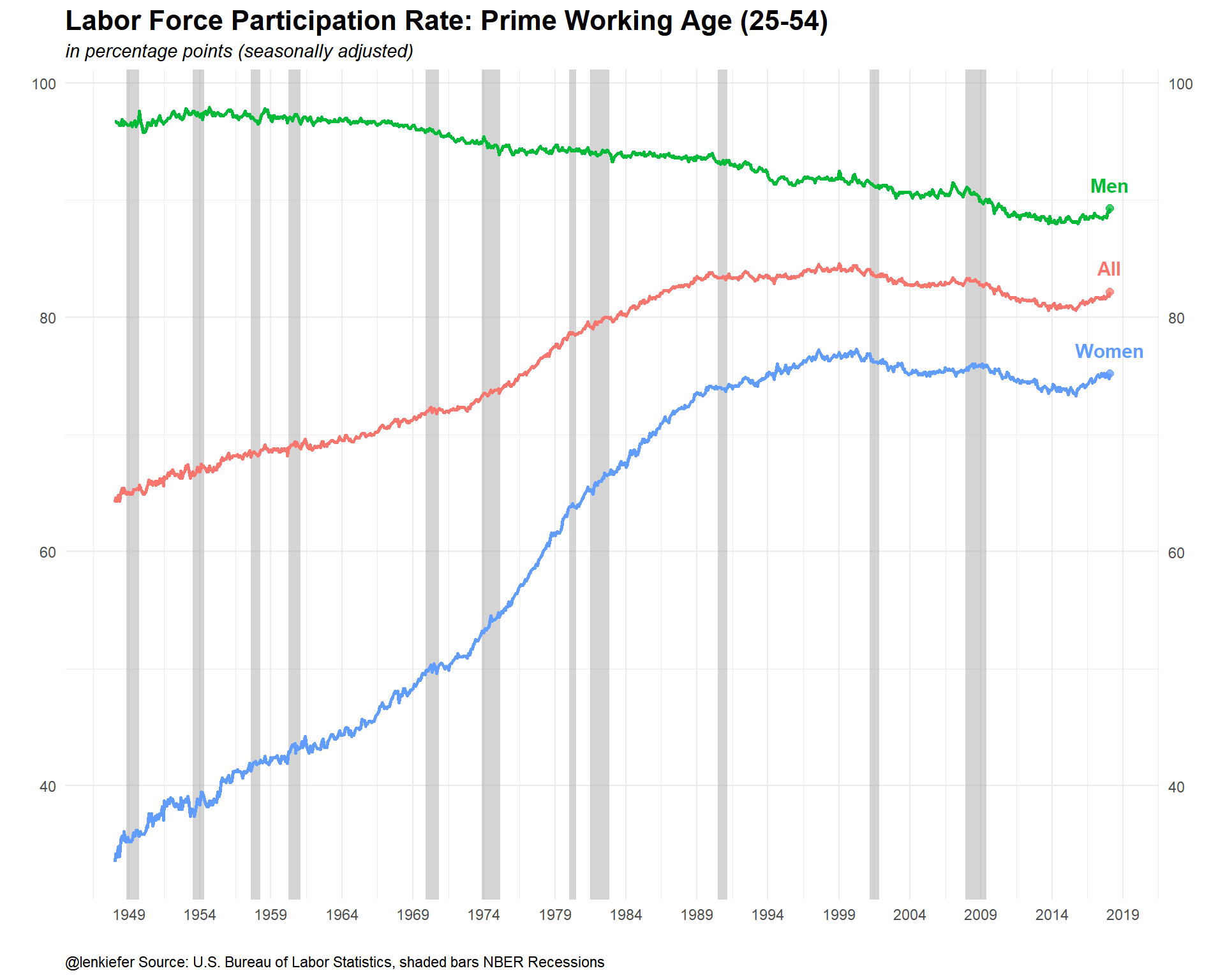
Quite a lot of stories there.