In this post I want review some trends in U.S. housing supply and demand. Specifically I want to look at county level trends in population, housing supply (the total number of housing units) and house prices. We’ll uncover some interesting trends.
Per usual we will make our graphics with R. Preparing the data required several steps that I will outline in a follow up post. For now we’ll just proceed with the data I’ve put together. In a future post I may review the data wrangling to assemble these data.
Data
The data we are going to use are estimates of U.S. county level population and housing units by year from the U.S. Census Bureau and house prices by county and metro area from the Federal Housing Finance Agency (FHFA).
I have combined estimates using the Census’s intercensal tables from 2000 to 2010 (population and housing units ) and then the latest table from 2010 to 2017 (population and housing units).
I’ve also brought in house price data from the FHFA. See this paper by Alexander N. Bogin, William M. Doerner, and William D. Larson. I’ve also brought in the house price index for metro areas link to .csv. For the metro data I used the annual average of the quarterly non-seasonally adjusted all-transactions house price index. I combined these data with the county data using a file you can find here.
Let us take a look:
| YEAR | FIPS | state_name | county_name | msa_code | msa_name | POP | HU | POP2000 | HU2000 | county_hpi | metro_hpi |
|---|---|---|---|---|---|---|---|---|---|---|---|
| 2000 | 01001 | AL | Autauga | 33860 | Montgomery, AL | 44021 | 17845 | 100 | 100 | 100 | 100 |
| 2000 | 01003 | AL | Baldwin | 19300 | Daphne-Fairhope-Foley, AL | 141342 | 74907 | 100 | 100 | 100 | 100 |
| 2000 | 01005 | AL | Barbour | 21640 | Eufaula, AL-GA | 29015 | 12481 | 100 | 100 | 100 | NA |
| 2000 | 01007 | AL | Bibb | 13820 | Birmingham-Hoover, AL | 19913 | 8362 | 100 | 100 | 100 | 100 |
| 2000 | 01009 | AL | Blount | 13820 | Birmingham-Hoover, AL | 51107 | 21235 | 100 | 100 | 100 | 100 |
| 2000 | 01013 | AL | Butler | NA | Non-metro | 21325 | 9991 | 100 | 100 | 100 | NA |
The data are arranged with year, and geographic identifiers and then the county population (POP) and housing units (HU) along with population and housing units indexed so the year 2000 =100 and then county and metro house price index also indexed so that 2000 = 100. I have saved these data in a dataframe called df.
High level summaries
Let’s first consider some high level summaries. Which areas had the most population growth from 2000 to 2017? Which areas added the most housing units during that time And how did house prices trend during this time?
library(tidyverse)
library(ggrepel)
library(scales)
library(ggthemes)
# comput population and housing unit growth 2000 to YEAR
df2 <-
  df %>%
  mutate(name=paste0(county_name,", ",state_name),
    pc = POP - 100*POP/POP2000,
    hc = HU  - 100*HU/HU2000) %>%
  arrange(desc(YEAR),desc(pc))

ggplot(data= filter(df2, YEAR==2017) %>% head(10), aes(x=fct_reorder(name,pc), y=pc, fill=POP2000/100-1))+
  geom_col()+coord_flip()+
  theme_minimal()+
  scale_x_discrete(expand=c(0,0))+
  scale_y_continuous(expand=c(0,0), labels=comma)+
  scale_fill_viridis_c(option="C",name="Population Growth (%)",label=percent)+
    theme(legend.position="top",
        legend.key.width=unit(1.5, "cm"))+
  labs(title="U.S. counties with the greatest population gain 2000 to 2017",
       y="Population growth 2000 to 2017",x="",
       caption="@lenkiefer Source: U.S. Census Bureau \n")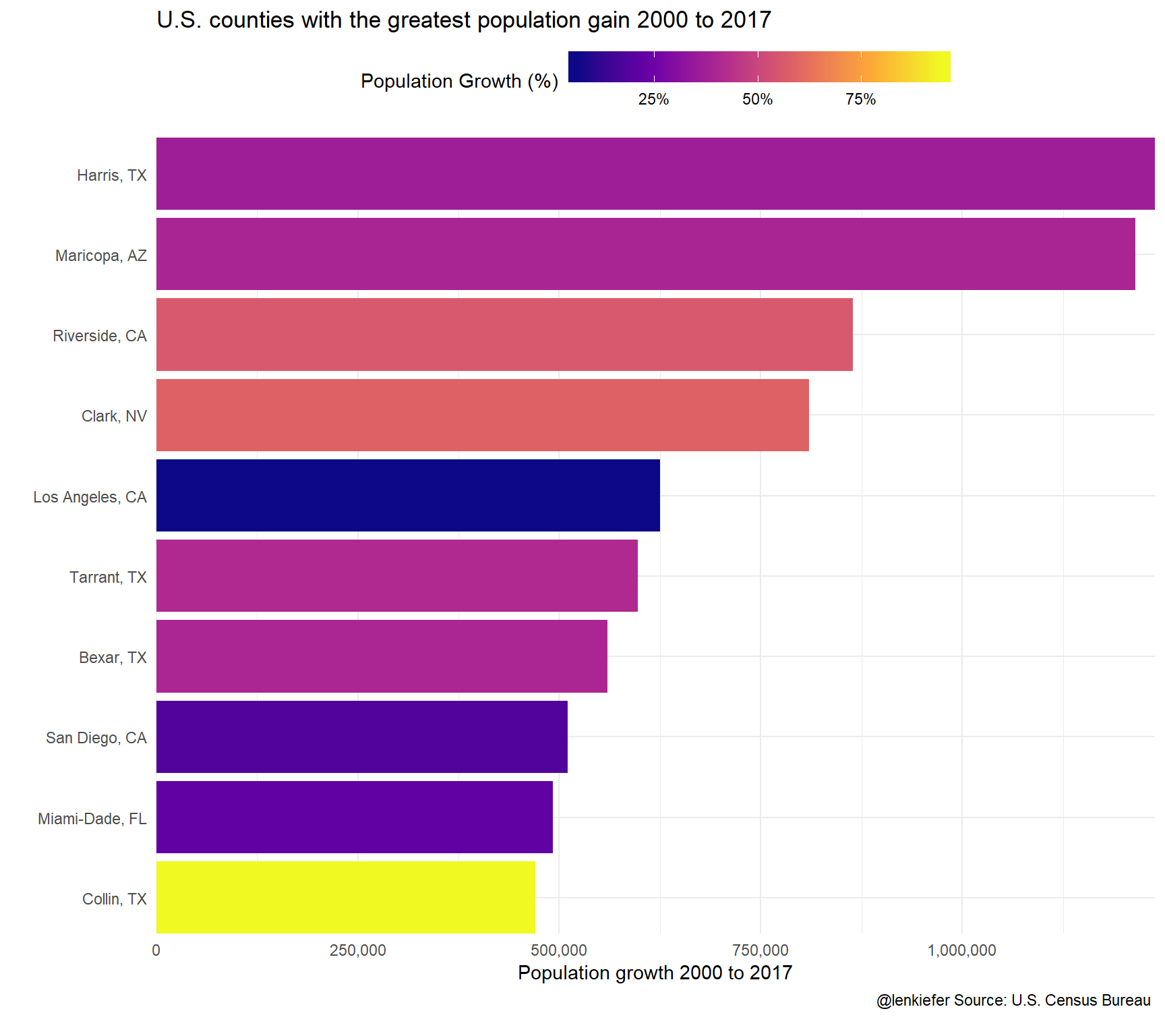
ggplot(data= filter(df2, YEAR==2017) %>% arrange(desc(hc)) %>% head(10), aes(x=fct_reorder(name,hc), y=hc, fill=HU2000/100-1))+
  geom_col()+coord_flip()+
  theme_minimal()+
  scale_x_discrete(expand=c(0,0))+
  scale_y_continuous(expand=c(0,0), labels=comma)+
  scale_fill_viridis_c(option="C",name="Housing Unit Growth (%)",label=percent)+
    theme(legend.position="top",
        legend.key.width=unit(1.5, "cm"))+
  labs(title="U.S. counties with greatest housing unit gain 2000 to 2017",
       y="Housing unit growth 2000 to 2017",x="",
       caption="@lenkiefer Source: U.S. Census Bureau \n")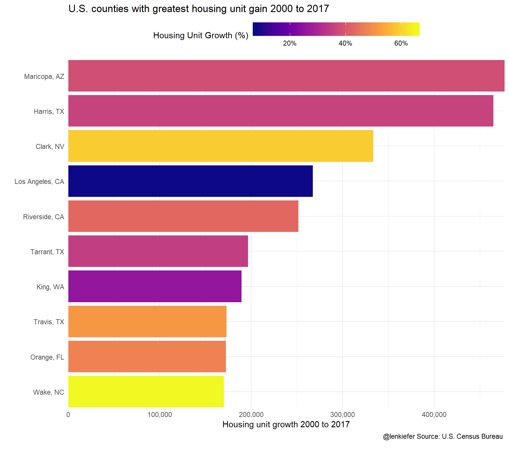
ggplot(data= filter(df2, YEAR==2017) %>% arrange(desc(county_hpi)) %>% head(10), aes(x=fct_reorder(name,county_hpi), y=county_hpi/100-1, fill=county_hpi/100-1))+

  geom_col()+coord_flip()+
  theme_minimal()+
  scale_x_discrete(expand=c(0,0))+
  scale_y_continuous(expand=c(0,0), labels=percent)+
  scale_fill_viridis_c(option="C",name="Housing Price Growth (%)",label=percent)+
    theme(legend.position="top",
        legend.key.width=unit(1.5, "cm"))+
  labs(title="U.S. counties with greatest house price growth2000 to 2017",
       y="House price growth(%) 2000 to 2017",x="",
       caption="@lenkiefer Source: FHFA \n")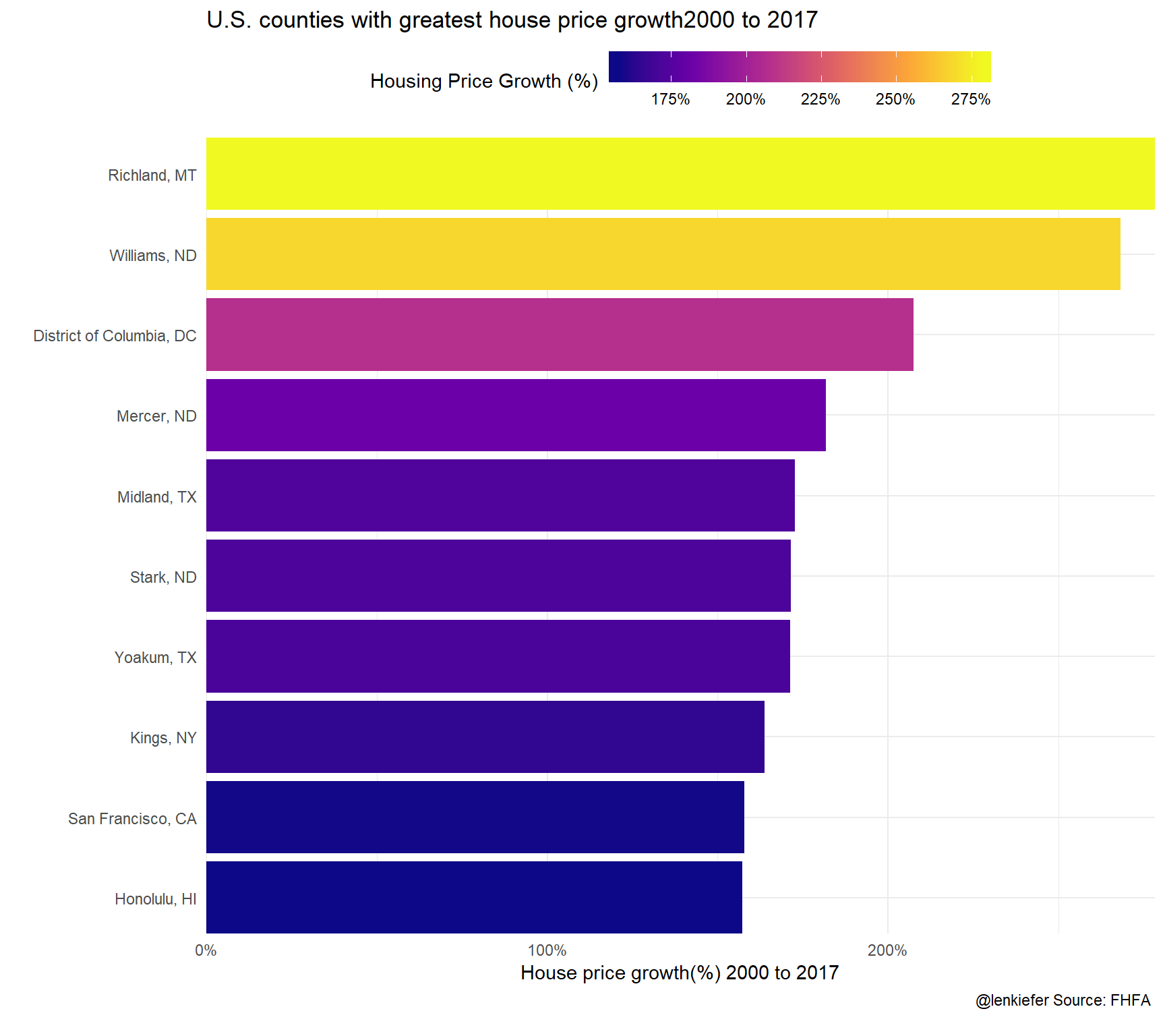
Are these variables related? Let’s construct some scatter plots to examine correlation.
ggplot(data=filter(df2, YEAR==2017, !is.na(county_hpi)), aes(x=POP2000/100-1, y=HU2000/100-1, color=county_hpi/100-1))+
  geom_point()+
  theme_minimal()+
  scale_x_continuous(labels=percent)+scale_y_continuous(labels=percent)+
  scale_color_viridis_c(option="C",name="Housing Price Growth (%)",label=percent)+
  stat_smooth(linetype=2, color="darkgray",fill=NA,method="lm", aes(y=POP2000/100-1), fullrange=T)+
    theme(legend.position="top",
        legend.key.width=unit(1.5, "cm"))+
  labs(title="A growing population requires an expanded housing stock",
       subtitle="Population and housing unit growth 2000 to 2017\neach dot a county, dotted line a 45 degree line (x=y)",
       x="Population growth 2000 to 2017",
        y="Housing unit growth 2000 to 2017",
       caption="@lenkiefer Source: U.S. Census Bureau, FHFA \n")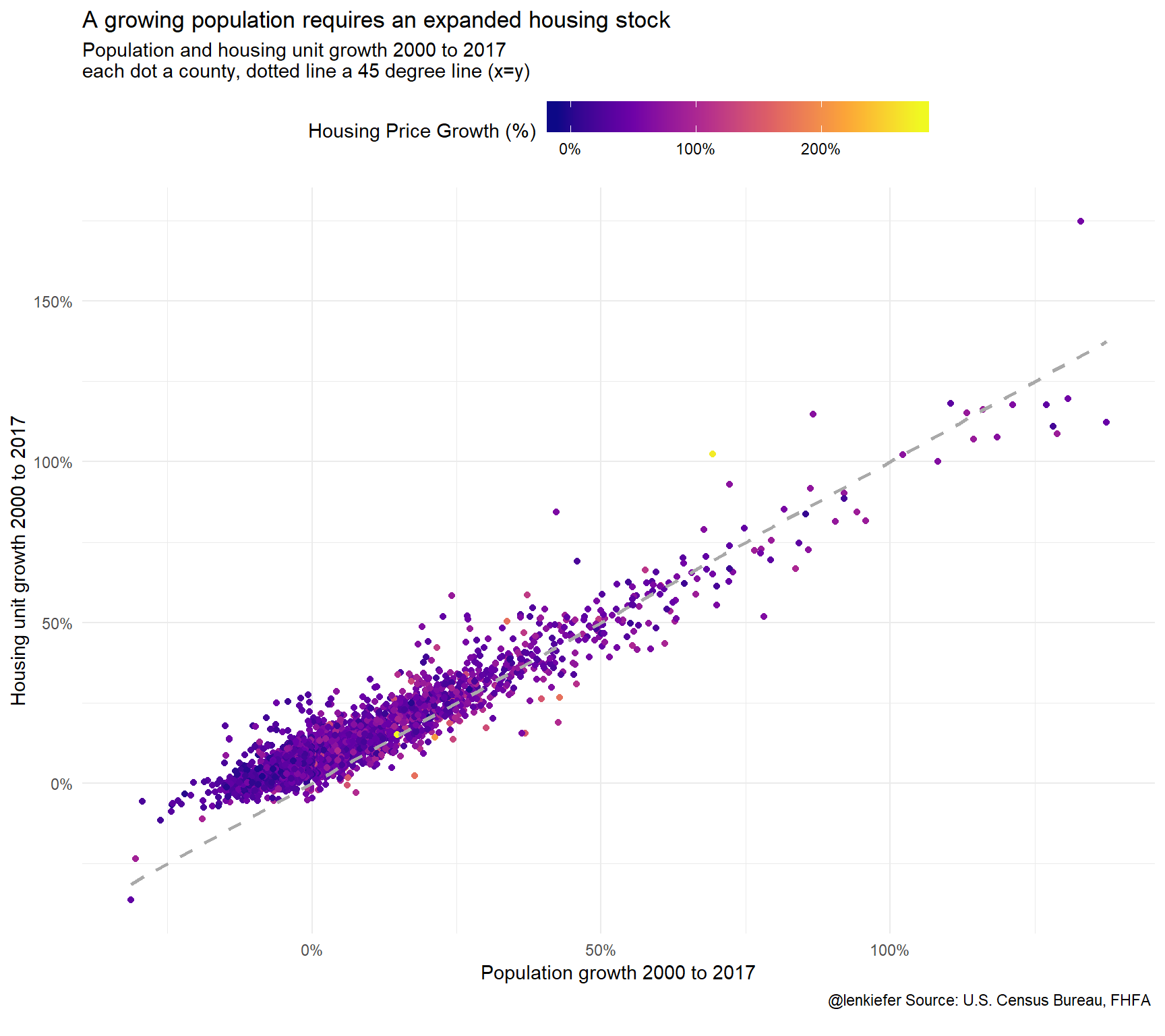
This chart is more interesting than it may appear. I have charted population growth from 2000 to 2017 versus housing unit growth. In percentage terms, the two statistics are nearly on top of one another (the points cluster very close to the 45 degree line). However, the relationship doesn’t hold as well when population shrinks. Absent major demolitions the housing stock tends not to shrink, so the housing unit growth remains generally above 0.
Let’s look a bit closer:
ggplot(data=filter(df2, YEAR==2017, !is.na(county_hpi)), aes(x=POP2000/100-1, y=HU2000/100-1, color=county_hpi/100-1))+
  geom_point()+
  theme_minimal()+
  scale_x_continuous(labels=percent)+scale_y_continuous(labels=percent)+
  scale_color_viridis_c(option="C",name="Housing Price Growth (%)",label=percent)+
  stat_smooth(linetype=2, color="darkgray",fill=NA,method="lm", aes(y=POP2000/100-1), fullrange=T)+
    theme(legend.position="top",
        legend.key.width=unit(1.5, "cm"))+
  labs(title="A growing population requires an expanded housing stock",
       subtitle="Population and housing unit growth 2000 to 2017\neach dot a county, dotted line a 45 degree line (x=y)",
       x="Population growth 2000 to 2017",
        y="Housing unit growth 2000 to 2017",
       caption="@lenkiefer Source: U.S. Census Bureau, FHFA \n")+
  facet_wrap(~paste0("Population Growth >0? ",(POP2000>100)), scales="free")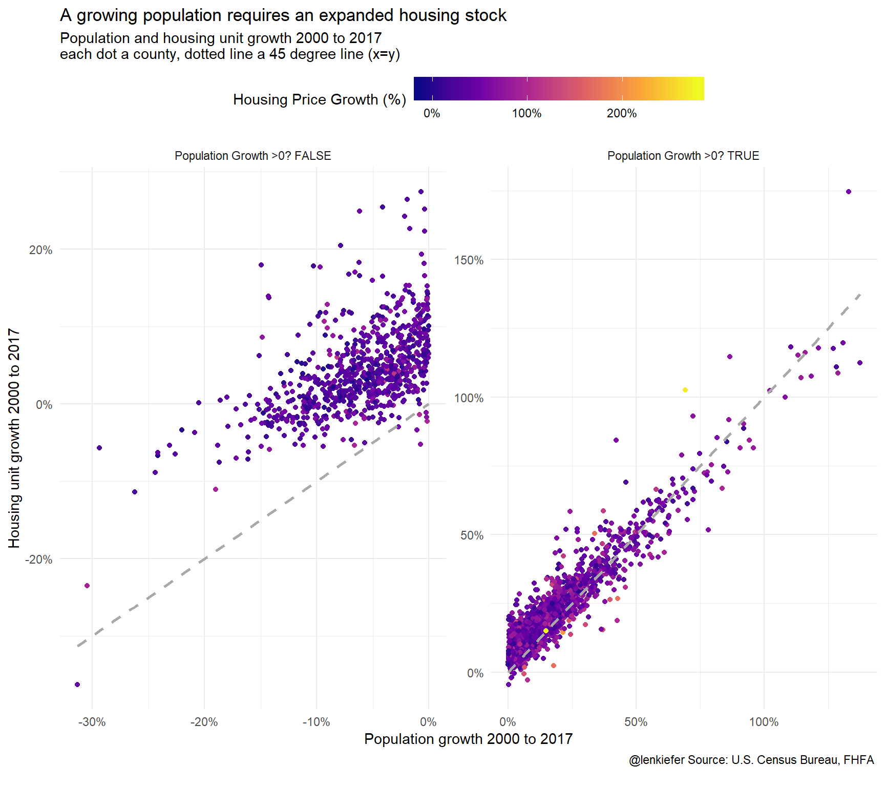
ggplot(data=filter(df2, YEAR==2017, !is.na(county_hpi)), aes(x=POP2000/HU2000-1,  y=county_hpi/100-1))+
  geom_point()+
  theme_minimal()+
  scale_x_continuous(labels=percent)+scale_y_continuous(labels=percent)+
  scale_color_viridis_c(option="C",name="Housing Price Growth (%)",label=percent)+
  stat_smooth(linetype=2, color="darkgray",fill=NA,method="lm",  fullrange=T)+
    theme(legend.position="top",
        legend.key.width=unit(1.5, "cm"))+
  labs(title="Population per housing unit growth and house prices",
       subtitle="2000 to 2017, each dot a county",
       x="Population/Housing Unit growth 2000 to 2017",
        y="House Price Growth",
       caption="@lenkiefer Source: U.S. Census Bureau, FHFA \n")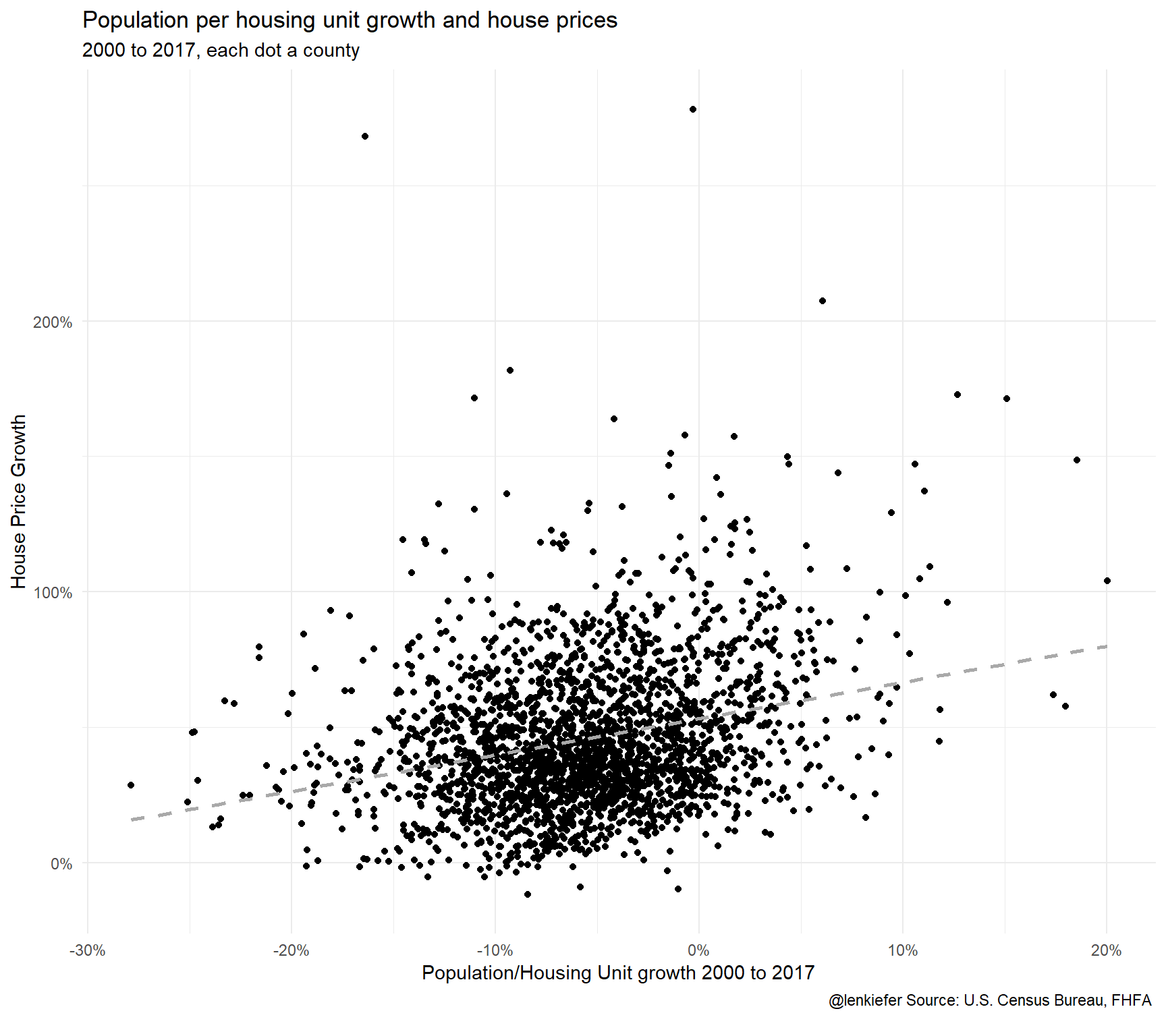
There seems to be some relationship, but it’s noisy and hard to see what is going on exactly with so many points. Let’s look closer.
Looking local
Let’s look at how population and housing units have grown in the Washington D.C. metro area (msa codes 47894 and 43524).
Prepare map
We can use the tigris package to make a map.
library(tigris)

us_geoc <- counties(cb=TRUE)
us_geoc$id <- rownames(us_geoc@data)
us_geocf <- fortify(us_geoc)
us_geocf     <- left_join(us_geocf,us_geoc@data, by="id")
# drop outside long(-125,67)  & lat(24,49)
us_geocf48<- filter(us_geocf, long > -125 & long < 67 & lat > 25 & lat < 50))
mdata <- left_join(filter(df, msa_code %in% c(47894,43524),YEAR==2017), us_geocf48, by=c("FIPS"="GEOID"))
ggplot(data=mdata ,
aes(x=long,y=lat, map_id=id, group=group))+
geom_polygon(color="white", aes(fill=POP/HU))+theme_map()+
geom_text_repel(data=mdata %>% group_by(group,id,FIPS, county_name,state_name) %>%
summarize(lat=median(lat),long=median(long)),
aes(label=paste0(county_name,", ",state_name, " ")), size=3)+
scale_fill_viridis_c(name="Population per housing unit")+
theme(legend.position="top",
legend.key.width=unit(1.75, "cm"))+
labs(title="Population per housing unit in the Washington D.C. Metro area",
subtitle="2017 \n",
caption="@lenkiefer Source: U.S. Census Bureau \n")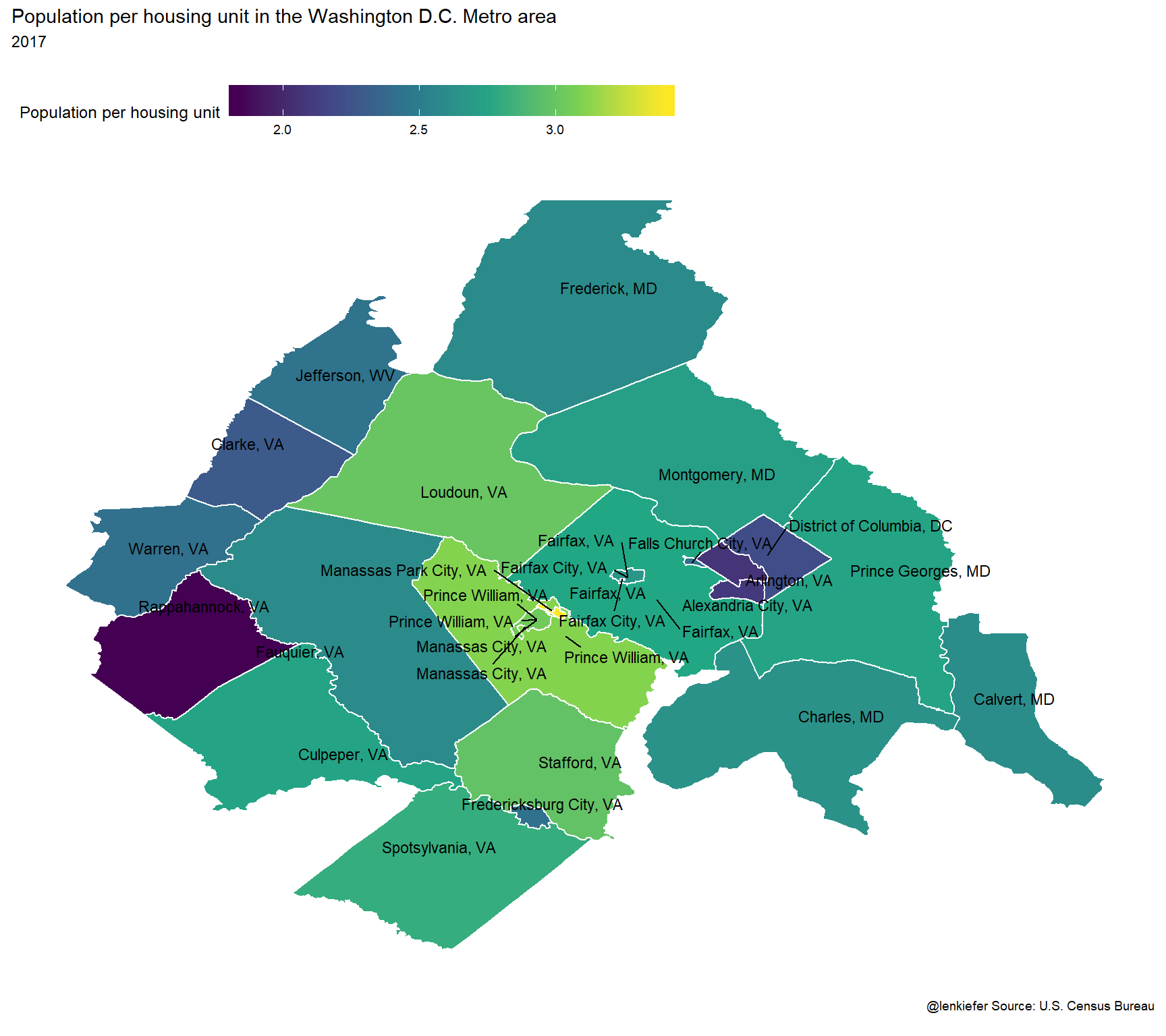
Then:
mdata <- left_join(filter(df, msa_code %in% c(47894,43524),YEAR==2017), us_geocf48, by=c("FIPS"="GEOID"))

ggplot(data=mdata ,
       aes(x=long,y=lat, map_id=id, group=group))+
  geom_polygon(color="white", aes(fill=POP2000/100-1))+theme_map()+
  geom_text_repel(data=mdata %>% group_by(group,id,FIPS, county_name,state_name) %>%
                    summarize(lat=median(lat),long=median(long)),
                  aes(label=paste0(county_name,", ",state_name, " ")), size=3)+
  scale_fill_viridis_c(name="Population Growth 2000 to 2017 (%)",labels=scales::percent)+
  theme(legend.position="top",
        legend.key.width=unit(1.75, "cm"))+
  labs(title="County Population Growth in the Washington D.C. Metro area\n",
       caption="@lenkiefer Source: U.S. Census Bureau \n")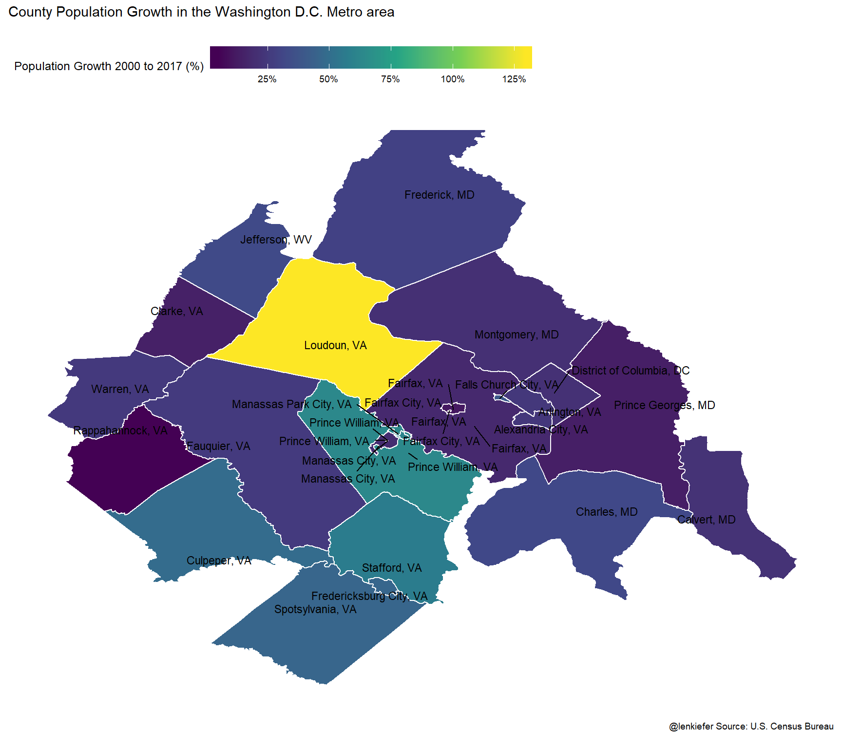
Loudon County has the most population growth over this period. Did the housing stock keep pace? Let’s chart the growth rate of population relative to the growth in housing units.
ggplot(data=mdata ,
       aes(x=long,y=lat, map_id=id, group=group))+
  geom_polygon(color="white", aes(fill=POP2000/HU2000-1))+theme_map()+
  geom_text_repel(data=mdata %>% group_by(group,id,FIPS, county_name,state_name) %>%
                    summarize(lat=median(lat),long=median(long)),
                  aes(label=paste0(county_name,", ",state_name, " ")), size=3)+
  scale_fill_viridis_c(name="Ratio: Population Growth to\nHousing Unit Growth\n2000 to 2017 (%)",labels=scales::percent)+
  theme(legend.position="top",
        legend.key.width=unit(1.75, "cm"))+
  labs(title="Where did the population grow faster than housing supply?",
    subtitle="County population per housing Unit growth in the Washington D.C. Metro area\nAreas in yellow(purple) had more (less) population growth than housing unit growth\n",
       caption="@lenkiefer Source: U.S. Census Bureau \n")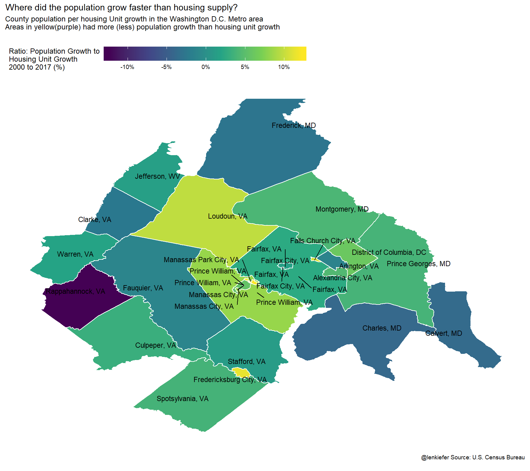
And house prices?
ggplot(data=mdata ,
       aes(x=long,y=lat, map_id=id, group=group))+
  geom_polygon(color="white", aes(fill=county_hpi/100-1))+theme_map()+
  geom_text_repel(data=mdata %>% group_by(group,id,FIPS, county_name,state_name) %>%
                    summarize(lat=median(lat),long=median(long)),
                  aes(label=paste0(county_name,", ",state_name, " ")), size=3)+
  scale_fill_viridis_c(name="House Price Growth 2000 to 2017 (%)",labels=scales::percent)+
  theme(legend.position="top",
        legend.key.width=unit(1.75, "cm"))+
  labs(title="House Price Growth 2000 to 2017 in Washington D.C. Metro Area\n",

       caption="@lenkiefer Source: FHFA \n")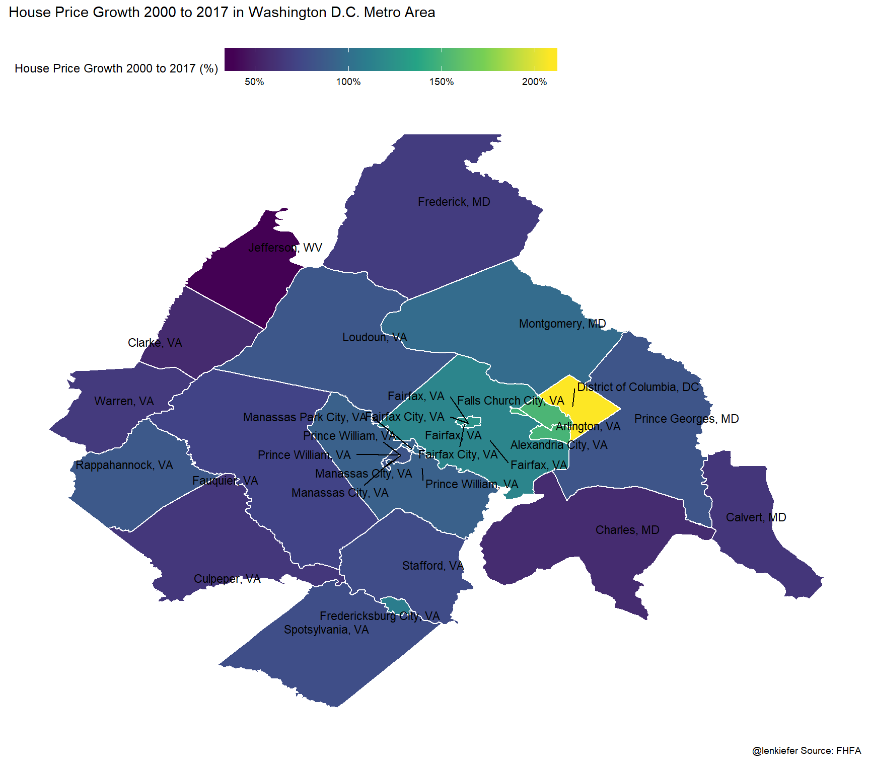
Now let’s build a scatterplot comparing house prices to growth in the ratio of population per housing unit.
ggplot(data=filter(df2, YEAR==2017,  msa_code %in% c(47894,43524)), aes(x=POP2000/HU2000-1,  y=county_hpi/100-1))+
  geom_point()+
  theme_minimal()+
  scale_x_continuous(labels=percent)+scale_y_continuous(labels=percent)+
  scale_color_viridis_c(option="C",name="Housing Price Growth (%)",label=percent)+
  stat_smooth(linetype=2, color="darkgray",fill=NA,method="lm",  fullrange=T)+
    theme(legend.position="top",
        legend.key.width=unit(1.5, "cm"))+
  labs(title="Population per housing unit growth and house prices",
       subtitle="Washington D.C. metro area, 2000 to 2017, each dot a county",
       x="Population/Housing Unit growth 2000 to 2017",
        y="House Price Growth",
       caption="@lenkiefer Source: U.S. Census Bureau, FHFA \n")+
    geom_text_repel(aes(label=county_name))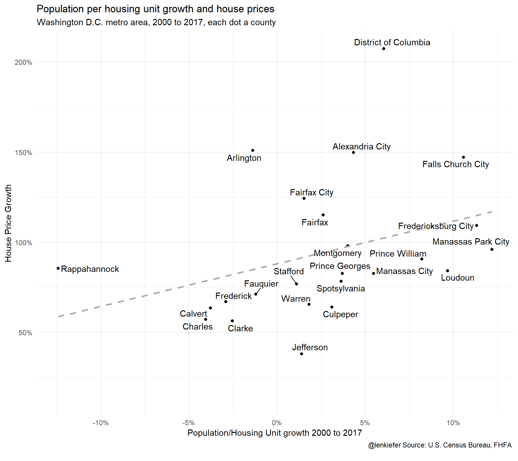
For the most part, the counties lie along the regression line, with the District of Columbia being a notable exception.
Tracing the time path
I think it’s very interesting to trace a time path of the relationship between population, housing units and house prices. We can do that by drawing a connected scatterplot for each county.
First, just for the District of Columbia:
ggplot(data=filter(df2,   msa_code %in% c(47894,43524),

                   county_name %in% c("District of Columbia") ),
       aes(x=POP2000/HU2000-1,  y=county_hpi/100-1, group=county_name))+
  geom_path()+
  geom_point(shape=21, fill="white",size=2)+
  theme_minimal()+
  scale_x_continuous(labels=percent)+scale_y_continuous(labels=percent)+
  theme(legend.position="none")+
  labs(title="Population per housing unit growth and house prices",
       subtitle="Washington D.C. metro area 2000 to 2017\neach dot a year, lines trace pace from 2000 to 2017",
       x="Population/Housing Unit growth 2000 to 2017",
       y="House Price Growth",
       caption="@lenkiefer Source: U.S. Census Bureau, FHFA \n")+
    geom_point(data=. %>% filter(YEAR==2017), color="red",size=3)+
      geom_point(data=. %>% filter(YEAR==2000), color="black",size=3)+
  geom_text_repel(
                  aes(label=YEAR))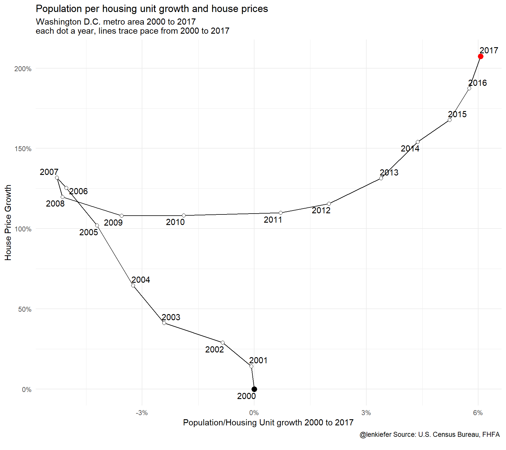
This chart tells an interesting story. For 2000 to 2007 the housing supply in the District of Columbia expanded faster than the population (line moves left). Then after the Great Recession, housing construction collapses and population per housing unit increased as population growth outpaced the expansion of the housing stock (line moves right). Throughout (nominal/not inflation-adjusted) house prices generally increased except for the years around the Great Recession.
How did it look in a few other counties in the Washington D.C. metro area.
ggplot(data=filter(df2,   msa_code %in% c(47894,43524),

                   county_name %in% c("Arlington", "Alexandria City", "Falls Church City", "Fairfax","District of Columbia","Montgomery","Loudoun","Prince Georges") ),
       aes(x=POP2000/HU2000-1,  y=county_hpi/100-1, group=county_name, color=county_name))+
  geom_path()+
  theme_minimal()+
  scale_x_continuous(labels=percent)+scale_y_continuous(labels=percent)+
  theme(legend.position="none")+
  labs(title="Population per housing unit growth and house prices",
       subtitle="Washington D.C. metro area 2000 to 2017\nlines trace pace from 2000 to 2017",
       x="Population/Housing Unit growth 2000 to 2017",
       y="House Price Growth",
       caption="@lenkiefer Source: U.S. Census Bureau, FHFA \n")+
  geom_text_repel(data=. %>% filter(YEAR==2017),
                  aes(label=county_name))+
  geom_point(data=. %>% filter(YEAR==2017))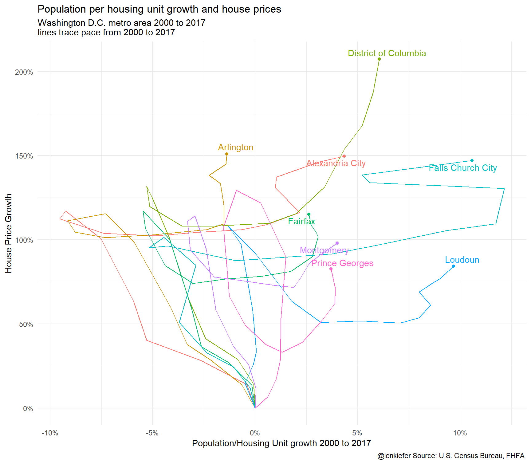
Lots going on here. We’ll explore more next time.