My studies involve a lot of data organized in space and across time. I look at housing data that usually captures activity around the United States, or sometimes the world, and almost always over time.
In my data visualization explorations I like to study different ways to visualize trends across both space and time, often simultaneously.
Let’s consider a couple here in this post. Per usual we will make our graphics with R.
Data
For today’s post we’ll look at data on the U.S. housing stock from the U.S. Census Bureau. We’ll look at housing vacancies from the Housing Vacancy Survey. We can get state vacancy rates from table 5a here.
We will also consider state population and housing unit totals. We can get estimates from 2010 to 2017 here for housing units and here for population. We can also get intercensal estimates from 2000 to 2010 here for housing units and here for population.
Get data
I ended up combining these estimates in a spreadsheet and loading them into R.
Click for R code
# Load libraries ----
suppressPackageStartupMessages({
library(tidyverse)
library(fiftystater)
  library(geofacet)

})

# load data ----

load("data/housing_Aug2018.Rdata")
Our data has 5 variables in addition to year and state indicators. We may use some of the others in a future post.
The data includes a variable var that indicates one of 5 variables:
- hsk is housing stock (# of units)
- pop is population
- pph is population per housing unit
- vac is year-round vacancy rate
- hpi2000 is FHFA purchase-only index (in Q4) normalized so 2000 = 100
head(hdf %>% arrange(year,var,-value))## # A tibble: 6 x 6
## FIPS state statecode year var value
## <dbl> <chr> <chr> <dbl> <chr> <dbl>
## 1 2 Alaska AK 2000 hpi2000 100
## 2 1 Alabama AL 2000 hpi2000 100
## 3 5 Arkansas AR 2000 hpi2000 100
## 4 4 Arizona AZ 2000 hpi2000 100
## 5 6 California CA 2000 hpi2000 100
## 6 8 Colorado CO 2000 hpi2000 100#list of variable
unique(hdf$var)## [1] "hsk" "pop" "pph" "vac" "hpi2000"Facets in time: small multiple choropleth
Let’s plot the year-round vacancy rate in 2017. We’ll use a choropleth map to visualize the variation in vacancy rates around the United States.
Note that Robert Allison over at SAS points out that small multiples might be too small sometimes. That could be the case, as we’ll see below.
For now, let’s make one map. As in a post from earlier this month we’ll use the fiftystater library to make a simple choropleth map for the U.S.
Click for R code
g.map<-
ggplot(data=filter(hdf, var=="vac",year==2017), aes(map_id=tolower(state)))+
  geom_map(aes(fill=value), map=fifty_states)+
  expand_limits(x = fifty_states$long, y = fifty_states$lat) +
  coord_map() +
  scale_x_continuous(breaks = NULL) +
  scale_y_continuous(breaks = NULL) +
  labs(x = "", y = "", title="Year-round vacancy rate by state",
       subtitle=paste0("",2017),
       caption="@lenkiefer Source: U.S. Census Bureau Housing Vacancies and Homeownership (CPS/HVS)") +
  theme(legend.position = "bottom",
        plot.title=element_text(hjust=0),
        plot.caption=element_text(hjust=0),
        legend.key.width=unit(2,"cm"),
        panel.background = element_blank())+
  scale_fill_distiller(palette="PuRd",type="seq",direction=1, name="Vacancy Rate (%) ")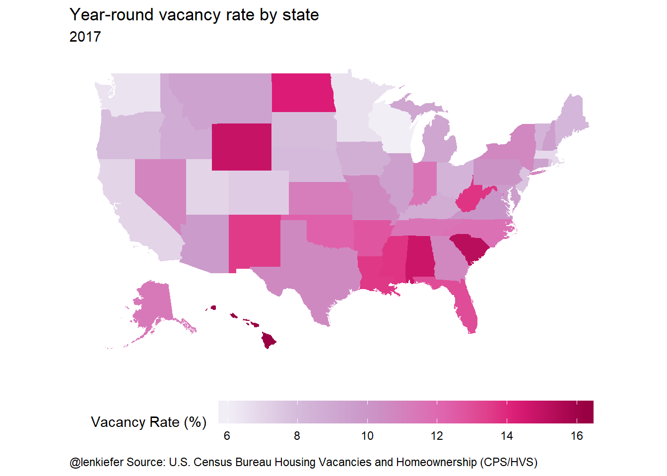
We can use ggplot’s facet_wrap to visualize over time. We’ll make a small multiple with one map for each year.
Click for R code and big plot
ggplot(data=filter(hdf, var=="vac",year>=2006), aes(map_id=tolower(state)))+
  geom_map(aes(fill=value), map=fifty_states)+
  expand_limits(x = fifty_states$long, y = fifty_states$lat) +
  coord_map() +
  scale_x_continuous(breaks = NULL) +
  scale_y_continuous(breaks = NULL) +
  labs(x = "", y = "", title="Year-round vacancy rate by state",
       subtitle=paste0("",2017),
       caption="@lenkiefer Source: U.S. Census Bureau Housing Vacancies and Homeownership (CPS/HVS)") +
  theme(legend.position = "bottom",
        plot.title=element_text(hjust=0),
        plot.caption=element_text(hjust=0),
        legend.key.width=unit(2,"cm"),
        panel.background = element_blank())+
  scale_fill_distiller(palette="PuRd",type="seq",direction=1, name="Vacancy Rate (%) ")+
  facet_wrap(~year)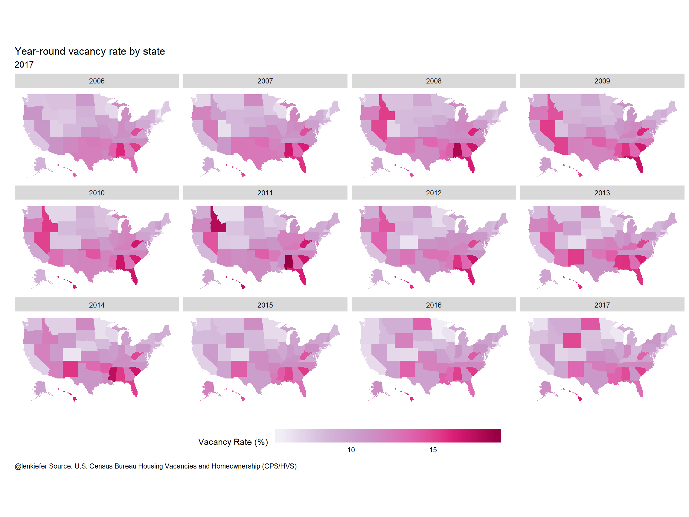
Facets in space: geofacets
Another type of graphic we have used before is geofacets. We can make geofacet plots using the geofacet library.
Click for R code and big plot
ggplot(data=filter(hdf, var=="vac",statecode !="US",year>=2006),aes(x=year,y=value,fill=value))+
  geom_col()+
  labs(x = "", y = "", title="Year-round vacancy rate by state",
       caption="@lenkiefer Source: U.S. Census Bureau Housing Vacancies and Homeownership (CPS/HVS)") +
  facet_geo(~state)+
  theme_minimal(base_size=18)+
  theme(legend.position = "bottom",
        plot.title=element_text(hjust=0),
        plot.caption=element_text(hjust=0),
        axis.text=element_text(size=8),
        strip.text=element_text(size=10),
        legend.key.width=unit(2,"cm"),
        panel.background = element_blank())+
  scale_fill_distiller(palette="PuRd",type="seq",direction=1, name="Year-round vacancy Rate (%) ")+
  scale_x_continuous(breaks=c(2006,2012,2017),labels=c("'06","'12","'17"))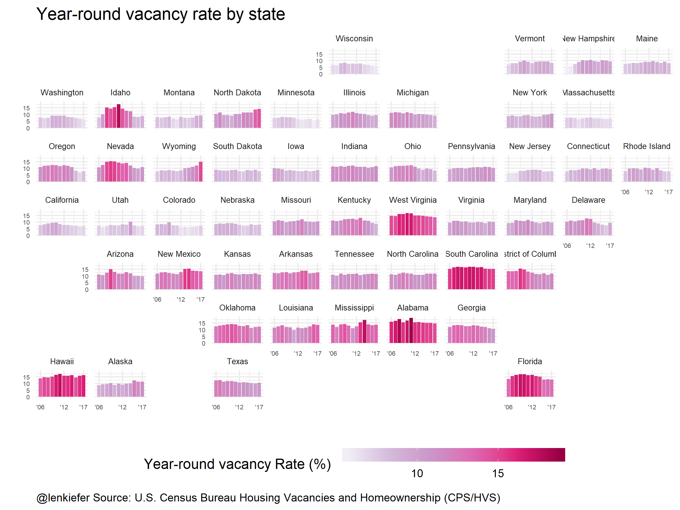
Both the small multiple choropleth and the geofacet map can be useful. Which do you like better?
Another example
While we’ve got these data handy, let’s take a look at estimates of population per housing unit. First, a geofacet plot:
Click for R code and big plot
ggplot(data=filter(hdf, var=="pph"), aes(x=year,y=value))+
  facet_geo(~statecode)+
  geom_line(color="#c51b8a")+  theme_minimal(base_size=18)+
  scale_x_continuous(breaks=c(2000,2009,2017),labels=c("'00","'09","'17"))+
  labs(x="",y="",title="Population per housing unit",
       caption="@lenkiefer Source: U.S. Census Bureau\nAnnual Estimates of Population and Housing Units for the United States, Regions, Divisions, States, and Counties: April 1, 2010 to July 1, 2017\nPopulation and Housing Units Intercensal Tables: 2000-2010 ") +
  theme(legend.position = "bottom",
        plot.title=element_text(hjust=0),
        plot.caption=element_text(hjust=0,size=9),
        axis.text=element_text(size=8),
        strip.text=element_text(size=10),
        legend.key.width=unit(2,"cm"),
        panel.background = element_blank())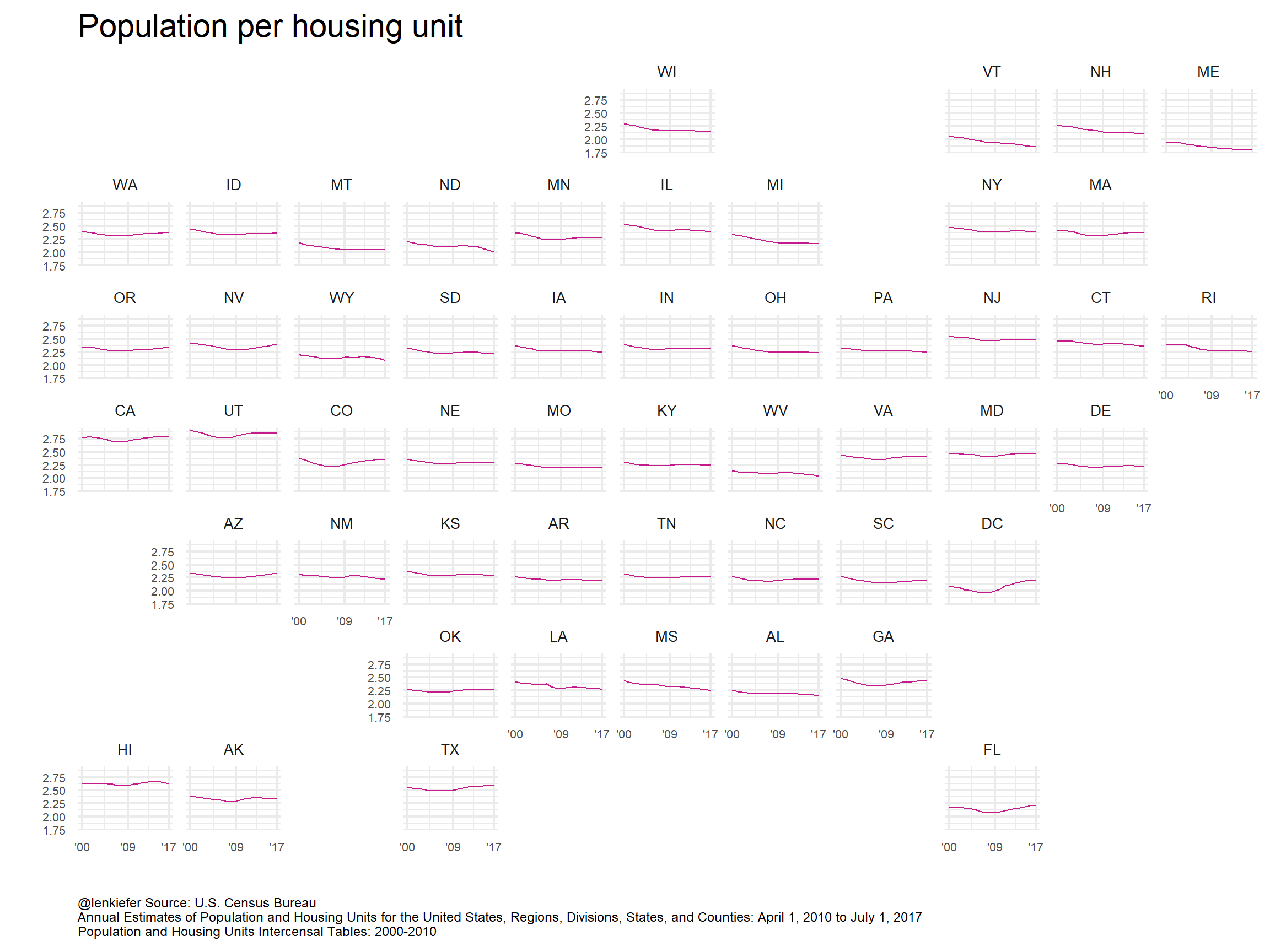
Interesting, but in this case we might follow Robert Allison’s lead and make a medium multiple. It will help to drop a few states and just focus on the largest states:
Click for R code
g<-
ggplot(data=filter(hdf,statecode %in% c("US","TX","CA","FL","NY","PA"), var=="pph"),
       aes(x=year,y=value,group=statecode,color=statecode, label=statecode))+
  geom_line()+geom_point()+
  ggrepel::geom_text_repel(data= .%>% filter(year==max(year)))+

  scale_color_brewer(palette="Dark2",type="seq",direction=1)+
  theme_minimal()+
  labs(x="",y="",title="Population per housing unit",
       subtitle="5 large states and the U.S.",
       caption="@lenkiefer Source: U.S. Census Bureau\nAnnual Estimates of Population and Housing Units for the United States, \nRegions, Divisions, States, and Counties: April 1, 2010 to July 1, 2017\nPopulation and Housing Units Intercensal Tables: 2000-2010 ") +
  theme(legend.position = "none",
        plot.title=element_text(hjust=0),
        plot.caption=element_text(hjust=0),
        legend.key.width=unit(2,"cm"),
        panel.background = element_blank())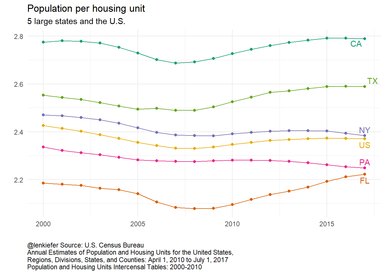
What’s going on here? That would make for an excellent follow-up.