In this post I want to share updated plots comparing house price trends around the world. Or at least part of the world. Our view will be somewhat limited, based on data, but will at least allow us to see how U.S. house prices compare to a few other countries.
The details behind these plots are explained in more detail in this post, but some of the images were lost due to my blog transition. No worries, I’ll post updated code and a few animated gifs here.
Data come from the Federal Reserve Bank of Dallas’s International House Price Database. Read the methodology there for details on the data.
First some plots:
Now some R code.
You can get the data via the Dallas Fed. It comes as an Excel spreadsheet hp1801.xls file. I saved it in my data directory and the proceeded from there following the steps outlined in more detail here.
Load & Prepare Data Details
# libraries
suppressPackageStartupMessages({
  library(tidyverse)
  library(readxl)
  library(gifski)
  library(data.table)
  library(ggthemes)
  library(lubridate)
  library(stringr)
  })

# load data (spreadsheet saved in data folder)
# can get via Dallas Fed at https://www.dallasfed.org/~/media/documents/institute/houseprice/hp1801.xlsx

#### Read in HPI data ----
df<-read_excel("data/hp1801.xlsx", sheet = "HPI")
colnames(df)[1]<-"cycle"  # rename first column
df$year<-substr(df$cycle,1,4) #create a year
df$month<-as.numeric(substr(df$cycle,7,7))*3 #create a
df$date<-as.Date(ISOdate(df$year,df$month,1))
df %>% select(-X__2,-cycle,-year,-month) %>%
  gather(country,hpi,-date) ->hpi.df

#### Read in Real HPI data  ----
df<-read_excel("data/hp1801.xlsx", sheet = "RHPI")
colnames(df)[1]<-"cycle"
df$year<-substr(df$cycle,1,4)
df$month<-as.numeric(substr(df$cycle,7,7))*3
df$date<-as.Date(ISOdate(df$year,df$month,1))
df %>% select(-X__2,-cycle,-year,-month) %>%
  gather(country,rhpi,-date) ->rhpi.df

#### Read in Disposable Income data  ----
df<-read_excel("data/hp1801.xlsx", sheet = "PDI")
colnames(df)[1]<-"cycle"
df$year<-substr(df$cycle,1,4)
df$month<-as.numeric(substr(df$cycle,7,7))*3
df$date<-as.Date(ISOdate(df$year,df$month,1))
df %>% select(-X__2,-cycle,-year,-month) %>%
  gather(country,pdi,-date) ->pdi.df

#### Read in Rea Disposable Income data  ----
df<-read_excel("data/hp1801.xlsx", sheet = "RPDI")
colnames(df)[1]<-"cycle"
df$year<-substr(df$cycle,1,4)
df$month<-as.numeric(substr(df$cycle,7,7))*3
df$date<-as.Date(ISOdate(df$year,df$month,1))
df %>% select(-X__2,-cycle,-year,-month) %>%
  gather(country,rpdi,-date) ->rpdi.df

#### Merge data together data  ----
#  Requires data.table() package

dt<-merge(hpi.df,rhpi.df,by=c("date","country"))
dt<-merge(dt,pdi.df,by=c("date","country"))
dt<-merge(dt,rpdi.df,by=c("date","country"))
dt<-data.table(dt)[year(date)>0,]
df3<-dt

#create a caption for attribution to source

mycaption<-"Mack, A., and E. Martinez-Garcia. 2011. 'A Cross-Country Quarterly Database of Real House Prices: A Methodological Note.' Globalization and Monetary Policy Institute Working Paper No. 99, Federal Reserve Bank of Dallas."
mycaption<-str_wrap(mycaption,width=80) #wrap the caption
mycap1<-"@lenkiefer Source: Dallas Federal Reserve International House Price Database  http://www.dallasfed.org/institute/houseprice/"  #caption part 2

# data for plots
clist<-c("US","UK","Canada","Australia","France","Germany")
dt2<-data.table(dt)[year(date)>1974 & country %in% clist,]
dlist<-unique(dt2[year(date)>1999]$date)
N<-length(dlist)

# rescale data ----
dt3 <- dt2 %>%
  group_by(country) %>%
  mutate(hpi=100*hpi/hpi[date=="2000-03-01"],
         rhpi=100*rhpi/rhpi[date=="2000-03-01"]) %>%
  ungroup() %>% data.table
With our data ready we can create two functions that we will iterate over to generate our gif. Plotting function details
# plot for real hpi
rhpi.plot<-function(i=1){
  ggplot(data=dt3[year(date)>1999 &
                    date<=dlist[i] &
                    country %in% clist],
         aes(x=date,y=rhpi,color=country,linetype=country,label=country))+
    geom_line(size=1.1)+
    scale_x_date(breaks=seq(dlist[1],dlist[N]+years(1),"1 year"),
                 date_labels="%Y",limits=c(dlist[1],dlist[N]+years(1)))+
    geom_text(data=dt3[date==dlist[i] &
                         country %in% clist],
              hjust=0,nudge_x=30,size=2.5)+
    theme_minimal()+ geom_hline(yintercept=100,linetype=2)+
    scale_y_log10(breaks=seq(50,300,50),limits=c(80,275))+
    theme_fivethirtyeight()+
    theme(legend.position="none",
          plot.caption=element_text(hjust=0,size=7),
          plot.subtitle=element_text(face="italic"))+
    labs(x="",y="",title="Global house price trends through 2018Q1",
         caption=paste0(mycap1,"\n",mycaption),
         subtitle="Seasonally adjusted real house price index (2000Q1=100, log scale)")
}

# code for nominal hpi
hpi.plot<-function(i=1){
  ggplot(data=dt3[year(date)>1999 &
                   date<=dlist[i] &
                   country %in% clist],
         aes(x=date,y=hpi,color=country,linetype=country,label=country))+
    geom_line(size=1.1)+
    scale_x_date(breaks=seq(dlist[1],dlist[N]+years(1),"1 year"),
                 date_labels="%Y",limits=c(dlist[1],dlist[N]+years(1)))+
    geom_text(data=dt3[date==dlist[i] &
                        country %in% clist],
              hjust=0,nudge_x=30,size=2.5)+
    theme_minimal()+ geom_hline(yintercept=100,linetype=2)+
    scale_y_log10(breaks=seq(100,400,50),limits=c(90,400))+
    theme_fivethirtyeight()+
    theme(legend.position="none",
          plot.caption=element_text(hjust=0,size=7),
          plot.subtitle=element_text(face="italic"))+
    labs(x="",y="",title="Global house price trends through 2018Q1",
         caption=paste0(mycap1,"\n",mycaption),
         subtitle="Seasonally adjusted nominal index (2000Q1=100, log scale)")
}
Then we can call these functions:
# N is maximum date (2018Q1)
rhpi.plot(N)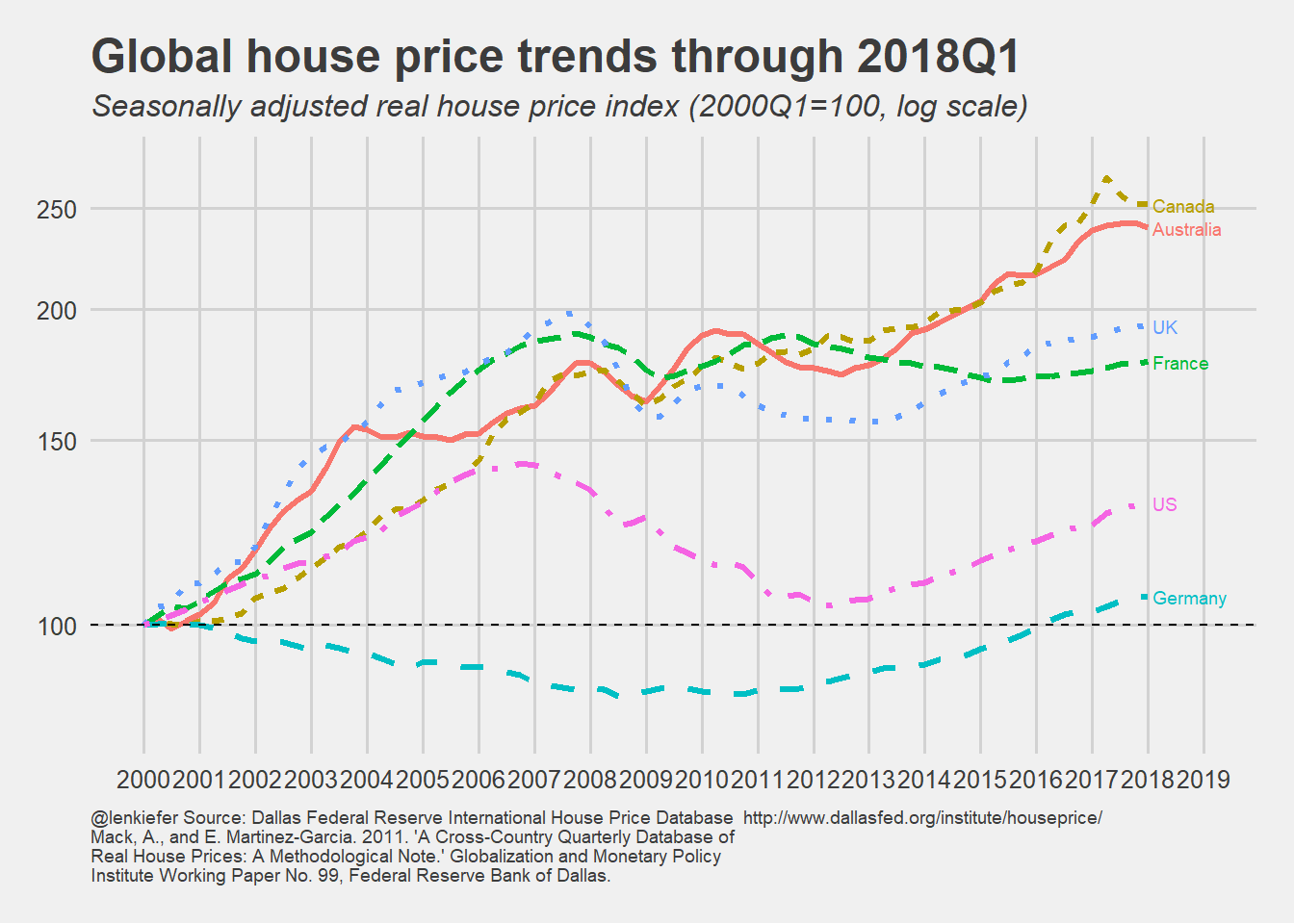
hpi.plot(N)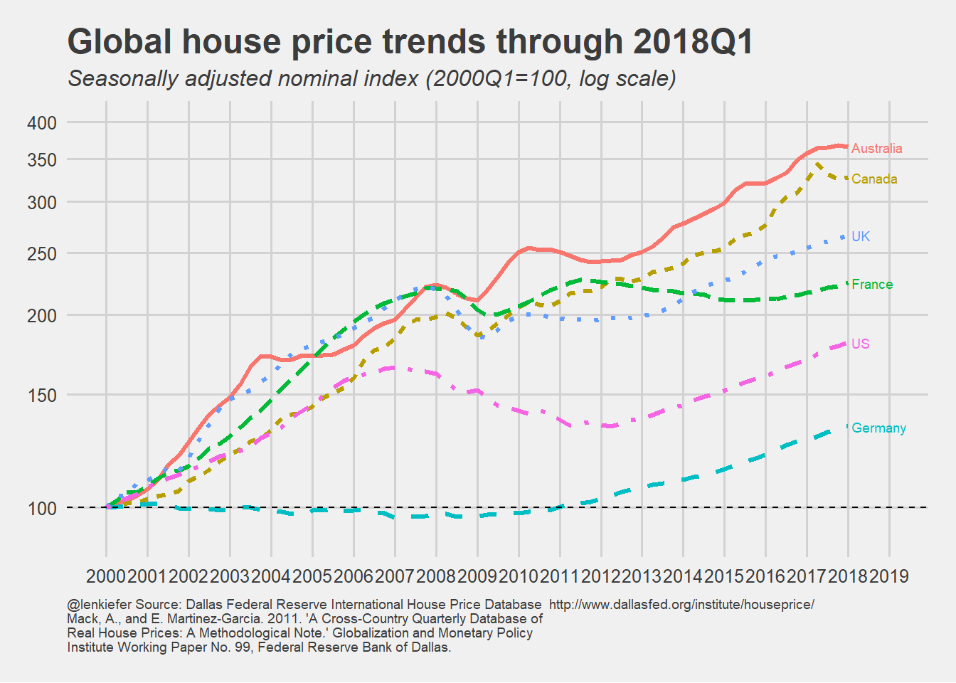
Finally, if we wanted to make the gifs above, we can use gifski and the following code.
Code for gif
# set mydir to a place to save gif
mydir <- PATH_TO_YOUR_DIRECTORY #change

gif_file <- save_gif({for (i in seq(1,N)){
  g<- rhpi.plot(i)
  print(g)
  print(paste(i,"out of",N))
}
  for (ii in 1:20){
    print(g)
    print(paste(ii,"out of",20))
  }
}, gif_file= paste0(mydir,"/global2018Q1_real.gif"),width = 1200, height = 800, res = 144, delay=1/10)
# show your plot:
utils::browseURL(gif_file)

gif_file <- save_gif({for (i in seq(1,N)){
  g<- hpi.plot(i)
  print(g)
  print(paste(i,"out of",N))
}
  for (ii in 1:20){
    print(g)
    print(paste(ii,"out of",20))
  }
}, gif_file= paste0(mydir,"/global2018Q1_v2.gif"),width = 1200, height = 800, res = 144, delay=1/10)
utils::browseURL(gif_file)
Altenative Data Wrangling
We could have skipped some of the steps above by using this code. However, my plots were already set up to use the longer approach so I kept it. But this is a handy bit of code that could come in handy if you have a spreadsheet with data in multiple sheets (it happens).
Alternative data wrangling code
# blink and you might miss it:

df <- c("HPI","RHPI","PDI","RPDI") %>%   #iterate over four sheets ----
  set_names() %>%

  # Now for something magical!

  map_df(~ read_excel(path = path, sheet = .x), .id = "sheet")

df$year<-substr(df$X__1,1,4)
df$month<-substr(df$X__1,7,7)
#quarterly data so multiply month by 3
df$date<-as.Date(ISOdate(df$year,as.numeric(df$month)*3,1))