I try not to use too much jargon (jargon monoxide can be deadly) on this blog. But I’ve got a bit of a technical term I’ve been using the describe U.S. residential construction: super-low.
To be sure, housing construction has been grinding higher, but it’s been taking a while for activity to get back close to historical averages. Once you account for the larger population, which all else equal needs more housing units, the level of construction is quite low.
Take a look at this movie:
R code for this graph is below. This post combines techniques described in more detail in this post on mortgage rates and this post on housing starts. And yes, some of the images in that last post have been lost due to my recent blog makeover. Good news though, the code still works.
Get data
#####################################################################################
## Step 0: Load Libraries ----
#####################################################################################
library(tidyverse)
library(cowplot)
library(lubridate)
library(scales)
library(ggridges)  # replaces ggjoy
library(extrafont)

#####################################################################################
## Step 1: Prepare for data  ----
#####################################################################################

tickers=data.frame(# variable symbols/mnemonics
  symbol = c("HOUST",
             "HOUST1F",
             "HOUST5F"),
  # variable names
  varname = c("Total housing starts",
              "1 unit housing starts",
              "5+ unit housing starts")) %>%
  map_if(is.factor,as.character) %>% # strings as characters
  as.tibble()                        # make a tibble


#####################################################################################
## Step 2: Pull data  ----
#####################################################################################

tickers$symbol %>% tidyquant::tq_get(get="economic.data", from="1960-01-01") -> df

#####################################################################################
## Step 3: Organize data  ----
#####################################################################################

df<-merge(df,tickers,by="symbol")
df %>% mutate( year=year(date),
               month=month(date),
               mname=forcats::fct_reorder(as.character(date, format="%b"),month)) %>%
  group_by(year,symbol) %>%
  arrange(date,symbol) %>%
  mutate(cs = cumsum(price)) %>%
  ungroup() -> df

df3 <- df %>% select(symbol,date,price) %>% spread(symbol,price) %>%
  mutate(yearf=factor(year(date)),year=year(date),decade=paste0(10*floor(year/10),"'s"))

# list of dates
dlist<- unique(df$date)
# number of dates
N <- length(dlist)

## Step 4: function for plot  ----

# Define custom color scales ----


## Make Color Scale ----  ##

my_colors <- c(
  "green"      = rgb(103,180,75, maxColorValue = 256),
  "green2"      = rgb(147,198,44, maxColorValue = 256),
  "lightblue"  =  rgb(9, 177,240, maxColorValue = 256),
  "lightblue2" = rgb(173,216,230, maxColorValue = 256),
  'blue'       = "#00aedb",
  'red'        = "#d11141",
  'orange'     = "#f37735",
  'yellow'     = "#ffc425",
  'gold'       = "#FFD700",
  'light grey' = "#cccccc",
  'purple'     = "#551A8B",
  'dark grey'  = "#8c8c8c")


my_cols <- function(...) {
  cols <- c(...)
  if (is.null(cols))
    return (my_colors)
  my_colors[cols]
}


my_palettes <- list(
  `main`  = my_cols("blue", "green", "yellow"),
  `cool`  = my_cols("blue", "green"),
  `hot`   = my_cols("yellow", "orange", "red"),
  `mixed` = my_cols("lightblue", "green", "yellow", "orange", "red"),
  `mixed2` = my_cols("lightblue2","lightblue", "green", "green2","yellow","gold", "orange", "red"),
  `mixed3` = my_cols("lightblue2","lightblue", "green", "yellow","gold", "orange", "red"),
  `mixed4` = my_cols("lightblue2","lightblue", "green", "green2","yellow","gold", "orange", "red","purple"),
  `mixed5` = my_cols("lightblue","green", "green2","yellow","gold", "orange", "red","purple","blue"),
  `mixed6` = my_cols("green", "gold", "orange", "red","purple","blue"),
  `grey`  = my_cols("light grey", "dark grey")
)


my_pal <- function(palette = "main", reverse = FALSE, ...) {
  pal <- my_palettes[[palette]]

  if (reverse) pal <- rev(pal)

  colorRampPalette(pal, ...)
}


scale_color_mycol <- function(palette = "main", discrete = TRUE, reverse = FALSE, ...) {
  pal <- my_pal(palette = palette, reverse = reverse)

  if (discrete) {
    discrete_scale("colour", paste0("my_", palette), palette = pal, ...)
  } else {
    scale_color_gradientn(colours = pal(256), ...)
  }
}


scale_fill_mycol <- function(palette = "main", discrete = TRUE, reverse = FALSE, ...) {
  pal <- my_pal(palette = palette, reverse = reverse)

  if (discrete) {
    discrete_scale("fill", paste0("my_", palette), palette = pal, ...)
  } else {
    scale_fill_gradientn(colours = pal(256), ...)
  }
}

myf <- function(i=N,var=HOUST, my.ylab=NULL){
  var <-  enquo(var)

  if(missing(my.ylab)) {my.ylab=var}

  myr0 <- function(x, a=0.02){
    geom_ribbon(alpha=a, color=NA, aes(ymin=0,ymax=min(x, !!var )))
  }

  myr <- function(x, a=0.02){
    geom_ribbon(alpha=a, color=NA, aes(ymin=min(x, !!var )))
  }

  ggplot(data=filter(df3, date<=dlist[i]) ,
         aes(x=date,y=!!var, ymax= !! var , fill=decade,color=decade))+
    geom_line(data=df3, alpha=0)+
    geom_ribbon(alpha=0.5, color=NA, aes(ymin=last(!!var)))+
    map(c(0,pull(df3,!!var) %>% min()) %>% pretty(10), myr0, a=0.005)+
    map(c(0,pull(df3,!!var) %>% last()) %>% pretty(10), myr, a=0.025)+
    guides(color=FALSE)+
    geom_hline(aes(yintercept=last(!!var)), linetype=2)+
    geom_line(size=0.85)+
    scale_color_mycol("mixed5")+
    scale_fill_mycol("mixed5")+
    theme_ridges(font_family="Roboto")+
    theme(legend.position="none",
          plot.caption=element_text(size=8, hjust=0))+
    scale_x_date(limits=as.Date(c("1960-01-01","2018-07-15")),date_breaks="10 year",date_labels="%Y",expand=c(0,0))+
    labs(x="",y="Housing Starts: 1000s SAAR",
         subtitle=paste0("Dotted line at last observation for ",as.character(dlist[i],format="%B, %Y")),
         title="U.S. Monthly Housing Starts (1000s, SAAR)",
         caption="@lenkiefer Source: U.S. Census Bureau and Department of Housing and Urban Development\n")

}

## Step 5: Make Plot  ----
print(myf(N))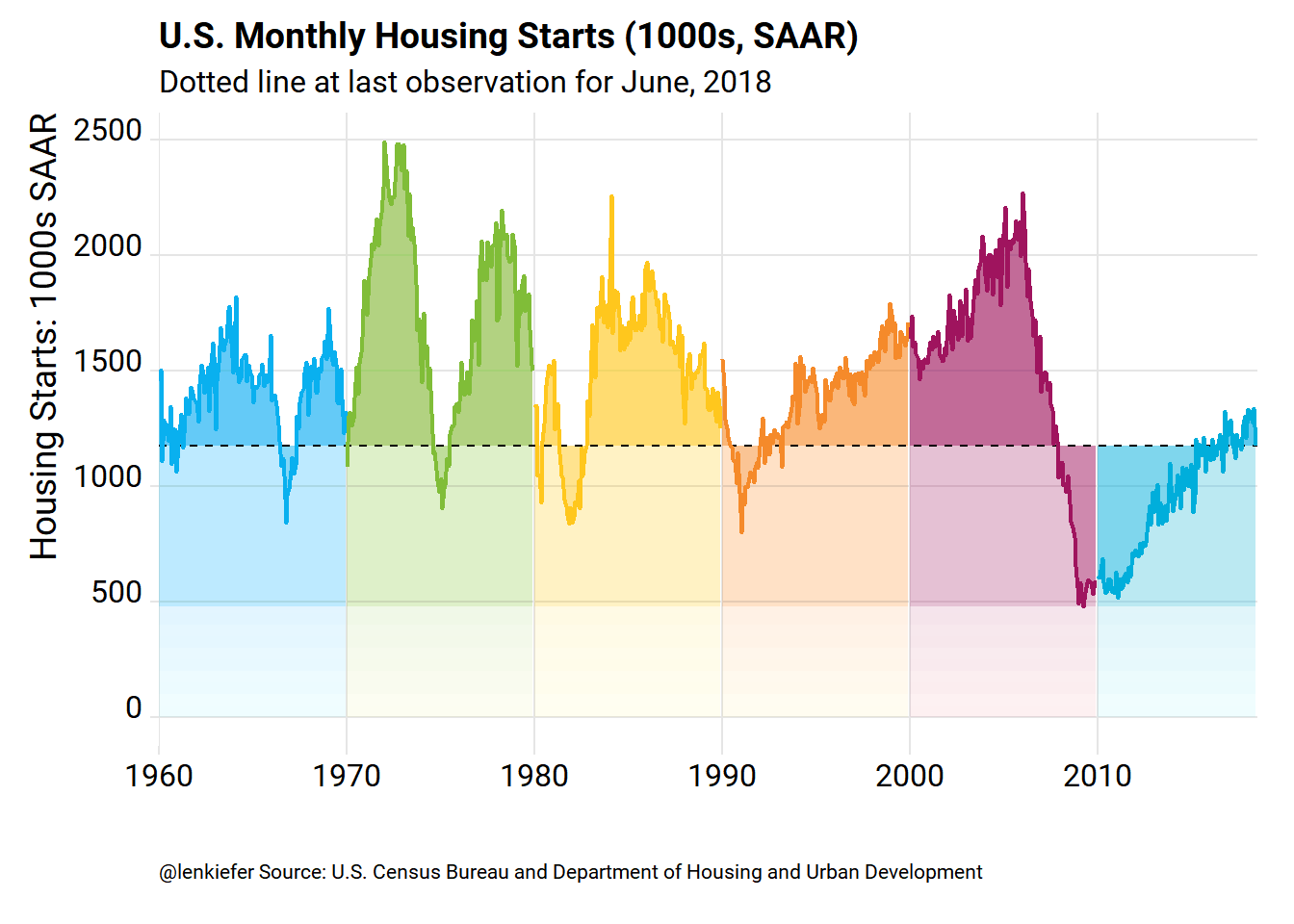
Animate it
To animate it run:
mydir <- path.to.your.directory  #change this

library(animation)
oopt<-ani.options(interval=1/20)
suppressMessages(
  saveGIF({for (i in seq(3,N,3)){
    g<- myf2(i)
    print(g)
    print(paste(i,"out of",N))
    ani.pause()
  }
    for (ii in 1:15){
      print(g)
      ani.pause()
      print(paste(ii,"out of",15))
    }
  }, movie.name = paste0(mydir,"starts.gif"),  ani.width=620, ani.height=400)
)
Make some other plots
While we have all that data we downloaded from FRED let’s use it. Out plotting function comes in handy now.
myf(N, var=HOUST1F)+labs(y="1-unit Housing Starts: 1000s SAAR", title="U.S. Monthly 1-unit Housing Starts (1000s, SAAR)")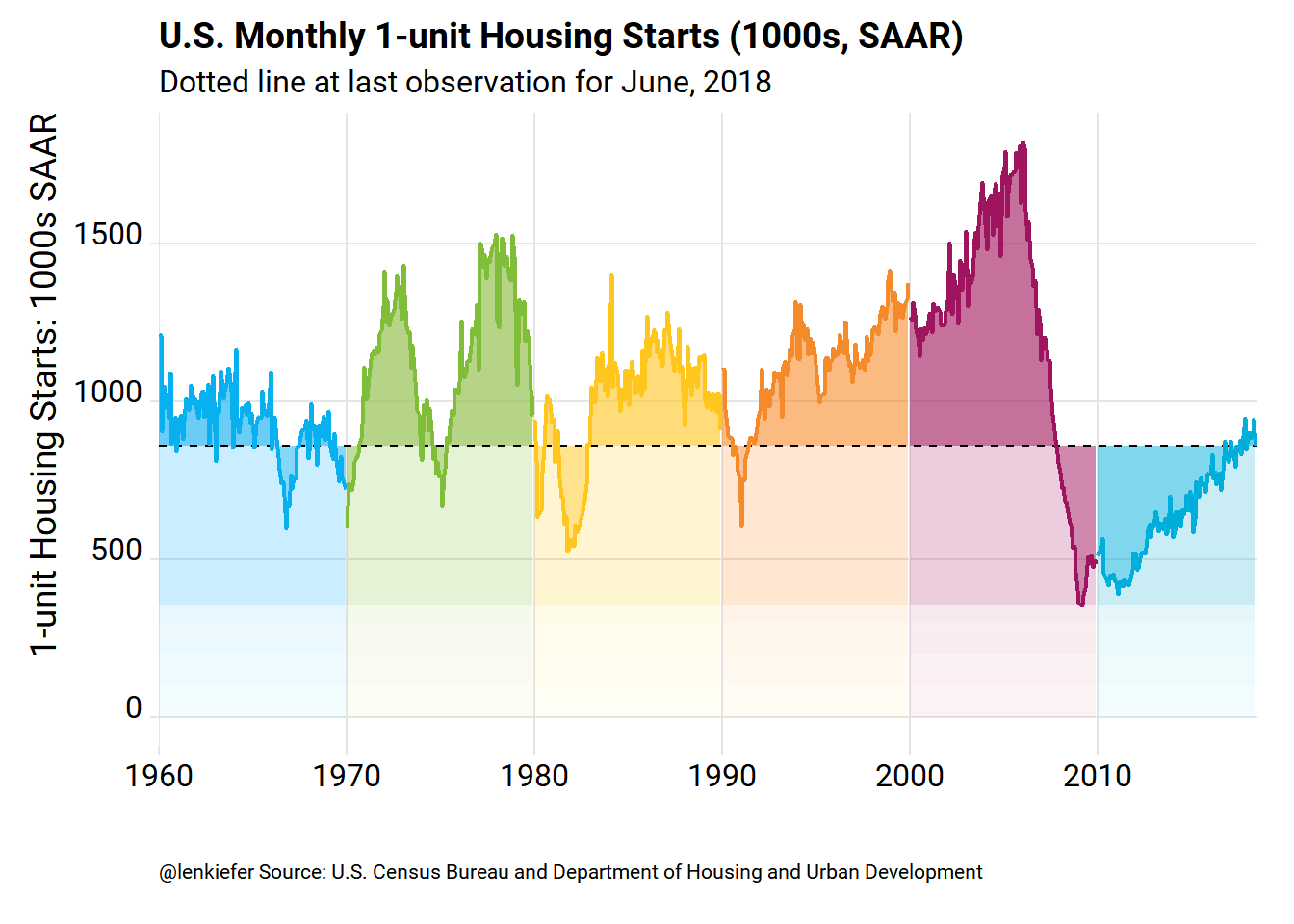
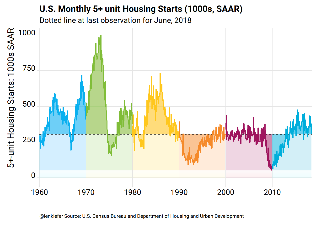
myf(N, var=HOUST5F)+labs(y="5+-unit Housing Starts: 1000s SAAR", title="U.S. Monthly 5+ unit Housing Starts (1000s, SAAR)")