SO TODAY I SPENT SOME TIME WITH THE KIDDOS and contemplated the Enlightenment, so I didn’t have time to write up some code. But I will post a couple images that I think are interesting.
I’ve got two plots for you, both using geofacets. See this post on using the geofacet package in R to make plots like these.
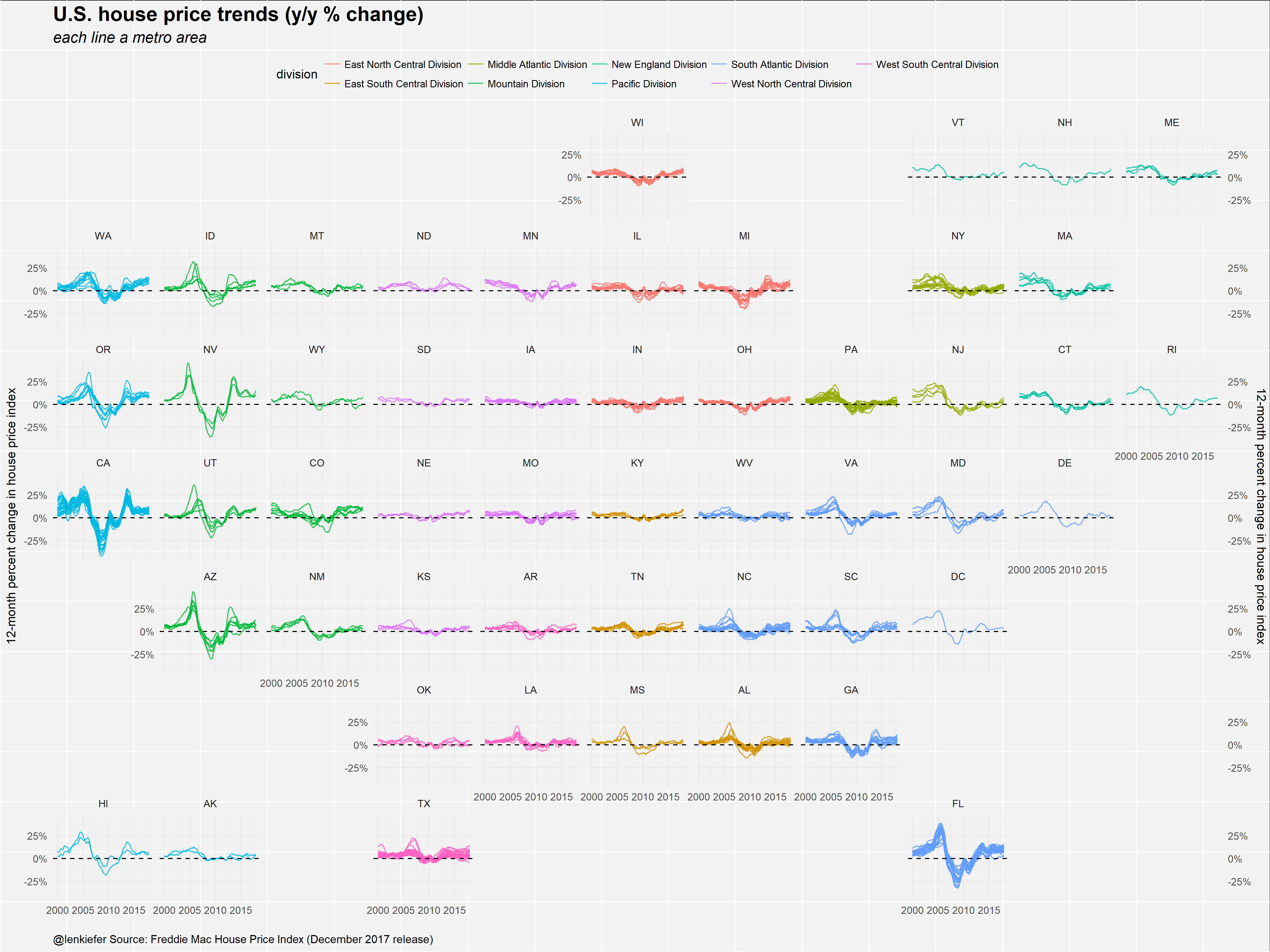
The first plot shows U.S. house price trends by metro area from January 2015 to December 2017. The plot shows 12-month percent changes in a house price index for several metro areas.

This plots show that generally house prices have been accelerating (the year-over-year percent changes have been rising) across much of the country.
There are several other interesting storeis embedded in this plot, which shows the same trens, but zooms out a bit.
We will perhaps have more to say about these in the near future.