I AM WORKING ON ADDING some more analysis around mortgage origination trends (see here for a high level summary).
It’s on the way, but let me just leave a few graphs for you. These are updated versions of the same ones we made last year.
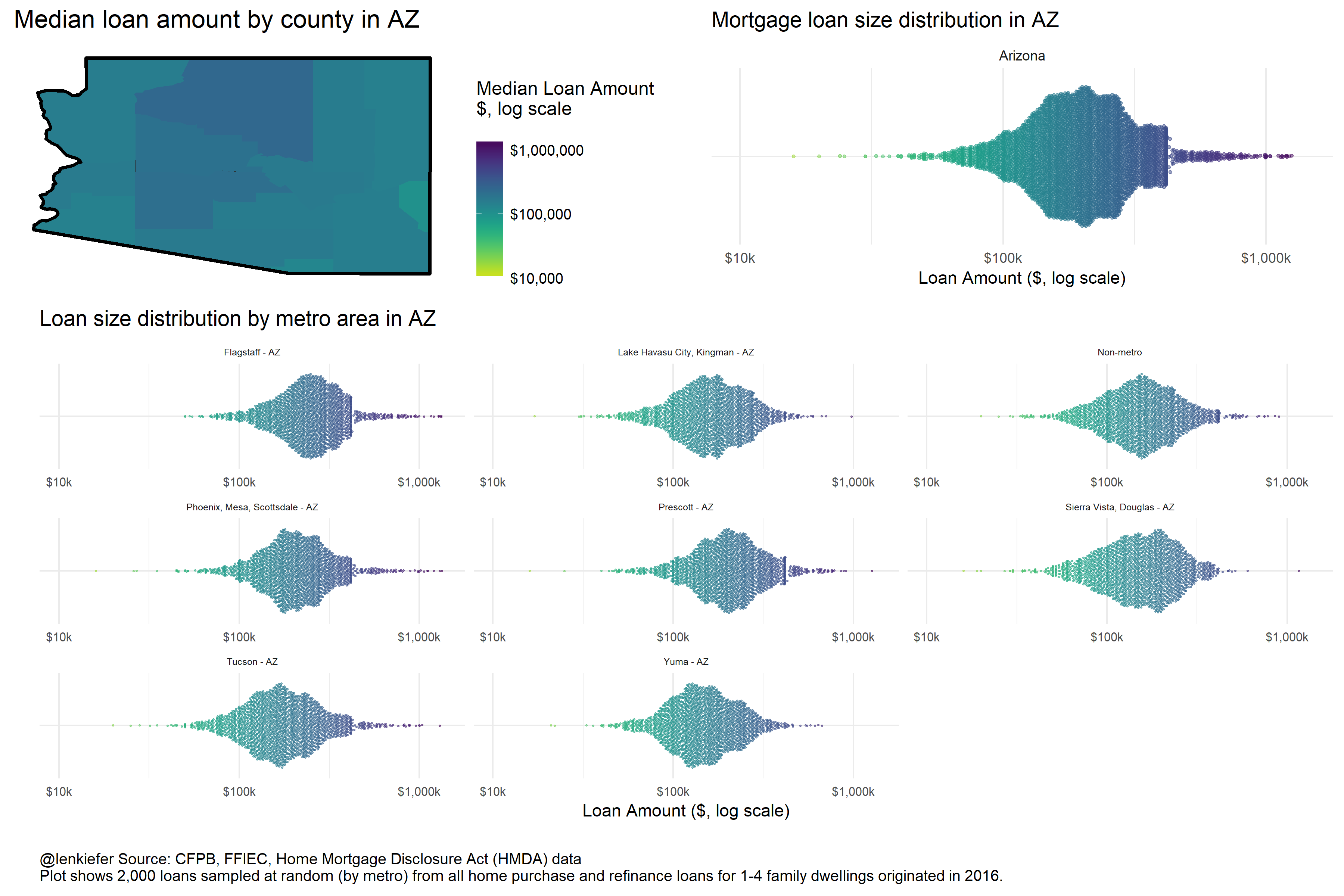
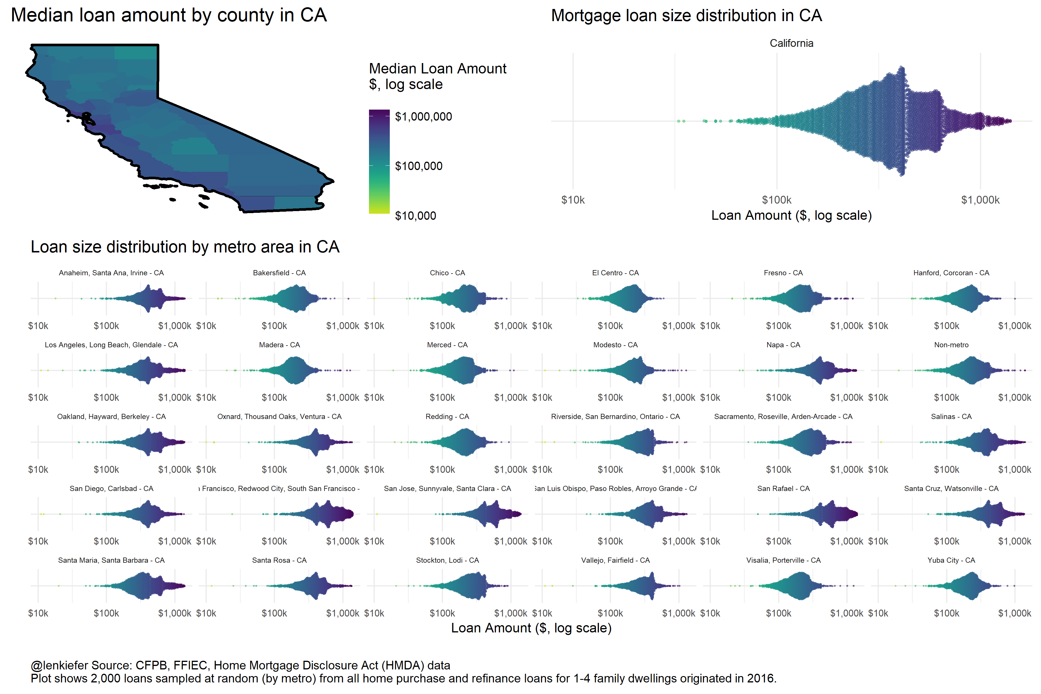
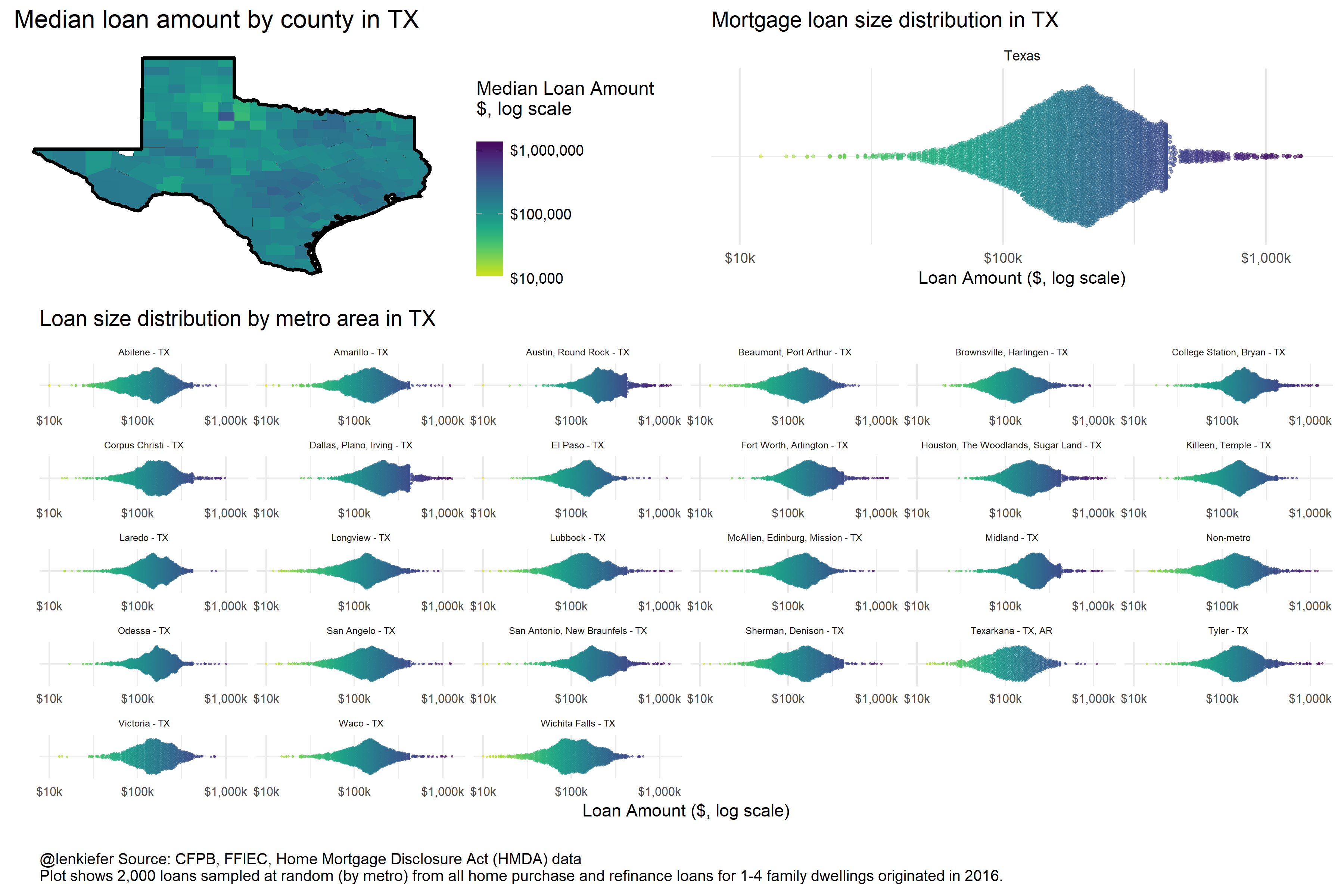
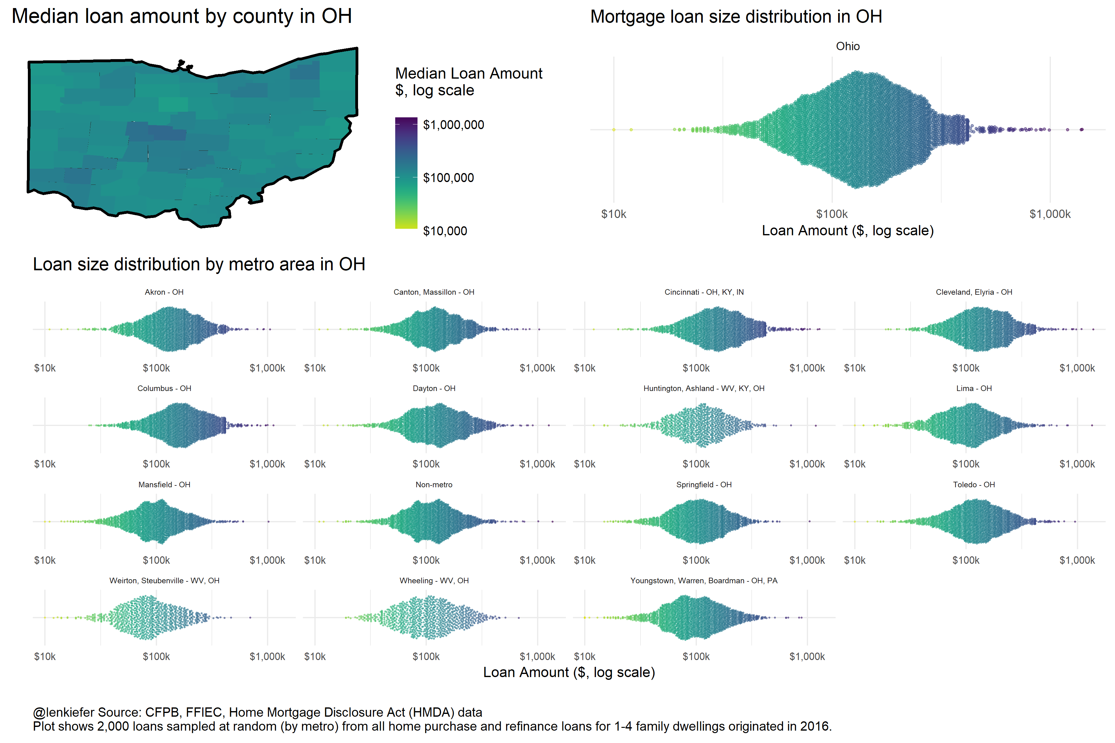
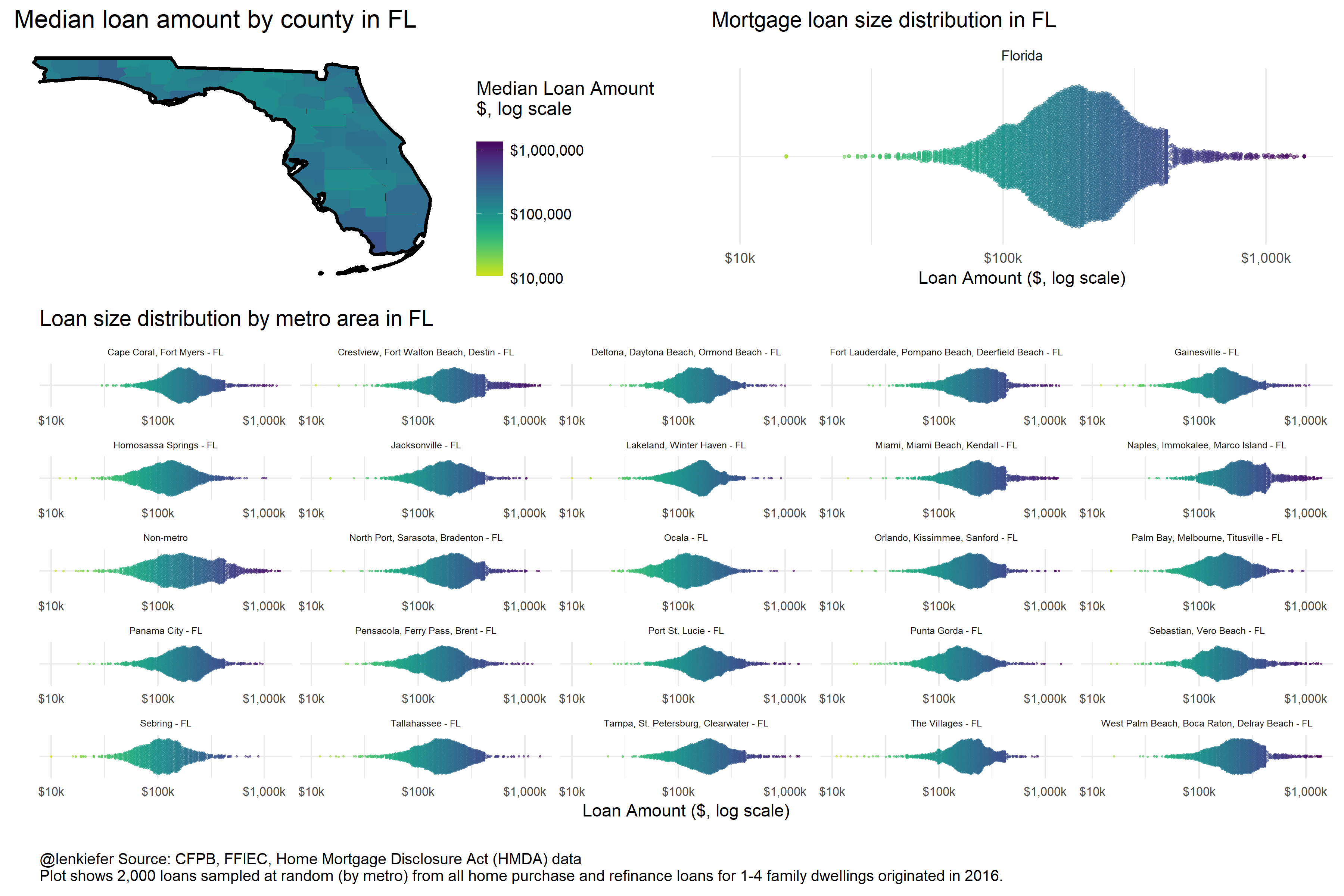
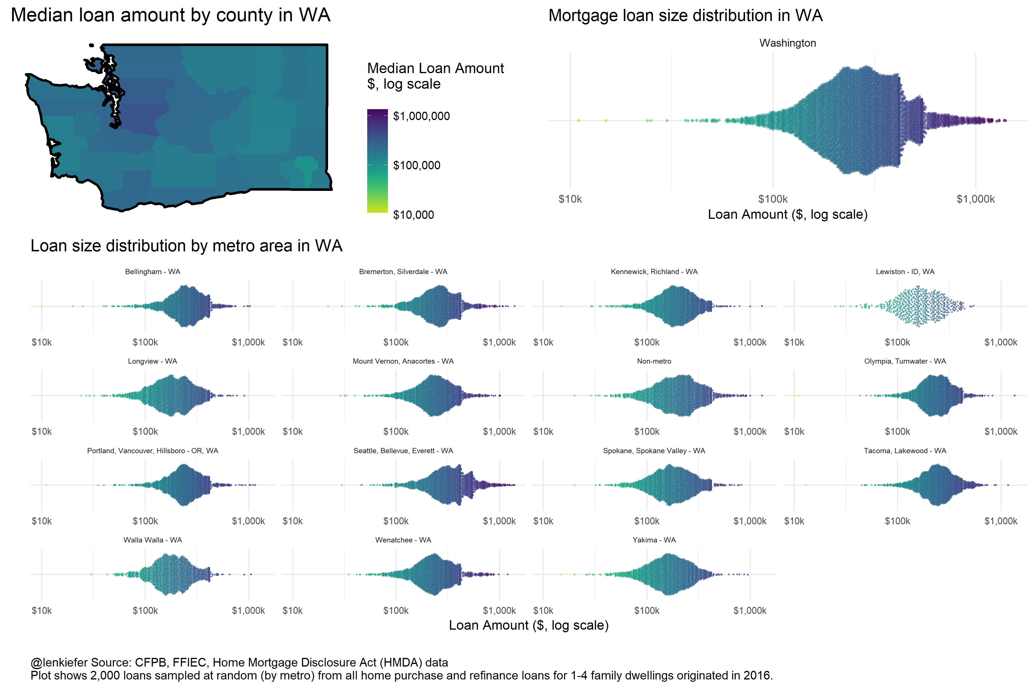
These infographics show the distribution of mortgage loan amounts by state/county and metro area.
For the beeswarm plots (see for example, Flowing Data) plots I have randomly sampled 2,000 loans from each state/metro area.
Let’s take a look and I’ll follow up later with some more analysis and some new visualizations.
Here are infographics for several states:
California
Texas
Ohio
Florida
Oregon
Arizona