I’ve BEEN MESSING AROUND MORE WITH R and OFFICER and having too much fun for a Monday. I’m going to dive into some details later, but I’ll just leave a couple files here.
See the attached PowerPoint .pptx file for all the charts.
Here’s a gif version I started with:

Then after I created the PowerPoint I started messing around with the drawing tools and made increasingly ill-advised edits.
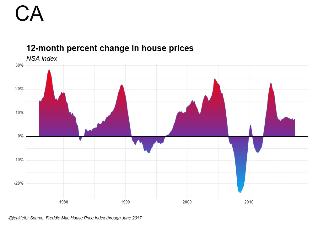
Making gradient shading is hard in R and ggplot2, but not in Office:
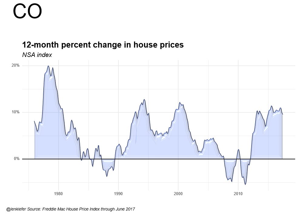
You could also add bevels:
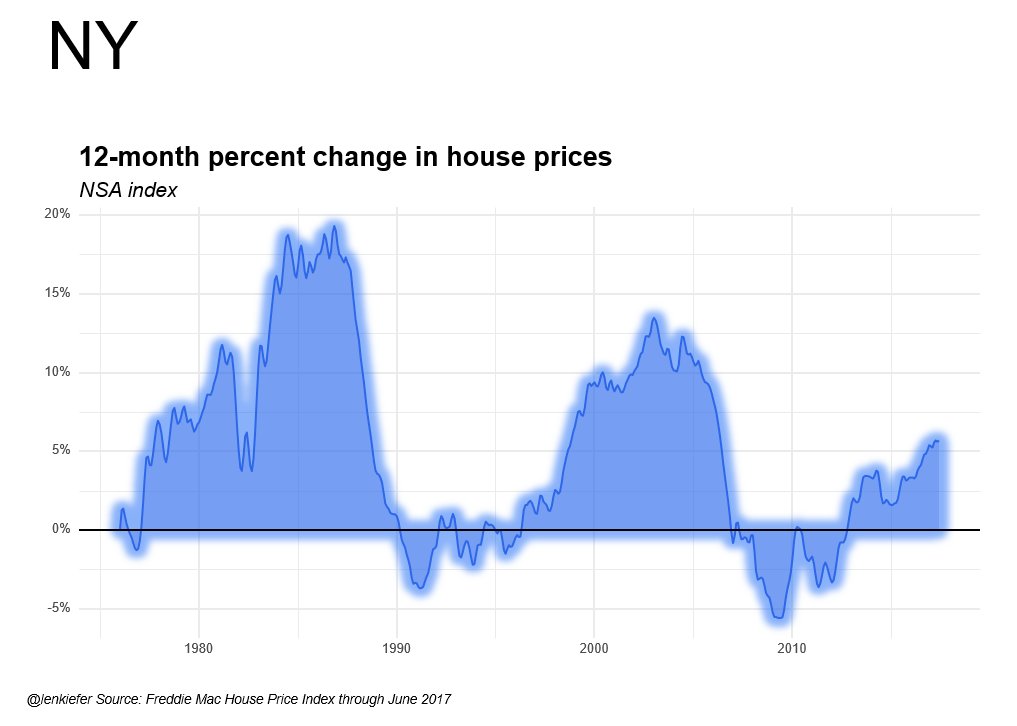
Or a soft glow to your image:
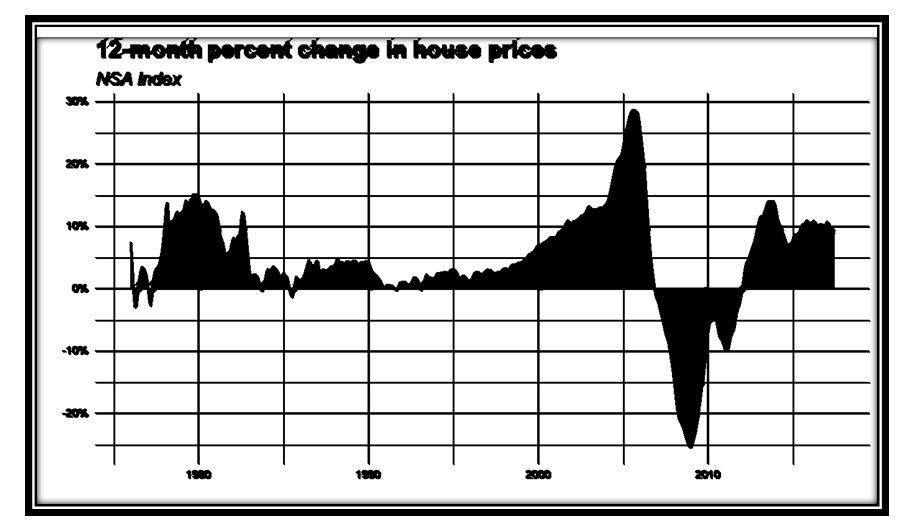
Or see how your slide would look after going through a lousy photocopier:
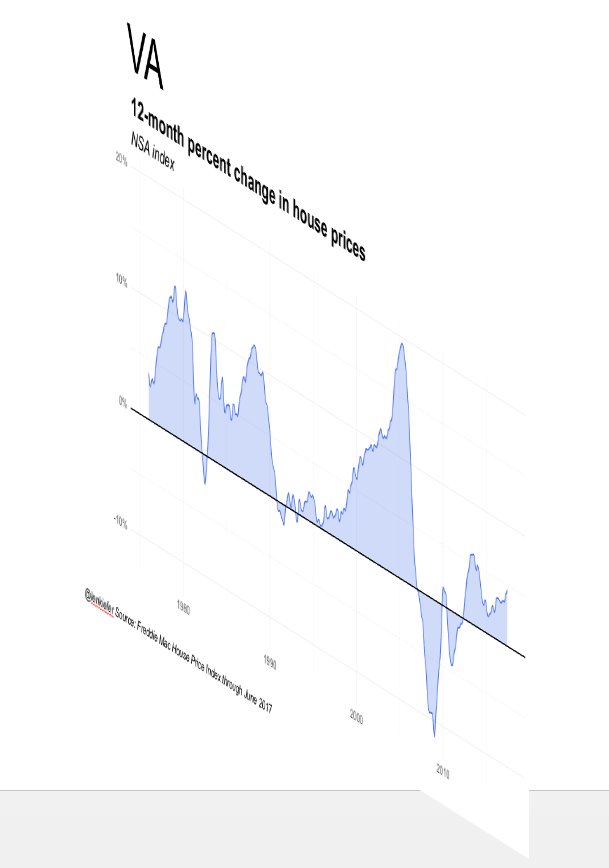
Maybe you want to rotate it:
Or whatever this is:
As long as we’re obscuring data, the only thing that limits us is our imagination.
Uses?
I didn’t tell you how I created the PowerPoint. If you open it, you’ll see that you can edit all the images. That’s how I added all those fancy effects. But how did I make the deck? I certainly didn’t paste anything in myself.
I’ll tell you about it, and a streamlined workflow I’m developing, in a future post.
Until then, check out these two posts on using Officer to generate PowerPoint slides: