OVER THE PAST THREE MONTHS I HAVE MADE several new house price visualizations. In these meditations I’ll consider some recent graphs and provide R code for them. For reference, prior meditations are available at:
- Part 1: data wrangling
- Part 2: sparklines and dots (animated)
- Part 3: bubbles and bounce
- Part 4: graph gallery
Meditation 1: Median sales price trends
Earlier this week, the National Association of Realtors (NAR) released their quarterly update on metro area median house prices (data here). These data show trends in the median sales price of existing single family homes.
According to the NAR report, the national median sales price of an existing single family home was $240,700 in the second quarter of 2016, but there are vast differences in house prices across the country. San Jose made news by having a median sales prices that was over $1 million dollars. On the other end of the spectrum, the median sales price in Youngstown, Ohio was just over $85,000.
In order to better understand the distribution of median sales prices, I constructed the following combination chart:
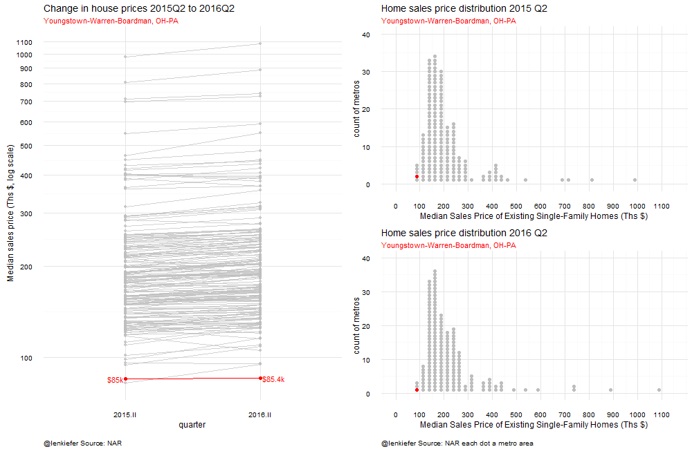
The chart combines a slopegraph showing the trend in house prices from the second quarter of 2015 to the second quarter of 2016 and two histogram of house prices where the bars are replaced with dots representing each individual metro. By looking at the slopes on the left, you can see how house prices have trended across metros (mostly up) and by looking at the histogram on the right, you can compare how individual metros stack up relative to other markets in the country. On the left I’ve created two histograms comparing 2015 Q2 to 2016Q2 so you can see how metros have moved in the median price distribution over time.
As there is a whole lot of data (180 metros), I use animation to highlight each individual metro one at a time. I sorted the metros based on their place in the 2016 Q2 price distribution, starting from Youngstown and going up to San Jose.
Code for plot
In order to construct this plot using R we’ll need to combine multiple graphs on a single page. Fortunately, the Cookbook for R has code for this. By using the multiplot function in the link above, we can easily combine two plots into one page.
The data from NAR comes in a spreadsheet, but we’re going to have to change it. From this:
to this:
I tried to manipulate the data in R, but the headers and formatting of the spreadsheet made it seem more trouble than it was worth, so I transformed the data using excel. See this post for details.
Slopegraph
The slopegraph is a line plot with two points. In this case, the median price in 2015Q2 and in 2016Q2. We’ll arrange the dates on the x axis and have the price displayed on the y axis. We’ll use a logarithmic scale for the y axis, so the slopes of the lines will approximate the percentage change in the median price.
We’ll call out the United State median sales price by overlaying a red line on tope of gray lines representing each individual metro area. In the animation we’ll loop through each metro and update the histogram.
{% highlight r #Load some packages… library(data.table, warn.conflicts = FALSE, quietly=TRUE) library(ggplot2, warn.conflicts = FALSE, quietly=TRUE) #Using the development version for captions/subtitles library(dplyr, warn.conflicts = FALSE, quietly=TRUE) library(zoo, warn.conflicts = FALSE, quietly=TRUE) library(ggthemes, warn.conflicts = FALSE, quietly=TRUE) library(scales, warn.conflicts = FALSE, quietly=TRUE) library(animation, warn.conflicts = FALSE, quietly=TRUE) library(tidyr, warn.conflicts = FALSE, quietly=TRUE) library(ggrepel, warn.conflicts = FALSE, quietly=TRUE) library(tweenr, warn.conflicts = FALSE, quietly=TRUE)
#Load some data that looks like the image above: ndata <- fread(“data/nar2016q2.txt”) ndata$date<-as.Date(ndata$date, format=“%m/%d/%Y”) #set dates ndata<-transform(ndata, value = as.numeric(value)) #force value to be numeric ndata[,myjust:=ifelse(id==“2016.II”,0,1)] #used to align text labels, left label right aligned, right label left aligned
#create the plot
g.slope<-ggplot(data=ndata[code==“US” & (id==“2015.II”|id==“2016.II”) & type==“level”,], aes(x=id,y=value,group=name,label=paste(” “,name,”\n”,dollar(round(value,0)),“k “,sep=”“)))+ #we need to group by metros, and create a label
#create gray lines for each metro geom_path(data=ndata[code==“metro” & (id==“2015.II”|id==“2016.II”) & type==“level”],color=“gray”,alpha=0.7)+ geom_point(data=ndata[code==“metro” & (id==“2015.II”|id==“2016.II”) & type==“level”],color=“gray”,alpha=0.7)+ theme_minimal()+
#create a red line for the U.S. geom_path(color=“red”)+geom_text(color=“red”,aes(hjust=myjust))+scale_y_log10(breaks=seq(100,1100,100))+ geom_point(color=“red”,size=2)+ labs(x=“quarter”,y=“Median sales price (Ths $, log scale)”,subtitle=“Median sales price of existing single family home”, caption=“@lenkiefer Source: NAR each line a metro area”,title=“Change in house prices 2015Q2 to 2016Q2”)+ theme(plot.caption=element_text(size=10, hjust=0, margin=margin(t=15)))
g.slope {% endhighlight

Create the histograms
In order to create the histograms we’re going to have build them ourselves. Our strategy will be to place each metro in a bin corresponding to a range of house prices (say from $75,000 to $100,000), and then count up how many metros are in each bin. So far, that’s just like a standard histogram. But as we’re going to draw a dot for each metro area, we have to assign a y axis value for each metro.
{% highlight r d<-ndata[code==“metro”& id==“2016.II” & type==“level” & value>0,] myhist<-hist(d$value,plot=FALSE, breaks=seq(0,1100,25) ) #construct a histogram
N<-length(myhist$mids) #how many bins in the histogram d<-d[order(value),] #sort the data by median house prices
myindex<-0 #initialize d$counter<-0 #initialize y axis counter g1<-ggplot(data=data.frame(x=myhist$mids[i],y=j), aes(x=x,y=y))+theme_minimal() for (i in 1:N){ for (j in 1:myhist$counts[i]) {if (myhist$counts[i]>0){ myindex<-myindex+1 #iterate counter d[myindex, counter:=j] #set y = j d[myindex, vbin:=myhist$mids[i]] # append bin value for this price g1<-g1+geom_point(data=data.frame(x=myhist$mids[i],y=j), aes(x=x,y=y),size=2,color=“gray”)} #add dot to plot }} g1<-g1+scale_x_continuous(limits=c(0,1150),breaks=seq(0,1100,100))+ scale_y_continuous(limits=c(0,40))+ labs(x=“Median Sales Price of Existing Single-Family Homes (Ths $)”, y=“count of metros”, title=“Home sales price distribution 2016 Q2”, caption=“@lenkiefer Source: NAR each dot a metro area”)+ theme(plot.caption=element_text(size=10, hjust=0, margin=margin(t=15))) g1 {% endhighlight

Combine the plots
Now we’ll used the multiplot function to combine the plots. We’ll also make another histogram so we can compare the distribution of median house sales prices in 2016Q2 to the distribution in 2015Q2.
{% highlight r source(“code/multiplot.R”) #include the multiplot function
#Recreate the histogram for 2015Q2:
d2<-ndata[code==“metro”& id==“2015.II” & type==“level” & value>0,] myhist<-hist(d2$value,plot=FALSE, breaks=seq(0,1100,25) ) N<-length(myhist$mids) g2<-ggplot() d2<-d2[order(value),] myindex<-0 d2$counter<-0 g2<-ggplot(data=data.frame(x=myhist$mids[i],y=j), aes(x=x,y=y))+theme_minimal() for (i in 1:N){ for (j in 1:myhist$counts[i]) {if (myhist$counts[i]>0){ myindex<-myindex+1 d2[myindex, counter:=j] d2[myindex, vbin:=myhist$mids[i]] g2<-g2+geom_point(data=data.frame(x=myhist$mids[i],y=j), aes(x=x,y=y),size=2,color=“gray”)} }}
g2<-g2+scale_x_continuous(limits=c(0,1150),breaks=seq(0,1100,100))+ scale_y_continuous(limits=c(0,40))+ labs(x=“Median Sales Price of Existing Single-Family Homes (Ths $)”, y=“count of metros”, title=“Home sales price distribution 2015 Q2”)
#Create the multiplot #We use a matrix layout to make the slopegraph two units tall and the histograms 1 in a 2x2 layout:
multiplot(g2+theme(axis.text=element_text(size=6),axis.title=element_text(size=7)), #shrink axis text and labels g1+theme(axis.text=element_text(size=6),axis.title=element_text(size=7)), g.slope+labs(caption=“@lenkiefer Source: NAR each dot/line a metro area”),layout=matrix(c(3,1,3,2), nrow=2, byrow=TRUE)) {% endhighlight

add animation
Now we want to highlight each individual metro area. To do so, we’ll construct an animated gif where we highlight each metro one at time. The code below generates the animated gif:
{% highlight r mlist<-unique(d$name) #get a unique list of metros, ordered by median prices in 2016Q2
oopt = ani.options(interval = 0.3) saveGIF({for (i in seq(1,length(mlist),1) ){ g3<- ggplot(data=ndata[name==mlist[i] & (id==“2015.II”|id==“2016.II”) & type==“level”,], aes(x=id,y=value,group=name,label=paste(” $“,round(value,1),“k “,sep=”“)))+ geom_path(data=ndata[code==“metro” & (id==“2015.II”|id==“2016.II”) & type==“level”],color=“gray”,alpha=0.7)+ geom_point(data=ndata[code==“metro” & (id==“2015.II”|id==“2016.II”) & type==“level”],color=“gray”,alpha=0.7)+ theme_minimal()+ geom_path(color=“red”)+geom_text(color=“red”,aes(hjust=myjust))+scale_y_log10(breaks=seq(100,1100,100))+ labs(x=“quarter”,y=“Median sales price (Ths $, log scale)”,subtitle=mlist[i], caption=“@lenkiefer Source: NAR”,title=“Change in house prices 2015Q2 to 2016Q2”)+ theme(plot.subtitle=element_text(color=“red”))+ theme(plot.caption=element_text(size=10, hjust=0,margin=margin(t=15)))+ geom_point(color=“red”,size=2)
multiplot(g2+ geom_point(data=d2[name==mlist[i]],aes(x=vbin,y=counter),size=2,color=“red”)+ labs(subtitle=mlist[i])+theme(plot.subtitle=element_text(color=“red”))+ theme(axis.text=element_text(size=6),axis.title=element_text(size=7)), g1+ geom_point(data=d[name==mlist[i]],aes(x=vbin,y=counter),size=2,color=“red”)+ labs(subtitle=mlist[i])+theme(plot.subtitle=element_text(color=“red”))+ theme(axis.text=element_text(size=6),axis.title=element_text(size=7)) , g3+theme(axis.text=element_text(size=6),axis.title=element_text(size=7)) ,layout=matrix(c(3,1,3,2), nrow=2, byrow=TRUE)) ani.pause() print(i) } },movie.name=“nar dots 2016 q2 v2.gif”,ani.width = 1000, ani.height = 650) {% endhighlight Run it and you get our plot:
Meditation 2: Changes in the Distribution of House Price Appreciation
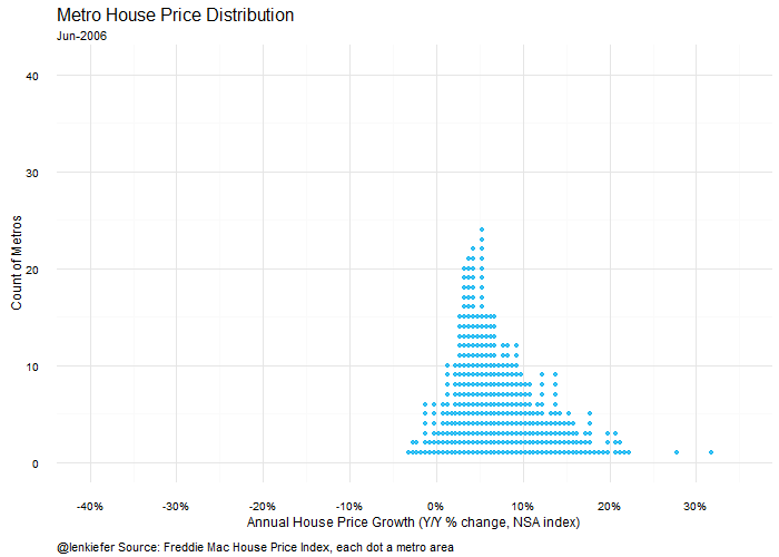
The NAR data only goes back to 2015Q2, but how has the metro level distribution of house prices changed over the last 10 years or so? In this section we’ll consider a graph I constructed using the Freddie Mac House Price Index (FMHPI), which is available to the public on Freddie Mac’s webpage and goes back to the 1970s for over 300 metro areas.
The data I’m going to use is an updated version of the files fmhpi2.txt I described in Part 1: data wrangling .
For the animation we’ll also be using the tweenr package, which I’ve written about before. See my earlier post about tweenr for an introduction, and more examples here and here.
{% highlight r #load data metrodata <- fread(“data/fmhpi4.txt”) #updated fmhpi file metrodata$date<-as.Date(metrodata$date, format=“%m/%d/%Y”) metrodata<-metrodata[,hpa12:=c(rep(NA,12),((1+diff(hpi,12)/hpi))^1)-1,by=metro]
#make a function to create a dot histogram, similar to above myf<-function(mydate){ d<-mdata[date==mydate,] myhist<-hist(d$hpa12,plot=FALSE, breaks=seq(-.45,62,.005) ) N<-length(myhist$mids) d<-d[order(hpa12),] myindex<-0 d$counter<-0 for (i in 1:N){ for (j in 1:myhist$counts[i]) {if (myhist$counts[i]>0){ myindex<-myindex+1 d[myindex, counter:=j] d[myindex, vbin:=myhist$mids[i]] }}} d$date<-factor(d$date) d.out<-as.data.frame(d[, list(date,vbin,counter,hpa12,state,region,metro)]) return(d.out) }
#create a plot using our function
ggplot(data=myf(unique(metrodata[year==2016 & month==6,]$date)), aes(x=vbin,y=counter,label=metro))+geom_point(size=1.5,color=“#00B0F0”)+theme_minimal()+ labs(x=“Annual House Price Growth (Y/Y % change, NSA index)”, y=“Count of Metros”, title=“Metro House Price Distribution”, caption=“@lenkiefer Source: Freddie Mac House Price Index. Each dot a metro area”, subtitle=format(as.Date(“2016-06-01”),“%b-%Y”))+ coord_cartesian(xlim=c(-0.2,.2),ylim=c(0,35))+ theme(plot.title=element_text(size=16))+ scale_x_continuous(labels=percent,breaks=seq(-.4,.4,.1))+ theme(plot.caption=element_text(hjust=0,vjust=1,margin=margin(t=10)))+ theme(legend.justification=c(0,0), legend.position=“top”) {% endhighlight

Adding animation
We want to compare how the distribution of annual house price growth has shifted from 2006 to 2016. We’ll compare the annual appreciation in June of each year. We’ll also use tweenr to have the dots smoothly transition between years.
{% highlight r dlist<-unique(metrodata[year>2005 & month==6,]$date) #generate a list of dates my.list2<-lapply(c(dlist,min(dlist)),myf) #apply our function to our list of dates
#use tweenr to interploate tf <- tween_states(my.list2,tweenlength= 3, statelength=1, ease=rep(‘cubic-in-out’,2),nframes=200) tf<-data.table(unique(tf)) #convert output into data table
oopt = ani.options(interval = 0.15)
saveGIF({for (i in 1:max(tf$.frame)) { #loop over frames
g<-
ggplot(data=tf[.frame==i,],aes(x=vbin,y=counter,label=metro))+geom_point(size=1.5,alpha=0.75,color=“#00B0F0”)+theme_minimal()+
labs(x=“Annual House Price Growth (Y/Y % change, NSA index)”,
y=“Count of Metros”,
title=“Metro House Price Distribution”,
caption=“@lenkiefer Source: Freddie Mac House Price Index. Each dot a metro area”,
subtitle=unique(format(as.Date(tf[.frame==i]$date), “%b-%Y”)))+
coord_cartesian(xlim=c(-0.4,.4),ylim=c(0,41))+
theme(plot.title=element_text(size=16))+
scale_x_continuous(labels=percent,breaks=seq(-.4,.4,.1))+
theme(plot.caption=element_text(hjust=0,vjust=1,margin=margin(t=10)))+
theme(legend.justification=c(0,0), legend.position=“top”)
print(g)
ani.pause()
print(i)}
},movie.name=“hpi dot tween aug 12 2016 portland highlight.gif”,ani.width = 700, ani.height = 500)
{% endhighlight
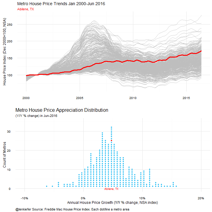
Adding a time series plot, highlighting individual metros
We can use multiplot again to combine the historgram with a line plot. In this case, we’ll loop through all the metro areas and compare the current year-over-year appreciation to the history of that metro from 2000 through 2016 (June).
Coder for this plot follows:
{% highlight r d.out<-myf(as.Date(“2016-06-01”)) #we’ll just plot the data for June 2016 d.out<-data.table(d.out) #make it a data table for ease of use mlist0<-unique(metrodata$metro) #generate a list of metros
oopt = ani.options(interval = 0.25) saveGIF({for (i in 1:length(mlist0)) { #loop over metros
g<- ggplot(data=d.out,aes(x=vbin,y=counter,label=metro))+geom_point(size=1.5,alpha=0.75,color=“#00B0F0”)+ theme_minimal()+
labs(x=“Annual House Price Growth (Y/Y % change, NSA index)”, y=“Count of Metros”, title=“Metro House Price Appreciation Distribution”, caption=“@lenkiefer Source: Freddie Mac House Price Index. Each dot/line a metro area”, subtitle=paste(“(Y/Y % change) in”,unique(format(as.Date(d.out$date), “%b-%Y”))))+ coord_cartesian(xlim=c(-0.1,.20),ylim=c(0,35))+ theme(plot.title=element_text(size=16))+ scale_x_continuous(labels=percent,breaks=seq(-.4,.4,.1))+ theme(plot.caption=element_text(hjust=0,vjust=1,margin=margin(t=10)))+ theme(legend.justification=c(0,0), legend.position=“top”)+ geom_text(data=d.out[metro==mlist0[i]],color=“red”,aes(y=0),size=3)+ geom_point(data=d.out[metro==mlist0[i]],color=“red”)
#now make a time series plot
g2<- ggplot(data=metrodata[year>1999,],aes(x=date,y=hpi,group=metro))+geom_line(color=“gray”,alpha=0.75)+
theme_minimal()+labs(x=“”,y=“House Price Index (Dec 2000=100, NSA)”, subtitle=mlist0[i], title=“Metro House Price Trends Jan 2000-Jun 2016”)+ theme(plot.subtitle=element_text(color=“red”))+ geom_line(data=metrodata[year>1999 & metro==mlist0[i],],color=“red”,size=1.2) #highlight the metro we want
m<-multiplot(g2,g)
print(m) ani.pause() print(i)} },movie.name=“hpi dot combo dot line aug 2016.gif”,ani.width = 700, ani.height = 700) {% endhighlight