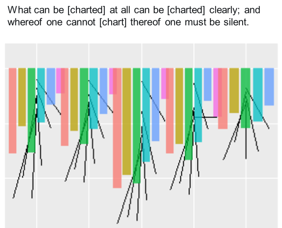
Today I got to talk #dataviz and shared a bunch of my charts, which always sort of feels like sharing my vacation photos. But it was fun to talk about why I made some of these charts, what they mean, and how different data visualization techniques can bring out new insights in familiar data.
The pdf version is below or here.
The pptx version has animations, get it here.
For almost all of these charts, I’ve posted R code somewhere on this page. But the secret for this awesome dataviz stays with me.
