A couple years ago I posted R code for a remix of a remix of a US state unemployment rate chart.
Post Working on a workout. Some of the images were lost in a blog transition. We’ll update below.
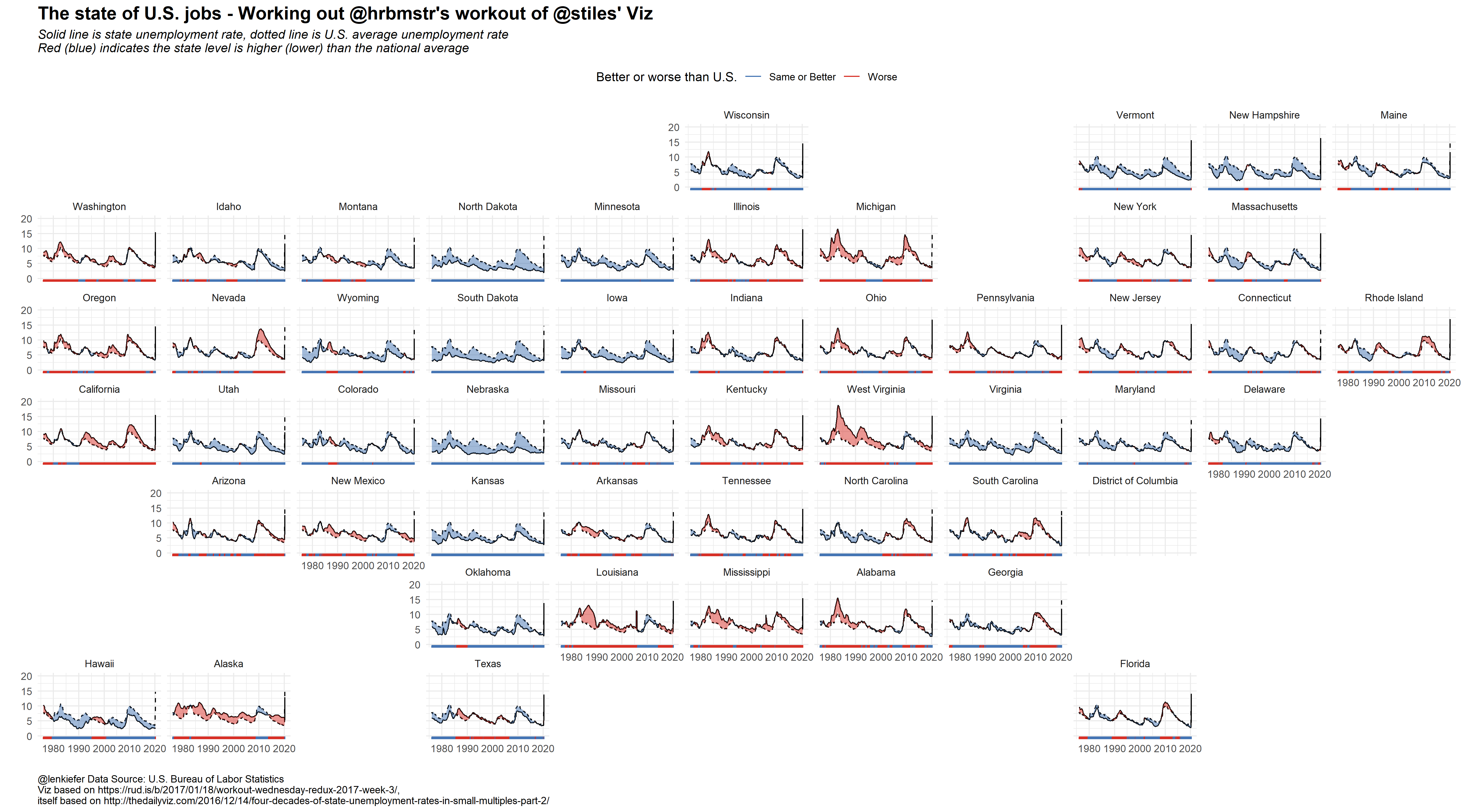
Here’s an updated version:
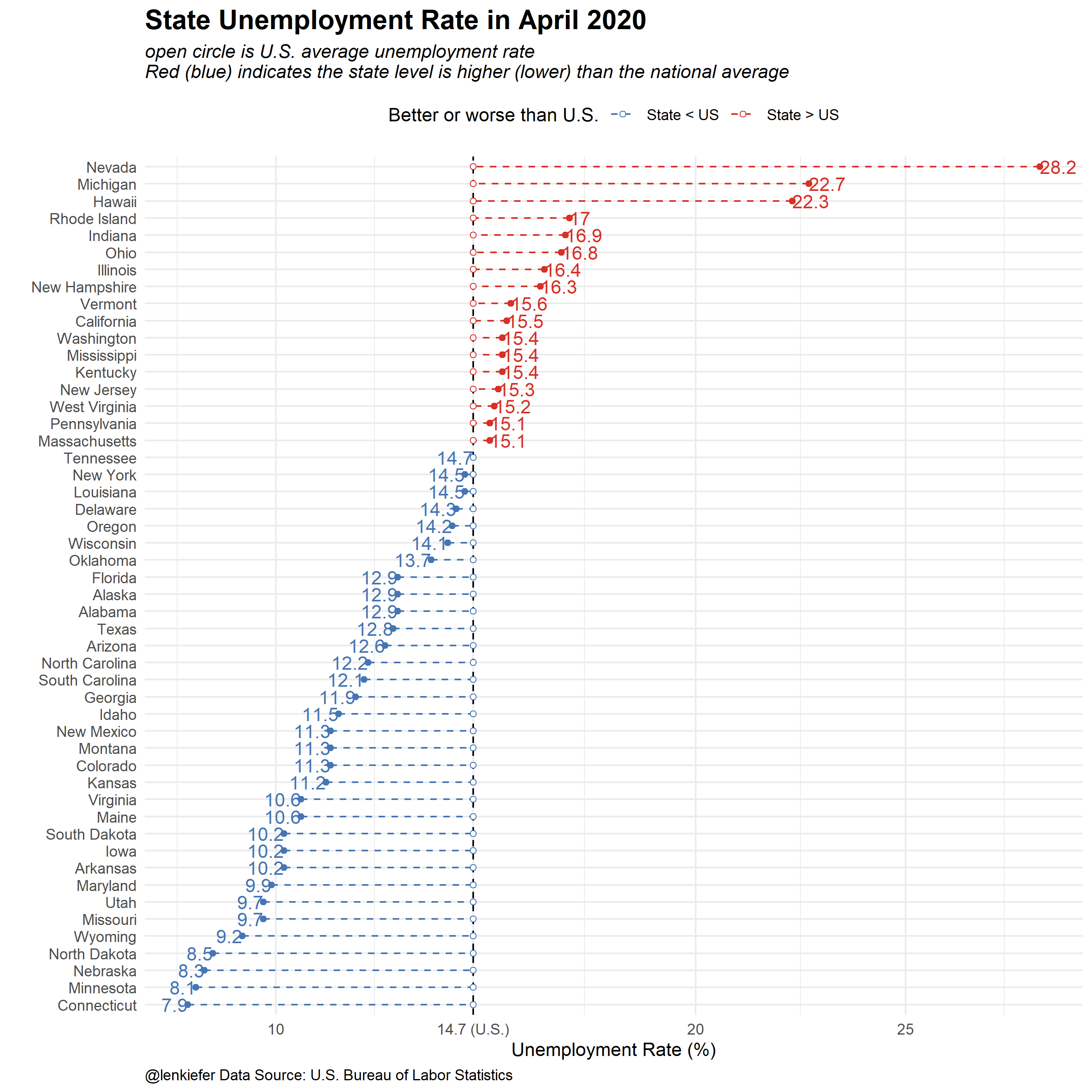
And another remix focusing just on April 2020 (latest data).
R code
######################
## Load Libraries ##
######################
library(data.table)
library(quantmod)
library(tidyverse)
library(geofacet)


# Download data big file
ur.data<-fread("http://download.bls.gov/pub/time.series/la/la.data.1.CurrentS")

# Download series ids

ur.series<-fread("http://download.bls.gov/pub/time.series/la/la.series")

# We'll subset data
ur.list<-ur.series[area_type_code =="A" &   #get states
                     measure_code == "3"  &   #get unemployment rate
                     seasonal == "S",         #get seasonally adjusted data
                   c("series_id","area_code","series_title"),
                   with=F]

## Get state names and area crosswalk
ur.area<-fread("http://download.bls.gov/pub/time.series/la/la.area",
               col.names=
                 c("area_type_code","area_code","area_text","display_level",
                   "selectable","sort_sequence"))

# merge data
ur.dt<-merge(ur.data,ur.list,by="series_id",all.y=T)

#create data variable
ur.dt[,month:=as.numeric(substr(ur.dt$period,2,3))]
ur.dt$date<- as.Date(ISOdate(ur.dt$year,ur.dt$month,1) ) #set up date variable
ur.dt<-merge(ur.dt,ur.area[,c("area_text","area_code"),with=F],by="area_code")


# Load national unemployment rate using quantmod and FRED database

# helpful reference https://jeffreybreen.wordpress.com/tag/quantmod/
unrate = getSymbols('UNRATE',src='FRED', auto.assign=F)
unrate.df = data.frame(date=time(unrate), coredata(unrate) )

# Drop some columns
ur.dt2<-ur.dt[,c("date","area_text","value"),with=F][,value:=as.numeric(value)]

## rename variables
ur.dt2<-dplyr::rename(ur.dt2, state=area_text)
ur.dt2<-dplyr::rename(ur.dt2, ur=value)

# merge national unemploymnent
ur.dt2<-merge(ur.dt2,unrate.df,by="date")
ur.dt2<-dplyr::rename(ur.dt2, ur.us=UNRATE)  #rename UNRATE to ur.us

# create variables for use in ribbon chart
ur.dt2[,up:=ifelse(ur>ur.us,ur,ur.us)]
ur.dt2[,down:=ifelse(ur<ur.us,ur,ur.us)]

# drop D.C. and Puerto Rico (so we can have 50 plots in small multiple)
ur.plot<-ur.dt2[! state %in% c("Puerto Rico","District of Columbia")]


# Get list of states:
st.list<-unique(ur.plot$state)

# used in original post for animation, not needed here, too lazy to undo
ur.plot.us<-copy(ur.plot)[state=="Alabama"]
ur.plot.us[,state:="United States"]
ur.plot.us[,ur:=ur.us]
ur.plot.us[,up:=ur.us]
ur.plot.us[,down:=ur.us]
ur.plot2<-rbind(ur.plot,ur.plot.us)

# State geo facet plot  ----

g1<-
  ggplot(data=ur.plot2,aes(x=date,y=ur))+
  geom_line(color="black")+
  geom_line(linetype=2,aes(y=ur.us))+
  geom_ribbon(aes(ymin=ur,ymax=down),fill="#d73027",alpha=0.5)+
  geom_ribbon(aes(ymin=ur,ymax=up),fill="#4575b4",alpha=0.5)+
  #facet_wrap(~state,ncol=10,scales="free_x")+
  facet_geo(~state)+
  scale_y_continuous(limits=c(0,20))+
  theme_minimal()+
  theme(legend.position="top",
        plot.caption=element_text(hjust=0),
        plot.subtitle=element_text(face="italic"),
        plot.title=element_text(size=16,face="bold"))+
  labs(x="",y="",
       title="The state of U.S. jobs - Working out @hrbmstr's workout of @stiles' Viz",
       subtitle="Solid line is state unemployment rate, dotted line is U.S. average unemployment rate\nRed (blue) indicates the state level is higher (lower) than the national average",
       caption="@lenkiefer Data Source: U.S. Bureau of Labor Statistics\nViz based on https://rud.is/b/2017/01/18/workout-wednesday-redux-2017-week-3/,\nitself based on http://thedailyviz.com/2016/12/14/four-decades-of-state-unemployment-rates-in-small-multiples-part-2/")+
  geom_rug(aes(color=ifelse(ur>ur.us,"Worse","Same or Better")),sides="b")+
  scale_color_manual(values=c("#4575b4","#d73027"),name="Better or worse than U.S.")

g1


# Static chart ----

g2 <-
  ggplot(data=filter(ur.plot,date==max(date)) %>%
           mutate(statef=fct_reorder(state,ur)),
         aes(x=ur,y=statef,
             color=ur>ur.us,
             label=round(ur,1)))+
  geom_vline(aes(xintercept=ur.us),linetype=2)+
  geom_point()+
  geom_segment(linetype=2, aes(yend=statef,xend=ur.us))+
  geom_point(shape=21,fill="white", aes(x=ur.us))+
  geom_text(show.legend=FALSE, aes(hjust=ifelse(ur>ur.us,0,1)))+
  scale_x_continuous(breaks=c(5,10,14.7,20,25),
                     labels=c("5","10","14.7 (U.S.)", "20","25"))+
  scale_color_manual(values=c("#4575b4","#d73027"),
                     labels=c("State < US","State > US"),
                     name="Better or worse than U.S.")+
  theme_minimal()+
  theme(legend.position="top",
        plot.caption=element_text(hjust=0),
        plot.subtitle=element_text(face="italic"),
        plot.title=element_text(size=16,face="bold"))+
  labs(x="Unemployment Rate (%)",
       y="",
       title="State Unemployment Rate in April 2020",
       subtitle="open circle is U.S. average unemployment rate\nRed (blue) indicates the state level is higher (lower) than the national average",
       caption="@lenkiefer Data Source: U.S. Bureau of Labor Statistics")

g2