SO APPARENTLY IT IS WORKOUT WEDNESDAY, a day when data visualization fans try to build data visualization skills. I heard about it via [this post by @hrbrmstr](https://rud.is/b/2017/01/18/workout-wednesday-redux-2017-week-3/) that reconsiders a visualization of state level unemployment rates. (Original post here).
When I study data visualization, I do so earnestly. That is, I approach it with an open mind and enthusiasm. In truth I like all of the visualizations mentioned above and you should check them out. But that doesn’t mean I can’t chime in with my own remix.
So in this post I’m going to offer up my own spin on this data visualization, and provide you R code that will enable you to remix mine if you like. If you do, be sure to tell me about it.
Anatomy of my viz
My remix is going to be slightly more complicated. This might be due to the fact I am cursed with knowledge, having studied unemployment trends quite closely. I feel like we can densify and add layers to the viz to convey even more information, even in a compact space.
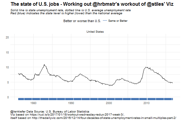
Because I’m gunning for a more complex viz and small multiples, let’s first break down the visualization piece by piece. Take a look:

This chart is a composite chart consisting of two lines, two shaded ribbons shading the area between the lines and a rug chart at the bottom. The chart compares the unemployment rate in Ohio (depicted by a solid line) relative to the national average unemployment rate for the United States (depicted by a dotted line. I’ve also colored the area between the two lines, using red to signify periods when Ohio had a higher unemployment rate than the U.S. in red and when Ohio had a lower unemployment rate than the U.S. in blue. I’ve further encoded these periods with the rug plot at the bottom.
Examining the chart, we can see that throughout the 1980s and most of the 2000s, Ohio fared worse than the national average in terms of unemployment, while the Buckeye State did better in the 1990s and much of the past ten years.
Small multiples
Now that we’ve broken the simple chart down, we can build a small multiple showing the same chart for each of the 50 states.

Animated gif
Instead of the small multiple, we could use a gif to animate the chart.
For smoothanimations we’ll use tweenr. See my earlier post about tweenr for an introduction to tweenr, and more examples here and here.
How I build these charts
Building these charts is quite easy with R. In the code below, I’m going to grab the data, do some manipulations and create the charts.
Data
Unemployment statistics are produced the U.S. Bureau of Labor Statistics and we can get state level data from their webpage..
Charts
Charts are created with ggplot2.
Code
The code below will create these charts and the animation:
######################
## Load Libraries ##
######################
library(data.table)
library(quantmod)
library(tidyverse)
library(tweenr)
library(animation)


# Download data big file
ur.data<-fread("https://download.bls.gov/pub/time.series/la/la.data.1.CurrentS")

# Download series ids

ur.series<-fread("https://download.bls.gov/pub/time.series/la/la.series")

# We'll subset data
ur.list<-ur.series[area_type_code =="A" &   #get states
                   measure_code == "3"  &   #get unemployment rate
                   seasonal == "S",         #get seasonally adjusted data
                   c("series_id","area_code","series_title"),
                   with=F]

## Get state names and area crosswalk
ur.area<-fread("https://download.bls.gov/pub/time.series/la/la.area",
               col.names=
                 c("area_type_code","area_code","area_text","display_level",
                   "selectable","sort_sequence","blank"))

# merge data
ur.dt<-merge(ur.data,ur.list,by="series_id",all.y=T)

#create data variable
ur.dt[,month:=as.numeric(substr(ur.dt$period,2,3))]
ur.dt$date<- as.Date(ISOdate(ur.dt$year,ur.dt$month,1) ) #set up date variable
ur.dt<-merge(ur.dt,ur.area[,c("area_text","area_code"),with=F],by="area_code")


# Load national unemployment rate using quantmod and FRED database

# helpful reference https://jeffreybreen.wordpress.com/tag/quantmod/
unrate = getSymbols('UNRATE',src='FRED', auto.assign=F)
unrate.df = data.frame(date=time(unrate), coredata(unrate) )

# Drop some columns
ur.dt2<-ur.dt[,c("date","area_text","value"),with=F]

## rename variables
ur.dt2<-dplyr::rename(ur.dt2, state=area_text)
ur.dt2<-dplyr::rename(ur.dt2, ur=value)

# merge national unemploymnent
ur.dt2<-merge(ur.dt2,unrate.df,by="date")
ur.dt2<-dplyr::rename(ur.dt2, ur.us=UNRATE)  #rename UNRATE to ur.us

# create variables for use in ribbon chart
ur.dt2[,up:=ifelse(ur>ur.us,ur,ur.us)]
ur.dt2[,down:=ifelse(ur<ur.us,ur,ur.us)]

# drop D.C. and Puerto Rico (so we can have 50 plots in small multiple)
ur.plot<-ur.dt2[! state %in% c("Puerto Rico","District of Columbia")]


# Get list of states:
st.list<-unique(ur.plot$state)

#Add U.S. as it's own state (for use in animation)
ur.plot.us<-copy(ur.plot)[state=="Alabama"]
ur.plot.us[,state:="United States"]
ur.plot.us[,ur:=ur.us]
ur.plot.us[,up:=ur.us]
ur.plot.us[,down:=ur.us]
ur.plot2<-rbind(ur.plot,ur.plot.us)

#######################################################################################################


#######################################################################################################
# Some functions

# Create plotting function
myplotf<-function(df){
  g<-
    ggplot(data=df,aes(x=date,y=ur))+
    geom_line(color="black")+
    geom_line(linetype=2,aes(y=ur.us))+
    geom_ribbon(aes(ymin=ur,ymax=down),fill="#d73027",alpha=0.5)+
    geom_ribbon(aes(ymin=ur,ymax=up),fill="#4575b4",alpha=0.5)+
    facet_wrap(~state,ncol=10,scales="free_x")+
    scale_y_continuous(limits=c(0,20))+
    theme_minimal()+
    theme(legend.position="top",
          plot.caption=element_text(hjust=0),
          plot.subtitle=element_text(face="italic"),
          plot.title=element_text(size=16,face="bold"))+
    labs(x="",y="",
         title="The state of U.S. jobs - Working out @hrbmstr's workout of @stiles' Viz",
         subtitle="Solid line is state unemployment rate, dotted line is U.S. average unemployment rate\nRed (blue) indicates the state level is higher (lower) than the national average",
         caption="@lenkiefer Data Source: U.S. Bureau of Labor Statistics\nViz based on https://rud.is/b/2017/01/18/workout-wednesday-redux-2017-week-3/,\nitself based on http://thedailyviz.com/2016/12/14/four-decades-of-state-unemployment-rates-in-small-multiples-part-2/")+
    geom_rug(aes(color=ifelse(ur>ur.us,"Worse","Same or Better")),sides="b")+
    scale_color_manual(values=c("#4575b4","#d73027"),name="Better or worse than U.S.")
  return(g)
}


# Data subsetting function

myf<-function(s){
  df<- ur.plot2[state==s]
  df %>% map_if(is.character, as.factor) %>% as_data_frame -> df
  return(df)
}

#######################################################################################################


#### Make Ohio Plot ###################################################################################

myplotf(myf("Ohio"))

#######################################################################################################


#### Make Small Multiple ##############################################################################

# Create Small Multiple

ggplot(data=ur.plot,aes(x=date,y=ur))+
  geom_line(color="black")+
  geom_line(linetype=2,aes(y=ur.us))+
  geom_ribbon(aes(ymin=ur,ymax=down),fill="#d73027",alpha=0.5)+
  geom_ribbon(aes(ymin=ur,ymax=up),fill="#4575b4",alpha=0.5)+
  facet_wrap(~state,ncol=10,scales="free_x")+
  theme_minimal()+
  theme(legend.position="top",
        plot.caption=element_text(hjust=0),
        plot.subtitle=element_text(face="italic"),
        plot.title=element_text(size=16,face="bold"))+
  labs(x="",y="",
       title="The state of U.S. jobs - Working out @hrbmstr's workout of @stiles' Viz",
       subtitle="Solid line is state unemployment rate, dotted line is U.S. average unemployment rate\nRed (blue) indicates the state level is higher (lower) than the national average",
       caption="@lenkiefer Data Source: U.S. Bureau of Labor Statistics\nViz based on https://rud.is/b/2017/01/18/workout-wednesday-redux-2017-week-3/, itself based on http://thedailyviz.com/2016/12/14/four-decades-of-state-unemployment-rates-in-small-multiples-part-2/")+
  geom_rug(aes(color=ifelse(ur>ur.us,"Worse","Better")),sides="b")+
  scale_color_manual(values=c("#4575b4","#d73027"),name="Better or worse than U.S.")


#####################################################################################################


#### Create Animation ##############################################################################

mylist<-lapply(c("United States",st.list,"United States"),myf)
tween.df<-tween_states(mylist,tweenlength=1,statelength=2, ease=rep('cubic-in-out',53), nframes=250)
tween.df<-data.table(tween.df)


oopt = ani.options(interval = 0.2)
saveGIF({for (i in 1:max(tween.df$.frame)) {
  g<-myplotf(tween.df[.frame==i,])
  print(g)
  print(i)
  ani.pause()
}
},movie.name="Workout UR jan 18 2017 v2.gif",ani.width = 600, ani.height =400)


##################################################################################################