In a blog post the dual y-axis chart just say no Tim Duy asks analysts to give up dual y-axis charts for a new year’s resolution. Like with many resolutions, I predict most will fail at this challenge. I also predict few will take it up. Dual y-axis charts are super popular, especially in finance/economics.
As you all know, I care a lot about data visualization. And I have been fighting a losing battle against dual y-axis charts for about a decade. Analysts I work with find them irresistible. I will often point out the downsides of such charts. See for example, Lisa Charlotte Rost’s summary. Folks will listen politely, sometimes nod, but almost immediately go back to using them.
For me, the main reason not to use dual y-axis charts is not because they are hard to read, or that in malicious hands they make it possible to deliberately mislead, rather the main reason I am skeptical of them is because for economic/financial time series dual axis charts risk discovering spurious correlation.
Here’s a quick example of discovering such a spurious correlation.
Suppose that variables \(x\) and \(y\) are generated by uncorrelated driftless random walks:
\[ y_{i,t} = \sum\epsilon_{i,t}\]
\[ \epsilon_{i,t} \sim i.i.N.(0,1)\] for \(i =1,2\).
The following R code simulates the data for 100 observations and regresses \(y_2\) on \(y_1\).
library(tidyverse,quietly=TRUE)
library(latex2exp,quietly=TRUE)
set.seed(200107)
N <- 100
df <- data.frame(id=1:N,y1=cumsum(rnorm(N)),y2=cumsum(rnorm(N)))
fit <- lm(data=df, formula=y2~y1)
stargazer::stargazer(fit,type="html", title="Spurious Regression")| Dependent variable: | |
| y2 | |
| y1 | 0.773*** |
| (0.052) | |
| Constant | -0.143 |
| (0.484) | |
| Observations | 100 |
| R2 | 0.693 |
| Adjusted R2 | 0.690 |
| Residual Std. Error | 2.461 (df = 98) |
| F Statistic | 221.242*** (df = 1; 98) |
| Note: | p<0.1; p<0.05; p<0.01 |
By regressing \(y_2\) on \(y_1\) we apparently find a very significant relationship. We can explain almost 70% of the variation in \(y_2\) with just on time series variable.
If we didn’t even run a regression we might find this strong relationship graphically. Suppose we just plotted the data as a dual y-axis chart. That’s easy enough to do with most software, though ggplot2 doesn’t make it easy. See Hadley Wickham’s response here for why not.
With the secondary axis you can create a dual axis chart with ggplot2 now. In order to add the secondary scale we first transform the values of \(y_1\) using the regression coefficients
\[\hat{y_2}=\hat{\beta_0}+\hat{\beta_1}y_1\] We plot \[\hat{y_2}\] but use a transformed scale for the secondary axis:
\[ \frac{(\hat{y_2}-\hat{\beta_0})}{\hat{\beta_1}}\] To make the legend easier, I’ll color the secondary axis to correspond to series, black for \(y_1\) and blue for \(y_2\).
ggplot(data=df, aes(x=id,y=y2))+
  geom_line()+
  geom_line(color="blue",aes(y=coef(fit)[1] + coef(fit)[2]*y1))+
  scale_y_continuous(sec.axis = sec_axis(~ (. -coef(fit)[1])/coef(fit)[2],
                                         name=TeX("$y_2$")))+
  labs(x="time",y=TeX("$y_1$"),
       caption="@lenkiefer random walks simulated using cumsum(rnorm(100))",
       title="Double Trouble: Hazard of Dual Axis Charts",
       subtitle=TeX("y_1,y_2 random walks: $ y_1 = \\sum\\epsilon_{1,t}, y_2=\\sum\\epsilon_{2,t}$, $\\epsilon_{i,t} \\sim i.i.N.(0,1)$")
       )+
  theme( plot.caption=element_text(hjust=0),
         plot.title=element_text(face="bold"),
         axis.line.y.right = element_line(color = "blue"),
         axis.text.y.right=element_text(color="blue"),
         axis.title.y.right=element_text(color="blue"),
         axis.ticks.y.right = element_line(color = "blue"))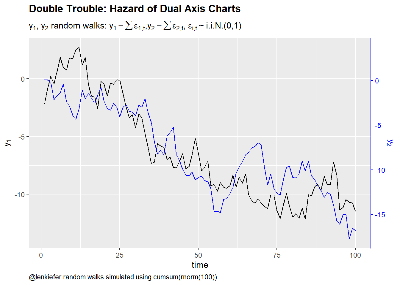
Figure 1: Dual axis charts and spurious correlation
This chart looks like lots charts I see in finance/economics discussions. Visually this plot is showing what the regression results above tell us. There is a strong correlation between \(y_1\) and \(y_2\).
Note that a scatterplot won’t help us here:
ggplot(data=df, aes(x=y1,y=y2))+
  geom_point(color="blue",alpha=0.75)+
  stat_smooth(method="lm",fill=NA)+
  labs(x=TeX("$y_1$"),y=TeX("$y_2$"),
       caption="@lenkiefer random walks simulated using cumsum(rnorm(100))",
       title="Scatter plots won't save us",
       subtitle=TeX("y_1,y_2 random walks: $ y_1 = \\sum\\epsilon_{1,t}, y_2=\\sum\\epsilon_{2,t}$, $\\epsilon_{i,t} \\sim i.i.N.(0,1)$")
       )+
  theme( plot.caption=element_text(hjust=0),
         plot.title=element_text(face="bold"),
         axis.line.y.right = element_line(color = "blue"),
         axis.text.y.right=element_text(color="blue"),
         axis.title.y.right=element_text(color="blue"),
         axis.ticks.y.right = element_line(color = "blue"))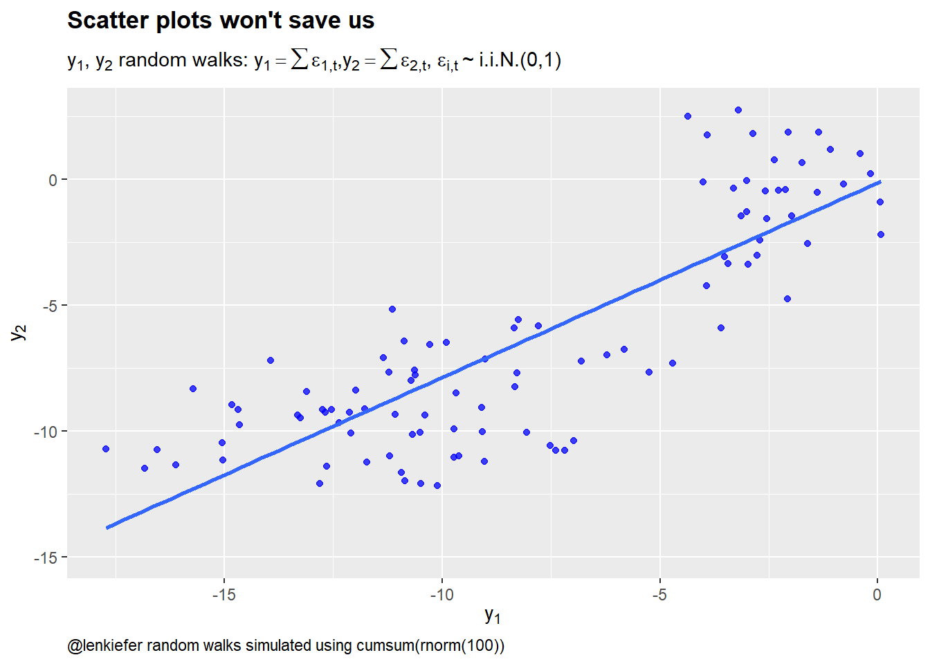
Figure 2: Scatter plots won’t protect us from spurious correlation
If you plot enough time series variables you are almost certain to stumble across spurious correlations. Many economic series exhibit unit root like behavior that drives such spurious correlations. Of course, there are also cases where there is a causal link and series are cointegrated or related in some other way.
The reason I like the scatterplot is because it forces you to think more directly about the relationship. Choosing to put \(y_1\) on the x axis makes us tend to think movements in \(y_1\) are causing movements in \(y_2\). This might not be true, but this mental mode is often useful. Is there some reason to believe \(y_1\) might be causing \(y_2\)? Or should it be the other way around? Perhaps some other factor is driving things.
This is not a panacea of course. You could get things spectacularly wrong with a scatterplot too. But in my experience the scatterplot generates less lazy thinking than generating a dual y-axis chart and saying: “Eureka! \(y_1\) and \(y_2\) move together.”, or worse: “\(y_2\) has deviated from its relationship to \(y_1\), so it must go up/down soon”.