I shared a chart recently on Twitter that got some attention:
static version pic.twitter.com/vtD54nXGio
— 📈 Len Kiefer 📊 (@lenkiefer) November 14, 2019
But not just any attention (though I do appreciate all your likes and retweets). This was special. Robert Allison [at]RobertAllison__ at SAS replicated the chart with SAS software and wrote a blog about it. These mortgage rates look shady to me. I worked on a lot of SAS stuff early in my days working at Freddie Mac, and Robert’s SAS graph examples were a resource I often used. Him taking the time to blog about one of my charts was really cool.
These days I use R more than SAS, but I hadn’t gotten around to posting the code for my chart. Let me post a modified version of the chart I tweeted out, incorporating some of the constructive criticism I got received after posting it.
Housing start trends
Instead of visualizing mortgage rates, we will visualize the housing starts data that Census/HUD released today. We’ll get the data via FRED and the fredr package.
#### Library setup ----
library(fredr)
library(tidyverse)
library(lubridate)
Get the economic data for U.S. single-family housing starts from January 2000 to (as of writing) November 2019:
fredr_set_key(YOUR_FRED_KEY)
# see here: https://research.stlouisfed.org/docs/api/api_key.html

df <-
  fredr(
  series_id = "HOUST1F",
  observation_start = as.Date("2000-01-01")
)
We’ll need to compute annual min/max and first and last values of the year:
dfy <-
  df %>%
  group_by(year=year(date)) %>%
  summarize(start_date=min(date),
            end_date=max(date),
            fvalue=first(value),
            lvalue=last(value),
            min_value=min(value),
            max_value=max(value)) %>%
  ungroup()
Make our plot
We will use our inari color and classic blue, the Pantone 2020 color of the year for the plot.
# set up caption (it long) ----
mycaption="@lenkiefer U.S. Census Bureau and U.S. Department of Housing and Urban Development, \nPrivately Owned Housing Starts: 1-Unit Structures [HOUST1F], \nretrieved from FRED, Federal Reserve Bank of St. Louis; https://fred.stlouisfed.org/series/HOUST1F, December 17, 2019."


# set up colors ----
classic.blue <- "#0f4c81"
inari  <- "#fe5305"
inari1 <- "#e53a00"
inari2 <- "#a90000"


# make plot ----
ggplot(data=filter(dfy,year>2009),
       # offset dates by 15 days
       aes(xmin=start_date+15,xmax=end_date+15,
           ymin=min_value,ymax=max_value,group=year,fill=factor(year)))+
  geom_rect(alpha=0.85,fill=classic.blue)+
  theme_minimal()+
  scale_x_date(date_breaks="1 year",date_labels="%Y")+
  theme(plot.caption=element_text(hjust=0,color=classic.blue),
        panel.grid.minor=element_blank(),
        plot.subtitle=element_text(face="italic",color=classic.blue),
        plot.title=element_text(face="bold",color=classic.blue))+
  geom_line(data=filter(df,year(date)>2009),
            color=inari,size=1.1,
            inherit.aes=FALSE,aes(x=date+15,y=value, group=year(date)))+
  geom_point(aes(x=start_date+15,y=fvalue),shape=21,size=2,fill="white",stroke=1.1,color=inari1)+
  geom_point(aes(x=end_date+15,y=lvalue),shape=21,size=2,fill="white",stroke=1.1,color=inari1)+
  labs(x="date",y="",title="U.S. single-family housing starts (1000s SAAR)",
       subtitle="boxes represent year range (min-max), line monthly values, circles first/last values",
       caption=mycaption)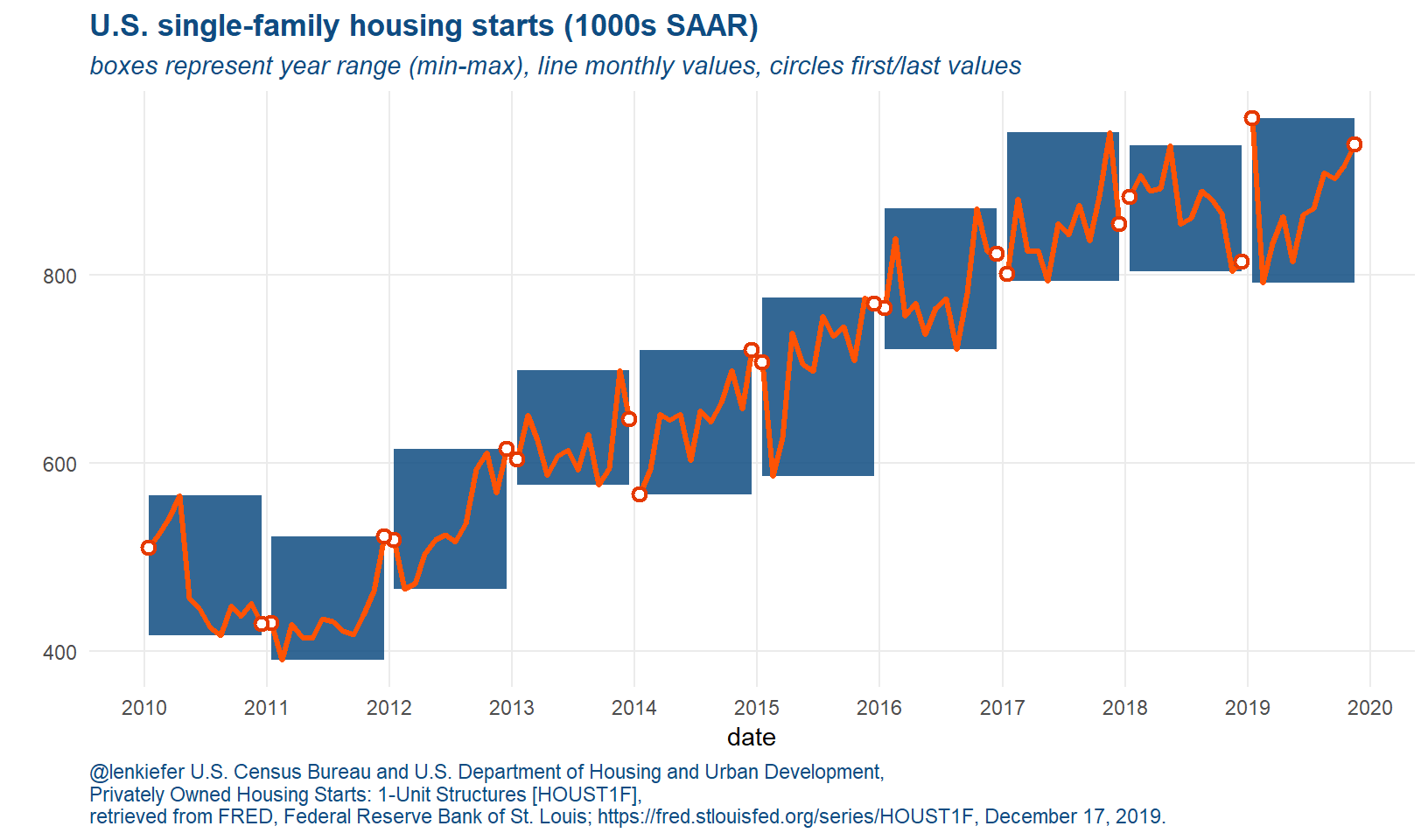
Figure 1: U.S. Single-family housing starts
In this version I’ve taken the advice of [at]xangregg via twitter and got rid of some of the gratuitous shading. In this version I use a blue background that contrasts nicely with the orange for the lines.
What does this chart show us?
I think this kind of chart can be useful. It helps to compare the range of values in a given year. For example, you can see that for most of 2019 (excluding the January blip), single-family housing starts have been increasing. That is in contrast to 2017 and 2018, when starts were seemingly stuck in a rut, moving more or less sideways.