Early last Friday morning I was sitting in Palm Springs International Airport waiting to catch a flight back to Virginia. I had traveled out west to speak at the 2019 NAGLREP Conference. This Friday happened to be jobs Friday, when the U.S. Bureau of Labor Statistics releases the employment situation. Jobs Fridays are busy on Twitter. Everybody seems eager to offer a perspective on what the latest jobs numbers mean for the U.S. economy.
As I scrolled through my feed one Tweet caught my attention. A lot of people have thoughts on jobs Friday. Ernie Tedeschi ( [@ernietedeschi](https://twitter.com/ernietedeschi)) usually has something interesting to say. Though I believe both Ernie and I live in the D.C. metro area, we haven’t met. Maybe one day I’ll be lucky enough to meet with him, but in the meantime I get a lot out of his analysis on Twitter.
This Jobs Friday Ernie was replying to some other thread:
I prefer looking Y-Y to eliminate more survey noise. Wage growth Y-Y has been flat or decelerating YTD. Something is either compositionally or fundamentally stunting wage growth this year. pic.twitter.com/HEE48rHFYU
— Ernie Tedeschi (@ernietedeschi) October 4, 2019
What caught my attention was something that I often do: transform data. When looking at time series data, it’s often helpful to do some sort of filtering. Every chart has embedded within it an implicit model about how the world works. This is especially true of time series plots. Any transformation you make can radically alter what the chart seems to tell you about the world.
When my team brings me charts to help explain something they are working on, I try hard not to be pedantic or a chart scold, but sometimes I can’t just let it go. I’ve tried to mellow out and be clear that I’m being picky for a reason. But often, choices for time series plots are making strong claims about the world.
When I looked at Ernie’s tweet, I wondered: what sort of world makes a 12-month percent change a better signal than a 3-month percent change? Let’s take a look at it. Per usual we will use R.
The data is pretty easy to get. Ernie’s chart plotted two standard economic time series from the U.S. Bureau of Labor Statistics: average hourly earnings of all private sector employees and average hourly earnings of production and nonsupervisory employees.
R code to get data
# libraries
library(forecast)
library(tidyquant)
library(tidyverse)
library(KFAS)
library(rucm)

# get data via FRED
tickers <- c("CES0500000003","AHETPI")
cnames <- c("Total Private",'Production and Nonsupervisory Employees')


df <-
  tidyquant::tq_get(tickers,
                    get="economic.data",
                    from="2006-03-01") %>%
  left_join( tibble(symbol=tickers,names=cnames), by="symbol")

# create captions for plots

mycaption1 <- paste0("@lenkiefer Source: U.S. Bureau of Labor Statistics, Average Hourly Earnings of All Employees: Total Private [CES0500000003],",
                     "\nretrieved from FRED, Federal Reserve Bank of St. Louis; https://fred.stlouisfed.org/series/CES0500000003, October 6, 2019")

mycaption2 <- paste0("@lenkiefer Source: U.S. Bureau of Labor Statistics, Average Hourly Earnings of Production and Nonsupervisory Employees, Total Private [AHETPI],",
                     "\nretrieved from FRED, Federal Reserve Bank of St. Louis; https://fred.stlouisfed.org/series/AHETPI, October 6, 2019.")


str(df)
## Classes 'tbl_df', 'tbl' and 'data.frame': 326 obs. of 4 variables:
## $ symbol: chr "CES0500000003" "CES0500000003" "CES0500000003" "CES0500000003" ...
## $ date : Date, format: "2006-03-01" "2006-04-01" ...
## $ price : num 20 20.2 20.1 20.2 20.3 ...
## $ names : chr "Total Private" "Total Private" "Total Private" "Total Private" ...Now that we have the data let’s take a look. It will be convenient to work with these data as times series, so we’ll convert them. We’ll also make some transformations we can use below. Let’s focus on the earnings for all private sector employees.
Wrangle data, basic plots
ts1 <- filter(df,symbol=="CES0500000003") %>% pull(price) %>% ts(start=2006+2/12,frequency=12)
ts2 <- filter(df,symbol=="AHETPI") %>% pull(price) %>% ts(start=2006+2/12,frequency=12)

# 1-month log difference, annualized growth rate
ts1m <- diff(log(ts1))*12
ts2m <- diff(log(ts2))*12

# 3-month log difference, annualized growth rate (3-month moving average)
ts1ma3 <- zoo::rollapply(ts1,3,  mean,  align="right")
ts2ma3 <- zoo::rollapply(ts2,3,  mean,  align="right")

# 3-month log difference, annualized growth rate
ts1q <- diff(log(ts1ma3),3)*4
ts2q <- diff(log(ts2ma3),3)*4

# 12-month log difference
ts1y <- diff(log(ts1),12)
ts2y <- diff(log(ts2),12)

# use the forecast package autoplot
# make plots (printed outside the details tab)
g1 <-
  autoplot(ts1) +
  labs(x="",
       y="",
       title="Average Hourly Earnings: All Private Sector Employees",
       subtitle="$/Hour",
       caption=mycaption1)+
  theme_minimal()+
  theme(plot.caption=element_text(hjust=0))

g2<-
  autoplot(ts2) +
  labs(x="",
       y="",
       title="Average Hourly Earnings: Private Sector Production and Nonsupervisory Employees",
       subtitle="$/Hour",
       caption=mycaption2)+
  theme_minimal()+
  theme(plot.caption=element_text(hjust=0))
cowplot::plot_grid(g1,g2, ncol=1)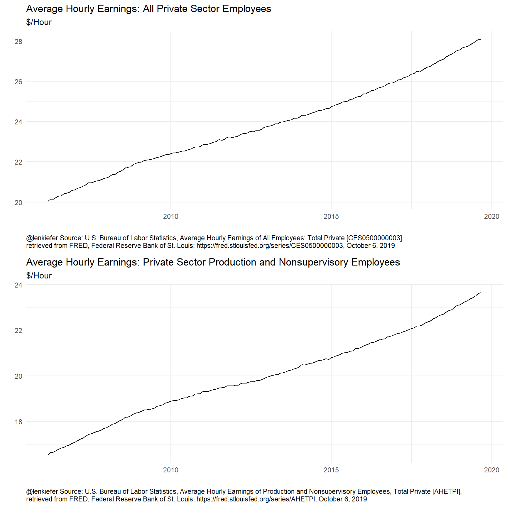
These plots reveal that average hourly earning typically rise, but how much? Let’s consider some transformations:
# inari colors!  http://lenkiefer.com/2019/09/23/theme-inari/
inari  <- "#fe5305"

ggplot(data=ts1y,
       aes(x=time(ts1y), y=ts1y, color="12-month log difference"))+
  geom_line(data=ts1m, aes(x=time(ts1m), y=ts1m, color="01-month log difference"),alpha=0.75)+
  geom_line(data=ts1q, aes(x=time(ts1q), y=ts1q, color="03-month log difference"),alpha=0.75)+
  geom_line()+
  scale_color_manual(name="transformation", values=c("gray","dodgerblue",inari))+
  labs(x="",y="",
       title="Average Hourly Earnings: All Private Sector Employees",
       subtitle="Annualized growth rate",
       caption=mycaption1)+
  scale_y_continuous(labels=scales::percent,sec.axis=dup_axis())+
  theme_minimal()+
  theme(plot.caption=element_text(hjust=0),
        legend.position="top")
## Don't know how to automatically pick scale for object of type ts. Defaulting to continuous.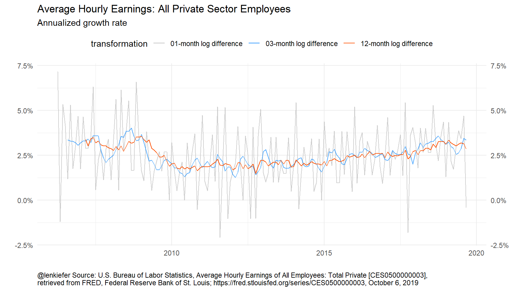
Figure 1: Trends in wages
Here we plot three transformations: 1-month (monthly) growth rate, 3-month (quarterly) growth rate, and 12-month (annual) growth rate. The monthly growth rates look quite noisy, so some smoothing seems warranted. But should we use a 3-month or 12-month percent change? Does it matter?
Structural time series approach
One way to approach this problem is to ask the following question. What is the underlying trend driving average hourly earnings, and has that trend changed? I believe that’s the spirit of the Twitter conversation up above.
Seasonality?
There’s also a nastier problem about seasonal adjustment that I’m going to avoid here.
An observation on seasonality
The underlying data is seasonally adjusted, but there could be residual seasonality in the data. We won’t be exploring that here in great detail.
If we restrict ourselves to ARIMA models of max non-seasonal differences of 1 we get.
# set lambda=0 implies log transform of underlying series
auto.arima(ts1,lambda=0,max.d=1)
## Series: ts1
## ARIMA(2,1,2)(1,0,2)[12] with drift
## Box Cox transformation: lambda= 0
##
## Coefficients:
## ar1 ar2 ma1 ma2 sar1 sma1 sma2 drift
## 0.9022 -0.0052 -1.3176 0.5268 0.3131 -0.3441 -0.3627 0.0021
## s.e. 0.1294 0.1572 0.1013 0.1298 0.2111 0.2074 0.0988 0.0001
##
## sigma^2 estimated as 1.455e-06: log likelihood=863.33
## AIC=-1708.67 AICc=-1707.48 BIC=-1680.88Even the seasonally adjusted data appears to possibly have some residual seasonality.
If we use the forecast package’s auto.arima function on the time series we get an ARIMA(2,2,1) model.
# set lambda=0 implies log transform of underlying series
auto.arima(ts1,lambda=0)
## Series: ts1
## ARIMA(2,2,1)
## Box Cox transformation: lambda= 0
##
## Coefficients:
## ar1 ar2 ma1
## -0.6348 -0.4037 -0.8255
## s.e. 0.0820 0.0830 0.0571
##
## sigma^2 estimated as 1.625e-06: log likelihood=850.5
## AIC=-1693 AICc=-1692.74 BIC=-1680.67An ARIMA (0,2,1) model is a close cousin of the local level model described by the following equations:
\[ y_t = \mu_t + \epsilon_t,\]
\[ \mu_t = \mu_{t-1} + \nu_t + \eta_t, \]
\[ \nu_t = \nu_{t-1} + u_t,\]
where \(y_t\) is the time series, \(\mu_t\) is the time-varying trend and \(\nu_t\) is the slope.
We could estimate these models with good old SAS PROC UCM or with the R wrapper for KFAS, rucm.
lts1 <- log(ts1)

# estimate ucm model with time varying trend, slope

ss1 <- ucm(lts1~1 ,data=lts1, slope=TRUE)

# combine data
ts1_all <- ts.union(ts1,ts1m,ts1y,ts1q,ss1$s.slope)
# make a tibble
df1   <- tibble(time=time(ts1_all),
                  ts1 = ts1_all[,"ts1"],
                  ts1m= ts1_all[,"ts1m"],
                  ts1q= ts1_all[,"ts1q"],
                  ts1y= ts1_all[,"ts1y"],
                  ss1 = ts1_all[,"ss1$s.slope"])

# plot data
ggplot(data=df1,
       aes(x=time, y=ts1y, color="12-month log difference"))+
  geom_line( aes(y=ts1q, color="03-month log difference"),alpha=0.75)+
    geom_line(aes(y=12*ss1, color="Smoothed Trend"),alpha=0.75,size=1.05)+
  geom_line()+
  scale_color_manual(name="transformation", values=c("dodgerblue",inari,"red"))+
  labs(x="",y="",
       title="Average Hourly Earnings: All Private Sector Employees",
       subtitle="Annualized growth rate",
       caption=mycaption1)+
  scale_y_continuous(labels=scales::percent,sec.axis=dup_axis())+
  theme_minimal()+
  theme(plot.caption=element_text(hjust=0),
        legend.position="top")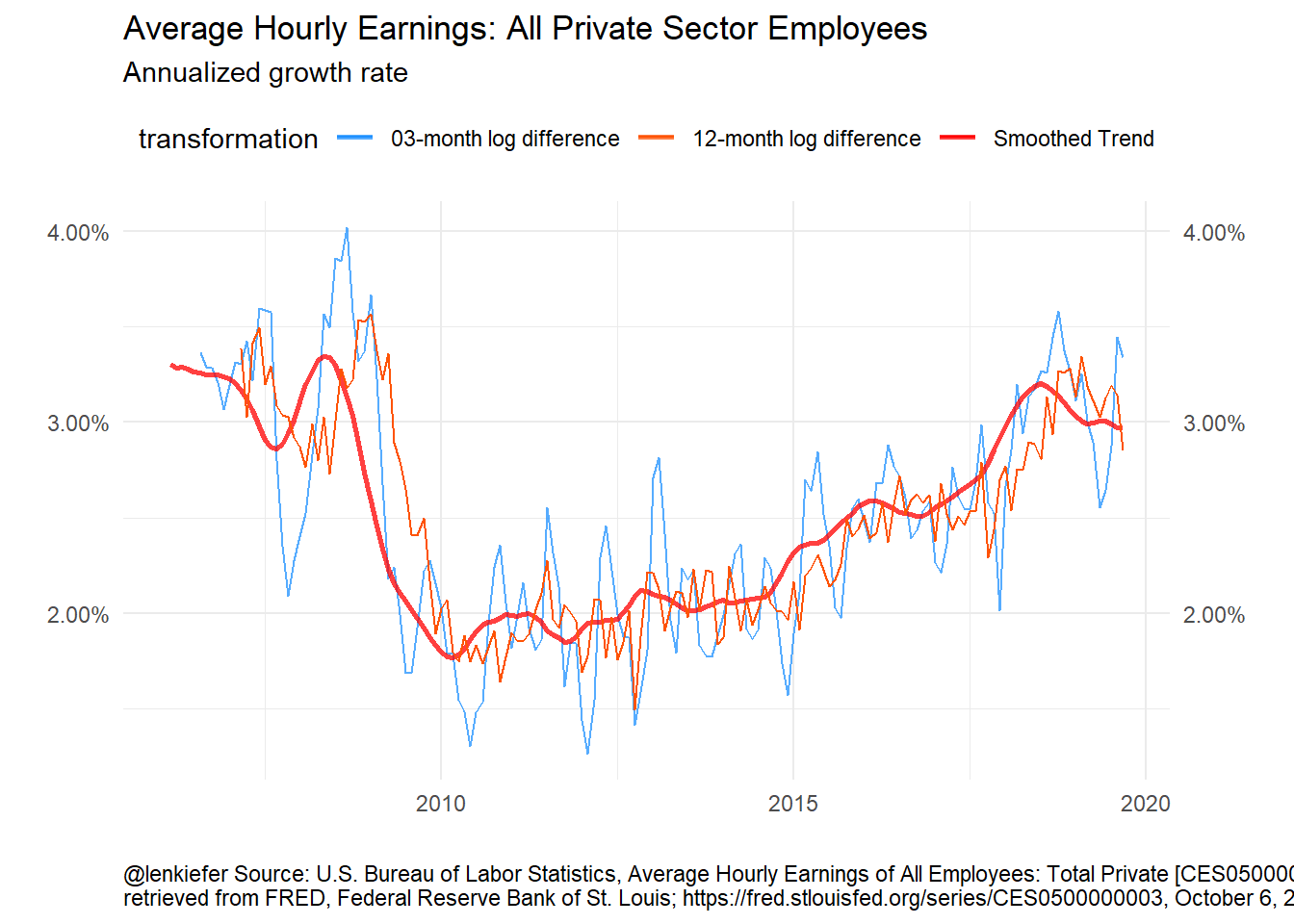
Figure 2: Unobserved Components Model for Wages
The UCM model gives an estimate of the trend that is smoother than both the 3-month and 12-month growth rates. The 3-month growth rate probably still has “too much” volatility, but it’s faster to track changes in the trend than the 12-month percent change.
Discussion
After I saw Ernie’s tweet, I asked under what conditions the 12-month percent change was a better transformation than the 3-month percent change. I’m not completely sure, though I have an inutitive feel that a 12-month filter is often “about right” for a lot of U.S. macroeconomic time series I look at day to day.
I feel this framework might be a useful way to work through some of those conditions. Perhaps we’ll revisit it in future.