Maybe you are of the opinion that charts should have their y axis extend all the way down to 0, even if the data live far away from zero. I’m not sure if that’s always the right thing to do. But if you are strict about this, how can you use the space?
One thing I experimented with in my Mortgage rates in the 21st century post was filling the area under a line with progressively fainter area. That had a neat effect, but didn’t provide much additional information. What if we tried to pack in some extra data?
Rug plots are useful. They add little ticks at the bottom or side of a plot to give you a sense of the distribution. They are designed to tack up a little space, but what if we have a lot of space?
Let’s try a quick modification. Per usual, we’ll make our charts with R.
Get data
Last week the U.S. Bureau of Labor Statistics (BLS) released their employment situation report. The BLS reported that the U.S. unemployment rate was back down to 3.9 percent in July. This is the lowest level it has been in many years.
We can get the data directly from the BLS via a flat text file they provide. We’ll read it in and filter it using the data.table package. Note that as this file has a lot of extra information in it it’s quite big (I was doing some other stuff with data in it). You could alternatively get this file from FRED or other places on the BLS website.
First load libraries:
suppressPackageStartupMessages({
library(data.table)
library(tidyverse)
library(extrafont)
library(ggridges)
library(cowplot)
})
Then get data from BLS:
Code for data
ln_series <- fread("https://download.bls.gov/pub/time.series/ln/ln.series")
# this is a really big file.
# alternativley can get from FRED VIA:
#  quantmod::getSymbols("UNRATE",src='FRED')
# df_ur <-  data.frame(date=zoo::index(UNRATE), value= zoo::coredata(UNRATE))

ln_data <- fread("https://download.bls.gov/pub/time.series/ln/ln.data.1.AllData")
# create dates ----
ln_data[,month:=as.numeric(substr(ln_data$period,2,3))]
ln_data$date<- as.Date(ISOdate(ln_data$year,ln_data$month,1) ) #set up date variable
df_ur <- filter(ln_data, series_id =="LNS14000000") %>% mutate(value=as.numeric(value))
Make a deceptively simple line plot
Let’s make a line plot with our data.
g1 <-
  ggplot(data=df_ur,
       aes(x=date,y=value))+
  geom_line()+
  theme_ridges(font_family="Roboto")+
  geom_hline(yintercept=3.9,linetype=2,size=1.1)+
  labs(x="",y="Unemployment Rate (%)", title="U.S. Unemployment rate was 3.9% in July 2018",
       subtitle="dotted line at 3.9%",
       caption="@lenkiefer Source: U.S. Bureau of Labor Statistics")
g1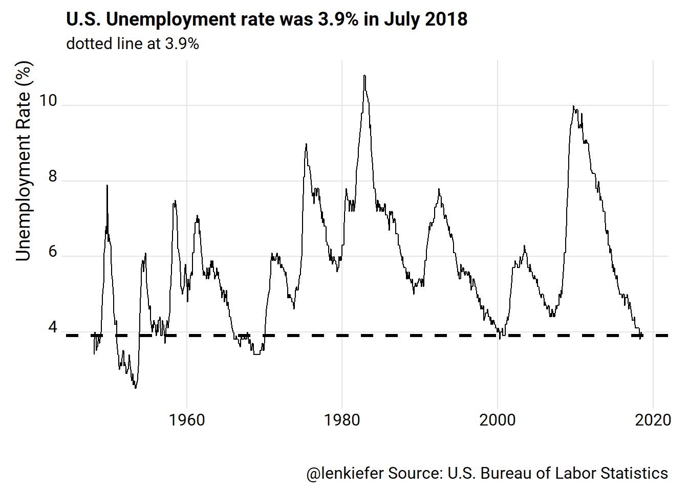
But uh-oh. The y axis doesn’t go all the way to 0! Some might not like that!
We could fix it.
g2<-
ggplot(data=df_ur, aes(x=date,y=value, fill=value-3.9))+
  geom_line()+
  scale_y_continuous(limits=c(0,11),breaks=seq(0,10,2), expand=c(0,0))+
  theme_ridges(font_family="Roboto")+
  geom_hline(yintercept=3.9,linetype=2,size=1.1)+
  labs(x="",y="Unemployment Rate (%)", title="U.S. Unemployment rate was 3.9% in July 2018",
       subtitle="dotted line at 3.9%",
       caption="@lenkiefer Source: U.S. Bureau of Labor Statistics")
g2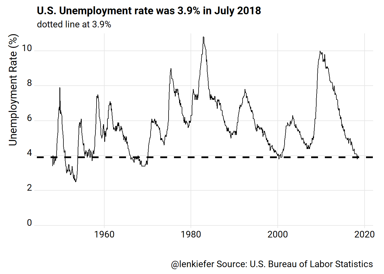
There, that’s (maybe) better. But now we have all that white space. What could we do with it?
One thing we might want to emphasize in this plot is the fact that the U.S. unemployment rate below 4 percent is a relatively rare event. We could try to add ticks using a geom_rug call in ggplot2.
g3 <- g2 +
  geom_rug(data= .%>% filter(value<4), sides="b")+
  labs(subtitle="dotted line at 3.9%, ticks at bottom when rate < 4%")

g3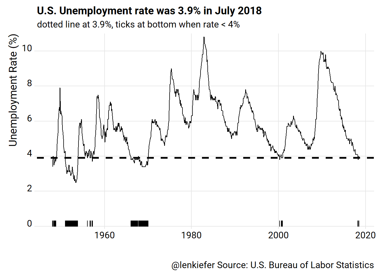
All right. What if we increased their size and added color? We could try playing with the aesethetics in geom_rug, or we could add a little column chart at the bottom. We can also use ggridges::geom_ridgeline_gradient to add a shaded area effect.
g4 <-
  ggplot(data=df_ur, aes(x=date,y=value, fill=value-3.9))+
  geom_ridgeline_gradient(aes(y=3.9, height=value-3.9), min_height= - 10, alpha=0.75)+
  scale_fill_viridis_c(breaks=seq(-2,6,2), labels=3.9+seq(-2,6,2), name="Unemployment Rate (%)", option="B")+
  theme_ridges(font_family="Roboto")+
  theme(legend.position= "bottom",legend.key.width=unit(2,"cm")) +
  scale_y_continuous(limits=c(0,11),breaks=seq(0,10,2), expand=c(0,0))+
  labs(x="",y="")+
  geom_col(aes(y= 1),width=100)+
  scale_x_date(date_breaks="5 years", date_labels="%Y")+
  geom_hline(yintercept=3.9,linetype=2,size=1.1)+
  labs(x="",y="Unemployment Rate (%)", title="U.S. Unemployment rate was 3.9% in July 2018",
       subtitle="dotted line at 3.9%",
       caption="@lenkiefer Source: U.S. Bureau of Labor Statistics")

g4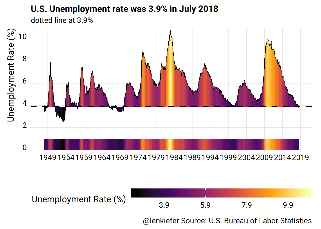
Better? Maybe. I like the use of the color to emphasize points.
An alternative plot
We also could try a tile chart.
ggplot(data=df_ur, aes(y=year,x=month, fill=value>3.9))+
  geom_tile(color="gray")+
  scale_y_reverse(expand=c(0,0), breaks =c(1948,seq(1950,2015,5),2018))+
  scale_x_continuous(labels=month.abb, breaks=1:12, expand=c(0,0))+
  scale_fill_manual(values= c("royalblue","lightblue"), name="Unemployment Rate > 3.9%")+
  theme_ridges()+
  theme(legend.position="top")+
    labs(x="Month",y="Year", title="When was the U.S. Unemployment rate as low as in July 2018?",
       subtitle="Months when rate was 3.9% or less",
       caption="@lenkiefer Source: U.S. Buereau of Labor Statistics")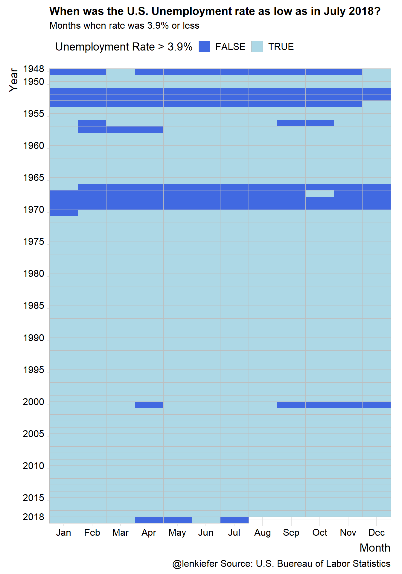
Jobs Friday Recap
For more on these data, check out my Jobs Friday threads over on Twitter. You may notice some versions of these plots (+ more!) showing up.
94 consecutive months of job gains pic.twitter.com/Ddwik3DvVL
— 📈 Len Kiefer 📊 (@lenkiefer) August 3, 2018
U.S. labor force participation, still down for prime working age (25-54) population since Great Recession, but gradually working higher pic.twitter.com/gzYpV92Q6k
— 📈 Len Kiefer 📊 (@lenkiefer) August 3, 2018
The U.S. unemployment rate was 3.9% in July. When has it been that low?
— 📈 Len Kiefer 📊 (@lenkiefer) August 3, 2018
Not often: pic.twitter.com/tzIaf1cWT9