On Twitter Claus Wilke asks:
Dear Lazyweb: Is there an accepted name for a plot showing a two-variable time series as a path in the x-y plane? #dataviz@Elijah_Meeks @albertocairo @lenkiefer @sharoz @dataandme pic.twitter.com/N8Edmf8qii
— Claus Wilke (@ClausWilke) July 21, 2018
I call them connected scatterplots, and we’ve made a few here. See for example this post.
But we can intensify things and make a plot like this:
hey @ClausWilke why stop at a 2-d connected scatterplot* when you could go to 3-d
— 📈 Len Kiefer 📊 (@lenkiefer) July 22, 2018
*or meandering plot etc pic.twitter.com/D7l8CQewZb
R code to follow.
suppressPackageStartupMessages({
library(tidyquant)
library(tidyverse)
library(lubridate)
library(ggridges)
library(cowplot)
  library(extrafont)
})
And then get some data via FRED.
tickers <- data.frame(symbol=c("PCEPI","UNRATE","FEDFUNDS"),varname=c("pce.level","ur","fedfunds"))

df <- tidyquant::tq_get(c("PCEPI","UNRATE","FEDFUNDS"),get="economic.data", from="1959-01-01")

df <- left_join(df,tickers, by="symbol")

df %>% dplyr::select(date,price,varname) %>%
  spread(varname,price) %>%
  mutate(pce =100*(pce.level/lag(pce.level,12)) -100) %>%
  filter(!is.na(pce)) -> dfq
To make our plot, we’ll use a custom color palette defined below (I really should make a package for this I think).
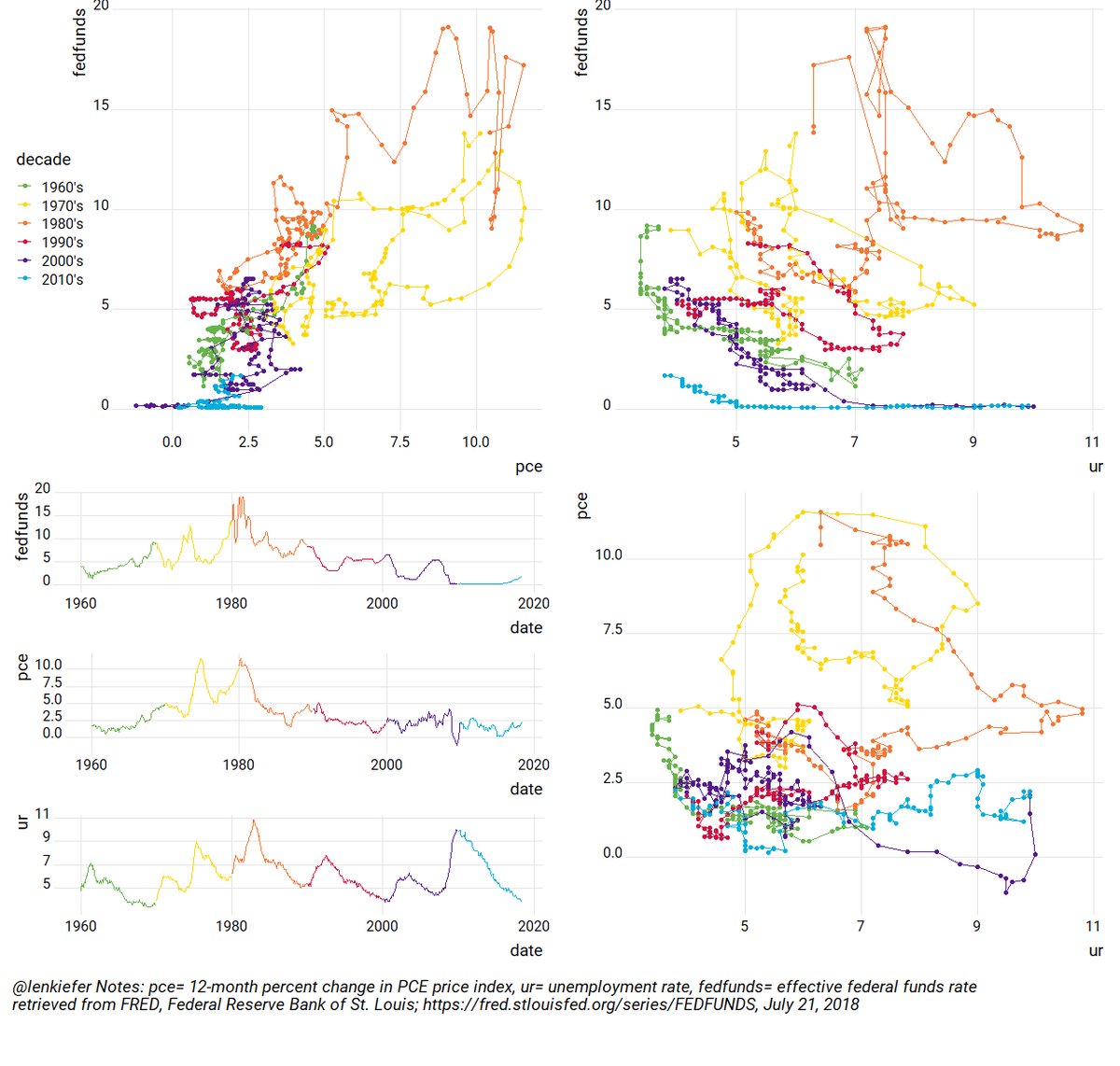
Now, make our plot. It’s going to need to be large to fit all the detail. Link to chart.
#add decade
dfq <- mutate(dfq, decade=paste0(10*floor(year(date)/10),"'s"))

g1 <- ggplot(data=dfq, aes(x=pce,y=fedfunds,color=decade))+geom_point()+ theme_ridges(font_family="Roboto")+geom_path()+scale_color_mycol("mixed6")+theme(legend.position="left")
g2 <- ggplot(data=dfq, aes(x=ur,y=pce,color=decade))+geom_point()+  theme_ridges(font_family="Roboto")+geom_path()+scale_color_mycol("mixed6")+theme(legend.position="none")
g3 <- ggplot(data=dfq, aes(x=ur,y=fedfunds,color=decade))+geom_point()+  theme_ridges(font_family="Roboto")+geom_path()+scale_color_mycol("mixed6")+theme(legend.position="none")

g1ts <- ggplot(data=dfq, aes(x=date,y=fedfunds,color=decade))+geom_line()+  theme_ridges(font_family="Roboto")+scale_color_mycol("mixed6")+theme(legend.position="none")
g2ts <- ggplot(data=dfq, aes(x=date,y=pce,color=decade))+geom_line()+  theme_ridges(font_family="Roboto")+scale_color_mycol("mixed6")+theme(legend.position="none")
g3ts <- ggplot(data=dfq, aes(x=date,y=ur,color=decade))+geom_line()+  theme_ridges(font_family="Roboto")+scale_color_mycol("mixed6")+theme(legend.position="none")

g.ts <- plot_grid(g1ts,g2ts,
                  g3ts,
                  ncol=1)

g<- plot_grid(g1,g3,g.ts,g2,ncol=2)

plot_grid( g,ggplot(data=NULL)+
             labs(title=" @lenkiefer Notes: pce= 12-month percent change in PCE price index, ur= unemployment rate, \n fedfunds= effective federal funds rate\n retrieved from FRED, Federal Reserve Bank of St. Louis; https://fred.stlouisfed.org/series/FEDFUNDS, July 21, 2018")+
             theme_ridges(font_family="Roboto")+theme(plot.title=element_text(hjust=0,size=12,face="italic")),
           rel_heights=c(10,1),ncol=1)
Code for color scale.
# Function for colors ----
#####################################################################################
## Make Color Scale ----  ##
#####################################################################################
my_colors <- c(
  "green"      = rgb(103,180,75, maxColorValue = 256),
  "green2"      = rgb(147,198,44, maxColorValue = 256),
  "lightblue"  =  rgb(9, 177,240, maxColorValue = 256),
  "lightblue2" = rgb(173,216,230, maxColorValue = 256),
  'blue'       = "#00aedb",
  'red'        = "#d11141",
  'orange'     = "#f37735",
  'yellow'     = "#ffc425",
  'gold'       = "#FFD700",
  'light grey' = "#cccccc",
  'purple'     = "#551A8B",
  'dark grey'  = "#8c8c8c")


my_cols <- function(...) {
  cols <- c(...)
  if (is.null(cols))
    return (my_colors)
  my_colors[cols]
}


my_palettes <- list(
  `main`  = my_cols("blue", "green", "yellow"),
  `cool`  = my_cols("blue", "green"),
  `hot`   = my_cols("yellow", "orange", "red"),
  `mixed` = my_cols("lightblue", "green", "yellow", "orange", "red"),
  `mixed2` = my_cols("lightblue2","lightblue", "green", "green2","yellow","gold", "orange", "red"),
  `mixed3` = my_cols("lightblue2","lightblue", "green", "yellow","gold", "orange", "red"),
  `mixed4` = my_cols("lightblue2","lightblue", "green", "green2","yellow","gold", "orange", "red","purple"),
  `mixed5` = my_cols("lightblue","green", "green2","yellow","gold", "orange", "red","purple","blue"),
  `mixed6` = my_cols("green", "gold", "orange", "red","purple","blue"),
  `grey`  = my_cols("light grey", "dark grey")
)


my_pal <- function(palette = "main", reverse = FALSE, ...) {
  pal <- my_palettes[[palette]]

  if (reverse) pal <- rev(pal)

  colorRampPalette(pal, ...)
}


scale_color_mycol <- function(palette = "main", discrete = TRUE, reverse = FALSE, ...) {
  pal <- my_pal(palette = palette, reverse = reverse)

  if (discrete) {
    discrete_scale("colour", paste0("my_", palette), palette = pal, ...)
  } else {
    scale_color_gradientn(colours = pal(256), ...)
  }
}


scale_fill_mycol <- function(palette = "main", discrete = TRUE, reverse = FALSE, ...) {
  pal <- my_pal(palette = palette, reverse = reverse)

  if (discrete) {
    discrete_scale("fill", paste0("my_", palette), palette = pal, ...)
  } else {
    scale_fill_gradientn(colours = pal(256), ...)
  }
}