IN MY LINE OF WORK, (finance/economics) you see a lot of dual axis line charts. I am of the opinion that dual y axis charts are sort of evil. But in this post I’m going to make one. It’s for a totally legit reason though.
Like in an earlier post we’ll make a graph similar to one I saw on xenographics. Xenographics gives examples of and links to “weird, but (sometimes) useful charts”. The examples xenographics gives are undoubtedly interesting and might help inspire you if you’re looking for something new.
Per usual, let’s make a graph with R.
Housing affordability
I’m scheduled to give a talk on house price trends. During my talk I’m going to compare recent house price trends to income. For recent trends see this tweet thread.
For my upcoming talk I want a special kind of graphic to compare house prices to income. After looking around xenographics I decided that spotlight charts might be a good visual for my talk. See here for the original dataviz.
But in order to make this chart with R we’re going to need to use a dual axis. Fortunately in recent versions of ggplot2 ther’es an ability to add a secondary y axis despite potential issues with them. See for example, this post by DataWrapper’s Lisa Charlotte Rost on Twitter that looks at these charts.
The plan
We’re going to compare median household income to median house prices by metro area. We’ll use a spotlight graph to expand the ratio by metro into its numerator and denominator. The ratio will serve as the light source, while the numerator and denominator will define the cone extending from the ratio.
Get data
We will use the acs packaged to access the U.S. Census Bureau’s American Community Survey (ACS) API and get data. Note for this to work for you you’ll need to get an API key from the U.S. Census Bureau.
The latest data from the ACS is for 2016 (in my talk I’ll use more recent data from other sources). Let’s access the 1-year estimates and gather data on metropolitan stastical area (MSA) median household income and median house values. For other ways to visualize these kinds of data see this post from last year.
#####################################################################################
## Load libraries ----
#####################################################################################
library(acs)
library(scales)
library(tidyverse)
library(viridis)

#####################################################################################
## Get data ----
#####################################################################################

#install your key
api.key.install(key="YOUR_API_KEY")

# Get metros
geo <- geo.make(msa='*')

# housing values table B25077

hv <- acs.fetch(endyear=2016, span=1, geography=geo, table.number="B25077")

# income table B19013
inc <- acs.fetch(endyear=2016, span=1, geography=geo, table.number="B19013")

# Population Table B25008
pop <- acs.fetch(endyear=2016, span=1, geography=geo, table.number="B25008")


df.acs <- data.frame(area=hv@geography$NAME,        # MSA name
                     pop=unname(pop@estimate[,1]), # Metro Population
                     hvalue=unname(hv@estimate),   # Median Housing value
                     inc=unname(inc@estimate)      # Median Household Income

                     ) %>%
  mutate(ratio=hvalue/inc) %>%                     # create ratio of house value to income
  arrange(-pop)                                    # sort (descending) by population
Let’s look at the first few rows…
knitr::kable(head(df.acs))| area | pop | hvalue | inc | ratio |
|---|---|---|---|---|
| New York-Newark-Jersey City, NY-NJ-PA Metro Area | 19742242 | 426300 | 71897 | 5.929316 |
| Los Angeles-Long Beach-Anaheim, CA Metro Area | 13092245 | 578200 | 65950 | 8.767248 |
| Chicago-Naperville-Elgin, IL-IN-WI Metro Area | 9352081 | 229900 | 66020 | 3.482278 |
| Dallas-Fort Worth-Arlington, TX Metro Area | 7148981 | 189100 | 63812 | 2.963392 |
| Houston-The Woodlands-Sugar Land, TX Metro Area | 6691456 | 181400 | 61708 | 2.939651 |
| Washington-Arlington-Alexandria, DC-VA-MD-WV Metro Area | 6026273 | 411400 | 95843 | 4.292437 |
| …and some summary stasitics. |
knitr::kable(summary(df.acs %>% select(-area)))| pop | hvalue | inc | ratio | |
|---|---|---|---|---|
| Min. : 52649 | Min. : 68500 | Min. : 14546 | Min. :1.700 | |
| 1st Qu.: 96092 | 1st Qu.:124200 | 1st Qu.: 45195 | 1st Qu.:2.666 | |
| Median : 158490 | Median :154450 | Median : 50967 | Median :3.101 | |
| Mean : 550359 | Mean :182636 | Mean : 51924 | Mean :3.430 | |
| 3rd Qu.: 402945 | 3rd Qu.:206500 | 3rd Qu.: 57748 | 3rd Qu.:3.742 | |
| Max. :19742242 | Max. :911900 | Max. :110040 | Max. :9.184 |
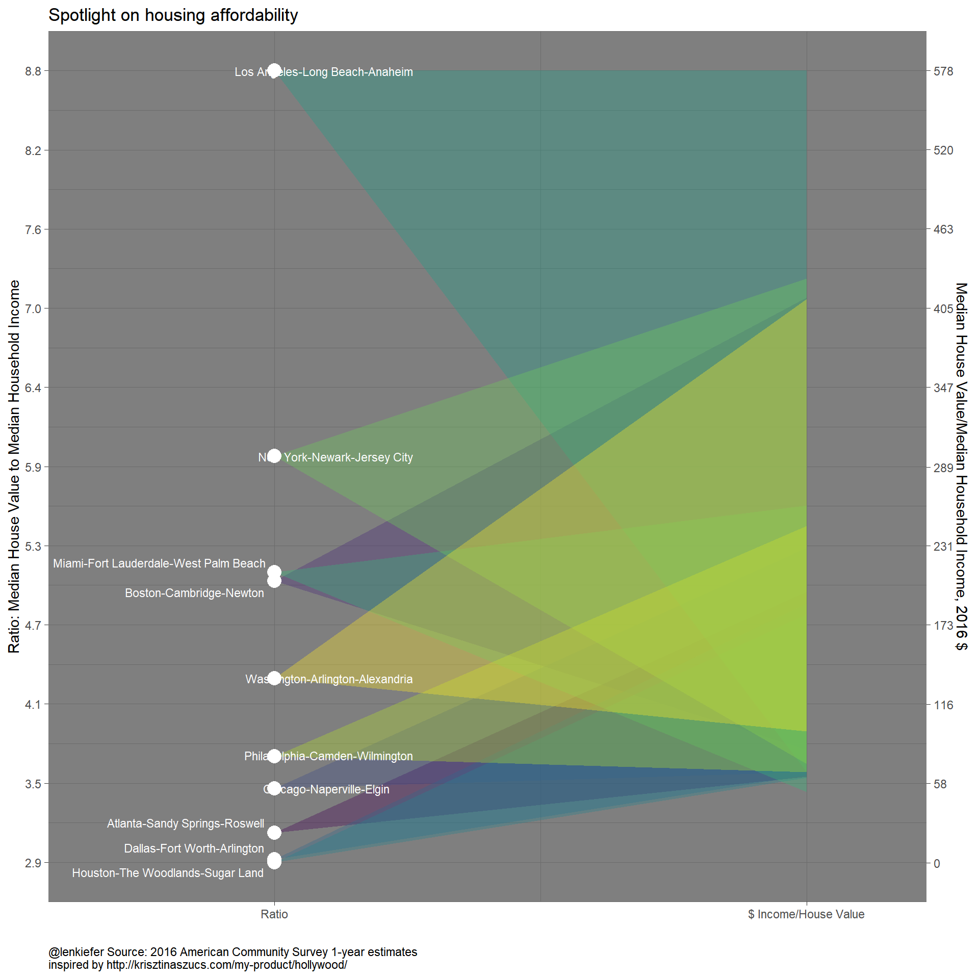
When we compare the median house price to the median household income, ratio, we see that there’s quite a bit of variation across MSAs.
Spotlight chart
Let me first show you the spotlight chart, and then we’ll explain.

On the left side I plot the ratio of median house prices to median income, while on the right I show the $ values of those stats.
This viz shines when you compare metros:
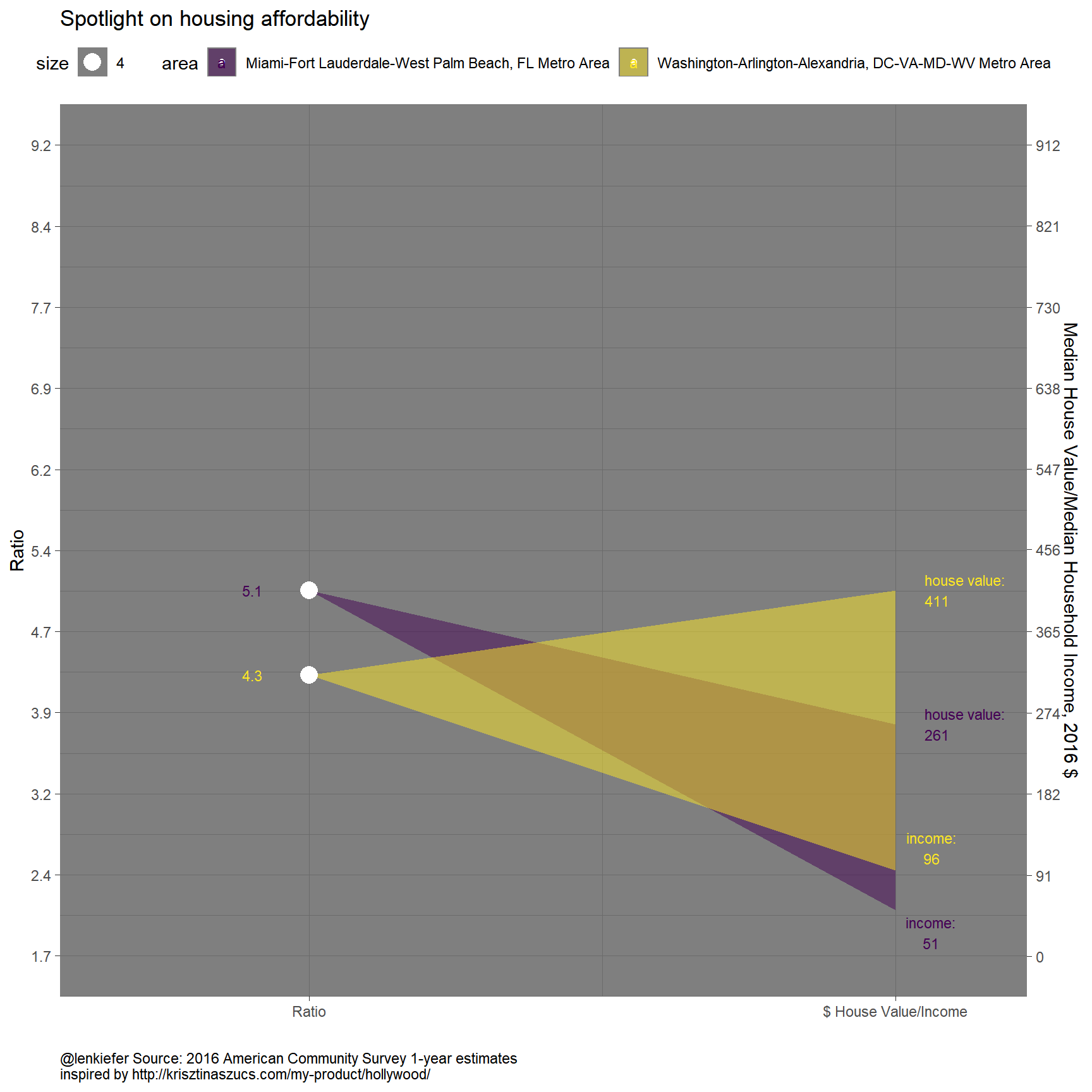
In this we see that the ratio of house values to income is greater in Miami metro compared to Washington D.C., but house values are greater in D.C. than in Miami. Lower incomes in Miami push the ratio higher. The spotlight is wider.
Make the chart
In order to make the chart we need to use (abuse?) the ggplot2 sec.axis function along with the rescale() function from the scales package.
What we will do is map the ratio, median income, and median price stasitics to a 0 to 100 scale. Then we’ll invert the mapping to label the points.
df.acs2 <- df.acs[6,]   # just get row 6, Washington D.C.

maxp <- max(df.acs$hvalue)
maxr <- max(df.acs$ratio)
minr <- min(df.acs$ratio)

df.plot <- df.acs2 %>%
  mutate(p=rescale(hvalue,to=c(0,100), from=c(0,maxp)),
         i=rescale(inc, to=c(0,100), from=c(0,maxp)),
         r=rescale(ratio, to=c(0,100), from=c(minr,maxr))
  )
knitr::kable(df.plot %>% select(-area))| pop | hvalue | inc | ratio | p | i | r |
|---|---|---|---|---|---|---|
| 6026273 | 411400 | 95843 | 4.292437 | 45.1146 | 10.51025 | 34.64067 |
Now our price (hvalue), income (inc), and ratio (ratio) stats are mapped to a 0 to 100 scale (p,i,r respectively).
To draw the spotlight we need a triangle that goes from r to p and i. We’ll put r on the left at x value 1 and the values i and r on the right at value 2 (the particular values are arbitrary). In order to create the points we’ll double up the x values using the expand function.
df.plot2 <-
  df.plot %>%
  group_by(area) %>%
  expand(x=c(0,1,2),r,p,i) %>%
  mutate(y=case_when(
    x == 0 ~ r,
    x == 1 ~ p,
    x == 2 ~ i)  ) %>%
  mutate(x=ifelse(x==0,1,2)) %>%
  ungroup()

knitr::kable(df.plot2 %>% select(-area))| x | r | p | i | y |
|---|---|---|---|---|
| 1 | 34.64067 | 45.1146 | 10.51025 | 34.64067 |
| 2 | 34.64067 | 45.1146 | 10.51025 | 45.11460 |
| 2 | 34.64067 | 45.1146 | 10.51025 | 10.51025 |
Now we simply draw our point (for the spotlight source) and the triangle (for the cone of light). And style. I’m using a dark theme, but it could be even darker.
# add back some fields we dropped wiht expand() above
df.plot2<- left_join(df.plot2, df.acs2, by="area")
ggplot(data=df.plot2,
aes(color=area,fill=area,group=area))+
geom_polygon(aes(x=x,y=y),alpha=0.5, color=NA,fill="white")+
geom_point(aes(x=1,y=r,size=4), color="white")+
scale_fill_viridis(discrete=TRUE)+
theme_dark()+
theme(legend.position="none")+
facet_wrap(~area,ncol=1)+
scale_x_continuous(labels=c("Ratio","$ House Value/Income"), breaks=c(1,2), limits=c(0.65,2.15))+
scale_y_continuous(name="Ratio",
breaks=seq(0,100,10),
limits=c(0,100),
labels=format(round(seq(minr,maxr,length.out=11),1),nsmall=1),
# Note that we'll invert the scale for the labels (switching to and from)
sec.axis=sec_axis(~rescale(., to=c(0,maxp),
from=c(0,100)),
breaks=seq(0,maxp,length.out=11),
name="Median House Value/Median Household Income, 2016 $",
labels=round(seq(0,maxp/1000,length.out=11),0))
)+
geom_text(data= . %>% filter(x==1),
aes(label=round(ratio,1), x=0.92,y=y),
hjust=1, color="white", size=3)+
geom_text(data= . %>% filter(y==p),
aes(label=paste0("house value:\n",round(hvalue/1000,0)), x=2.05,y=y),
hjust=0, color="white", size=3)+
geom_text(data= . %>% filter(y==i),
aes(label=paste0("income:\n",round(inc/1000,0)), x=2.05,y=y),
hjust=0, color="white", size=3)+
theme(plot.caption=element_text(hjust=0))+
labs(x="", title="Spotlight on housing affordability",
caption="@lenkiefer Source: 2016 American Community Survey 1-year estimates\ninspired by http://krisztinaszucs.com/my-product/hollywood/")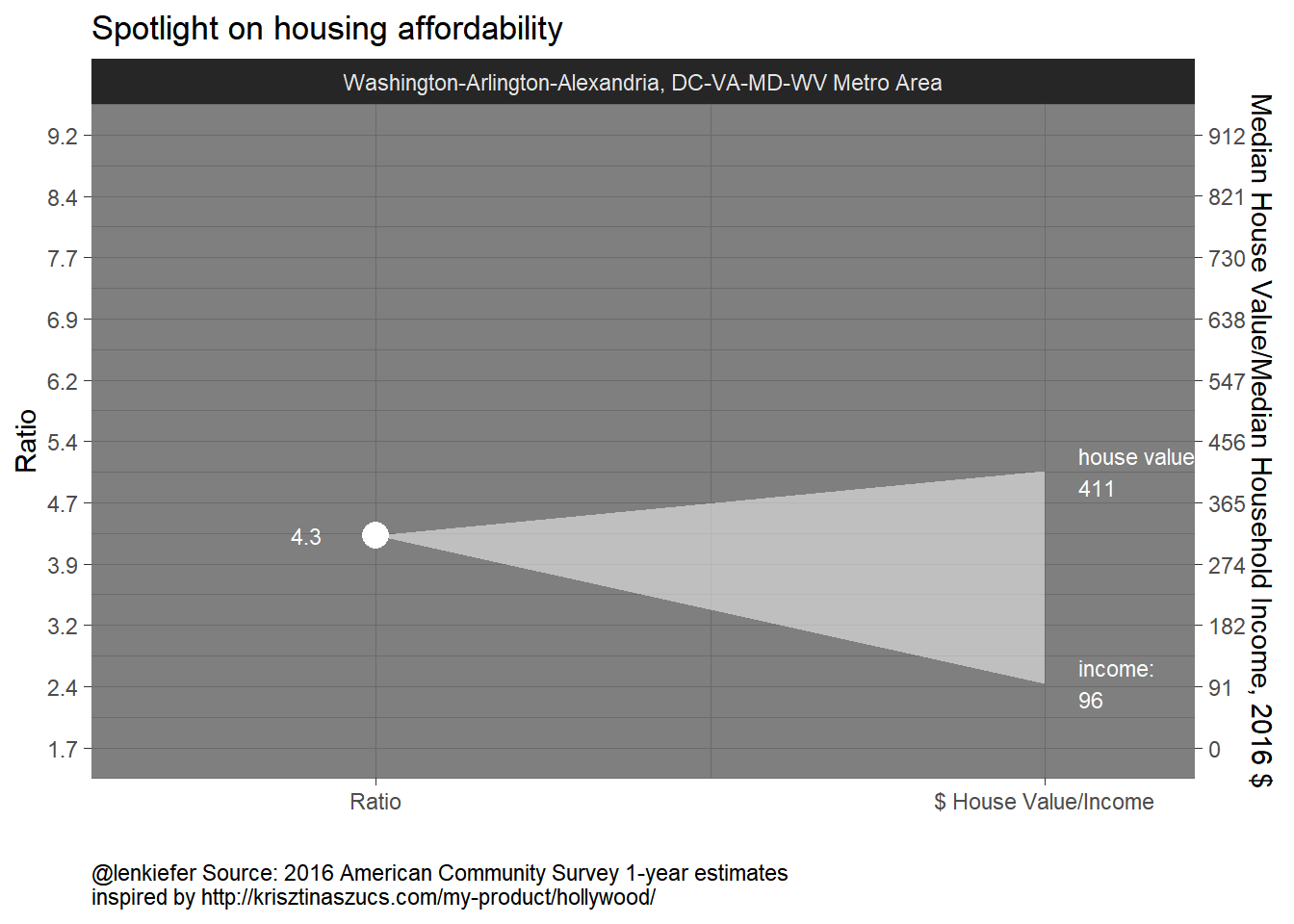 Finally, we can create a function and try out some additional styling. The original viz used a restrained black/white and gray color scheme. I don’t understand colors, but that doesn’t stop me from experimenting so I’ll try out a viridis palette.
plotf <- function(df.acs2= df.acs[1:10,]){

maxp <- max(df.acs2$hvalue)
maxr <- max(df.acs2$ratio)
minr <- min(df.acs2$ratio)

df.plot <- df.acs2 %>%

  mutate(r=rescale(ratio, to=c(0,100), from=c(minr,maxr)),
         p=rescale(hvalue,to=c(0,100), from=c(0,maxp)),
         i=rescale(inc, to=c(0,100), from=c(0,maxp))
  )

df.plot2 <-
  df.plot %>%
  group_by(area) %>%
  expand(x=c(0,1,2),r,p,i) %>%
  mutate(y=case_when(
    x == 0 ~ r,
    x == 1 ~ p,
    x == 2 ~ i)  ) %>%
  mutate(x=ifelse(x==0,1,2))

df.plot2<- left_join(df.plot2, df.acs2, by="area")

g1<-


ggplot(data=df.plot2,
       aes(color=area,fill=area,group=area))+
  geom_polygon(aes(x=x,y=y),alpha=0.35, color=NA)+
  geom_point(aes(x=1,y=r,size=4), color="white")+
  theme_dark()+
  scale_fill_viridis(discrete=TRUE)+
  theme(legend.position="none")+#facet_wrap(~area)+
  scale_x_continuous(labels=c("Ratio","$ Income/House Value"), breaks=c(1,2), limits=c(0.65,2.15))+
  scale_y_continuous(name="Ratio: Median House Value to Median Household Income",
                     breaks=seq(0,100,10),
                     limits=c(0,100),
                     labels=format(round(seq(minr,maxr,length.out=11),1),nsmall=1),
                     sec.axis=sec_axis(~rescale(., to=c(0,maxp),
                                                from=c(0,100)),
                                       breaks=seq(0,maxp,length.out=11),
                                       labels=round(seq(0,maxp/1000,length.out=11),0),
                                       name="Median House Value/Median Household Income, 2016 $")
  )+
  ggrepel::geom_text_repel(data= . %>% filter(x==1),
            aes(#label=paste0(gsub("(.*),.*", "\\1", area),"\nratio: ",round(ratio,1)),
              label=paste0(gsub("(.*),.*", "\\1", area)),
                x=0.97,y=y),
            hjust=1, color="white", size=3)+
  theme(plot.caption=element_text(hjust=0))+
  labs(x="", title="Spotlight on housing affordability",
       caption="@lenkiefer Source: 2016 American Community Survey 1-year estimates\ninspired by http://krisztinaszucs.com/my-product/hollywood/")

return(g1)
}

plotf()