IN THIS POST WE SHALL EXPLORE VALUE-SUPRESSING UNCERTAINTY PALETTES.
One of my favorite new sites is xenographics that gives examples of and links to “weird, but (sometimes) useful charts”. The examples xenographics gives are undoubtedly interesting and might help inspire you if you’re looking for something new.
One new (to me) graphic was something called Value-Suppressing Uncertainty Palettes (VSUP). See this research paper (pdf). VSUPs “allocate larger ranges of a visual channel when uncertainty is low, and smaller ranges when uncertainty is high”. As we mentioned in an earlier post, much of the economic and housing data I track is highly uncertain. Perhaps VSUPs can be useful.
Per usual, let’s make a graph with R.
Value-Suppressing Uncertainty Palette
Let’s build a VSUP and take a look. We can construct a visual describing the VSUP using ggplot2 and ggforce. The ggforce package is nice because it helps us avoid polar coordinates.
library(tidyverse)
library(viridis)
library(ggforce)
library(ggrepel)
library(scales)
library(cowplot)

#____________________________________________________________________________________
## Draw Legend ----
#____________________________________________________________________________________

# Function to draw legend
d.legend <- function(){

  nlevels=4
  X=seq(-0.5/pi,0.5/pi,length.out=8)
  Y=1:4
  df<-expand.grid(x=X,y=Y)

  X0 <- seq(-1.75,1.75,.5)/pi
  X1 <- X0[c(TRUE,FALSE)]
  X2 <- X1[c(TRUE,FALSE)]
  X3 <- X2[c(TRUE,FALSE)]

  quant.X<- function (x, level=5, X=X0){
    X1 <- X[c(TRUE,FALSE)]
    X2 <- X1[c(TRUE,FALSE)]
    X3 <- X2[c(TRUE,FALSE)]
    case_when(
      level== 5 ~ X[findInterval(x,X)],
      level== 4 ~ X1[findInterval(x,X1)],
      level== 3 ~ X2[findInterval(x,X2)],
      level== 2 ~ X3[findInterval(x,X3)],
      TRUE ~ median(X0)

    )
  }

  d<-expand.grid(x=X0, y=1:5)

  ggplot(data=dplyr::filter(d,y>1))+
    geom_arc_bar(aes(x0=0,
                     y0=0,
                     r0=y-2,
                     r=y-1,
                     start=x-0.25/pi,
                     end=x+0.25/pi,
                     fill=quant.X(x,y),
                     alpha=y),color=NA)+
    scale_fill_viridis(limits=c(min(X0),max(X0)), option="C", direction=-1)+
    theme_void()+
    theme(legend.position="none", plot.subtitle=element_text(hjust=0.5, face="italic"))+guides(alpha=F)+
    geom_segment(x= 0.1, xend= 2.5, yend= 3.1, y=0,
                 arrow = arrow(length = unit(0.03, "npc"), ends="first"))+
    geom_segment(xend= -2.5, x= 2.5, yend= 4.05, y=4.05,
                 arrow = arrow(length = unit(0.03, "npc"), ends="first"))+
    annotate(geom="text", x= 0.1, y=4.3, label=" Value increases" )+
    annotate(geom="text", x= 1.7, y=1.5, label=" Uncertainty increases" ,angle=45 )+
    labs( title="Value-Supressing Uncertainty Scale",
          subtitle="Darker values indicate higher values, higher transparency indicates higher uncertainty")

}

# Call Function
d.legend()
Using VSUP
The VSUP can be useful if we want to plot some data that has some measure of uncertainty attached to it. Let’s use the VSUP to plot median house values by county estimated in the U.S. Census Bureau’s American Community Survey (ACS). We can easily access the ACS data with the acs package. Note for this to work for you you’ll need to get an API key from the U.S. Census Bureau.
I want to look at the median value of owner-occupied housing units. Estimates are reported in table B25077. The ACS also gives us an estimate of the standard error/ margin of error for the estimates.
State data
Let’s start by looking at state data.
#install your key
api.key.install(key="YOUR_API_KEY")

# get state data
geo2 <- geo.make(state='*')
# get state estimates
hv <- acs.fetch(endyear=2016,         # get data estimates ending in 2016
                span=1,               # for states we can use 1-year ACS estimates
                geography=geo2,       # state geography
                table.number="B25077" # housing values
                )
# convert to data frame

df.hv <- data.frame(NAME=hv@geography$NAME,
                    value=unname(hv@estimate),
                    sd=unname(hv@standard.error)) %>%
  filter(! NAME %in% c("Puerto Rico","Alaska","Hawaii" )) # keep only lower 48 states

# Print the data
knitr::kable(df.hv %>% select(NAME, value, sd) %>%
               mutate(value=dollar(round(value,0)),
                      sd=dollar(round(sd,0))
                      ),
             col.names=c("State", "Median Value ($)", "Standard Error")
)| State | Median Value ($) | Standard Error |
|---|---|---|
| Alabama | $136,200 | $1,000 |
| Arizona | $205,900 | $1,187 |
| Arkansas | $123,300 | $1,058 |
| California | $477,500 | $1,011 |
| Colorado | $314,200 | $1,433 |
| Connecticut | $274,600 | $1,412 |
| Delaware | $243,400 | $2,274 |
| District of Columbia | $576,100 | $10,779 |
| Florida | $197,700 | $801 |
| Georgia | $166,800 | $677 |
| Idaho | $189,400 | $1,858 |
| Illinois | $186,500 | $861 |
| Indiana | $134,800 | $602 |
| Iowa | $142,300 | $925 |
| Kansas | $144,900 | $1,134 |
| Kentucky | $135,600 | $869 |
| Louisiana | $158,000 | $876 |
| Maine | $184,700 | $1,827 |
| Maryland | $306,900 | $1,623 |
| Massachusetts | $366,900 | $1,367 |
| Michigan | $147,100 | $567 |
| Minnesota | $211,800 | $813 |
| Mississippi | $113,900 | $1,286 |
| Missouri | $151,400 | $722 |
| Montana | $217,200 | $2,348 |
| Nebraska | $148,100 | $1,018 |
| Nevada | $239,500 | $1,341 |
| New Hampshire | $251,100 | $2,110 |
| New Jersey | $328,200 | $1,332 |
| New Mexico | $167,500 | $1,303 |
| New York | $302,400 | $1,495 |
| North Carolina | $165,400 | $633 |
| North Dakota | $184,100 | $2,387 |
| Ohio | $140,100 | $459 |
| Oklahoma | $132,200 | $884 |
| Oregon | $287,100 | $1,414 |
| Pennsylvania | $174,100 | $447 |
| Rhode Island | $247,700 | $2,194 |
| South Carolina | $153,900 | $872 |
| South Dakota | $160,700 | $1,588 |
| Tennessee | $157,700 | $726 |
| Texas | $161,500 | $484 |
| Utah | $250,300 | $1,654 |
| Vermont | $223,700 | $2,437 |
| Virginia | $264,000 | $1,245 |
| Washington | $306,400 | $1,562 |
| West Virginia | $117,900 | $1,424 |
| Wisconsin | $173,200 | $640 |
| Wyoming | $209,500 | $3,716 |
How does the standard error of estimates vary with the estimate itself?
s.lin<-
ggplot(data=df.hv, aes(x=value, y=sd) )+
  geom_point()+
  geom_text_repel( aes(label=NAME))+
  scale_x_log10(limits=c(1e5,6e5),breaks=c(1e5, 2e5, 4e5, 6e5), labels=dollar)+scale_y_log10(limits=c(100,12000),labels=dollar)+
  guides(alpha=F,color=F)+
  labs(x="Median House Value (log scale, owner-occupied housing units)",
       y="Standard Errror of estimates (log scale)",
       caption="@lenkiefer Source: U.S. Census Bureau American Community Survey (1-year estimates)")+
  theme(plot.caption=element_text(hjust=0))
s.lin
How about if we scale the value estimates by the estimated standard deviation?
s.lin<-
ggplot(data=df.hv, aes(x=value, y=value/sd) )+
  geom_point()+
  geom_text_repel( aes(label=NAME))+
 # scale_color_viridis(option="C",discrete=F,direction=-1)+
  scale_x_log10(limits=c(1e5,6e5),breaks=c(1e5, 2e5, 4e5, 6e5), labels=dollar)+scale_y_log10(limits=c(100,1000))+
  guides(alpha=F,color=F)+
  labs(x="Median House Value (log scale, owner-occupied housing units)",
       y="Ratio: Housing Value/Standard Errror of estimates\n(log scale)",
       caption="@lenkiefer Source: U.S. Census Bureau American Community Survey (1-year estimates)")+
  theme(plot.caption=element_text(hjust=0))
s.lin
## Warning: Removed 7 rows containing missing values (geom_point).## Warning: Removed 7 rows containing missing values (geom_text_repel).
Let’s apply the VSUP scale to this plot. To do so we need to assign each state to a value based on the uncertaninty associated with the estimate. (I may come back and explain in more detail what’s going on with this code, but for now let me just put it down.)
#____________________________________________________________________________________
## Assign Uncertainty category ----
#____________________________________________________________________________________

df.hv <- mutate(df.hv, y2=findInterval(value/sd,quantile(value/sd, c(0,0.25,0.5,0.75,.9))))

X0b<- quantile(df.hv$value,probs=seq(0,0.9,length.out=8))
# Function to quantize the value
quant.X2<- function (x=0, level=5, Z=X0b){
  X1 <- Z[c(TRUE,FALSE)]
  X2 <- X1[c(TRUE,FALSE)]
  X3 <- X2[c(TRUE,FALSE)]
  case_when(
    level== 5 ~ Z[findInterval(x,Z)],
    level== 4 ~ X1[findInterval(x,X1)],
    level== 3 ~ X2[findInterval(x,X2)],
    level== 2 ~ X3[findInterval(x,X3)],
    TRUE ~ median(Z)
  )
}


df.hv <- mutate(df.hv, z=quant.X2(value,y2))

s.vsup <-
  ggplot(data=df.hv, aes(x=value, y=value/sd, color=z, alpha=y2))+
  geom_point()+
  ggrepel::geom_text_repel(data=. %>% filter(y2==5), aes(label=NAME))+
  scale_color_viridis(option="C",discrete=F,direction=-1)+
  #scale_x_log10()+scale_y_log10()+
  guides(alpha=F,color=F)+
  labs(x="Median House Value (log scale, owner-occupied housing units)", title="Value Suppressing Uncertainty Palette",
       y="Ratio: Housing Value/Standard Errror of estimates\n(log scale)",
       caption="@lenkiefer Source: U.S. Census Bureau American Community Survey (1-year estimates)")+
  theme(plot.caption=element_text(hjust=0))

s.lin<-
ggplot(data=df.hv, aes(x=value, y=value/sd,
                       color=quant.X2(value, level=5,
                                      Z=quantile(df.hv$value,probs=seq(0,0.9,length.out=8))
                                      )) )+
  geom_point()+
  ggrepel::geom_text_repel(data=. %>% filter(y2==5), aes(label=NAME))+
  scale_color_viridis(option="C",discrete=F,direction=-1)+
  #scale_x_log10()+scale_y_log10()+
  guides(alpha=F,color=F)+
  labs(x="Median House Value (log scale, owner-occupied housing units)", title="Standard Scale",
       y="Ratio: Housing Value/Standard Errror of estimates\n(log scale)",
       caption=" ")+
  theme(plot.caption=element_text(hjust=0))


state.scatters <- plot_grid(s.lin,s.vsup,ncol=1)

print(state.scatters)
What we’ve done here is supressed the color for the observations with low ratios of estimated value to standard error. The utility of this approach might be easier to see with a map.
Making maps
In order to make the maps, we can use the tigris package.
#____________________________________________________________________________________
## Load Map and Filter ----
#____________________________________________________________________________________
us_geo2 <- states(cb=TRUE)
us_geo48 <- us_geo2[! us_geo2@data$STUSPS %in% c("AK","PR","VI","HI","GU","MP","AS"), ]
us_geo48@data$id <- rownames(us_geo48@data)
us_geo48f <- fortify(us_geo48)
us_geo48f <- left_join(us_geo48f,us_geo48@data, by="id")
df.map <- left_join(us_geo48f,df.hv, by="NAME")
gmap.slin<-
ggplot(data=df.map,
aes(x=long,y=lat, map_id=id, group=group,
fill=factor(quant.X2(value, level=5,
Z=quantile(value,probs=seq(0,0.9,length.out=8))
))) #use level==5 to force 8 categories
)+
geom_polygon(color="white")+theme_map()+
theme(legend.position="none",
plot.caption=element_text(hjust=1),
plot.title=element_text(hjust=0))+
scale_fill_viridis(option="C",discrete=T,direction=-1, name= "Housing value")+
labs(x="Median House Value (log scale, owner-occupied housing units)",
title="Standard Choropleth",
subtitle="Housing Values (Binned 8 values)",
y="Ratio: Housing Value/Standard Errror of estimates\n(log scale)",
caption="@lenkiefer Source: U.S. Census Bureau American Community Survey (1-year estimates)")
gmap.slin
COmpare that to our VSUP plot:
gmap.svsup<-
  ggplot(data=df.map ,
       aes(x=long,y=lat, map_id=id, group=group,
           fill =z, alpha=factor(y2)
           ))+
  geom_polygon(color="white")+theme_map()+
    theme(legend.position="none",
        plot.caption=element_text(hjust=1),
        plot.title=element_text(hjust=0))+
  scale_fill_viridis(option="C",discrete=F,direction=-1)+
    labs(x="Median House Value (log scale, owner-occupied housing units)", title="Value Suppressing Uncertainty Palette",
       y="Ratio: Housing Value/Standard Errror of estimates\n(log scale)",
       caption="@lenkiefer Source: U.S. Census Bureau American Community Survey (1-year estimates)")

ggdraw()+
  draw_plot(gmap.svsup+theme(legend.position="none",panel.border=element_rect(color="black",fill=NA))+
              labs(title="Median Home Values by County",
                             subtitle="Value Suppressing Uncertainty Palette with R",
                             caption="@lenkiefer Source 2016 American Community Survey  \n")+
              theme(plot.title=element_text(hjust=0)), 0, 0, 1, 1) +
  draw_plot(d.legend()+labs(title="",subtitle="")+theme_void()+theme(legend.position="none",panel.border=element_rect(color="black",fill=NA)) , 0.01, 0.01, 0.34, 0.35)
## Warning: Using alpha for a discrete variable is not advised.
Now let’s drill down and look at county-level estimates. For this, we’ll need the 5-year ACS estimates.
#####################################################################################
## Draw County Map ##
#####################################################################################


geoc <- geo.make(state='*', county="*")
hvc <- acs.fetch(endyear=2016,
                 span=5,   # 5-year estimates
                 geography=geoc, table.number="B25077")

df.hvc <- data.frame(NAME=hvc@geography$NAME,
                    state=hvc@geography$state,
                    county=hvc@geography$county,
                    value=unname(hvc@estimate),
                    sd=unname(hvc@standard.error)) %>%
  mutate(GEOID= paste0(str_pad(state,width=2,side="left",pad="0"),county)) %>% filter(value>0 & sd > 0)


us_geoc <- counties(cb=TRUE)
us_geoc$id <- rownames(us_geoc@data)
us_geocf <- fortify(us_geoc)
us_geocf     <- left_join(us_geocf,us_geoc@data, by="id")
# drop outside long(-125,67)  & lat(24,49)
us_geocf48<- filter(us_geocf, long > -125 & long < 67 & lat > 25 & lat < 50)

dfc.map <- left_join(us_geocf48,df.hvc, by="GEOID")
#____________________________________________________________________________________
## Make data ----
#____________________________________________________________________________________
df.hvc <- mutate(df.hvc, y2=findInterval(value/sd,quantile(value/sd, c(0,0.25,0.5,0.75,.9))))
X0b<- quantile(df.hvc$value,probs=seq(0,0.9,length.out=8))
quant.X2<- function (x=0, level=5, Z=X0b){
X1 <- Z[c(TRUE,FALSE)]
X2 <- X1[c(TRUE,FALSE)]
X3 <- X2[c(TRUE,FALSE)]
case_when(
level== 5 ~ Z[findInterval(x,Z)],
level== 4 ~ X1[findInterval(x,X1)],
level== 3 ~ X2[findInterval(x,X2)],
level== 2 ~ X3[findInterval(x,X3)],
TRUE ~ median(Z)
)
}
df.hvc <- mutate(df.hvc, z=quant.X2(value,y2))
#____________________________________________________________________________________
## Create Scatters ----
#____________________________________________________________________________________
s.vsupc<-
ggplot(data=df.hvc, aes(x=value, y=value/sd, color=z, alpha=y2))+
geom_point()+
scale_color_viridis(option="C",discrete=F,direction=-1)+
scale_x_log10(limits=c(1e4,6e5),breaks=c(1e4,1e5, 2e5, 4e5, 6e5), labels=dollar)+scale_y_log10(limits=c(10,1000))+
guides(alpha=F,color=F)+
labs(x="Median House Value (log scale, owner-occupied housing units)",
y="Ratio: Housing Value/Standard Errror of estimates\n(log scale)")
s.linc<-
ggplot(data=df.hvc, aes(x=value, y=value/sd,
color=quant.X2(value, level=5, Z=quantile(df.hvc$value,probs=seq(0,0.9,length.out=8)))))+
geom_point()+
scale_color_viridis(option="C",discrete=F,direction=-1)+
scale_x_log10(limits=c(1e4,6e5),breaks=c(1e4,1e5, 2e5, 4e5, 6e5), labels=dollar)+scale_y_log10(limits=c(10,1000))+
guides(alpha=F,color=F)+
labs(x="Median House Value (log scale, owner-occupied housing units)",
y="Ratio: Housing Value/Standard Errror of estimates\n(log scale)")
plot_grid(s.linc+labs(title="Standard Scale"),
s.vsupc +labs(title="Value Suppressing Uncertainty Palette",
caption="@lenkiefer Source 2016 American Community Survey \nMedian house value by county (5 year estimates) "),
ncol=1, align="hv")## Warning: Removed 135 rows containing missing values (geom_point).
## Warning: Removed 135 rows containing missing values (geom_point).
#____________________________________________________________________________________
## Create Maps ----
#____________________________________________________________________________________
dfc.map <- left_join(us_geocf48,df.hvc, by="GEOID")
gmap.cvsup <-
ggplot(data=dfc.map ,
       aes(x=long,y=lat, map_id=id, group=group,
           fill =z, alpha=y2
       ))+
  geom_polygon(color="white")+theme_map()+
  scale_fill_viridis(option="C",discrete=F,direction=-1)+
  theme(legend.position="none")

gmap.clin<-
  ggplot(data=dfc.map ,
       aes(x=long,y=lat, map_id=id, group=group,
           fill =z#, alpha=factor(y2)
       ))+
  geom_polygon(color="white")+theme_map()+
  scale_fill_viridis(option="C",discrete=F,direction=-1)+
  theme(legend.position="none")

#____________________________________________________________________________________
## Put it all together ----
#____________________________________________________________________________________

plot_grid(plot_grid(s.linc+labs(title="Standard Choropleth"),
                    s.vsupc+labs(title="Value Suppressing Uncertainty Palette"),
                    ncol=2),
          plot_grid(gmap.clin+ theme(legend.position = "none")+ labs(caption=""),
                    ggdraw()+draw_plot(gmap.cvsup+ theme(legend.position = "none")+ labs(caption="@lenkiefer Source 2016 American Community Survey  \nMedian house value by county (5 year estimates)  "))+
                      draw_plot(d.legend()+labs(title="",subtitle="")+theme_void()+theme(legend.position="none",panel.border=element_rect(color="black",fill=NA)) , 0.01, 0.01, 0.35, 0.375),
                                        ncol=2),
          ncol=1)
## Warning: Removed 135 rows containing missing values (geom_point).
## Warning: Removed 135 rows containing missing values (geom_point).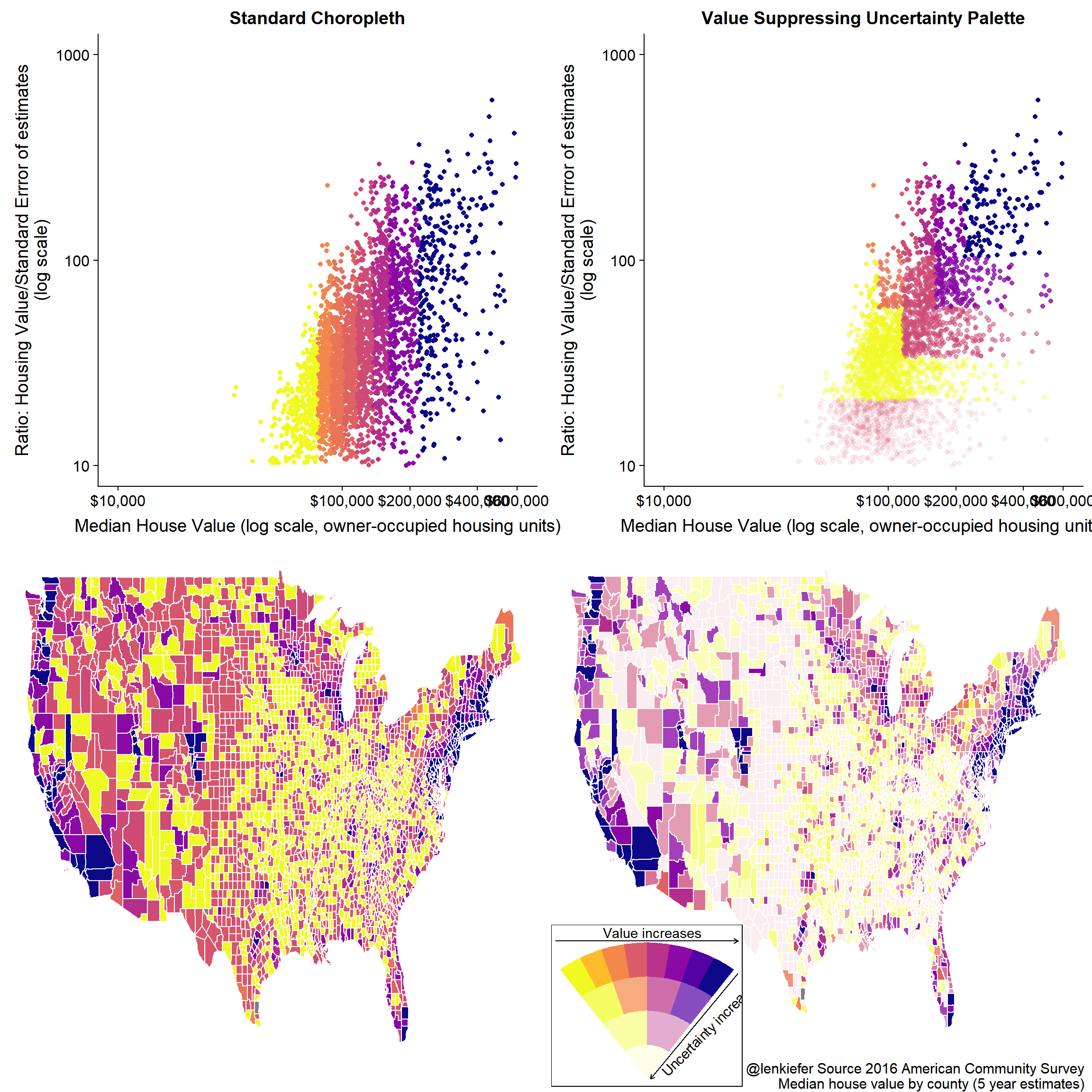
There’s a lot more we could do with this, but that’s enough for one post.