HOUSING DATA ARE OFTEN MEASURED WITH CONSIDERABLE uncertainty. Estimates are usually based on small samples that are subject to sampling variability. The various government statistical agencies usually report estimates of uncertainty with their releases. For example, both the New Residential Construction and New Residential Sales reports include estimates of sampling uncertainty along with their point estimates.
In this post I want to explore ways to visualize sampling uncertainty with R. I am reminded of article from a the New York Times Upshot blog a few years ago.
Data
For data, let’s go ahead and use New Home Sales estimates from the U.S. Census Bureau and U.S. Department of Housing and Urban Development. The Census provides a nice .csv file you can download here. The spreadsheet includes estimates of sampling uncertainty.
If you go to this link you can get a zip file that contains the data we’ll use. If you open the .csv file in Excel, you will find the data actually begins on row 705 (as of April 26, 2017, it will move over time). Let’s proceed you’ve unzipped the .csv file and saved it somewhere as RESSALES-mf.csv.
Note that this file is laid out much the same as the housing starts data we used last week.
##################################################################################
# Load libraries
##################################################################################
library("animation")
library("ggplot2")
library("scales")
library('ggthemes')
library(viridis)
## Loading required package: viridisLitelibrary(tidyverse)## Loading tidyverse: tibble
## Loading tidyverse: tidyr
## Loading tidyverse: readr
## Loading tidyverse: purrr
## Loading tidyverse: dplyr## Conflicts with tidy packages ----------------------------------------------## col_factor(): readr, scales
## discard(): purrr, scales
## filter(): dplyr, stats
## lag(): dplyr, statslibrary(readxl)
library(ggbeeswarm)
library(zoo)##
## Attaching package: 'zoo'## The following objects are masked from 'package:base':
##
## as.Date, as.Date.numericlibrary(data.table)##
## Attaching package: 'data.table'## The following objects are masked from 'package:dplyr':
##
## between, first, last## The following object is masked from 'package:purrr':
##
## transpose##################################################################################
# Load Data
##################################################################################
df.sales<-read.csv("data/RESSALES-mf.csv",skip=704)
##################################################################################
# The following information comes straight from the .csv file
# and describes the keys in the data file
##################################################################################
##################################################################################
# CATEGORIES
# cat_idx cat_code cat_desc cat_indent
# 1 SOLD New Single-family Houses Sold 0
# 2 ASOLD Annual Rate for New Single-family Houses Sold 0
# 3 FORSALE New Single-family Houses For Sale 0
##################################################################################
##################################################################################
# DATA TYPES
# dt_idx dt_code dt_desc dt_unit
# 1 TOTAL All Houses K
# 2 NOTSTD Houses that are Not Started K
# 3 UNDERC Houses that are Under Construction K
# 4 COMPED Houses that are Completed K
# 5 MEDIAN Median Sales Price DOL
# 6 AVERAG Average Sales Price DOL
# 7 MONSUP Months' Supply at Current Sales Rate MO
# 8 MMTHS Median Number of Months For Sale Since Completion MO
##################################################################################
##################################################################################
# ERROR TYPES
# et_idx et_code et_desc et_unit
# 1 E_TOTAL Relative Standard Error for All Houses PCT
# 2 E_NOTSTD Relative Standard Error for Houses that are Not Started PCT
# 3 E_UNDERC Relative Standard Error for Houses that are Under Construction PCT
# 4 E_COMPED Relative Standard Error for Houses that are Completed PCT
# 5 E_MEDIAN Relative Standard Error for Median Sales Price PCT
# 6 E_AVERAG Relative Standard Error for Average Sales Price PCT
# 7 E_MONSUP Relative Standard Error for Months' Supply at Current Sales Rate PCT
# 8 E_MMTHS Relative Standard Error for Median Number of Months For Sale Since Completion PCT
##################################################################################
##################################################################################
# GEO LEVELS
# geo_idx geo_code geo_desc
# 1 US United States
# 2 NE Northeast
# 3 MW Midwest
# 4 SO South
# 5 WE West
##################################################################################
##################################################################################
# Dates are indexed one a month from 1963-01-01 to 2017-03-01
# e. g.
# TIME PERIODS
# per_idx per_name
# 1 1/1/19563
# 2 2/1/1963
# ....
# 651 3/1/2017
##################################################################################
##################################################################################
# Construct a lookup table for dates
dt.lookup<- data.table(per_idx=seq(1,651),
date=seq.Date(as.Date("1963-01-01"),
as.Date("2017-03-01"),by="month"))
##################################################################################
##################################################################################
# Append dataes
df.sales<-left_join(df.sales,dt.lookup,by="per_idx")
##################################################################################
##################################################################################
# print a table using the htmlTable library, round numeric to 0 digits for readability
# Note we won't round in analysis)
##################################################################################
htmlTable::htmlTable(rbind(tail(df.sales %>%
map_if(is_numeric,round,0) %>%
data.frame() %>% as.tbl())))## Warning: Deprecated
## Warning: Deprecated
## Warning: Deprecated
## Warning: Deprecated
## Warning: Deprecated
## Warning: Deprecated
## Warning: Deprecated
## Warning: Deprecated| per_idx | cat_idx | dt_idx | et_idx | geo_idx | is_adj | val | date | |
|---|---|---|---|---|---|---|---|---|
| 1 | 651 | 3 | 1 | 0 | 3 | 0 | 34 | 2017-03-01 |
| 2 | 651 | 3 | 0 | 1 | 3 | 0 | 10 | 2017-03-01 |
| 3 | 651 | 3 | 1 | 0 | 4 | 0 | 144 | 2017-03-01 |
| 4 | 651 | 3 | 0 | 1 | 4 | 0 | 6 | 2017-03-01 |
| 5 | 651 | 3 | 1 | 0 | 5 | 0 | 62 | 2017-03-01 |
| 6 | 651 | 3 | 0 | 1 | 5 | 0 | 7 | 2017-03-01 |
Let’s organize the data a little bit more.
##################################################################################
# Filter to just the us, total sales at an annual rate
new.sales<-filter(df.sales, cat_idx==2 & (dt_idx==1 | et_idx==1) & geo_idx ==1 )
##################################################################################

##################################################################################
# Rearrange the data
new.sales<-new.sales %>% filter(year(date)>1999) %>%
  select(date,val,et_idx) %>% spread(et_idx,val)
# Rename columns
colnames(new.sales)<-c("date","sales","e.sales")
##################################################################################

# Check it out:
htmlTable::htmlTable(rbind(tail(new.sales %>%
                                  map_if(is_numeric,round,0) %>%
                                  data.frame() %>% as.tbl())))
## Warning: Deprecated
## Warning: Deprecated
## Warning: Deprecated| date | sales | e.sales | |
|---|---|---|---|
| 1 | 2016-10-01 | 568 | 8 |
| 2 | 2016-11-01 | 573 | 8 |
| 3 | 2016-12-01 | 551 | 7 |
| 4 | 2017-01-01 | 585 | 8 |
| 5 | 2017-02-01 | 587 | 8 |
| 6 | 2017-03-01 | 621 | 8 |
VIZ 1: Ribbon Chart
First, let’s remake a viz we’ve done before. We’ll plot a standard line chart and add a ribbon capturing uncertainty.
##################################################################################
# Compute ribbon size

new.sales <- new.sales %>% mutate( up=qnorm(0.95,mean=sales,sd=e.sales/100*sales),
                                   down=qnorm(0.05,mean=sales,sd=e.sales/100*sales))
##################################################################################


##################################################################################
# Make Plot
ggplot(data=new.sales, aes(x=date,y=sales, label = sales))+
    geom_line()+
    scale_y_continuous() +
    scale_x_date(labels= date_format("%Y"), date_breaks="1 year" ) +
    geom_ribbon(aes(x=date,ymin=down,ymax=up),fill=plasma(5)[5],alpha=0.5)  +
    theme_minimal()+
    labs(x=NULL, y=NULL,
         title="New Home Sales (Ths. SAAR)",
         subtitle="shaded region denotes confidence interval",
           caption="@lenkiefer Source: U.S. Census Bureau and U.S. Department of Housing and Urban Development")+
    theme(plot.caption=element_text(hjust=0))
Viz 2: Gif
Instead of using a ribbon, let’s draw random samples and animate them to highlight uncertainty.
##################################################################################
# Function for sampling
myf<- function(sales,e.sales){
  rnorm(250,sales,e.sales/100*sales)
}
##################################################################################


##################################################################################
# draw samples using map2, then unnest to blow up data and group
output.data<-new.sales %>%
  mutate(sales.samp =map2(sales,e.sales,myf)) %>%  # draw our samples
  unnest(sales.samp) %>%  # unpack the samples
  group_by(date) %>%
  mutate(id=row_number()) %>% ungroup()  # this gives us an id for each sample
##################################################################################
Now we can animate it:
##################################################################################
# Animate plot!
##################################################################################
oopt = ani.options(interval = 0.25)
saveGIF({for (i in 1:100) {
  g<-
    ggplot(data=filter(output.data,year(date)>2015 & id<=i),aes(x=date,y=sales.samp,group=id))+
    geom_line(color="gray50",aes(alpha=ifelse(id==i,1,0.2)))+
    #geom_line(data=filter(output.data,id==i),color="red",alpha=1,size=1.05)+
    guides(alpha=F)+
    geom_point(size=3,color="black",aes(y=sales))+
    theme_minimal()+
    labs(x="",y="",
         title="New home sales (1000s, SAAR)",
         subtitle="Black dots estimates,each gray line a random sample from normal with survey standard error",
           caption="@lenkiefer Source: U.S. Census Bureau and U.S. Department of Housing and Urban Development")+
    coord_cartesian(xlim=as.Date(c("2016-01-01","2017-03-01")),ylim=c(400,700))+
    theme(plot.caption=element_text(hjust=0))
  print(g)
  ani.pause()
  print(paste(i,"out of 100"))
}

},movie.name="newsales_04_26_2017 samp ex.gif",ani.width = 600, ani.height = 450)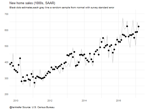
Viz 3: Beeswarm
We can also make a beeswarm plot (for more see here).
ggplot(data=filter(output.data,year(date)>2015),
       aes(x=date,y=sales.samp,color=sales.samp))+
  scale_color_viridis(name="")+ guides(color=F)+
  geom_quasirandom()+theme_minimal()+
  geom_point(data=filter(output.data,year(date)>2015 & id==1),
             aes(y=sales),color="black",size=3) +
  scale_x_date(date_labels="%b-%Y",date_breaks="2 months")+
    labs(x="",y="",
         title="New Home Sales (1000s SAAR)",
         subtitle="Estimates (black dots) and sampling uncertainty",
         caption="@lenkiefer Source: U.S. Census Bureau and U.S. Department of Housing and Urban Development\ncolored dots represent draws from a normal distribution centered at estimate with standard error of estimate.")+
      theme(plot.caption=element_text(hjust=0))
And we could animate it:
##################################################################################
# Animate plot!
##################################################################################
oopt = ani.options(interval = 0.2)
saveGIF({for (i in 1:200) {
  g<-
    ggplot(data=filter(output.data,date>="2016-03-01" & id<=i),
           aes(x=date,y=sales.samp,color=sales.samp,
               alpha=ifelse(id==i,1,0.2) ))+
    scale_color_viridis(name="")+ guides(color=F)+
    geom_quasirandom()+theme_minimal()+
    geom_point(data=filter(output.data,date>="2016-03-01" & id==1),
               aes(y=sales),color="black",size=3,alpha=1) +
    scale_x_date(date_labels="%b-%Y",date_breaks="2 months",
                 limits=as.Date(c("2016-02-15","2017-04-15")))+
    scale_y_continuous(limits=c(400,800))+
    guides(alpha=F)+
    labs(x="",y="",
         title="New Home Sales (1000s SAAR)",
         subtitle="Estimates (black dots) and sampling uncertainty",
         caption="@lenkiefer Source: U.S. Census Bureau and U.S. Department of Housing and Urban Development\ncolored dots represent draws from a normal distribution centered at estimate with standard error of estimate.")+
      theme(plot.caption=element_text(hjust=0))
  print(g)
  ani.pause()
  print(paste(i,"out of 250"))  #counter
}

},movie.name="new home sales swarm.gif",ani.width = 600, ani.height = 450)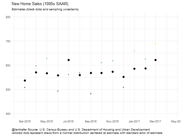
Conclusion
Visualizing uncertainty can be challenging. Depending on the audience, uncertainty can be a difficult concept. I’m not sure the data visualization field has a consensus on the right way to visualize uncertainty.
But communicating uncertainty can be quite important. Maybe one of these ideas could work for you.