THE UNITED STATES IS NOT building enough homes to meet demand. Be sure to check out my upcoming presentation at Realtor University to learn more about whether or not this could mean a house price bubble.
One reason often cited for low levels of construction is a lack of labor. How do construction trends compare to construction employment? Let’s take a look.
Financial blogger Logan Mohtashami (Twitter, blog) tweeted out (he’s a power Twitter user so I’m not sure exactly when or where, so I probably saw it multiple places) an interesting observation on housing construction and employment (see blog post). Essentially, housing construction in the U.S. is below early 2000 levels, but housing employment is above those levels. On the surface it seems that a lack of construction labor might not be as severe as it seems. See for example, the National Association of Home Builders (NAHB) chief economist Robert Dietz’s (Twitter) recent article on construction trend or this post on challenges facing home builders.
National Housing Construction and Employment Trends
Let’s take a look at national home building and construction employment trends. We’ll follow the NAHB (for example here) and combine estimates of residential building employment and residential specialty trade contractors as estimated by the U.S. Bureau of Labor Statistics to measure U.S. residential building employment. The downside of this approach is that we will have a relatively shorter time series and can only look at national trends. Later on, we may relax this restriction.
I’ll post some R code at the bottom, and all the data we’ll need is available in the St. Louis Federal Reserve Bank Economic Database FRED.
# Load libraries
library(tidyverse)
library(tidyquant)
library(scales)

# Get data via FRED
# Specialty trade contractors: CES2023800101
# Residential buliding: CES2023610001
# Housing starts: "HOUST"

tickers<-c("HOUST","CES2023800101","CES2023610001","USCONS")
myn<- c("Housing Starts","Residential Specialty Trade Contractors","Employment: Residential Building","Employment: All Construction" )
vnames<-c("starts","res.spec.trade","res.builders","all.cons")

df <- tq_get(tickers,                    #
             get="economic.data",        # use FRED
             from="1985-01-01")          # go from 1985 forward

mylook<-data.frame(symbol=tickers,vname=vnames)
mylook2<-data.frame(symbol=tickers,vname=vnames,name=myn)

df2<-left_join(df,mylook,by="symbol") %>%
  select(-symbol) %>%
  spread(vname,price)
# Plot starts:
g1<-
ggplot(data=filter(df2,year(date)>2000), aes(x=date,y=starts))+
geom_line(size=1.1,color="royalblue")+
theme_minimal()+
labs(x="",y="",
title="U.S. housing starts ",
subtitle="1000s seasonally adjusted annual rate",
caption="@lenkiefer Source: U.S. Census Bureau and Department of Housing and Urban Development")+
theme(legend.position="none",plot.caption=element_text(hjust=0))+
scale_y_continuous(labels=scales::comma,sec.axis=dup_axis())+
scale_x_date(date_breaks="2 years",date_labels="%Y")
g1
# Plot Residential Construciton Employment

g2<-
ggplot(data=filter(df2,year(date)>2000), aes(x=date,y=res.builders+res.spec.trade))+
  geom_line(size=1.1,color="royalblue")+
  theme_minimal()+
    labs(x="",y="",
       title="U.S. Residential Construction Employment",
       subtitle="1000s seasonally adjusted",
       caption="@lenkiefer Source: U.S. Bureau of Labor Statistics")+
  theme(legend.position="none",plot.caption=element_text(hjust=0))+
  scale_y_continuous(labels=scales::comma,sec.axis=dup_axis())+
  scale_x_date(date_breaks="2 years",date_labels="%Y")

g2
It seems as though residential construction employment has bounced back more than housing starts. Some of you may be tempted to use a dual axis chart here to show this relationship, but I tend to think that is not a good idea or possibly evil:
Evil mastermind: How do the data look if we graph them?
— 📈 Len Kiefer 📊 (@lenkiefer) May 27, 2017
Henchman: How do you want them to look? <cackles maniacally> We have dual axes! pic.twitter.com/Vbj7o62WDy
I prefer other approaches. Here are two.
Ratio line plot
We could compare the ratio of residential construction employment to housing starts.
ggplot(data=filter(df2,year(date)>2000), aes(x=date,y=(res.builders+res.spec.trade)/starts))+
  geom_line(size=1.1,color="royalblue")+
  theme_minimal()+
    labs(x="",y="",
       title="U.S. Residential Construction Employment per Housing Start",
       subtitle="Employment in 1000s (SA) divided by housing starts in 1000s (SAAR)",
       caption="@lenkiefer Source: U.S. Census/HUD, U.S. Bureau of Labor Statistics")+
  theme(legend.position="none",plot.caption=element_text(hjust=0))+
  scale_y_continuous(labels=scales::comma,sec.axis=dup_axis())+
  scale_x_date(date_breaks="2 years",date_labels="%Y")
This plot shows that there are about two residential construction workers per housing start (at an annual rate) in the U.S. recently. The ratio was as high as 5, but prior to the housing boom and Great Recession averages closer to 1.5.
Connected Scatter
A connected scatterplot might show the trends better.
ggplot(data=filter(df2,year(date)>2000),
       aes(x=(res.builders+res.spec.trade),
           y=starts,
           label=as.character(date,format="%b-%Y")),
       )+
  geom_path(size=0.75,color="gray")+
  geom_point()+
  theme_minimal()+
    labs(x="Residential Construction Employment (1000s, SA)",y="Housing Starts (1000s, SAAR)",
       title="U.S. Residential Construction Employment and Housing Starts",
       subtitle="Employment in 1000s (SA) compared to housing starts in 1000s (SAAR)",
       caption="@lenkiefer Source: U.S. Census/HUD, U.S. Bureau of Labor Statistics")+
  theme(legend.position="none",plot.caption=element_text(hjust=0))+
  scale_y_continuous(labels=scales::comma,sec.axis=dup_axis())+scale_x_continuous(labels=scales::comma,sec.axis=dup_axis())+
  geom_point(data=filter(df2,date=="2001-01-01"), color="blue",size=3)+
    geom_text(data=filter(df2,date=="2001-01-01"), color="blue",size=3,nudge_y=-100)+
  geom_point(data=filter(df2,date==max(df2$date)), color="red",size=3)+
  geom_text(data=filter(df2,date==max(df2$date)), color="red",size=3,nudge_x=100)
This plot shows that employment in October of 2017 is above January 2001 levels, though housing starts in October 2017 are below January 2001 levels.
A look at regional trends
Does this hold up at the state level? Unfortunately the BLS employment data at the state level isn’t detailed enough to reconstruct this plot for each state. Absent a model of regional residential construction employment we can look at a few states where residential building employment estimates are available. Note this leaves out residential specialty trade contractors. But residential building construction employment and residential specialty contractors are correlated enought that the trends are probably pretty close. Again, a model might help but we’d have to build one. (Perhaps that could make for an interesting future post).
First let’s look at a line graph for 3 states, California, New York, and Washington.
# Note: permits is 12-month rolling sum of permits (SA)
# const is employment (in thousands, SA
# See below for data wrangling to construct these data frames using FRED and tidyquant

ggplot(data=df.ca, aes(x=date,y=permits))+
  geom_line()+
  geom_line(aes(y=cons*1000),color="royalblue",linetype=2)+
  ggrepel::geom_text_repel(data=filter(df.ca,date==max(df.ca$date)),label="Permits",size=5)+
    ggrepel::geom_text_repel(data=filter(df.ca,date==min(df.ca$date)),label="Employment",color="royalblue", aes(y=cons*1000),size=5)+
  theme_minimal()+scale_y_continuous(labels=comma)+
  labs(x="",y="",
       title="Residential Building Employment and New Housing Permits by State",
       subtitle="California, solid line 12-month rolling sum of permits, dotted line employment",
       caption="@lenkiefer Source: U.S. Census Bureau/HUD, U.S. Bureau of Labor Statistics")
ggplot(data=df.ny, aes(x=date,y=permits))+
  geom_line()+
  geom_line(aes(y=cons*1000),color="royalblue",linetype=2)+
  ggrepel::geom_text_repel(data=filter(df.ny,date==max(df.ca$date)),label="Permits",size=5)+
    ggrepel::geom_text_repel(data=filter(df.ny,date==min(df.ca$date)),label="Employment",color="royalblue", aes(y=cons*1000),size=5)+
  theme_minimal()+scale_y_continuous(labels=comma)+
  labs(x="",y="",
       title="Residential Building Employment and New Housing Permits by State",
       subtitle="New York, solid line 12-month rolling sum of permits, dotted line employment",
       caption="@lenkiefer Source: U.S. Census Bureau/HUD, U.S. Bureau of Labor Statistics")
ggplot(data=df.wa, aes(x=date,y=permits))+
  geom_line()+
  geom_line(aes(y=cons*1000),color="royalblue",linetype=2)+
  ggrepel::geom_text_repel(data=filter(df.wa,date==max(df.ca$date)),label="Permits",size=5)+
    ggrepel::geom_text_repel(data=filter(df.wa,date==min(df.ca$date)),label="Employment",color="royalblue", aes(y=cons*1000),size=5)+
  theme_minimal()+scale_y_continuous(labels=comma)+
  labs(x="",y="",
       title="Residential Building Employment and New Housing Permits by State",
       subtitle="Washington, solid line 12-month rolling sum of permits, dotted line employment",
       caption="@lenkiefer Source: U.S. Census Bureau/HUD, U.S. Bureau of Labor Statistics")
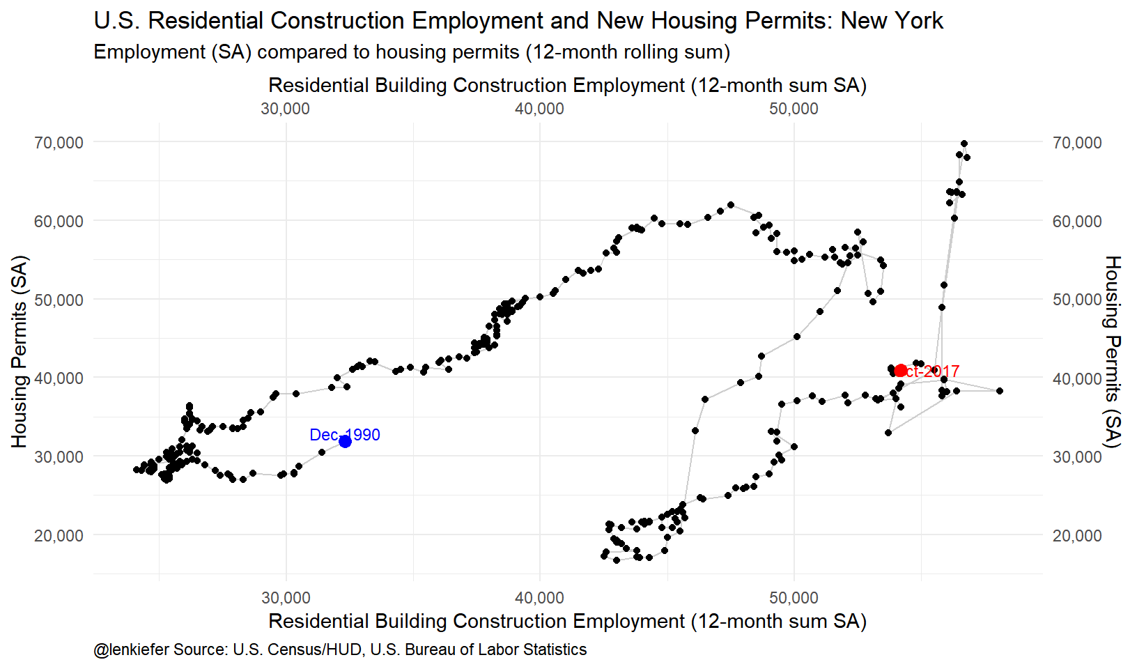
The New York data looks curious, but there was a rush to get permits in ahead of a tax policy change in 2015 that led to a huge spike in permits in the second quarter of 2015.
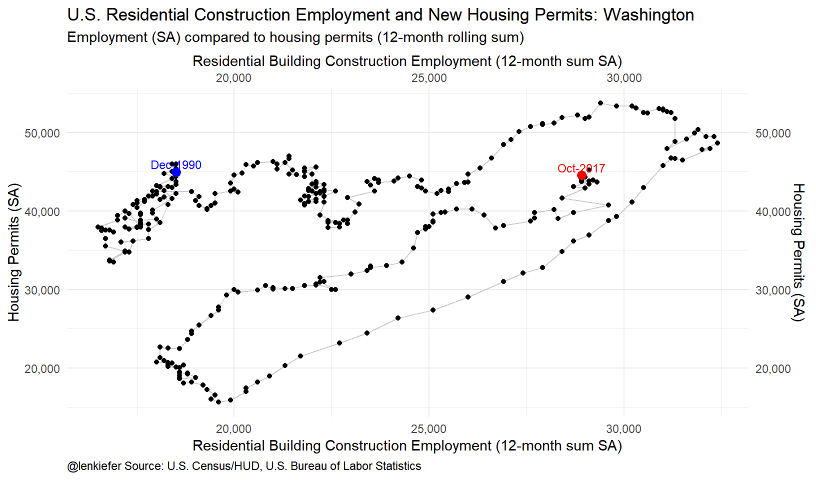
And now a scatterplot:
ggplot(data=df.ca, aes(x=cons*1000,
                       y=permits,
                       label=as.character(date,format="%b-%Y")
                       ))+
  geom_path(color="gray",alpha=0.75)+
  geom_point()+
  theme_minimal()+
    labs(x="Residential Building Construction Employment (12-month sum SA)",y="Housing Permits (SA)",
       title="U.S. Residential Construction Employment and New Housing Permits: California",
       subtitle="Employment (SA) compared to housing permits (12-month rolling sum)",
       caption="@lenkiefer Source: U.S. Census/HUD, U.S. Bureau of Labor Statistics")+
  theme(legend.position="none",plot.caption=element_text(hjust=0))+
  scale_y_continuous(labels=scales::comma,sec.axis=dup_axis())+scale_x_continuous(labels=scales::comma,sec.axis=dup_axis())+
  geom_point(data=filter(df.ca,date=="1990-12-01"), color="blue",size=3)+
  geom_text(data=filter(df.ca,date=="1990-12-01"), color="blue",size=3,nudge_y=1000)+
  geom_point(data=filter(df.ca,date==max(df.ca$date)), color="red",size=3)+
  geom_text(data=filter(df.ca,date==max(df.ca$date)), color="red",size=3,nudge_x=1000)
ggplot(data=df.ny, aes(x=cons*1000,
                       y=permits,
                       label=as.character(date,format="%b-%Y")
                       ))+
  geom_path(color="gray",alpha=0.75)+
  geom_point()+
  theme_minimal()+
    labs(x="Residential Building Construction Employment (12-month sum SA)",y="Housing Permits (SA)",
       title="U.S. Residential Construction Employment and New Housing Permits: New York",
       subtitle="Employment (SA) compared to housing permits (12-month rolling sum)",
       caption="@lenkiefer Source: U.S. Census/HUD, U.S. Bureau of Labor Statistics")+
  theme(legend.position="none",plot.caption=element_text(hjust=0))+
  scale_y_continuous(labels=scales::comma,sec.axis=dup_axis())+scale_x_continuous(labels=scales::comma,sec.axis=dup_axis())+
  geom_point(data=filter(df.ny,date=="1990-12-01"), color="blue",size=3)+
  geom_text(data=filter(df.ny,date=="1990-12-01"), color="blue",size=3,nudge_y=1000)+
  geom_point(data=filter(df.ny,date==max(df.ny$date)), color="red",size=3)+
  geom_text(data=filter(df.ny,date==max(df.ny$date)), color="red",size=3,nudge_x=1000)
ggplot(data=df.wa, aes(x=cons*1000,
                       y=permits,
                       label=as.character(date,format="%b-%Y")
))+
  geom_path(color="gray",alpha=0.75)+
  geom_point()+
  theme_minimal()+
    labs(x="Residential Building Construction Employment (12-month sum SA)",y="Housing Permits (SA)",
       title="U.S. Residential Construction Employment and New Housing Permits: Washington",
       subtitle="Employment (SA) compared to housing permits (12-month rolling sum)",
       caption="@lenkiefer Source: U.S. Census/HUD, U.S. Bureau of Labor Statistics")+
  theme(legend.position="none",plot.caption=element_text(hjust=0))+
  scale_y_continuous(labels=scales::comma,sec.axis=dup_axis())+scale_x_continuous(labels=scales::comma,sec.axis=dup_axis())+
  geom_point(data=filter(df.wa,date=="1990-12-01"), color="blue",size=3)+
  geom_text(data=filter(df.wa,date=="1990-12-01"), color="blue",size=3,nudge_y=1000)+
  geom_point(data=filter(df.wa,date==max(df.wa$date)), color="red",size=3)+
  geom_text(data=filter(df.wa,date==max(df.wa$date)), color="red",size=3,nudge_y=1000)
Washington state is an interesting example. Housing markets in the Evergreen State have been hot with house prices increasing over 12 percent on a year-over-year basis according. In the scatterplot above we can see that residential building employment has come on strong in recent months (it’s up over 1/3 since the lows of 2009/2010). New housing permits have also surged. They remain below their housing boom peak, but are moving higher in a hurry.
What’s going on?
What is going on? I’m not entirely sure. As I tweeted, these are chartfood for thought. One factor is the shift in composition from single family to multifamily construction. In general it takes fewer construction workers per unit to produce a multifamily unit (a net impact on the economy of about 3 jobs per single-family home vs 1 job per apartment per NAHB). I suspect that might explain much of the change in the ratio of construction employment to housing starts.
But these charts indicate that recent increases in housing construction have been associated nearly one-for-one with increased residential construction employment. In order to increase housing construction to keep pace with long run demand we’re going to need more construction workers, especially if we shift towards more labor intensive singe family construction.
Addendum: getting state housing data
The code below gets the data for the state permits and construction employment.
library(tibbletime)
library(geofacet)

# get employment data via FRED
# states with residential construction employment estimates (monthly, SA)
fips.list<-c("06","22","16","27","34","36","40","41","53")


# mnemonic is   SMUXX000002023610001SA, with XX 2-digit state FIPS code

df3 <- tq_get(paste0("SMU",fips.list,"000002023610001SA"),  # mnenonmic for residential construction
             get="economic.data",             # use FRED
             from="1990-01-01")               # go from 1990 forward


# get permits data via FRED
df.permits <- tq_get(paste0(us_state_grid3$code,      # get state abbreviations (via geofacet::us_state_grid3)
                         "BPPRIVSA"),                 # append code for permits (e.g. CABPPRIVSA for CA permits)
                  get="economic.data",                # use FRED
                  from="1990-01-01")     %>%          # go from 1990 forward
  mutate(state=substr(symbol,1,2)        # create a state variable
         ) %>% rename(permits=price) -> df.permits


# construct 12-month moving sum

sum_roll_12 <- rollify(sum, window = 12)

df.permits %<>% group_by(state) %>% mutate(price12=sum_roll_12(price)) %>% ungroup()

# California data

df.ca<- left_join(filter(df.permits, state=="CA") %>% rename(permits=price12),
                  filter(df3,symbol=="SMU06000002023610001SA") %>%
                    rename(cons=price), by="date")

# New York State data
df.ny<- left_join(filter(df.permits, state=="NY") %>% rename(permits=price12),
                  filter(df3,symbol=="SMU36000002023610001SA") %>%
                    rename(cons=price), by="date")

# Washington State data

df.wa<- left_join(filter(df.permits, state=="WA") %>% rename(permits=price12),
                  filter(df3,symbol=="SMU53000002023610001SA") %>%
                    rename(cons=price), by="date")