IN THIS POST WE WILL STUDY FORECASTS OF US ECONOMIC CONDITIONS.
Niels Bohr quipped:
Prediction is very difficult, especially if it’s about the future.
I’m a macroeconomist by training, and my day job sometimes requires me to forecast the future so I can relate. Predicting the future can be quite difficult.
In this post, we’ll analyze forecasts of economic conditions from professional forecasters using R to wrangle the data and construct plots.
Note that while in my work I do sometimes help forecast variables we’ll look at here, the analysis here is strictly for fun, represents my own views and does not necessarily reflect the views of my employer or any other organization.
Get forecast data
Professional economists and analysts routinely make forecasts of economic conditions. There are several services that collect, aggregate and reproduce a variety of economic forecasts. For today’s exercise, we’ll look at forecasts collected in the Survey of Professional Forecasters.
Note: I do not currently participate in the Survey of Professional Forecasters
The forecasts for the Survey of Professional Forecasters are currently provided by the Federal Reserve Bank of Philadelphia. The quarterly survey, formerly conducted by the American Statistical Association (ASA) and the National Bureau of Economic Research (NBER), began in 1968:Q4 and was taken over by the Philadelphia Fed in 1990:Q2. For more on the Survey, see the documentation provided by the Federal Reserve Bank of Philadelphia.
This survey is nice, because it is freely available, goes back to the 1960s for some variables, and is relatively easily accessible in files provided by the Federal Reserve Bank of Philadelphia on their webpage.
Interesting questions we are not addressing today is how the forecasters arrive at their forecasts and how one might efficiently use the forecast results. Instead, we are going to be interested in understanding how the forecasts evolved over time and save those other questions for a later date. If you are interested in these questions note that the Federal Reserve Bank of Philadelphia has compiled a list of articles that either discuss or use the data from the survey. Plenty to read there.
Getting the data
The data are available in a variety of spreadsheets. You can download the variables one at a time if you are only interested in a subset. For example, here is a link to just housing starts forecasts. Alternatively, you can download all the survey responses. Because I am interested in both aggregates (like median and mean forecasts) and the cross sectional distribution of forecasts, I have chosen to download all invidual responses. GIVE ME MOAR DATA
You can get those data here.
- Surveys 1968:4-1979:4 Excel spreadsheet
- Surveys 1980:1-1989:4 Excel spreadsheet
- Surveys 1990:1-1999:4 Excel spreadsheet
- Surveys 2000:1-2009:4 Excel spreadsheet
- Surveys 2010:1-present Excel spreadsheet
Each of those links will allow you to download a spreadsheet names micro1.xlsx through micro5.xlsx. We can read these data into R and do some wrangling.
Before we do, let’s go back and read the documentation to better understand how the data are set up. Hurray for all the people who write clear documentation! You are real heros.
The data are stored in Excel spreadsheets, with data for each variable stored in a separate worksheet named after the mnemonic for that variable. Housing starts for example, are stored in a worksheet called HOUSING. For today, let’s focus on a subset of variables. They are listed below:
- HOUSING U.S. Housing Starts
- TBOND 10-year U.S. Treasury Bond rate
- TBILL 3-month U.S> Treasury Bill rate
- EMP U.S. Nonfarm Payroll Employment
- UNEMP U.S. Unemployment Rate
- CPI U.S. Consumer Price Index Inflation Rate
- CORECPI Core Consumer Price Index Inflation Rate
- PCE PCE Inflation Rate
- COREPCE Core PCE Inflation Rate
Within each worksheet there are 12 columns. The first four are:
- YEAR
- QUARTER
- ID
- INDUSTRY
corresponding to the year and quarter when the forecast is made, the survey respondent ID, and the industry for the survey respondent. We won’t be using the ID or INDUSTRY column for anything today. YEAR and QUARTER will let us construct a date variable.
The next 6 columns are numbered X1-X6 and the final two are XA and XB, where X is the mnemonic for the variable. It’s important to understand what each of these columns is measuring.
Each row identified by YEAR and QUARTER tells us when the forecast was made. Say for example we are looking at YEAR=2017 and QUARTER=3. That means the forecast is recorded in the 3rd quarter of 2017. X1 would record the respondent’s estimate of X in the prior quarter, so 2017:Q2 in our example. X2 is the forecast for the current quarter, and X3 through X6 for each of the next 4 quarters (X6 is the forecast for 4 quarters in the future, or 2018:Q3 in our example). The variables XA and XB represent the respondents forecasts for the current calendar year and the next calendar year (2017 and 2018 in our example).
We’re going to have to be careful about this because we are going to be dealing with two time dimensions. We are going to have a vintage corresponding to when the forecast was made. We are also going to have a period for the forecast itself. Because economic data is often only available with a lag and forecasts are made in the middle of a quarter, the forecaster will have to nowcast the current quarter. Indeed, though the prior quarter’s estimates are usually available when the forecast is made, not all respondents report the same number for X1.
It gets worse.
Most economic data is revised. Often substantially so. So even if the respondents have the most up-to-date information about the prior quarter at the time they make their forecast. Future revisions may change the past. We have to be careful about taking the most recent estimates and comparing it to historical forecasts. Fortunately, the Federal Reserve Bank of Philadelphia makes available Real Time Estimates of economic data that allows us to reconstruct the information set available to forecasts at the time they made their forecast.
For today’s post we’ll work around these issues (see discussion below) and save the Real Time Estimates for a future post.
Importing data
Let’s bring our data in and see what we’ve got. We’ll use readxl and exploit the tricks from this article to get our data ready in R.
Recall that we have 5 Excel spreadsheets saved in our data directory. The following code will start getting our data ready.
#####################################################################################
## Load Libraries ##
#####################################################################################
library(tidyverse)
## Loading tidyverse: ggplot2
## Loading tidyverse: tibble
## Loading tidyverse: tidyr
## Loading tidyverse: readr
## Loading tidyverse: purrr
## Loading tidyverse: dplyr## Conflicts with tidy packages ----------------------------------------------## filter(): dplyr, stats
## lag(): dplyr, statslibrary(readxl)
library(data.table)##
## Attaching package: 'data.table'## The following objects are masked from 'package:dplyr':
##
## between, first, last## The following object is masked from 'package:purrr':
##
## transposelibrary(tidyverse)
library(cowplot)##
## Attaching package: 'cowplot'## The following object is masked from 'package:ggplot2':
##
## ggsavelibrary(readxl)
library(viridis)## Loading required package: viridisLitelibrary(stringr)
library(ggbeeswarm)
#####################################################################################
#####################################################################################
# Import data
#####################################################################################
################################################################
# List of spreadsheets we'll import
################################################################
p.list<-c("data/micro1.xlsx","data/micro2.xlsx","data/micro3.xlsx",
"data/micro4.xlsx","data/micro5.xlsx")
################################################################
# List of variables we want (corresponds to worksheet names)
# If you want MOAR variables, adjust the list
################################################################
vlist<-c("HOUSING","TBOND","EMP","TBILL","UNEMP","RGDP",
"CPI","CORECPI","PCE","COREPCE")
################################################################
# Import data function (don't ask about my.import1)
my.import2<-function(path="data/micro1.xlsx"){
vlist %>%set_names()%>% map_df(~ read_excel(path = path, sheet = .x), .id = "sheet") ->df.out
return(df.out)
}
################################################################
################################################################
# we probably could use purrr better here,
# but four copy + paste isn't so bad
################################################################
df1<-my.import2(p.list[1])
df2<-my.import2(p.list[2])
df3<-my.import2(p.list[3])
df4<-my.import2(p.list[4])
df5<-my.import2(p.list[5])
# stack the data
df.all<-rbind(df1,df2,df3,df4,df5)
#####################################################################################I would print the header of our dataset but at the moment there are 97 variables. Let’s do some transposing and gathering to tidy these data into a more manageable format.
################################################################
# Tidy the data
################################################################

df.all %>%
  filter(YEAR>1989) %>%  # restrict to just 1989
  gather(var,value, -1,-2,-3,-4,-5) %>%   # gather variables starting in column 6

  mutate(horizon=as.numeric(str_sub(var, start= -1)), # we'll explain below
         value=as.numeric(value),                     # turn values into numbers
         date=as.Date(ISOdate(YEAR,QUARTER*3,1)),     # dates
         ydate=date+months(horizon*3-6)               # we'll explain below
         ) %>%
  select(date,ydate,horizon, everything()) %>%        # i like date to be on the left
  filter(!is.na(horizon)) -> df.all2                  # get rid of annual forecasts
## Warning in evalq(as.numeric(str_sub(var, start = -1)), <environment>): NAs
## introduced by coercion## Warning in evalq(as.numeric(value), <environment>): NAs introduced by
## coercion################################################################
# Now look at data
################################################################
str(df.all2)## Classes 'tbl_df', 'tbl' and 'data.frame': 2599200 obs. of 10 variables:
## $ date : Date, format: "1990-03-01" "1990-03-01" ...
## $ ydate : Date, format: "1989-12-01" "1989-12-01" ...
## $ horizon : num 1 1 1 1 1 1 1 1 1 1 ...
## $ sheet : chr "HOUSING" "HOUSING" "HOUSING" "HOUSING" ...
## $ YEAR : num 1990 1990 1990 1990 1990 1990 1990 1990 1990 1990 ...
## $ QUARTER : num 1 1 1 1 1 1 1 1 1 1 ...
## $ ID : num 15 20 30 35 40 41 44 60 62 82 ...
## $ INDUSTRY: chr "#N/A" "#N/A" "#N/A" "#N/A" ...
## $ var : chr "HOUSING1" "HOUSING1" "HOUSING1" "HOUSING1" ...
## $ value : num 1.39 1.33 1.33 1.33 1.33 1.33 1.33 1.33 1.33 1.33 ...knitr::kable(head(df.all2))| date | ydate | horizon | sheet | YEAR | QUARTER | ID | INDUSTRY | var | value |
|---|---|---|---|---|---|---|---|---|---|
| 1990-03-01 | 1989-12-01 | 1 | HOUSING | 1990 | 1 | 15 | #N/A | HOUSING1 | 1.39 |
| 1990-03-01 | 1989-12-01 | 1 | HOUSING | 1990 | 1 | 20 | #N/A | HOUSING1 | 1.33 |
| 1990-03-01 | 1989-12-01 | 1 | HOUSING | 1990 | 1 | 30 | #N/A | HOUSING1 | 1.33 |
| 1990-03-01 | 1989-12-01 | 1 | HOUSING | 1990 | 1 | 35 | #N/A | HOUSING1 | 1.33 |
| 1990-03-01 | 1989-12-01 | 1 | HOUSING | 1990 | 1 | 40 | #N/A | HOUSING1 | 1.33 |
| 1990-03-01 | 1989-12-01 | 1 | HOUSING | 1990 | 1 | 41 | #N/A | HOUSING1 | 1.33 |
Now you will see that we have two dates. The variable date corresponds to the date when the forecast was made, the vintage date. The variable ydate corresponds to the date for which the forecast applies. So HOUSING1 in Q1 of 1990 (1990-03-01) correponds to estimates for 1989Q4 (1989-12-01) housing starts. I’ve also chosen to drop the annual forecasts here. I do that by forcing my horizon variable to be numeric, creating NA values when var ends in A or B and then dropping rows with horizon=NA. Note, we’ll bring the annual numbers back in later.
Make some plots
Now that we have our data wrangled, we can start to make some fun plots.
First, I’m going to aggregate the responses up to a median response and plot that against the actuals.
################################################################
# Summarize by medians
################################################################
df.all2  %>% group_by(YEAR,QUARTER,sheet,horizon) %>%
  dplyr::summarize(value.sd=sd(value,na.rm=T),
            value.iqr=quantile(value,0.75,na.rm=T)-quantile(value,0.25,na.rm=T),
            value=median(value,na.rm=T)      ) %>%
  mutate( date=as.Date(ISOdate(YEAR,QUARTER*3,1)),
          ydate=date+months(horizon*3-6)) -> df.median

################################################################
# Now look at data
################################################################
knitr::kable(tail(df.median))| YEAR | QUARTER | sheet | horizon | value.sd | value.iqr | value | date | ydate |
|---|---|---|---|---|---|---|---|---|
| 2017 | 3 | UNEMP | 1 | 0.0092149 | 0.0000 | 4.4000 | 2017-09-01 | 2017-06-01 |
| 2017 | 3 | UNEMP | 2 | 0.0723417 | 0.0102 | 4.3000 | 2017-09-01 | 2017-09-01 |
| 2017 | 3 | UNEMP | 3 | 0.1271787 | 0.1000 | 4.2297 | 2017-09-01 | 2017-12-01 |
| 2017 | 3 | UNEMP | 4 | 0.1675234 | 0.2000 | 4.1931 | 2017-09-01 | 2018-03-01 |
| 2017 | 3 | UNEMP | 5 | 0.2273253 | 0.3000 | 4.1483 | 2017-09-01 | 2018-06-01 |
| 2017 | 3 | UNEMP | 6 | 0.2724329 | 0.3329 | 4.1047 | 2017-09-01 | 2018-09-01 |
Even at horizon=1, which corresponds to estimates for the prior quarter, not all forecasters agree. Later we can use the Real Time Data to bring in the actual historical estimates that were available at the time of forecasting. But for now, we’ll use the median at horizon=1 to stand in for the values.
################################################################
# Create a function to compare forecasts to actuals
################################################################

f.plot<-function(s="HOUSING", h=6,ymin=1999){
  df.p<-filter(df.all2, YEAR>=ymin & sheet==s & horizon==h & ! is.na(value))
  g<-
    ggplot(data=df.p, aes(x=ydate,y=value))+
    geom_boxplot(aes(group=ydate), outlier.size=0.5)+
    geom_point(alpha=0.15,size=0.9)+guides(color=F)+
    theme_minimal()+
    scale_color_viridis(discrete=T,end=0.85)+
    geom_path(data=filter(df.median, YEAR>=ymin & sheet==s &
                            horizon==1 & !is.na(value)),
              aes(x=ydate),size=1.05,color="red")+
    labs(x="",y="")
  return(g)
}

################################################################
# Gonna use these for annotations
################################################################
df.p<-filter(df.all2, YEAR>=1999 & sheet=="HOUSING" & horizon==1 & ! is.na(value))

# this will give us the red line actual
dfps<-filter(df.median,date==median(df.p$date) & sheet=="HOUSING" & horizon==1)

# this will give us the dots/box
dfb<-filter(df.p, date==median(df.p$ydate)-months(24) &
              sheet=="HOUSING" & horizon==6 )

# Combine plot with annotations
f.plot(s="HOUSING")+
  annotate(geom="text",x=median((df.p$date))-months(24),hjust=1,
           y =0.75,
           label="actual estimates\nas observed in real time\n(without
           revisions)",
           color="red")+
  geom_segment(data=dfps,
               aes(x=ydate, xend=ydate-months(24),
                   yend=0.8,y=value),color="red",linetype=2)+
  geom_segment(aes(x=median(dfb$ydate), xend=median(dfb$ydate)+months(24),
                   y=median(dfb$value), yend=1.8),linetype=3)+
  annotate(geom="text",x=median((df.p$date))+months(24), hjust=0,
           y =1.82, label="boxplots show\ndistribution of 4-quarter\nahead forecasts",
           color="black")+
  labs(x="",
       y="Housing starts (quarterly average of monthly estimates in millions, SAAR)",
       title="4-quarter ahead forecasts for U.S. Housing Starts",
       subtitle="Solid line historical esimates of housing starts (without revisions), dots individual forecasts",
       caption="@lenkiefer Source: U.S. Census Bureau and Department of Housing and Urban Development\nForecasts from Survey of Professional Forecasters\nhttps://www.philadelphiafed.org/research-and-data/real-time-center/survey-of-professional-forecasters")+
  theme(plot.caption=element_text(hjust=0),
        plot.subtitle=element_text(face="italic"))
## Warning: Removed 2770 rows containing missing values (geom_segment).
Let’s break down what we are looking at here.
The black dots represent what each forecaster in the panel believes housing starts will be four quarters in the future. A dot at 2017:Q2 corresponds to what an individual forecaster though housing starts would be in 2017:Q2 as of 2016Q2. The boxes summarize the distribution of black dots, with the box capturing the 25th to 75th percentile of forecasts and the line indicating the median forecast.
The red line is the median estimate from the panel the quarter after the data released. Since the data is available to forecasters at that time the red line should match the historical vintage estimate. Again using our example of 2017:Q2: the red line at 2017:Q3 represents the median estimate for 2017:Q2 housing starts as of 2017:Q3.
By comparing the red line to the black line, we can get a sense of what forecaster expected to see for housing starts (the dots/box) and then what they subsequently saw. In the early to mid- 2000s the red line was above the dots, meaning that forecasts were on average too low. During the Great Recession housing starts fell more than expected (the red line is below most of the dots) and the recovery was slower than expected.
Another plot might be easier to digest. Let’s compare the median forecasts to the actual estimates.
################################################################
# Create a function to compare forecasts to actuals
################################################################
f.plot2<-function(s="HOUSING",ymin=1999){
df.p<-filter(df.median, YEAR>=ymin & sheet==s & ! is.na(value))
g<-
ggplot(data=df.p, aes(x=ydate,y=value, group=date,color=factor(date)))+
geom_line(alpha=0.75,linetype=2,size=1.02)+
guides(color=F)+
theme_minimal()+
geom_path(data=filter(df.median, YEAR>=ymin & sheet==s & horizon==1 & !
is.na(value)),
aes(x=ydate,group="actual"),size=1.05,color="black")+
labs(x="",y="")
return(g)
}
################################################################
# Make a plot
# Adjusted on 8/28/2017 to fix y axis label
# label had been 1000s but should be millions
################################################################
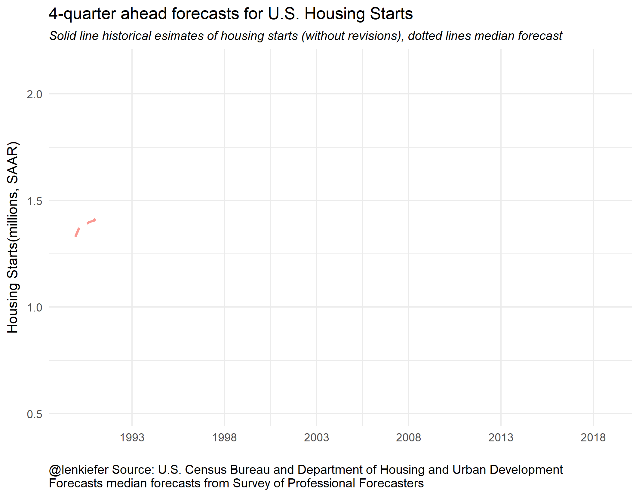
f.plot2() +
labs(x="",y="Housing Starts(millions, SAAR)",
title="4-quarter ahead forecasts for U.S. Housing Starts",
subtitle="Solid line historical esimates of housing starts (without revisions), dotted lines median forecast",
caption="@lenkiefer Source: U.S. Census Bureau and Department of Housing and Urban Development\nForecasts median forecasts from Survey of Professional Forecasters\nhttps://www.philadelphiafed.org/research-and-data/real-time-center/survey-of-professional-forecasters")+
theme(plot.caption=element_text(hjust=0),
plot.subtitle=element_text(face="italic"))
We can see that from the early- to mid-2000s forecasters were expecting housing starts to decrease. Then during the Great Recession and the collapse of housing starts, forecasters tended to overestimate 4-quarter ahead starts. Once the recover began, forecasters also tended to overestimate starts. Early in the recovery, the tentacles have a greater slope, indicating forecasters anticipated a strong recovery. Over time, the slope of the forecast line started to flatten and line up with the data.
Let’s watch this as an animated gif. Some people find animated gifs gratuitous and even tell me so on Twitter. That’s an okay opinion. Sometimes the animation is gratuitous, though it does help focus attention.
But in this case I think the animation helps you understand better. Imagine you are a forecaster and see the black line as estimates are released. Where do you think housing starts will be next year? The dotted lines don’t seem as obviously wrong as they might if you only look at the static plot. Forecasting is hard.
Now that we have these handy plotting functions, we can use cowplot to arrange small multiples into a single plot.
First the boxplot:
################################################################
# Make a composite plot arranged with cowplot::plot_grid()
################################################################

plot_grid(f.plot(s="HOUSING")+labs(title="Houing Starts (millions SAAR)"),
          f.plot(s="UNEMP")+labs(title="Unemployment Rate (%)"),
          f.plot(s="TBILL")+
            labs(title="3-Month Treasury Bill Rate (%)",
                 caption="@lenkiefer solid line historical real time estimates (without revisions), dots 4-quarter ahead forecasts\nSource: Forecasts from Survey of Professional Forecasters\nhttps://www.philadelphiafed.org/research-and-data/real-time-center/survey-of-professional-forecasters")+
          theme(plot.caption=element_text(hjust=0)),
          f.plot(s="TBOND")+
            labs(title="10-Year Treasury Bond Rate (%)"),
          align="hv")
And let’s make the tentacle plot focusing on median forecasts:
################################################################
# Make a composite plot arranged with cowplot::plot_grid()
################################################################
plot_grid(f.plot2(s="HOUSING")+labs(title="Housing Starts (millions SAAR)"),
          f.plot2(s="UNEMP")+labs(title="Unemployment Rate (%)"),
          f.plot2(s="TBILL")+
            labs(title="3-Month Treasury Bill Rate (%)",
                 caption="@lenkiefer black line historical real time estimates (without revisions), dotted lines median 1- to 4-quarter ahead forecasts\nSource: Forecasts from Survey of Professional Forecasters\nhttps://www.philadelphiafed.org/research-and-data/real-time-center/survey-of-professional-forecasters")+
          theme(plot.caption=element_text(hjust=0)),
          f.plot2(s="TBOND")+labs(title="10-Year Treasury Bond Rate (%)"),
          align="hv")
Inflation forecasts
We also extracted inflation forecasts. Let’s use our function to draw plots of inflation forecasts. We have four variables to look at corresponding to forecasts of headline CPI, core CPI, headline PCE and core PCE inflation. The core inflation measures are indices that strip away volatile food and energy prices.
################################################################
# Make a composite plot arranged with cowplot::plot_grid()
################################################################

plot_grid(f.plot(s="CPI")+labs(title="CPI Inflation Rate (%)"),
          f.plot(s="CORECPI")+labs(title="Core CPI Inflation Rate (%)"),
          f.plot(s="PCE")+
            labs(title="PCE Inflation Rate (%)",
                 caption="@lenkiefer solid line historical real time estimates (without revisions), dots 4-quarter ahead forecasts\nSource: Forecasts from Survey of Professional Forecasters\nhttps://www.philadelphiafed.org/research-and-data/real-time-center/survey-of-professional-forecasters")+
          theme(plot.caption=element_text(hjust=0)),
          f.plot(s="COREPCE")+
            labs(title="Core PCE Inflation Rate (%)"),
          align="hv")
################################################################
# Make a composite plot arranged with cowplot::plot_grid()
################################################################

plot_grid(f.plot2(s="CPI")+labs(title="CPI Inflation Rate (%)"),
          f.plot2(s="CORECPI")+labs(title="Core CPI Inflation Rate (%)"),
          f.plot2(s="PCE")+
            labs(title="PCE Inflation Rate (%)",
                 caption="@lenkiefer solid line historical real time estimates (without revisions), dotted lines median 1- to 4-quarter ahead forecasts\nSource: Forecasts from Survey of Professional Forecasters\nhttps://www.philadelphiafed.org/research-and-data/real-time-center/survey-of-professional-forecasters")+
          theme(plot.caption=element_text(hjust=0)),
          f.plot2(s="COREPCE")+
            labs(title="Core PCE Inflation Rate (%)"),
          align="hv")
Two things to note about these forecasts. First, the inflation forecasts are a lot less volatile than inflation rates, particularly for the Core measures that strip away volatile food and energy prices. That’s not too surprising. What’s more interesting is that the inflation forecasts seem to cluster right around a 2% rate, even though inflation has remained consistently below 2 percent.
Joyswarm
Let’s try to visualize these trends with a Joyswarm plot.
Remember how we dropped the annual data above? Well, turns out I want them back, so we need to re-wrangle our data. It’s not so bad.
library(ggjoy)

################################################################
# Get annual
################################################################

df.all %>%
  filter(YEAR>1989) %>%  # restrict to just 1989
  gather(var,value, -1,-2,-3,-4,-5) %>%   # gather variables starting in column 6
  mutate(horizonA=str_sub(var, start= -1)) %>%
  filter(horizonA=="B") %>%               # get only forecasts for next calendar year
  mutate(value=as.numeric(value),         # turn values into numbers
         YEARF=YEAR+1     ) %>%           # Forecast year
  select(YEAR,QUARTER, YEARF, everything()) ->   df.annual
## Warning in evalq(as.numeric(value), <environment>): NAs introduced by
## coercionf.plot3<-function(s="HOUSING", h=6,ymin=1999, qq=3){
g<-
ggplot(data=filter(df.annual, YEAR>=ymin & QUARTER==qq &
sheet==s & ! is.na(value)), aes(x=value,
y=forcats::fct_reorder(factor(YEARF),-YEARF),
fill=forcats::fct_reorder(factor(YEARF),-YEARF),
color=forcats::fct_reorder(factor(YEARF),-YEARF)))+
geom_joy(rel_min_height=.01, alpha=0.5)+
geom_quasirandom(size=1.1)+
scale_fill_viridis(discrete=T,option="B",end=0.85,direction=-1)+
scale_color_viridis(discrete=T,option="B",end=0.85,direction=-1)+
guides(color=F,fill=F)+
theme_joy()+
labs(x="",y="")
return(g)
}
f.plot3()+
labs(y="",x="Housing Starts(millions, SAAR)",
title="Year ahead forecasts for U.S. Housing Starts made in Q3 of prior year",
subtitle="Each dot a forecast for annual starts made in q3 of prior year\nshaded areas density curve fit to forecasts",
caption="@lenkiefer Source: U.S. Census Bureau and Department of Housing and Urban Development\nForecasts from Survey of Professional Forecasters\nhttps://www.philadelphiafed.org/research-and-data/real-time-center/survey-of-professional-forecasters")+
theme(plot.caption=element_text(hjust=0,size=9),
plot.subtitle=element_text(face="italic"))## Picking joint bandwidth of 0.0409
For this plot, it might help to add an anotation for actual housing starts. We’ll save the real-time data for a future post, but we can grab the latest estimates for housing starts and add to the plot. We’ll use the Saint Louis Federal Reserve Economic Database (FRED). In this post I talk more about using FRED with R.
library(quantmod)## Loading required package: xts## Loading required package: zoo##
## Attaching package: 'zoo'## The following objects are masked from 'package:base':
##
## as.Date, as.Date.numeric##
## Attaching package: 'xts'## The following objects are masked from 'package:data.table':
##
## first, last## The following objects are masked from 'package:dplyr':
##
## first, last## Loading required package: TTR## Version 0.4-0 included new data defaults. See ?getSymbols.################################################################
# Get Fred data
################################################################
df.fred = getSymbols('HOUST',src='FRED', auto.assign=F) ## 'getSymbols' currently uses auto.assign=TRUE by default, but will
## use auto.assign=FALSE in 0.5-0. You will still be able to use
## 'loadSymbols' to automatically load data. getOption("getSymbols.env")
## and getOption("getSymbols.auto.assign") will still be checked for
## alternate defaults.
##
## This message is shown once per session and may be disabled by setting
## options("getSymbols.warning4.0"=FALSE). See ?getSymbols for details.df.fred = data.frame(date=time(df.fred), coredata(df.fred) )
################################################################
# Compute annual totals
################################################################
df.fred %>% mutate(YEAR=year(date)) %>% group_by(YEAR) %>%
dplyr::summarize(hs=mean(HOUST)) -> df.fredannualNow with the actual annual averages we can add it to our joyswarm plot.
f.plot3()+
  labs(y="",x="Housing Starts(millions, SAAR)",
       title="Year ahead forecasts for U.S. Housing Starts made in Q3 of prior year",
       subtitle="Each dot a forecast for annual starts made in q3 of prior year\nshaded areas density curve fit to forecasts\nXs mark annual average (with revisions)",
       caption="@lenkiefer Source: U.S. Census Bureau and Department of Housing and Urban Development\nForecasts from Survey of Professional Forecasters\nhttps://www.philadelphiafed.org/research-and-data/real-time-center/survey-of-professional-forecasters\nTotal: New Privately Owned Housing Units Started [HOUST],\nretrieved from FRED, Federal Reserve Bank of St. Louis; https://fred.stlouisfed.org/series/HOUST, August 26, 2017.")+
  theme(plot.caption=element_text(hjust=0,size=9),
        plot.subtitle=element_text(face="italic"))+
  geom_point(data=filter(df.fredannual,YEAR>=2000 & YEAR<2017),
             aes(x=hs/1000,y=forcats::fct_reorder(factor(YEAR),-YEAR),
                          fill=forcats::fct_reorder(factor(YEAR),-YEAR),
                          color=forcats::fct_reorder(factor(YEAR),-YEAR)),
             shape=4,size=5)
## Picking joint bandwidth of 0.0409
Forecasting is hard work
Forecasting is hard work, especially when the forecasts are about the future. Estimates of economic data often don’t settle down for years after the fact. With the past and present constantly shifting it’s no surprise that forecasting the future isn’t easy.
In this post we gathered some historical forecasts of economic activity and plotted them. These data are made available in a relatively easy format to work with. Using tidyverse tools we were able to pull the data out of their spreadsheets and make some interesting plots.
There’s still quite a bit more we could do with these data. Let me know if you’d like to see a follow up.