IN THIS POST I WANT TO SHARE SOME R data wrangling strategy and use it to prepare an update to some global house price plots I shared last year.
In last year’s post I did some data manipulation by hand and mouse in Excel before getting into R. In this post I’m going to use the newly updated readxl library to do the data manipulations entirely in R. If you follow along, then you should be able to use this code to recreate my graphs.
This should prove to be a major improvement over my previous workflows. Because of the realities of my professional life I cannot escape Excel. Actually, I probably wouldn’t want to escape it even if I could. Despite its limitations and frequent misuse it is still my favorite application.
However, while I’ve gotten pretty fast at doing some fairly complex manipulations in Excel (see this post from last year for an example) it isn’t exactly reproducible. Using a scripting language in R should help with making the workflow more reproducible. Also, by using a scripting language you can automate tasks and easily scale to larger problems. I often encounter situations where I would need to work with hundreds of workbooks/worksheets.
I’m going to lean heavily on the ideas in this post on the readxl workflow to prepare our data.
Some data
Let’s update our global house price charts and make a couple new ones.
First we’re going to need to gather some data on house prices. Fortunately, the Dallas Federal Reserve Bank has compiled statistics on international house price trends. Fed researchers have gone through the hard work of collecting data for many countries and harmonizing the series so they are more easily comparable. Read about their hard work and the details here.
The data are available in a convenient spreadsheet (2016Q4 data). We’re going to proceed assuming that the hp1604.xlsx spreadsheet is saved in a data folder.
Using readxl
I began this update attempting to read the data in the following manner (which works). In this example, which we will improve upon, I first read in each separate sheet and then do some data manipulations.
First load our libraries:
library(tidyverse)## Loading tidyverse: ggplot2
## Loading tidyverse: tibble
## Loading tidyverse: tidyr
## Loading tidyverse: readr
## Loading tidyverse: purrr
## Loading tidyverse: dplyr## Conflicts with tidy packages ----------------------------------------------## filter(): dplyr, stats
## lag(): dplyr, statslibrary(data.table)##
## Attaching package: 'data.table'## The following objects are masked from 'package:dplyr':
##
## between, first, last## The following object is masked from 'package:purrr':
##
## transposelibrary(ggthemes,quietly=T,warn.conflicts=F)
library(readxl)
library(stringr)Now we could do things this way:
###############################################################################
#### Read in HPI data  ##########################################
df<-read_excel("data/hp1604.xlsx", sheet = "HPI")
colnames(df)[1]<-"cycle"  # rename first column
df$year<-substr(df$cycle,1,4) #create a year
df$month<-substr(df$cycle,7,7) #create a
df$date<-as.Date(ISOdate(df$year,df$month,1))
df %>% select(-X__2,-cycle,-year,-month) %>%
  gather(country,hpi,-date) ->hpi.df
###############################################################################

###############################################################################
#### Read in Real HPI data  ##########################################
df<-read_excel("data/hp1604.xlsx", sheet = "RHPI")
colnames(df)[1]<-"cycle"
df$year<-substr(df$cycle,1,4)
df$month<-substr(df$cycle,7,7)
df$date<-as.Date(ISOdate(df$year,df$month,1))
df %>% select(-X__2,-cycle,-year,-month) %>%
  gather(country,rhpi,-date) ->rhpi.df
###############################################################################

###############################################################################
#### Read in Disposable Income data  ############################
df<-read_excel("data/hp1604.xlsx", sheet = "PDI")
colnames(df)[1]<-"cycle"
df$year<-substr(df$cycle,1,4)
df$month<-substr(df$cycle,7,7)
df$date<-as.Date(ISOdate(df$year,df$month,1))
df %>% select(-X__2,-cycle,-year,-month) %>%
  gather(country,pdi,-date) ->pdi.df
###############################################################################

###############################################################################
#### Read in Rea Disposable Income data  ############################
df<-read_excel("data/hp1604.xlsx", sheet = "RPDI")
colnames(df)[1]<-"cycle"
df$year<-substr(df$cycle,1,4)
df$month<-substr(df$cycle,7,7)
df$date<-as.Date(ISOdate(df$year,df$month,1))
df %>% select(-X__2,-cycle,-year,-month) %>%
  gather(country,rpdi,-date) ->rpdi.df
###############################################################################

###############################################################################
#### Merge data together data  ############################
###  Requires data.table() package ************************
dt<-merge(hpi.df,rhpi.df,by=c("date","country"))
dt<-merge(dt,pdi.df,by=c("date","country"))
dt<-merge(dt,rpdi.df,by=c("date","country"))
dt<-data.table(dt)[year(date)>0,]
###############################################################################
While this works, and isn’t too bad, it could get really old if we had 10s or hundreds of worksheets to chew through. Fortunately, we have a better alternatively using the readxl workflow combined with map_df from the purrr library (available in the tidyverse).
# path to data
path <-"data/hp1604.xlsx"

###########################################################################
#  We'll omit this step, hard coding instead

#  xl.list<-path %>% excel_sheets()   #get a list of sheet names
###########################################################################

df <- c("HPI","RHPI","PDI","RPDI") %>%   #iterate over four sheets
      set_names() %>%

      # Now for something magical!

      map_df(~ read_excel(path = path, sheet = .x), .id = "sheet")

# print a table using the htmlTable library, round numeric to 0 digits for readability
# Note we won't round in analysis)

htmlTable::htmlTable(rbind(head(df %>%
                                  map_if(is_numeric,round,0) %>%
                                  data.frame() %>% as.tbl())))
## Warning: Deprecated
## Warning: Deprecated
## Warning: Deprecated
## Warning: Deprecated
## Warning: Deprecated
## Warning: Deprecated
## Warning: Deprecated
## Warning: Deprecated
## Warning: Deprecated
## Warning: Deprecated
## Warning: Deprecated
## Warning: Deprecated
## Warning: Deprecated
## Warning: Deprecated
## Warning: Deprecated
## Warning: Deprecated
## Warning: Deprecated
## Warning: Deprecated
## Warning: Deprecated
## Warning: Deprecated
## Warning: Deprecated
## Warning: Deprecated
## Warning: Deprecated
## Warning: Deprecated
## Warning: Deprecated
## Warning: Deprecated
## Warning: Deprecated| sheet | X__1 | Australia | Belgium | Canada | Switzerland | Germany | Denmark | Spain | Finland | France | UK | Ireland | Italy | Japan | S..Korea | Luxembourg | Netherlands | Norway | New.Zealand | Sweden | US | S..Africa | Croatia | Israel | X__2 | Aggregate | |
|---|---|---|---|---|---|---|---|---|---|---|---|---|---|---|---|---|---|---|---|---|---|---|---|---|---|---|---|
| 1 | HPI | ||||||||||||||||||||||||||
| 2 | HPI | 1975:Q1 | 8 | 15 | 16 | 49 | 52 | 16 | 9 | 13 | 11 | 6 | 3 | 8 | 60 | 9 | 7 | 15 | 13 | 7 | 15 | 17 | 3 | 0 | 0 | 22 | |
| 3 | HPI | 1975:Q2 | 8 | 16 | 16 | 48 | 53 | 16 | 10 | 14 | 12 | 6 | 4 | 8 | 60 | 9 | 8 | 16 | 13 | 7 | 15 | 18 | 3 | 0 | 0 | 23 | |
| 4 | HPI | 1975:Q3 | 8 | 17 | 17 | 48 | 53 | 17 | 10 | 14 | 12 | 6 | 4 | 8 | 61 | 10 | 9 | 17 | 14 | 8 | 16 | 18 | 3 | 0 | 0 | 23 | |
| 5 | HPI | 1975:Q4 | 8 | 18 | 17 | 47 | 54 | 17 | 11 | 14 | 12 | 6 | 4 | 8 | 61 | 10 | 10 | 18 | 14 | 8 | 16 | 18 | 3 | 0 | 0 | 23 | |
| 6 | HPI | 1976:Q1 | 9 | 19 | 18 | 46 | 55 | 18 | 11 | 14 | 13 | 6 | 4 | 8 | 61 | 11 | 10 | 19 | 14 | 8 | 17 | 18 | 3 | 0 | 0 | 24 |
Now we have data. The first column sheet has values of c("HPI","RHPI","PDI","RPDI") corresponding to the four sheets we read in. We also have the date variable stored in the X__1 column. It’s not a date, so let’s correct that.
df$year<-substr(df$X__1,1,4)
df$month<-substr(df$X__1,7,7)

#quarterly data so multiply month by 3
df$date<-as.Date(ISOdate(df$year,as.numeric(df$month)*3,1))

# Now we don't need year, month or X__1 any more, let's drop them
# we also don't need X__2 which corresponds to a blank column so let's drop it
df<-select(df,-year,-month,-X__1,-X__2)
str(df)
## Classes 'tbl_df', 'tbl' and 'data.frame': 676 obs. of 26 variables:
## $ sheet : chr "HPI" "HPI" "HPI" "HPI" ...
## $ Australia : num NA 7.6 7.74 8.04 8.29 ...
## $ Belgium : num NA 15.2 15.9 16.7 17.7 ...
## $ Canada : num NA 16.2 16.4 17.1 17.3 ...
## $ Switzerland: num NA 48.8 48.2 47.7 47.1 ...
## $ Germany : num NA 52 52.7 53.3 54.1 ...
## $ Denmark : num NA 15.8 16.2 17 17.1 ...
## $ Spain : num NA 8.71 9.75 9.96 10.7 ...
## $ Finland : num NA 13.5 13.6 13.8 14.2 ...
## $ France : num NA 11.1 11.5 11.9 12.4 ...
## $ UK : num NA 5.92 6.03 6.15 6.25 ...
## $ Ireland : num NA 3.42 3.65 3.87 4.08 ...
## $ Italy : num NA 8.19 8.06 7.97 7.91 ...
## $ Japan : num NA 60.1 60.3 60.5 60.7 ...
## $ S. Korea : num NA 8.7 9.23 9.82 10.43 ...
## $ Luxembourg : num NA 7.49 8.19 8.87 9.53 ...
## $ Netherlands: num NA 14.9 15.8 16.8 18 ...
## $ Norway : num NA 13.4 13.5 13.7 14.1 ...
## $ New Zealand: num NA 7.42 7.43 7.54 7.71 ...
## $ Sweden : num NA 14.6 15.1 15.6 16.2 ...
## $ US : num NA 17.3 17.6 17.6 18 ...
## $ S. Africa : num NA 3.23 3.28 3.29 3.37 ...
## $ Croatia : num NA 6.88e-05 7.22e-05 7.57e-05 7.97e-05 ...
## $ Israel : num NA 0.00342 0.00344 0.00357 0.00387 ...
## $ Aggregate : num NA 22.5 22.8 23.1 23.4 ...
## $ date : Date, format: NA "1975-03-01" ...Now we have a data.frame() (or tbl) that has 26 columns. The first column correspons to the sheet in the original .xlsx file and the last column is our date variable.
Gather the data
Now let’s tidy the data by gathering the country columns:
df2<-df %>% gather(country, value, 2:25) # I happen to know data is in colums 2:25

# same business for printing
htmlTable::htmlTable(head(df2 %>% map_if(is_numeric,round,0) %>% data.frame() %>% as.tbl()))
## Warning: Deprecated
## Warning: Deprecated
## Warning: Deprecated
## Warning: Deprecated| sheet | date | country | value | |
|---|---|---|---|---|
| 1 | HPI | Australia | ||
| 2 | HPI | 1975-03-01 | Australia | 8 |
| 3 | HPI | 1975-06-01 | Australia | 8 |
| 4 | HPI | 1975-09-01 | Australia | 8 |
| 5 | HPI | 1975-12-01 | Australia | 8 |
| 6 | HPI | 1976-03-01 | Australia | 9 |
This dataset is pretty tidy, but for the analysis we want to do not the easiest to work with.
Spread the data
We have the variable names stored in the sheet column, but we’d like to spread those variables out. Let’s spread it out:
df3<-df2 %>% spread(sheet,value)
# same business for printing
htmlTable::htmlTable(head(df3 %>% map_if(is_numeric,round,0) %>% data.frame() %>% as.tbl()))## Warning: Deprecated
## Warning: Deprecated

## Warning: Deprecated

## Warning: Deprecated

## Warning: Deprecated
## Warning: Deprecated| date | country | HPI | PDI | RHPI | RPDI | |
|---|---|---|---|---|---|---|
| 1 | 1975-03-01 | Aggregate | 22 | 19 | 66 | 60 |
| 2 | 1975-03-01 | Australia | 8 | 14 | 39 | 73 |
| 3 | 1975-03-01 | Belgium | 15 | 23 | 45 | 66 |
| 4 | 1975-03-01 | Canada | 16 | 19 | 59 | 71 |
| 5 | 1975-03-01 | Croatia | 0 | 0 | 73 | 8 |
| 6 | 1975-03-01 | Denmark | 16 | 19 | 57 | 70 |
Now we have a dataset that will be easy to work with in near future. We’ve got a date variable and a country indicator. We also have four columns corresponding to the four spreadsheets:
- HPI : nominal house price index (not adjusted for inflation)
- RHPI : real house price index
- PDI : nominal personal disposable income (not adjusted for inflation)
- RPDI : real personal disposable income
Now we can create some plots!
Global house price trends
Let’s construct a small multiple showing how nominal and real house prices look across countries since 2005.
#create a caption for attribution to source

mycaption<-"Mack, A., and E. Martinez-Garcia. 2011. 'A Cross-Country Quarterly Database of Real House Prices: A Methodological Note.' Globalization and Monetary Policy Institute Working Paper No. 99, Federal Reserve Bank of Dallas."
mycaption<-str_wrap(mycaption,width=90) #wrap the caption
mycap1<-"@lenkiefer Source: Dallas Federal Reserve International House Price Database  http://www.dallasfed.org/institute/houseprice/"  #caption part 2
#######################################################################
### Plot nominal house prices ###
#######################################################################
ggplot(data=filter(df3,year(date)>2004),
       aes(x=date,y=HPI,color=country,label=country))+
  geom_line(size=1.1)+
  scale_x_date(date_breaks="2 year",date_labels="%y")+
  facet_wrap(~country)+
  theme_minimal()+ geom_hline(yintercept=100,linetype=2)+
  scale_y_log10(breaks=seq(50,200,25),limits=c(50,225))+
  theme_fivethirtyeight()+
  theme(legend.position="none",plot.caption=element_text(hjust=0,size=7),
        plot.subtitle=element_text(face="italic"),
        axis.text=element_text(size=7.5))+
  labs(x="",y="",title="Comparing house prices",
       caption=paste0(mycap1,"\n",mycaption),
       subtitle="Seasonally adjusted index (2005=100, log scale)")
Compare to real house prices.
#######################################################################
### Plot real house prices ###
#######################################################################
ggplot(data=filter(df3,year(date)>2004),
       aes(x=date,y=RHPI,color=country,label=country))+
  geom_line(size=1.1)+
  scale_x_date(date_breaks="2 year",date_labels="%y")+
  facet_wrap(~country)+
  theme_minimal()+ geom_hline(yintercept=100,linetype=2)+
  scale_y_log10(breaks=seq(50,200,25),limits=c(50,225))+
  theme_fivethirtyeight()+
  theme(legend.position="none",plot.caption=element_text(hjust=0,size=7),plot.subtitle=element_text(face="italic"),
        axis.text=element_text(size=7.5))+
  labs(x="",y="",title="Comparing real (inflation-adjusted) house prices",
       caption=paste0(mycap1,"\n",mycaption),
       subtitle="Seasonally adjusted index (2005=100, log scale)")
We also might want to compare nominal/real house prices to estimates of nominal/real house prices. Let’s just do it for nominal house prices:
ggplot(data=filter(df3,year(date)>2004),
       aes(x=date,y=HPI,color=country,label=country))+
  geom_line(size=1.1,aes(color="House Prices"))+
  geom_line(size=1.1,aes(y=PDI,color="Disposable Income"),linetype=2)+
  scale_color_fivethirtyeight("Nominal index (2005=100)")+
  scale_x_date(date_breaks="2 year",date_labels="%y")+
  facet_wrap(~country)+
  theme_minimal()+ geom_hline(yintercept=100,linetype=2)+
  scale_y_log10(breaks=seq(50,200,25),limits=c(50,225))+
  theme_fivethirtyeight()+
  theme(legend.position="top",plot.caption=element_text(hjust=0,size=7),plot.subtitle=element_text(face="italic"),
        axis.text=element_text(size=7.5))+
  labs(x="",y="",title="Comparing nominal house prices to disposable income",
       caption=paste0(mycap1,"\n",mycaption),
       subtitle="Seasonally adjusted index (2005=100, log scale)")
While the small multiples are useful, let’s restrict our attention to comparing just Canada and the United States which allows us to zoom in more:
ggplot(data=filter(df3,year(date)>2004 & country %in% c("Canada","US")),
       aes(x=date,y=HPI,color=country,label=country))+
  geom_line(size=1.1,aes(color="House Prices"))+
  geom_line(size=1.1,aes(y=PDI,color="Disposable Income"),linetype=2)+
  scale_color_fivethirtyeight(name="Nominal index (2005=100)")+
  scale_x_date(date_breaks="2 year",date_labels="%y")+
  facet_wrap(~country)+
  theme_minimal()+ geom_hline(yintercept=100,linetype=2)+
  scale_y_log10(breaks=seq(50,200,25),limits=c(50,225))+
  theme_fivethirtyeight()+
  theme(legend.position="top",plot.caption=element_text(hjust=0,size=7),plot.subtitle=element_text(face="italic"),
        axis.text=element_text(size=7.5))+
  labs(x="",y="",title="Comparing nominal house prices to disposable income",
       caption=paste0(mycap1,"\n",mycaption),
       subtitle="Seasonally adjusted index (2005=100, log scale)")
Since 2005, house prices in Canada have outpaced incomes, while the United States the opposite is true. Of course, we should use caution when interpreting these lines, as the U.S. housing market peaked in 2006 so 2005 might distort the comparison. Also, differences in inflation could drive some of the differences.
Let’s instead compute the rate of real house price growth and real income growth and compare.
pct <- function(x) {(x/lag(x,4))-1}

# usually do this with data.table(), but can with dplyr
# Thanks Stackoverflow!  http://stackoverflow.com/questions/31352685/how-can-i-calculate-the-percentage-change-within-a-group-for-multiple-columns-in
df3 %>% group_by(country) %>%
  mutate_each(funs(pct), c(HPI, PDI, RHPI,RPDI)) ->df4

ggplot(data=filter(df4,year(date)>1989 & country %in% c("Canada","US")),
       aes(x=date,y=RHPI,color=country,label=country))+
  geom_line(size=1.1,aes(color="House Prices"))+
  geom_line(size=1.1,aes(y=RPDI,color="Disposable Income"),linetype=2)+
  scale_color_fivethirtyeight(name="4-qtr % change in real ")+
  scale_x_date(date_breaks="2 year",date_labels="%y")+
  facet_wrap(~country)+
  theme_minimal()+
  scale_y_continuous(label=scales::percent,  #need scales library for % formatting
                     breaks=seq(-.1,.15,.05))+
  theme_fivethirtyeight()+
  theme(legend.position="top",plot.caption=element_text(hjust=0,size=7),
        plot.subtitle=element_text(face="italic"),
        axis.text=element_text(size=7.5))+
  labs(x="",y="",title="Real house price and real disposable income growth",
       caption=paste0(mycap1,"\n",mycaption),
       subtitle="Four quarter percent change in seasonally adjusted index (2005=100, log scale)")
Here we see that real house prices have been outpacing incomes by a fairly wide margin in Canada over the past couple years.
Data Wrangling
Using readxl and the tidyverse I was able to do some nifty data wrangling. In the past I have been able to do these things in Excel or through brute force with some repetitive code. The functions of the tidyverse, particularly from readxl and purrr enable us to get these data into shape in a compact, easily readable, reproducible, and elegant fashion.
Next time I face a thorny Excel problem I can modify this approach and apply it. How could it work for you?
Bonus: Some gifs
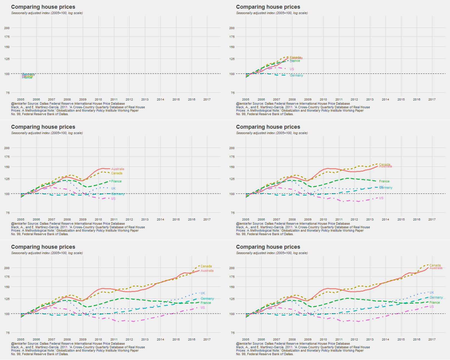
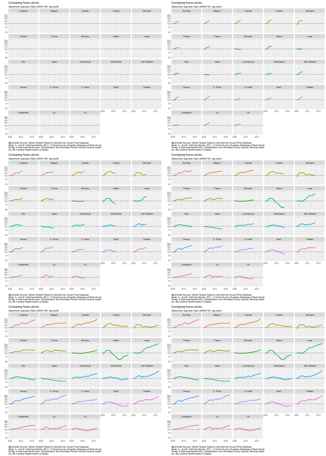
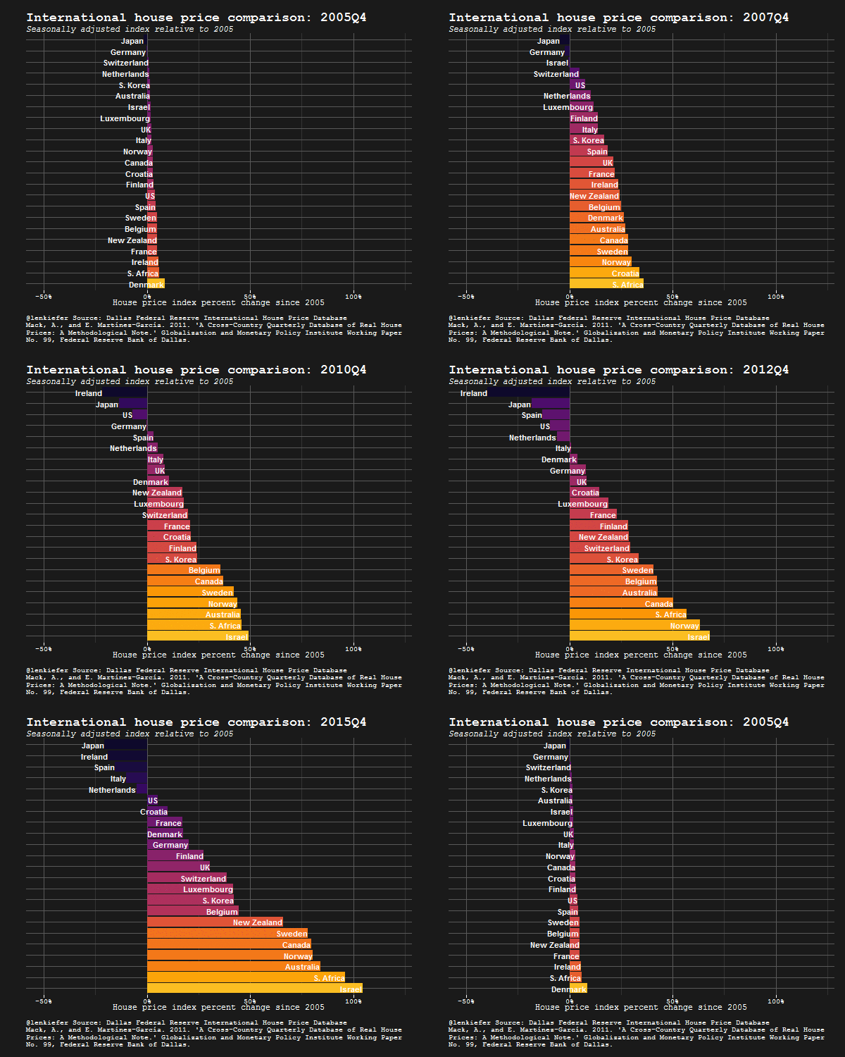
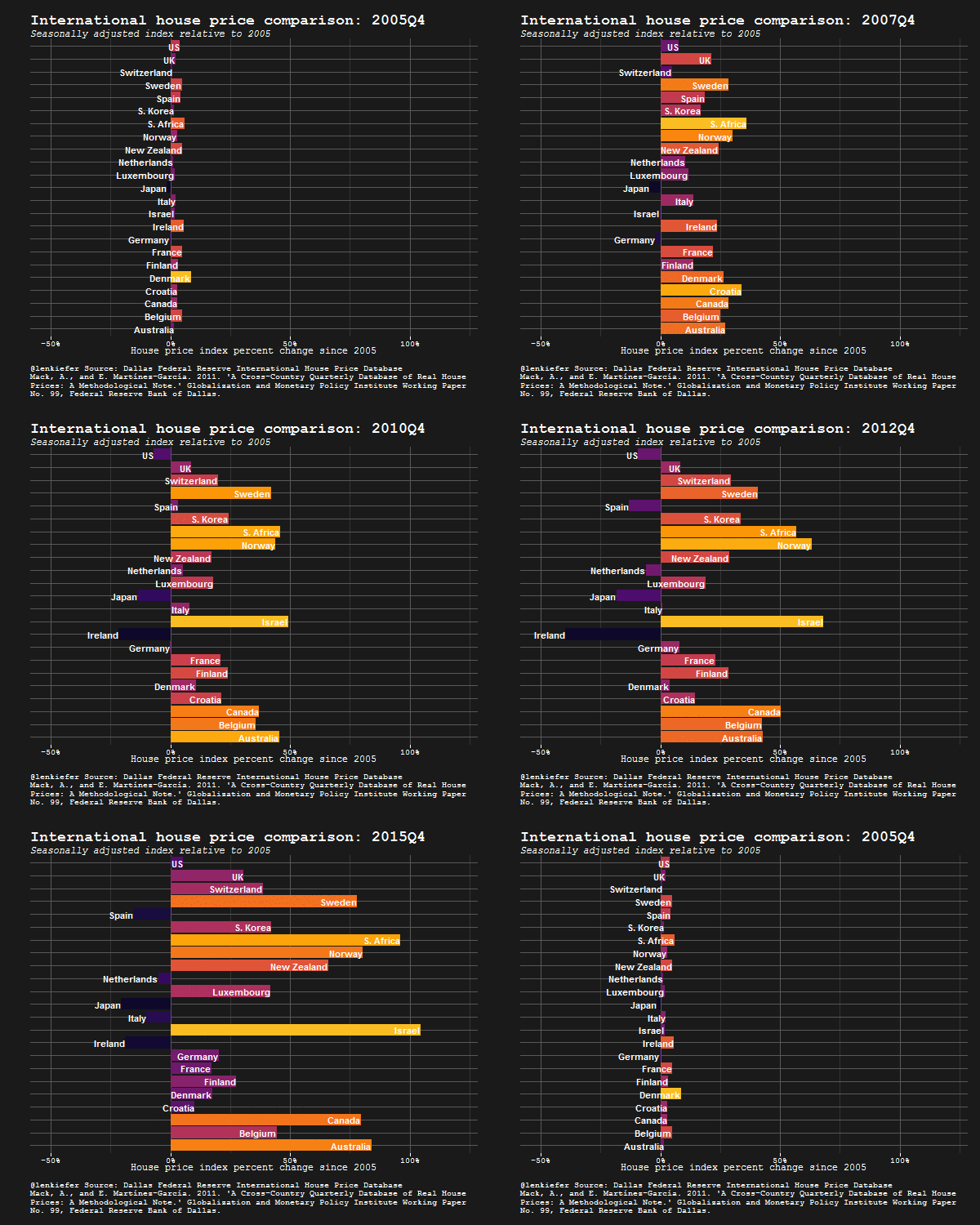
Below, without additional commentary, I leave a few animated gifs.


