NOTE: After I posted this (like within 5 minutes) I found this post which also constructs bivariate chropleths in R.
IN THIS POST I WANT TO REVISIT SOME MAPS I MADE LAST YEAR. At that time, I was using Tableau to create choropleth maps, but in this post I want to reimagine the maps and make them in R.
Last year in this post we looked at the relationship between population growth and the growth in housing units from 2010 to 2015. While the Census has released national level estimates for population, the county level estimates are not updated yet. However, you can get estimates for 2010 through 2015, which is what I used last year and will use again this year.
Bivariate choropleth
In last year’s post I wanted to compare population growth to expansion of the housing supply. I constructed a ratio of the growth in population from 2010 to 2015 to the growth in housing units from 2010 to 2015 by county. Then I plotted this ratio on a diverging color scheme.
Instead, we could use a bivariate color scale. If you are into reading, see an extended discussion here.
Or you could do like me. Just jump in we’ll and figure it out as we go. Here goes!
library(tidyverse)## Warning: package 'tidyverse' was built under R version 3.5.1## -- Attaching packages -------------------------------------------------------------------------------------------------------------------------------------------------------------------------------- tidyverse 1.2.1 --## v ggplot2 3.0.0 v purrr 0.2.5
## v tibble 1.4.2 v dplyr 0.7.6
## v tidyr 0.8.0 v stringr 1.3.1
## v readr 1.1.1 v forcats 0.3.0## Warning: package 'purrr' was built under R version 3.5.1## Warning: package 'stringr' was built under R version 3.5.1## -- Conflicts ----------------------------------------------------------------------------------------------------------------------------------------------------------------------------------- tidyverse_conflicts() --
## x dplyr::filter() masks stats::filter()
## x dplyr::lag() masks stats::lag()library(viridis)## Loading required package: viridisLitelibrary(readxl)
library(stringr)
d<-expand.grid(x=1:100,y=1:100)
ggplot(d, aes(x,y,fill=atan(y/x),alpha=x+y))+
geom_tile()+
scale_fill_viridis()+
theme(legend.position="none",
panel.background=element_blank())+
labs(title="A bivariate color scheme (Viridis)")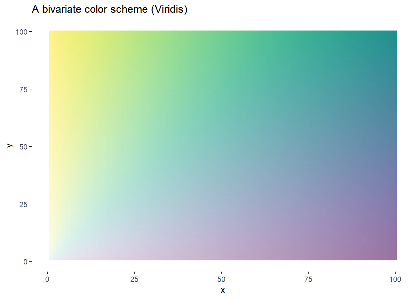
We could allow this scheme to vary smoothly, or it might be easier to see what’s going on, but using a discrete scale. A 3x3 grid seems to work pretty well.
# Add some labels
d<-expand.grid(x=1:3,y=1:3)
#dlabel<-data.frame(x=1:3,xlabel=c("X low", "X middle","X High"))
d<-merge(d,data.frame(x=1:3,xlabel=c("X low", "X middle","X high")),by="x")
d<-merge(d,data.frame(y=1:3,ylabel=c("Y low", "Y middle","Y high")),by="y")

g.legend<-
  ggplot(d, aes(x,y,fill=atan(y/x),alpha=x+y,label=paste0(xlabel,"\n",ylabel)))+
  geom_tile()+
  geom_text(alpha=1)+
  scale_fill_viridis()+
  theme_void()+
  theme(legend.position="none",
        panel.background=element_blank(),
        plot.margin=margin(t=10,b=10,l=10))+
  labs(title="A bivariate color scheme (Viridis)",x="X",y="Y")+
    theme(axis.title=element_text(color="black"))+
  # Draw some arrows:
  geom_segment(aes(x=1, xend = 3 , y=0, yend = 0), size=1.5,
               arrow = arrow(length = unit(0.6,"cm"))) +
  geom_segment(aes(x=0, xend = 0 , y=1, yend = 3), size=1.5,
               arrow = arrow(length = unit(0.6,"cm")))
g.legend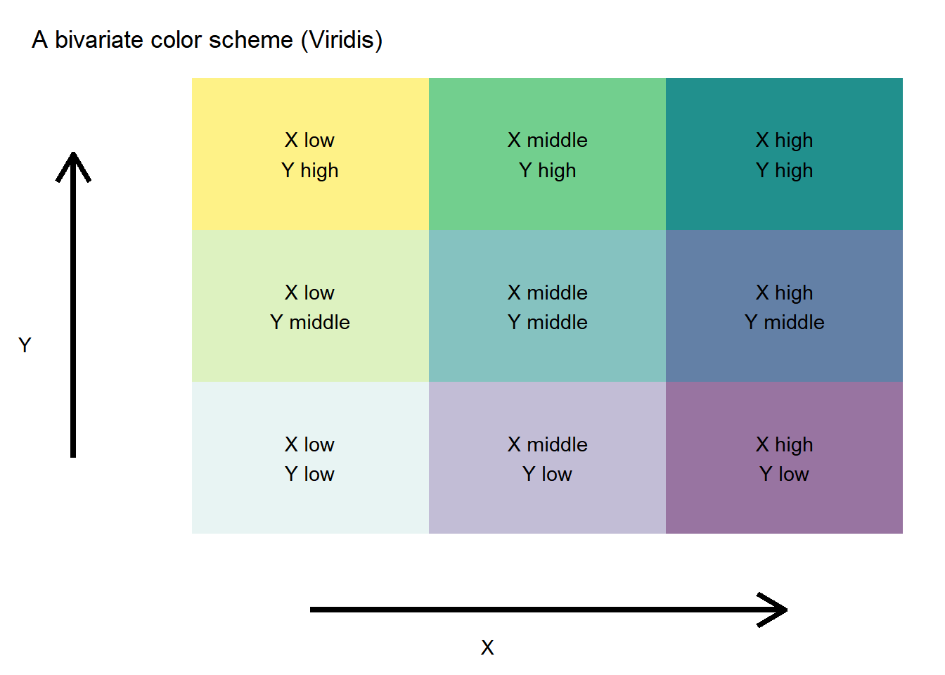
Get some data
I happened to have the data in a spreadsheet called pophous.xlsx. You can get estimates direct from the U.S. Cesnsus Bureau (here for housing units and here for population).
I rearranged my data in a spreadsheet like this:

This was of course, before I wised up about readxl. But since I had these data around, we’ll just start here.
# Load data and check

dfh<-read_excel("data/pophous.xlsx", sheet = "housing1")
dfp<-read_excel("data/pophous.xlsx", sheet = "pop1")
df<-left_join(dfh,dfp,by="fips")
df <- df %>% select(-h2010apr,-h2010base,-p2010apr,-p2010base)


htmlTable::htmlTable(rbind(head(df %>%
                                  map_if(is_numeric,round,0) %>%
                                  data.frame() %>% as.tbl())))
## Warning: Deprecated
## Warning: Deprecated
## Warning: Deprecated
## Warning: Deprecated
## Warning: Deprecated
## Warning: Deprecated
## Warning: Deprecated
## Warning: Deprecated
## Warning: Deprecated
## Warning: Deprecated
## Warning: Deprecated
## Warning: Deprecated
## Warning: Deprecated| fips | h2010 | h2011 | h2012 | h2013 | h2014 | h2015 | p2010 | p2011 | p2012 | p2013 | p2014 | p2015 | |
|---|---|---|---|---|---|---|---|---|---|---|---|---|---|
| 1 | 1001 | 22152 | 22284 | 22352 | 22670 | 22751 | 22847 | 54660 | 55253 | 55175 | 55038 | 55290 | 55347 |
| 2 | 1003 | 104248 | 104701 | 105264 | 106227 | 107368 | 108564 | 183193 | 186659 | 190396 | 195126 | 199713 | 203709 |
| 3 | 1005 | 11827 | 11808 | 11841 | 11816 | 11799 | 11789 | 27341 | 27226 | 27159 | 26973 | 26815 | 26489 |
| 4 | 1007 | 8982 | 8972 | 8972 | 8972 | 8977 | 8986 | 22861 | 22733 | 22642 | 22512 | 22549 | 22583 |
| 5 | 1009 | 23887 | 23875 | 23862 | 23841 | 23826 | 23817 | 57373 | 57711 | 57776 | 57734 | 57658 | 57673 |
| 6 | 1011 | 4492 | 4483 | 4477 | 4468 | 4461 | 4456 | 10887 | 10629 | 10606 | 10628 | 10829 | 10696 |
After clearning our data are arranged with state/county FIPS numbers and then variables p2010-p2015 and h2010-h2015 corresponding to population estimates for each year 2010-2015 and housing units for each year 2010-2015 respectively.
The FIPS numbers are stored as numbers (thanks Excel!) and we’d like to rearrange the data, so let’s do some tidying.
# gather up columns by fips
df2<-df %>% gather(var,value,-fips)

# Create a type varialbe (h for housing, p for population) & year variable
df2<-df2 %>% mutate( type=substr(var,1,1), year=as.numeric(substr(var,2,5)))

# spread back out housing units and population
df3 <- df2 %>% select(fips,type,year,value) %>% spread(type,value)

# turn fips into string by padding with a 0
df3<-mutate(df3, fips=str_pad(fips, 5, pad = "0"))

# comput housing units and population in 2010
df3.sums<-df3 %>% group_by(fips) %>%  summarize(h2010= h[sum(year==2010)],
                                           p2010= p[sum(year==2010)])
df3<-left_join(df3,df3.sums,by="fips")

# create variables for housing unites (hr) and population (pr) relative to 2010
# also create ratio
df3 <- df3 %>% mutate(hr=h/h2010, pr=p/p2010, ratio=(h/h2010)/(p/p2010))

# Check it out
htmlTable::htmlTable(rbind(head(df3 %>%
                                  map_if(is_numeric,round,0) %>%
                                  data.frame() %>% as.tbl())))
## Warning: Deprecated
## Warning: Deprecated
## Warning: Deprecated
## Warning: Deprecated
## Warning: Deprecated
## Warning: Deprecated
## Warning: Deprecated
## Warning: Deprecated
## Warning: Deprecated| fips | year | h | p | h2010 | p2010 | hr | pr | ratio | |
|---|---|---|---|---|---|---|---|---|---|
| 1 | 01001 | 2010 | 22152 | 54660 | 22152 | 54660 | 1 | 1 | 1 |
| 2 | 01001 | 2011 | 22284 | 55253 | 22152 | 54660 | 1 | 1 | 1 |
| 3 | 01001 | 2012 | 22352 | 55175 | 22152 | 54660 | 1 | 1 | 1 |
| 4 | 01001 | 2013 | 22670 | 55038 | 22152 | 54660 | 1 | 1 | 1 |
| 5 | 01001 | 2014 | 22751 | 55290 | 22152 | 54660 | 1 | 1 | 1 |
| 6 | 01001 | 2015 | 22847 | 55347 | 22152 | 54660 | 1 | 1 | 1 |
Now things are looking a lot better.
Let’s filter to just 2015 and get ready to make our map.
First, for housing units and population (both relative to 2010) we’ll compute terciles (divide the range into 3 parts each with 1/3 of observations). We’ll then categorize each observation as falling within one of these terciles. Then, we’ll let these terciles be ordered 1 through 3 and construct a scatterplot.
d2015<-filter(df3,year==2015)

# compute quantiles (dividing into 3rds)
h.v<-quantile(d2015$hr,c(0.33,0.66,1))
p.v<-quantile(d2015$pr,c(0.33,0.66,1))

d2015<- d2015 %>% mutate(y= ifelse(pr<p.v[1],1,ifelse(pr<p.v[2],2,3)) ,
                     x= ifelse(hr<h.v[1],1,ifelse(hr<h.v[2],2,3))  )

ggplot(data=d2015,aes(x=hr,y=pr,color=atan(y/x),alpha=x+y))+
  geom_point(size=1)+  guides(alpha=F,color=F)+
  geom_hline(yintercept=p.v,color="gray20",linetype=2)+
  geom_vline(xintercept=h.v,color="gray20",linetype=2)+
  scale_color_viridis(name="Color scale")+theme_minimal()+
  theme(plot.caption=element_text(size = 9, hjust=0),
        panel.grid=element_blank()) +

  labs(x="Housing units in 2015 relative to 2010 (log scale)",
       y="Population in 2015 relative to 2010 (log scale)",
       caption="@lenkiefer Source: U.S. Census Bureau\nEach dot one county, lines divide (univariate) terciles")+
  # limit the rang e
  scale_x_log10(limits=c(0.95,1.05), breaks=c(h.v),
                labels=round(c(h.v),2)) +
  scale_y_log10(limits=c(0.95,1.05),breaks=c(p.v),
                labels=round(c(p.v),2))
## Warning: Removed 646 rows containing missing values (geom_point).## Warning: Removed 1 rows containing missing values (geom_hline).## Warning: Removed 1 rows containing missing values (geom_vline).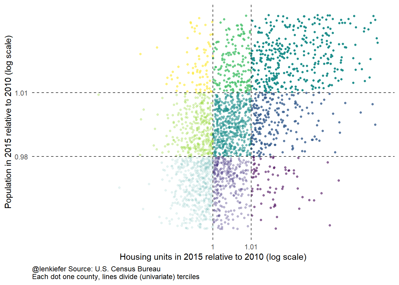
Now that we’ve divided up the observations, let’s map them!
#################################################################################
### Map Libraries
library(ggthemes)
library(ggalt)
library(maps)
##
## Attaching package: 'maps'## The following object is masked from 'package:purrr':
##
## maplibrary(rgeos)## rgeos version: 0.3-28, (SVN revision 572)
## GEOS runtime version: 3.6.1-CAPI-1.10.1 r0
## Linking to sp version: 1.3-1
## Polygon checking: TRUElibrary(maptools)## Loading required package: sp## Checking rgeos availability: TRUElibrary(albersusa)
library(grid)
#################################################################################
#################################################################################
# Let's load some maps:
states<-usa_composite() #create a state map thing
smap<-fortify(states,region="fips_state")
counties <- counties_composite() #create a county map thing
#################################################################################
#add on summary stats by county using FIPS code
counties@data <- left_join(counties@data, d2015, by = "fips")
#################################################################################
cmap <- fortify(counties_composite(), region="fips")
#create state and county FIPS codes
cmap$state<-substr(cmap$id,1,2)
cmap$county<-substr(cmap$id,3,5)
cmap$fips<-paste0(cmap$state,cmap$county)
#### Make a legend
g.legend<-
ggplot(d, aes(x,y,fill=atan(y/x),alpha=x+y,label=paste0(xlabel,"\n",ylabel)))+
geom_tile()+
scale_fill_viridis()+
theme_void()+
theme(legend.position="none",
axis.title=element_text(size=5),
panel.background=element_blank(),
plot.margin=margin(t=10,b=10,l=10))+
theme(axis.title=element_text(color="black"))+
labs(x="Housing unit growth",
y="Population growth")
gmap<-
ggplot() +
geom_map(data =cmap, map = cmap,
aes(x = long, y = lat, map_id = id),
color = "#2b2b2b", size = 0.05, fill = NA) +
geom_map(data = filter(counties@data,year==2015), map = cmap,
aes(fill =atan(y/x),alpha=x+y, map_id = fips),
color = "gray50") +
#add black state borders (just to see if things are working)
geom_map(data = smap, map = smap,
aes(x = long, y = lat, map_id = id),
color = "black", size = .5, fill = NA) +
theme_map(base_size = 12) +
theme(plot.title=element_text(size = 16, face="bold",margin=margin(b=10))) +
theme(plot.subtitle=element_text(size = 14, margin=margin(b=-20))) +
theme(plot.caption=element_text(size = 9, margin=margin(t=-15),hjust=0)) +
# scale_fill_gradient(low="red",high="blue")
scale_fill_viridis()+guides(alpha=F,fill=F)+
labs(caption="@lenkiefer Source: U.S. Census Bureau",
title="Housing units and Population growth 2010-2015",
subtitle="Bivariate choropleth")
vp<-viewport(width=0.24,height=0.24,x=0.58,y=0.14)
print(gmap)
print(g.legend+labs(title=""),vp=vp)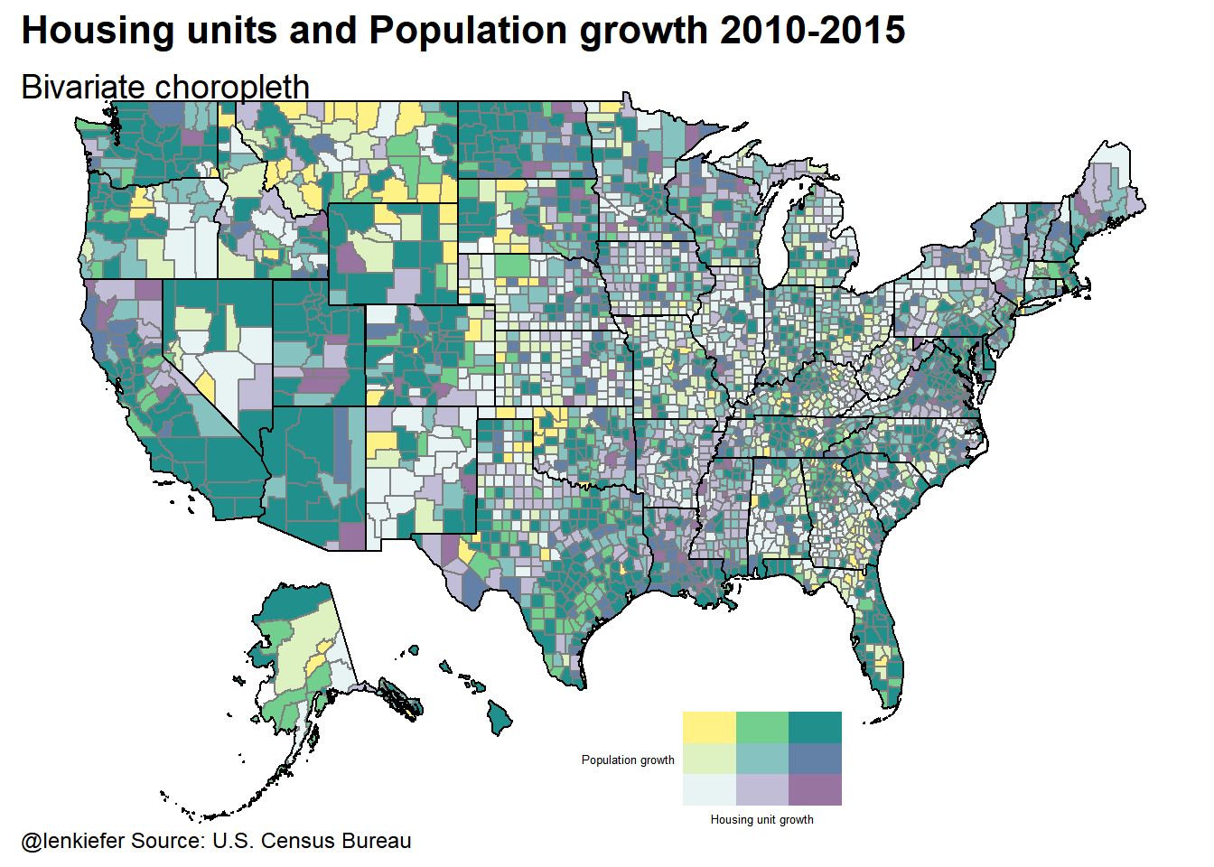
So what?
Well, that was pretty neat.
I think you probably should be careful about interpreting these maps, particularly when you have some counties that might not be estimated as well as others. Still, the ability to display two variables on one map might be handy sometime.
In the past I compared employment and house prices and a bivariate choropleth might be a good option for comparing how these variables evolve. I’ve also go some research going looking at some other aspects of the housing market where such a plot might at least be useful at the data exploration stage.
How could it work for you?