IN LATE 2016 HOUSE PRICES recovered back to their pre-recession peak. At least nationally. At least not adjusted for inflation. Let’s talk about it.
National trends
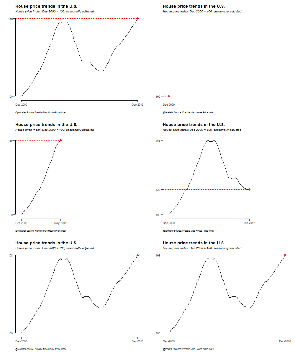
The chart below shows the Freddie Mac House Price Index (link to source) for the United States from December 2000 to December 2016.

Prior to the Great Recession, house prices reached their seasonally-adjusted peak in March of 2007. Prices fell from 2007 (with a brief interruption due to the first time homebuyer tax credit) to December 2011 when they reached their post-recession minimum. Since 2012, house prices have been increasing, surpassing their prior peak in the fall of 2016. As of December 2016, house prices were 1.9 percent above their pre-2008 peak.
The animation below shows the dramatic rise, fall, and recovery of house prices.
State trends
The national time series obscures a lot of diversity across local housing markets. Let’s redraw the plot above using a small multiple for each state.

Here we can see quite a bit of divergence across states. About half of the states are at an all-time high for the level of nominal house prices, while the other half still are below their pre-2008 peak.
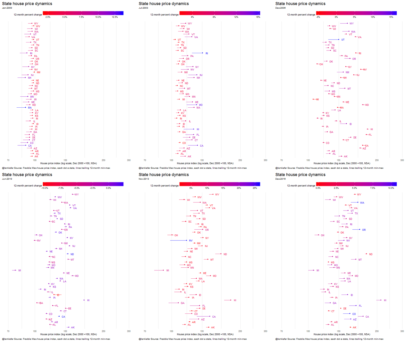
We can visualize these dynamics using a dot plot. The plot below is a static plot for December 2016, showing the level of the house price index for each state. I’ve added in a line segment showing the trailing 12-month min/max. If the dot is on the right, that means that house prices have been generally rising over the past year. If the dot is on the left, prices have been falling. The dots and segments are also color coded by the 12-month percent change in the index.

In the graph the bluest states (OR, WA, CO) have the longest line segments, which indicate that these states have experienced the most house price appreciation over the past year (over 10 percent each). Only Alaska has the dot on the far left indicating that the December 2016 house price index in Alaska was the lowest in the past year. Many energy dependent states (AK, OK, ND, WY) are the reddest in color indicating that they have had the lowest house price appreciation in the past year (though only Alaska has experience a year-over-year decline).
We can use animation to see how this graph evolves from 2000 to 2016:
The stories in this data visualization are legion.
Looking within states
House prices at a state level can also obscure important local trends, particularly for large states. Let’s view metro area house price trends within two large states, California and Texas.

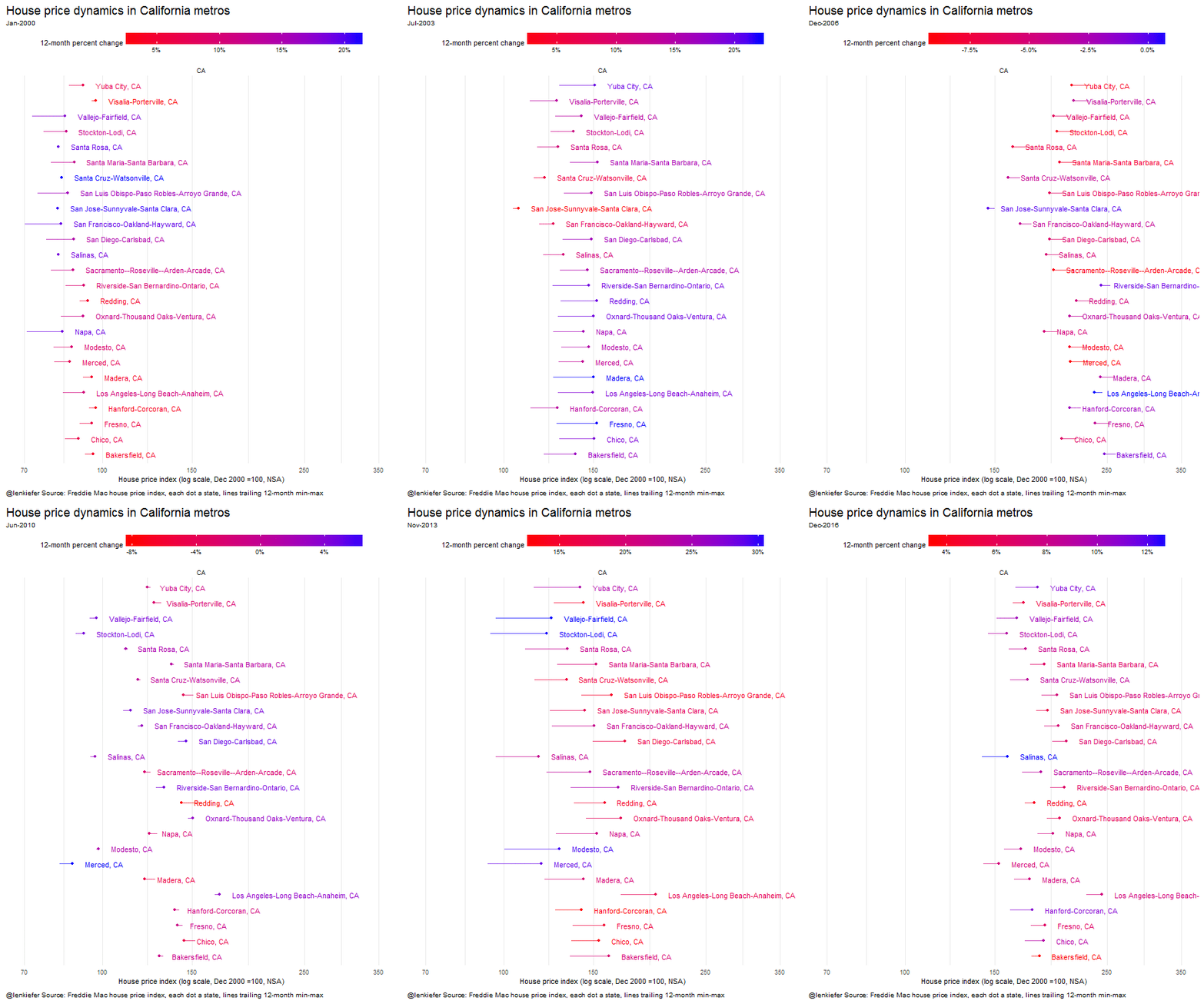
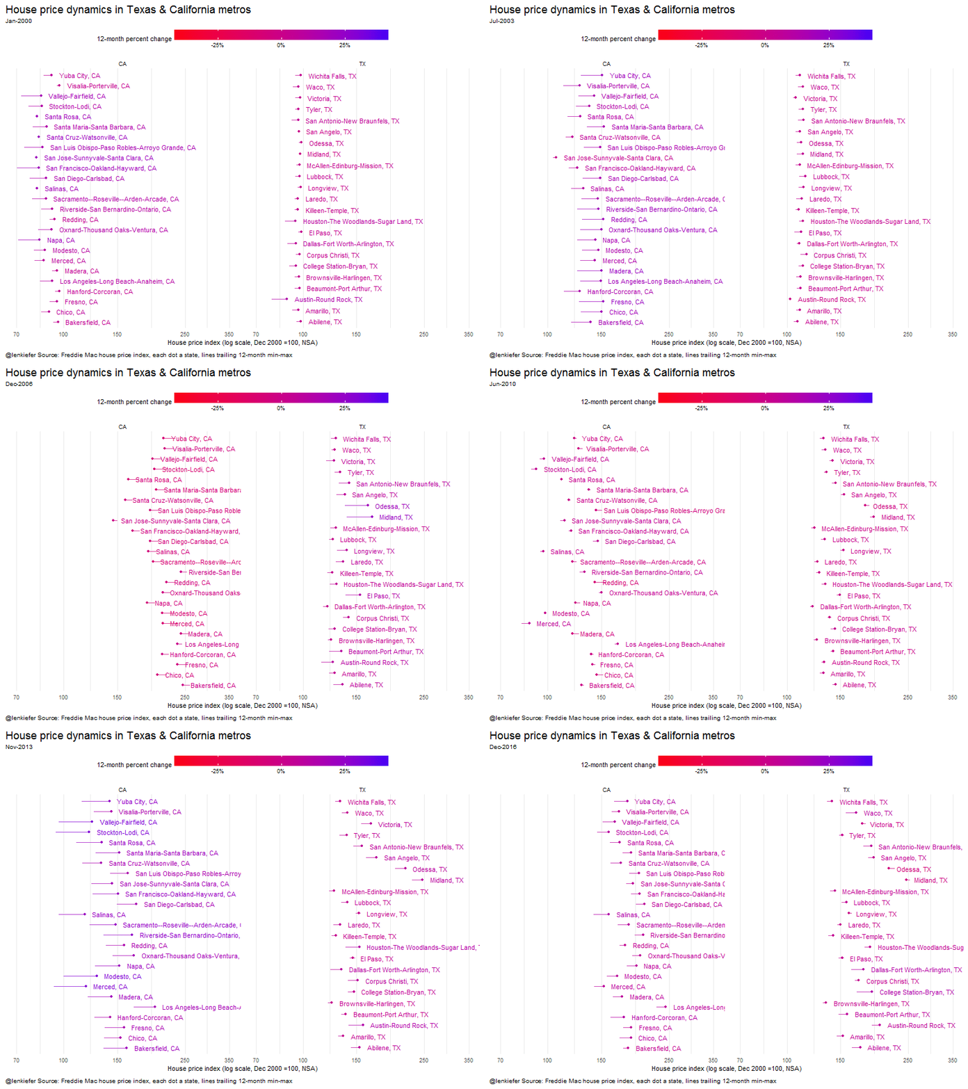
This graph is the same style as the state dotplot above, but considers the metro areas that are located in California (specifically those whose primary state is California). We can see that generally house prices are rising in the Golden State, with Salinas leading the pack with 12.6 percent year-over-year house price growth in December 2016.
Contrast with Texas:

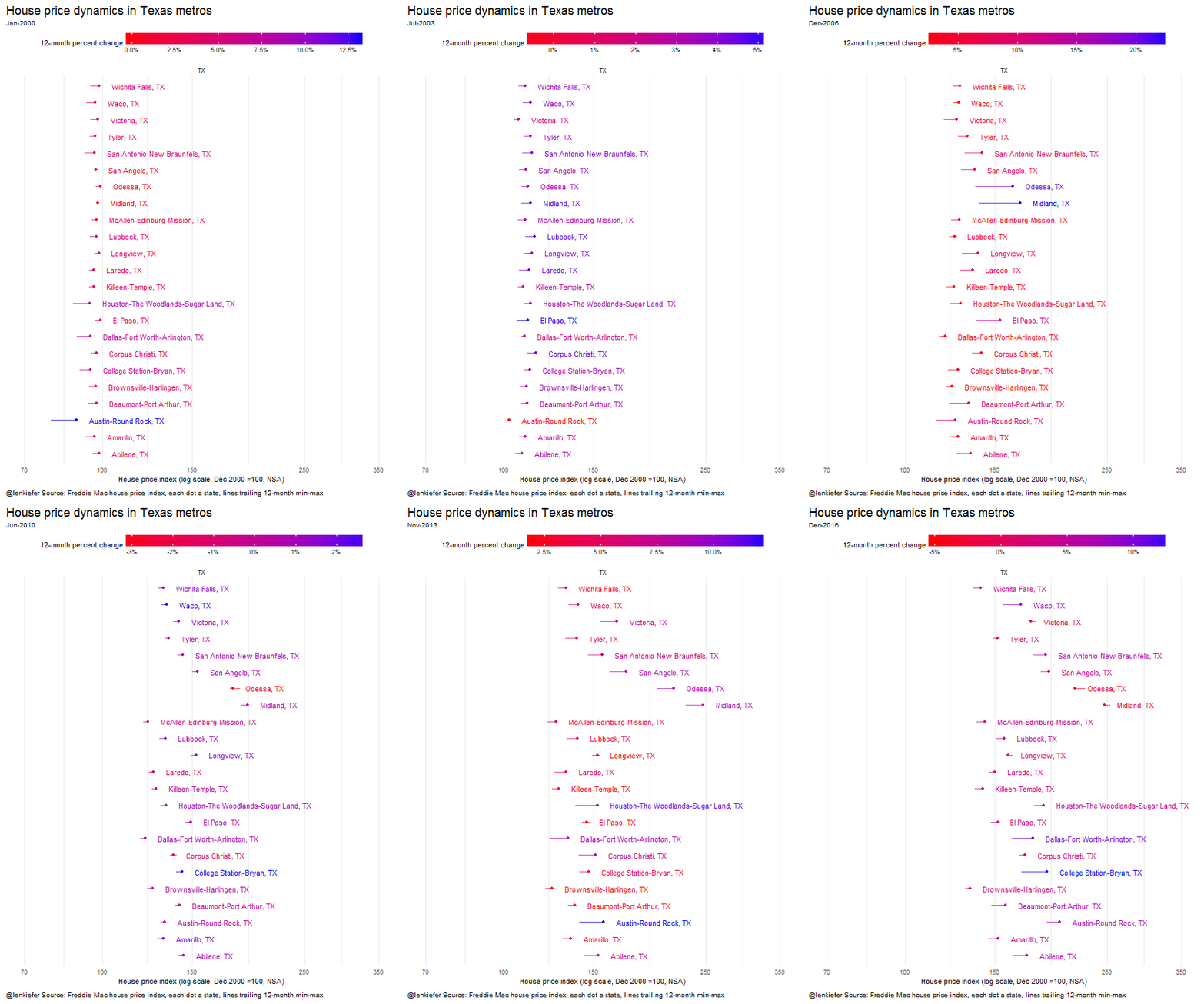
In Texas a few metros are experiencing a year-over-year decline in house prices (Longview, Midland, Odessa, and Victoria).These declines are at least in part due to the contraction in the energy sector. College Station-Bryan leads all Texas metros with 12.9 percent year-over-year house price appreciation in December 2016.
While recently house price growth in California has exceeded that in Texas, it might be helpful to compare the history. The animated gifs below echo the one we made for the U.S., first for California and Texas individually, then in a side-by-side comparison.
House price grand tour
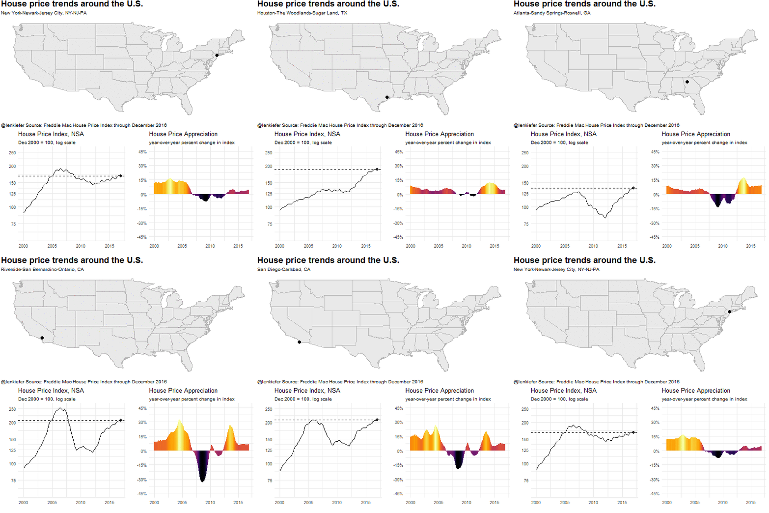
In the graphs below, we take a “grand tour” of the US and explore house price trends.
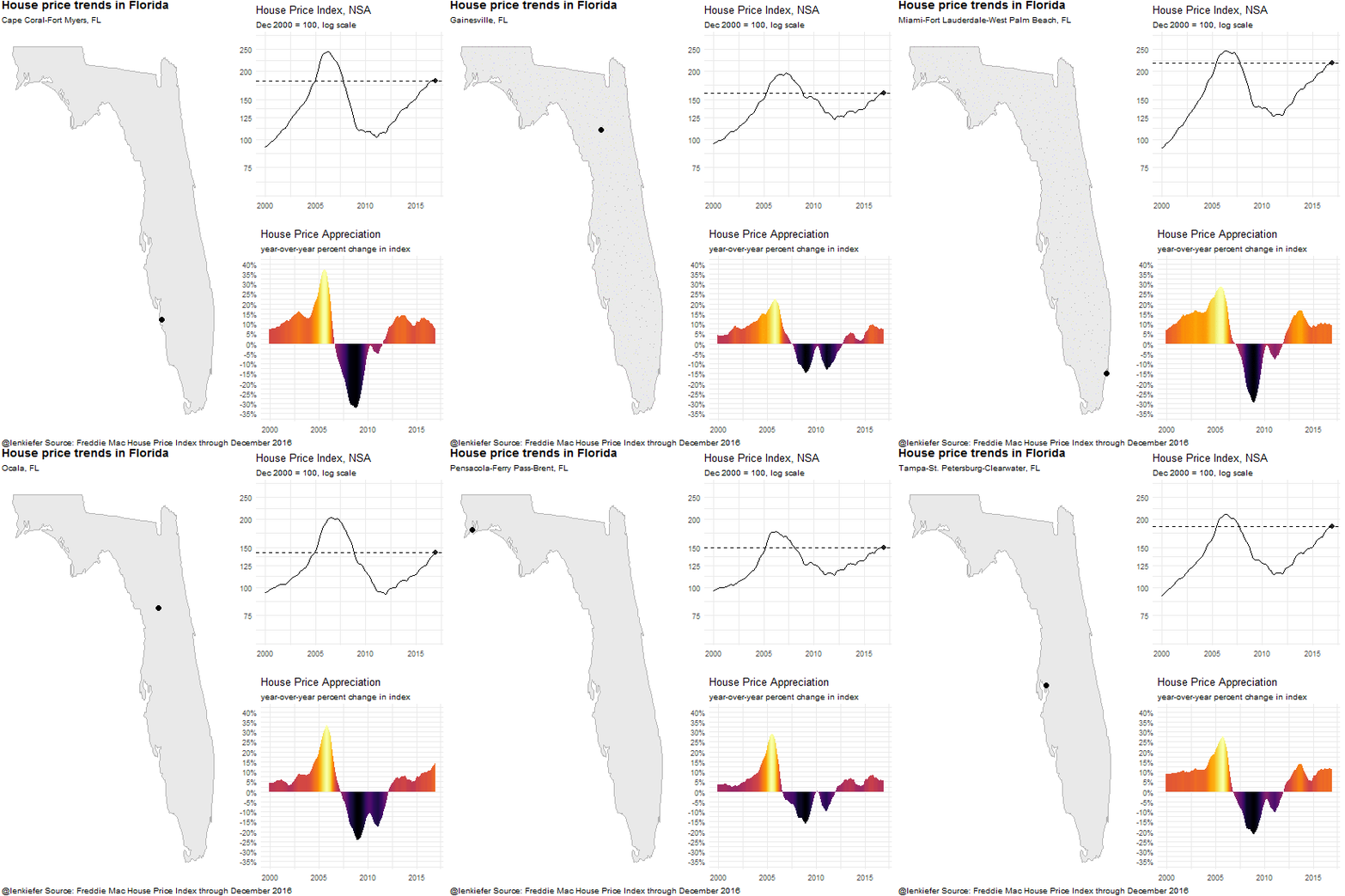
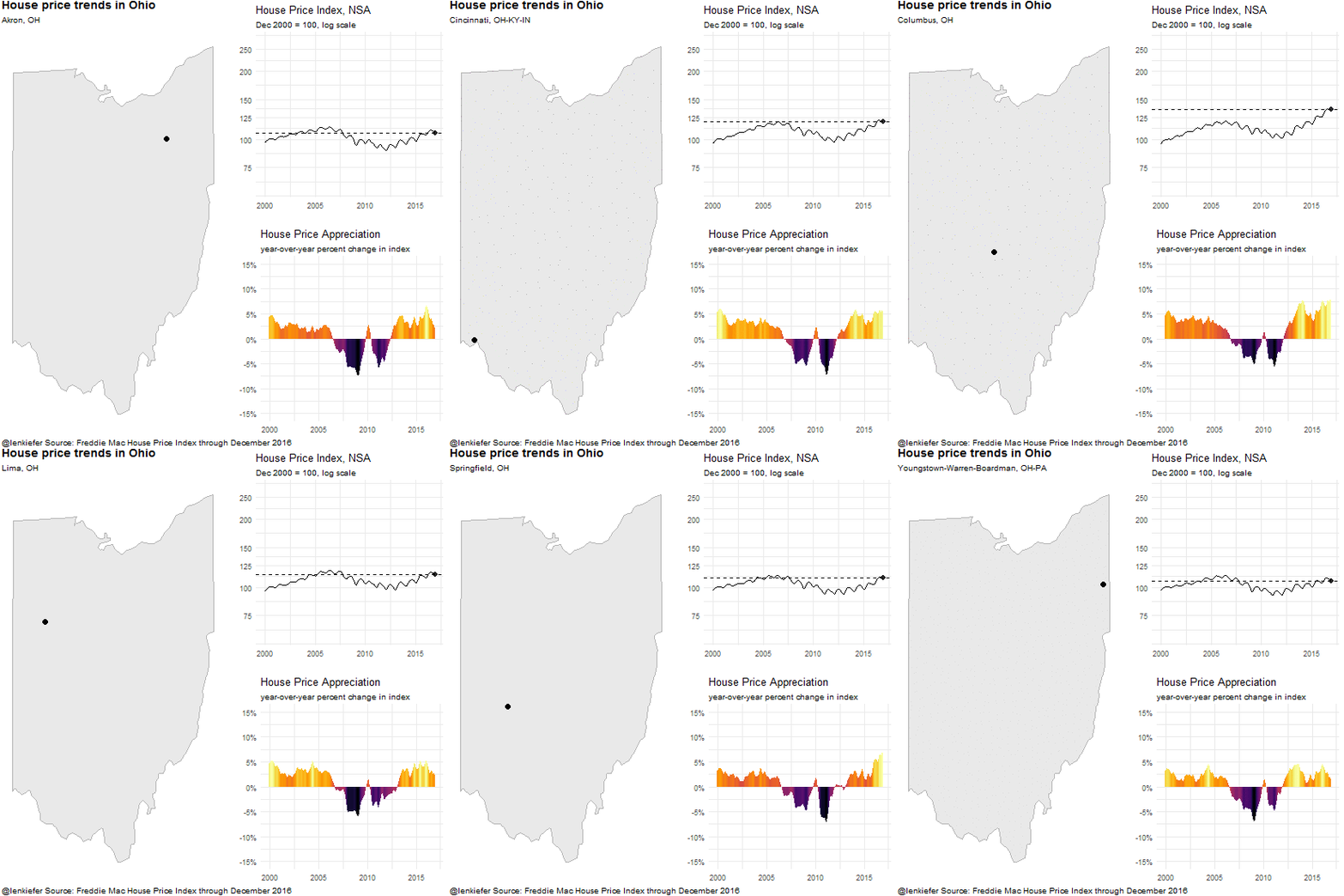
First let’s take a tour of the largest metro areas in the U.S. and see house price trends. The dot on the map indicates which metro we are currently visiting and then the graphs below show the level of the index and the year-over-year-percent change in the index for the metro area.
Tour 4 large states
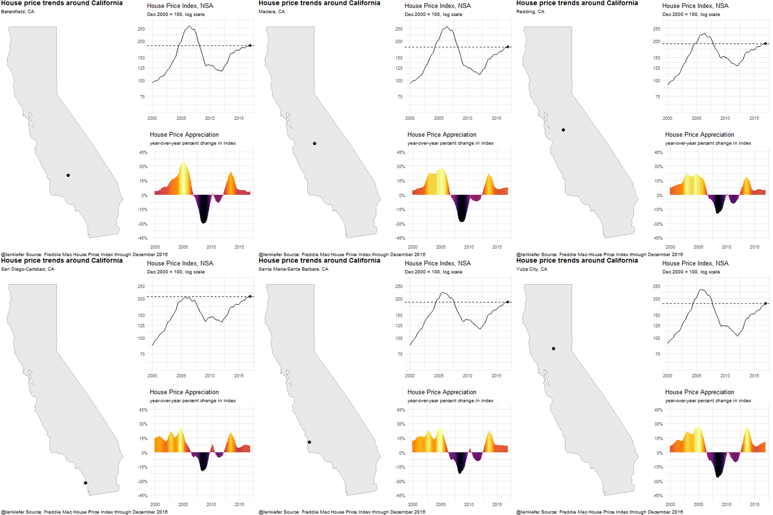
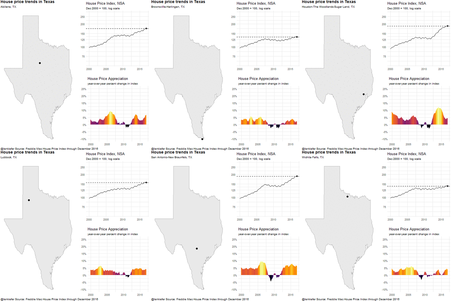
Let’s visit the metro areas within 4 large states, California, Texas, Florida and Ohio.
California tour
Texas tour
Florida tour
Ohio tour
Code for plots
If you are intrested in how I made these graphics, check out the following posts. I have shared bits and pieces of code for all of these posts in the past. All these graphics were made with R.
Relevant Posts to check out
Visual Meditations on House Prices This collection of posts contains R code for most of these graphics
Flexdashboards This post uses flexdashboards to display data
Ticks out This post shows how to make the sweet axis on my first plot
Check ’em all out!