LET US EXPERIMENT A BIT WITH AXES. In this post I’m going to try out some data visualization ideas expanding on our earlier work with ticks marks (see post ticks out).
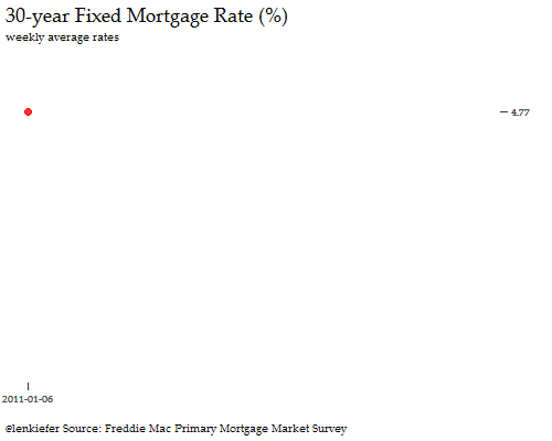
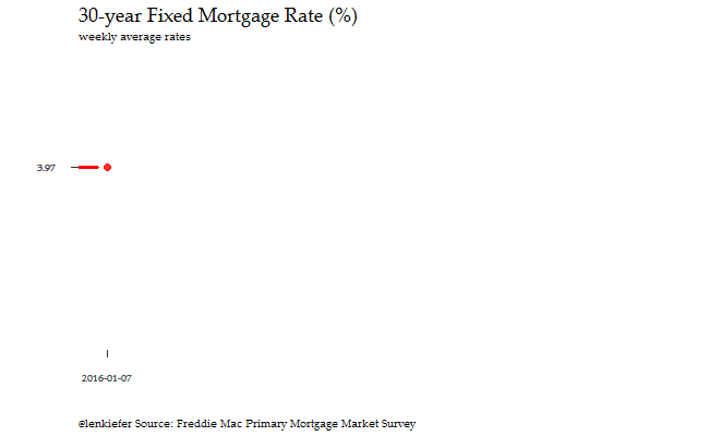
We’re going to make the following plot and some variations with R. As before, we’ll use data we used in our mortgage rate post to explore weekly average mortgage rates in the United States based on Freddie Mac’s Primary Mortgage Market Survey.
The idea
The idea here is to have a minimal axis that expand with the data. This gives us a sense of how the data evolve relative to the minimum and maximum data.
Let’s start by making a static plot. Our data are stored in an excel spreadsheet called rates.xlsx with the data we want stored in the worksheet labeled rates.
- You can download the data here Excel File
Let’s load the data
########################
####  Load Pacakges ####
########################

library(data.table)
library(scales)
library(readxl)
library(ggthemes)
library(tidyverse)
library(extrafont)


########################
####  Load Data ########
########################

#for mor on these data see http://lenkiefer.com/2016/12/08/10-ways-to-visualize-rates

dt<- read_excel('data/rates.xlsx',sheet= 'rates')
dt$date<-as.Date(dt$date, format="%m/%d/%Y")
dt<-data.table(dt)
dt$year<-year(dt$date) # create year variable
Next let’s draw a static graph:
#####################
#### Setup axes #####
#####################

# x axis limits
xlim<-as.numeric(c(min(dt$date),max(dt$date)))

# x axis breaks
xb<-xlim

# x axis labels
xlab<-c(min(dt$date),max(dt$date))

# Compute max and min rate
ylim<-c(min(dt$rate30),max(dt$rate30))

# Compute max and min rate, last rate
yb<-c(min(dt$rate30),tail(dt,1)$rate30,max(dt$rate30))

#####################
####  Make Graph ####
#####################

ggplot(data=dt, aes(x=as.numeric(date),y=rate30,label=rate30))+
  geom_line()+theme_bw()+
   labs(x="", y="",
       title="30-year Fixed Mortgage Rate (%)",
       subtitle="weekly average rates",
       caption="@lenkiefer Source: Freddie Mac Primary Mortgage Market Survey")+

  # modify theme
  theme(plot.title=element_text(size=18),
        plot.caption=element_text(hjust=0),
        panel.border = element_blank(),
        panel.grid.major = element_blank(),
        text=element_text(family="Palatino Linotype"),
        panel.grid.minor = element_blank(),
        axis.ticks.length=unit(0.25,"cm")        ) +

  # add point at end
  geom_point(data=tail(dt,1),color="red",size=3,alpha=0.82)+

  # create axes with line segments

  # y axis
  geom_segment(aes(x=-Inf,xend=-Inf,y=max(dt$rate30),yend=min(dt$rate30)))+
  scale_y_continuous(limits=ylim,  breaks=yb,position = "left" )+

  # x axis
  scale_x_continuous(limits=xlim,breaks=xb,labels=xlab)+
  geom_segment(aes(x=as.numeric(min(dt$date)), xend=as.numeric(max(dt$date)),
                           y=-Inf,yend=-Inf),inherit.aes=FALSE)
Make an animation
Let’s have some fun and make an animated version.
For smooth animations we’ll use tweenr. See my earlier post about tweenr for an introduction to tweenr, and more examples here and here.
We’ll have the axes expand as the data evolve.
library(tweenr)
library(animation)

#subset to 2016 and later
dt2<-dt[year(date)>2015]

#create function for plotting:
myfg<-function(dd){
  g<-
    ggplot(data=dt2[date<=dd,], aes(x=as.numeric(date),y=rate30,label=rate30))+
    geom_line()+theme_bw()+
    labs(x="", y="",
         title="30-year Fixed Mortgage Rate (%)",
         subtitle="weekly average rates",
         caption="@lenkiefer Source: Freddie Mac Primary Mortgage Market Survey")+
    theme(plot.title=element_text(size=18),
          plot.caption=element_text(hjust=0),
          panel.border = element_blank(),
          panel.grid.major = element_blank(),
          panel.grid.minor = element_blank(),
          text=element_text(family="Palatino Linotype"),
          axis.ticks.length=unit(0.25,"cm"),  # Ticks out!
          # padding for ticks
          axis.text.y = element_text(margin=unit(c(0.5,0.5,0.5,0.5), "cm")),
          axis.text.x = element_text(margin=unit(c(0.5,0.5,0.5,0.5), "cm"))
          )
  return(g)
}

# list of dates
dlist<-unique(dt2$date)
N<-length(dlist) #number of dates
oopt = ani.options(interval = 0.2)
saveGIF({for (i in 1:N) {
  dd<-dlist[i]
  # Set up limits and labels
  xlim<-c(as.numeric(min(dt2$date)),as.numeric(dd))
  xlim2<-c(as.numeric(min(dt2$date)),as.numeric(max(dt2$date)))
  xlab<-c(min(dt2$date),dd)
  ylim2<-c(min(dt2$rate30),max(dt2$rate30))
  dt3<-dt2[date<=dd]
  ylim<-c(min(dt3$rate30),max(dt3$rate30))

  g<-
    myfg(dd) +
    geom_segment(aes(x=-Inf,xend=-Inf,y=max(dt3$rate30),yend=min(dt3$rate30)))+
    scale_y_continuous(limits=ylim2,breaks=c(ylim,dt2[date==dd]$rate30))+
    geom_segment(data=d, aes(x=as.numeric(min(dt2$date)),
                             y=-Inf, xend=as.numeric(dd),
                             yend=-Inf),inherit.aes=FALSE)+
    scale_x_continuous(limits=xlim2,breaks=xlim,labels=xlab)+
    geom_point(color="red",size=3,alpha=0.82,
               aes(x=as.numeric(dd),y=dt2[date==dd]$rate30))+
    geom_rug(data=dt2[date==dd],sides="l",color="red",
             aes(y=rate30),size=1.1)
  print(g)
  print(paste(i,"out of",N))
  ani.pause()
}
  for (i2 in 1:10) {
    print(g)
    ani.pause()
  }
},movie.name="rate_02_11_base_extend2_2017.gif",ani.width = 650, ani.height = 400)
Running this code will create this animation:
An alternative
Let’s try a modification. We’ll move the axis over to the right using postion="right" in the ggplot call.
For smooth animations we’ll use tweenr. See my earlier post about tweenr for an introduction to tweenr, and more examples here and here.
#subset data to be later than 2010:
dt2<-dt[year(date)>2010]

# Create a function to make axis
myp<-function (in.dt,
               # Can set the limits,
               # or let data determine it by leaving xlim, ylim missing
               xlim,
               ylim){

  in.dt<-data.table(in.dt)
  if (missing(xlim))
    {
    # x axis limits
    xlim<-as.numeric(c(min(in.dt$date,na.rm=T),max(in.dt$date,na.rm=T)))
    }

  # x axis breaks
  xb<-as.numeric(c(min(in.dt$date,na.rm=T),max(in.dt$date,na.rm=T)))

  # x axis labels
  xlab<-c(min(in.dt$date,na.rm=T),max(in.dt$date,na.rm=T))

  if (missing(ylim))
  {
    # Compute max and min rate
    ylim<-c(min(in.dt$rate30,na.rm=T),max(in.dt$rate30,na.rm=T))
  }

  # Compute max and min rate, last rate
  yb<-c(min(in.dt$rate30,na.rm=T),tail(in.dt,1)$rate30,max(in.dt$rate30,na.rm=T))

  #####################
  ####  Make Graph ####
  #####################
g<-
  ggplot(data=in.dt, aes(x=as.numeric(date),y=rate30,label=rate30))+
    geom_line()+theme_bw()+
    labs(x="", y="",
         title="30-year Fixed Mortgage Rate (%)",
         subtitle="weekly average rates",
         caption="@lenkiefer Source: Freddie Mac Primary Mortgage Market Survey")+
    theme(plot.title=element_text(size=18),
          plot.caption=element_text(hjust=0),
          panel.border = element_blank(),
          panel.grid.major = element_blank(),
          text=element_text(family="Palatino Linotype"),
          panel.grid.minor = element_blank(),
          axis.ticks.length=unit(0.25,"cm")) +
    geom_point(data=tail(in.dt[rate30>0,],1),color="red",size=3,alpha=0.82)+
    geom_segment(aes(x=Inf,xend=Inf,y=max(yb),yend=min(yb)))+
    scale_y_continuous(limits=ylim,breaks=yb,
                       position = "right",labels=round(yb,2) )+
    scale_x_continuous(limits=xlim,breaks=xb,labels=xlab)+
    geom_segment(aes(x=min(xb), xend=max(xb),
                     y=-Inf,yend=-Inf),inherit.aes=FALSE)
  return(g)
}

#  Function for use with tweenr
myf<-function (dd){
  d.out<-copy(dt2)
  d.max<-max(d.out[date<=dd]$date,na.rm=T)
  r.max<-d.out[date==d.max]$rate30
  d.out[date>dd,rate30:=r.max]  # if date beyond dd set to r.max
  d.out[date>dd,date:=d.max]    # if date beyond dd set to d.max
  d.out %>% map_if(is.character, as.factor) %>% as.data.frame -> d.out
  return(d.out)
}

# Set limits for  axis
xlim<-c(as.numeric(min(dt2$date)),as.numeric(max(dt2$date)))
ylim<-c(as.numeric(min(dt2$rate30)),as.numeric(max(dt2$rate30)))

# Compute the first date by year with: dt2[,min(date),by=year]$V1

my.list2<-lapply(c(min(dt2$date),dt2[,min(date),by=year]$V1,max(dt2$date) ),myf)

#use tweenr to interploate
tf <- tween_states(my.list2,tweenlength= 3,
                   statelength=1, ease=rep('cubic-in-out',2),nframes=60)
tf<-data.table(unique(tf)) #convert output into data table

#Animate plot
oopt = ani.options(interval = 0.1)
saveGIF({for (i in 1:max(tf$.frame)) { #loop over frames
  g<-
    myp(tf[.frame==i],xlim=xlim,ylim=ylim)
  print(g)
  ani.pause()
  print(i)}
},movie.name="tween pmms base v2 feb 11 2017.gif",ani.width = 500, ani.height = 400)
Running this will generate: