RECENTLY I HAVE BEEN EXPLORING FLEXDASHBOARDS to visualize data. In this post I want to focus on a tool I’ve found particularly useful, plotly.
Plotly enables you to make interactive html widgets that you can embed in your webpage or view from within R. I’ve been having a lot of fun converting existing visualizations I have made with ggplot2 into plotly visualizations using ggplotly.
In this post, let me share some of what I’ve been doing.
The Plan
I’m going to include the code and discussion for several graphs I’ve been using. I will use updated data that we used in our Cross talk dashboard. These data cover weekly mortgage rates and house prices.
The data
We’ve used these data before, but if you want to follow along they are:
- Mortgage rate data rates.xlsx spreadsheet
- Metro hpi files hpimetro.csv
- State house price file hpistate.csv
- National house price file hpiusa.csv
Now that if you store the data in a folder called data, you can prep the data with the following code:
library(tidyverse,quietly=T)
library(data.table,quietly=T)
library(htmlTable,quietly=T)
library(viridis,quietly=T)
library(DT,quietly=T)
library(plotly,quietly=T)
library(scales,quietly=T)
library(maps,quietly=T)
library(crosstalk,quietly=T)
library(readxl,quietly=T)
library(zoo,quietly=T)
####################
#### Load Data ####
####################
states_map <- map_data("state") # state data for map
# Load metro data
df<-fread("data/hpimetro.csv")
df$date<-as.Date(df$date, format="%m/%d/%Y")
# Load state data
df.state<-fread("data/hpistate.csv")
df.state$date<-as.Date(df.state$date, format="%m/%d/%Y")
# Load US data
df.us<-fread("data/hpiusa.csv")
df.us$date<-as.Date(df.us$date, format="%m/%d/%Y")
# Set up metro data for cross talk:
df.metro<-group_by(df,geo)
sd.metro <- SharedData$new(df.metro, ~geo)
#### Load Mortgage Rates Data
#### See for discussion http://lenkiefer.com/2017/01/08/mortgage-rate-viewer
####################################################################################################
dt<- read_excel('data/rates.xlsx',sheet= 'rates')
dt$date<-as.Date(dt$date, format="%m/%d/%Y")
dt<-data.table(dt)
dt$year<-year(dt$date) # create year variable
dt[,week:=1:.N,by=year] # add a week number variable for week of yearMortgage rate plots
I’ve made many mortgage rates plots (see here for 10 visualizations and here for a flexdashboard).
Simple line plot
Let’s start with a simple line plot:
g1<-
ggplot(data=dt[year>2010,],aes(x=date,y=rate30,label=rate30))+geom_line()+
geom_text(data=tail(dt,1),nudge_x=60,nudge_y=.1,color="red",size=2.5,hjust=0)+
geom_point(data=tail(dt,1),size=2,color="red",alpha=0.75)+
theme_minimal()+
geom_hline(linetype=2,color="red",yintercept=tail(dt,1)$rate30)+
labs(x="", y="",
title="30-year Fixed Mortgage Rate (%)",
subtitle="weekly rates since 2011",
caption="@lenkiefer Source: Freddie Mac Primary Mortgage Market Survey")+
theme(plot.title=element_text(size=18),
plot.caption=element_text(hjust=0,vjust=1,margin=margin(t=10)),
plot.background=element_rect(fill="#fffff8",color=NA))
g1
Converting this simple plot to plotly is quite easy. We simply have to use ggplotly() with the graph name (g1) as the function argument. If we want to add a range slider to select dates, we can add it with pipes via %>% rangeslider().
ggplotly(g1) %>% rangeslider()The graph above is a static screenshot, but you can see the interactive version by clicking here.
Distribution dot plot
I like to look at the distribution of observations.
g2<-
ggplot(data=dt[year>2000,],aes(x=year,y=rate30,color=rate30,group=year))+
geom_jitter(height=0,width=0.2,alpha=0.1,color="gray")+
geom_jitter(height=0,width=0.2,alpha=0.82)+
scale_x_continuous(breaks=seq(2001,2017,1))+
theme_minimal()+
scale_color_viridis(direction=-1,name="rate in pp")+
labs(y="30-year fixed mortgage rate (%)", x="year",
title="Distribution of weekly mortgage rates",
subtitle="Each dot average rate for a week",
caption="@lenkiefer Source: Freddie Mac Primary Mortgage Market Survey")+
theme(legend.position="none",plot.subtitle=element_text(face="italic"),
plot.title=element_text(face="bold"),
plot.caption=element_text(hjust=0))
g2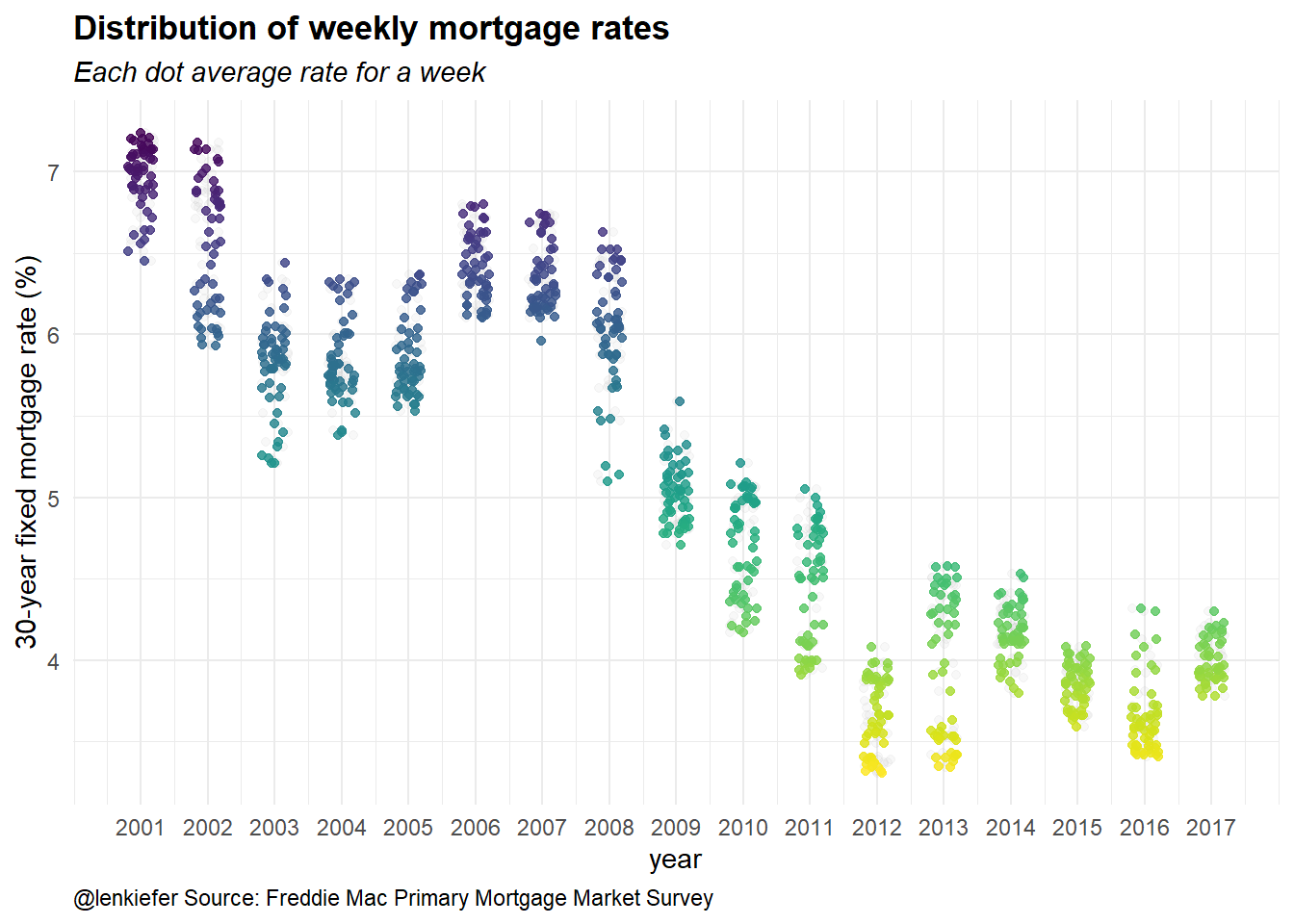
In this plot we group each year and then jitter the x position of each dot. By comparing the mass of points, we can get a feeling about how the distribution of weekly rates has shifted by year.
Add animation
With plotly, we can easily add animation to this plot to see how the distribution has evolved over time. We have to modify our original code slightly:
g2<-
ggplot(data=dt[year>2000,],aes(x=year,y=rate30,color=rate30,group=year))+
geom_jitter(height=0,width=0.2,alpha=0.1,color="gray")+
geom_jitter(height=0,width=0.2,alpha=0.82,aes(frame=year))+
scale_x_continuous(breaks=seq(2001,2017,1))+
theme_minimal()+
scale_color_viridis(direction=-1,name="rate in pp")+
labs(y="30-year fixed mortgage rate (%)", x="year",
title="Distribution of weekly mortgage rates<br><i>Each dot a week</i><br>@lenkiefer Source: Primary Mortgage Market Survey",
subtitle="Each dot average rate for a week",
caption="@lenkiefer Source: Freddie Mac Primary Mortgage Market Survey")+
theme(legend.position="none",plot.subtitle=element_text(face="italic"),
plot.title=element_text(face="bold"),
plot.caption=element_text(hjust=0))## Warning: Ignoring unknown aesthetics: frameggplotly(g2) %>% animation_opts(frame=1000,transition=600,redraw=T) ## Warning: `group_by_()` is deprecated as of dplyr 0.7.0.
## Please use `group_by()` instead.
## See vignette('programming') for more help
## This warning is displayed once every 8 hours.
## Call `lifecycle::last_warnings()` to see where this warning was generated.Once again, the graph above is a static screenshot, but you can see the interactive version by clicking here.
House Price visualizations
Let’s explore the house price data. Last year, I made several [Visual Meditations on House Prices](../../../../2016/05/08/visual-meditations-on-house-prices) exploring different ways to look at house price trends. Let’s revisit one of my favorite meditations and render it with plotly.
State dot plot
Let’s explore trends in house prices, with a dot plot:
#compute rolling min/max of house price index
df.state<-df.state[, hpi12min:=rollapply(hpi, 12, min,fill=NA, na.rm=FALSE,align='right'), by=state]
df.state<-df.state[, hpi12max:=rollapply(hpi, 12, max,fill=NA, na.rm=FALSE,align='right'), by=state]
g3<-
ggplot(data=df.state[(year>=2016) & month==9 & state !="DC" & state !="US"], aes(x=hpi, y=reorder(state,hpi), label=state,color=hpa12))+
geom_text(nudge_x = 0.025) +
geom_point()+scale_x_log10(limits=c(70,350), breaks=c(70,100,150,250,350))+
geom_segment(aes(xend=hpi12min,x=hpi12max,y=reorder(state,hpi),yend=reorder(state,hpi)),alpha=0.7)+
theme_minimal() +
scale_colour_gradient(low="red",high="blue",name = "12-month HPA",labels = percent)+
labs(y="", x="House price index (log scale, Dec 2000 =100, NSA)",
title="State house price dynamics",
subtitle=paste(as.character(df.state[year==2016 & month==9 & state=="US"]$date,format="%b-%Y")),
caption="@lenkiefer Source: Freddie Mac house price index, each dot a state, lines trailing 12-month min-max")+
theme(plot.title=element_text(size=18))+
theme(plot.caption=element_text(hjust=0,vjust=1,margin=margin(t=10)))+
theme(plot.margin=unit(c(0.25,0.25,0.25,0.25),"cm"),
axis.text.y=element_blank())+
theme(legend.justification=c(0,0), legend.position=c(.8,.75))
g3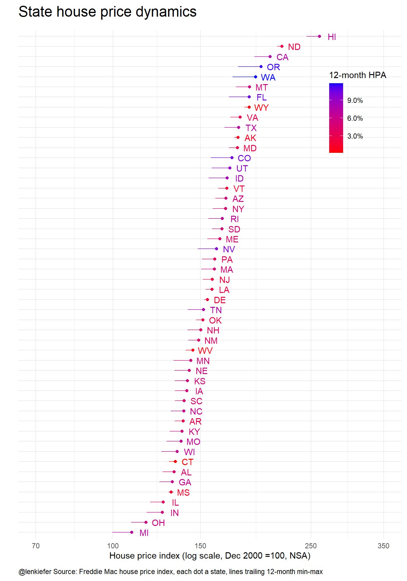
Once again, with slith modifications we can render this chart (and animate it over years) with plotly.
g3<-
ggplot(data=df.state[(year>=2000) & month==9 & state !="DC" & state !="US"], aes(x=hpi, y=reorder(state,hpi), label=paste(" ",state," "), color=hpa12,frame=year,ids=state))+
geom_text(nudge_x= 0.005,size=2) +
geom_point(alpha=0.82)+scale_x_log10(limits=c(70,350), breaks=c(70,100,150,250,350))+
theme_minimal() +
scale_colour_gradient(low="red",high="blue",name = "12-month HPA",labels = percent)+
labs(y="State", x="House price index (log scale, Dec 2000 =100, NSA)<br>Source: Freddie Mac House Price Index in September of year",
title="State house price dynamics by @lenkiefer")+
theme(plot.title=element_text(size=14),
axis.text.y=element_blank())+
theme(plot.caption=element_text(hjust=0,vjust=1,margin=margin(t=10)))+
theme(legend.justification=c(0,0), legend.position=c(.8,.75))
ggplotly(g3) %>% animation_opts(frame=1500,transition=750,redraw=T) Once again, the graph above is a static screenshot, but you can see the interactive version by clicking here.
Metro distribution
Let’s explore one more plot. This one will show the distribution of annual house price percentage changes over the more than 300 metro areas tracked in the Freddie Mac House Price Index.
We want to see how the distribution of house price percent changes across metro areas has changed over time. For September of each year in our sample we will find a kernel density function over metro house price percent changes. Then we’ll examine the data using a static ggplot2 graph. Finally, we’ll animate the plot using plotly.
Fit a static plot
The code below takes our house price data and fits a kernel density function. We also create a couple of function myf() and myf2() to subset the data and stack a bunch of data frames using rbind().
df$year<-year(df$date)
df$month<-month(df$date)
myf<-function(yy){
df.area<-data.frame(x=density(df[year==yy & month==9]$hpa12)$x,
y=density(df[year==yy & month==9]$hpa12)$y)
df.area$year<-yy
return(df.area)
}
# Create a function to stack the fitted densities in a data frame:
myf2<-function(start,end){
my.out<-myf(start)
for (i in (start+1):end){
my.out<-rbind(my.out,myf(i))
}
return(my.out)
}
# Create plot:
g4<-
ggplot(data=myf2(2005,2016),aes(x=x,y=y,fill=factor(year),group=year,frame=year))+geom_area(alpha=0.7,position="identity")+
facet_wrap(~year)+
scale_color_viridis(discrete=T)+ theme_minimal()+
scale_fill_viridis(discrete=T)+scale_x_continuous(label=percent)+
labs(x="Annual % Change in House Prices",y="density",
title="Distribution of annual house price percent change",
subtitle="over metro areas",
caption="@lenkiefer Source: Freddie Mac House Price Index")+
theme(plot.title=element_text(size=18),
legend.position="none",
plot.caption=element_text(hjust=0,vjust=1,margin=margin(t=10)),
plot.background=element_rect(fill="#fffff8",color=NA))
g4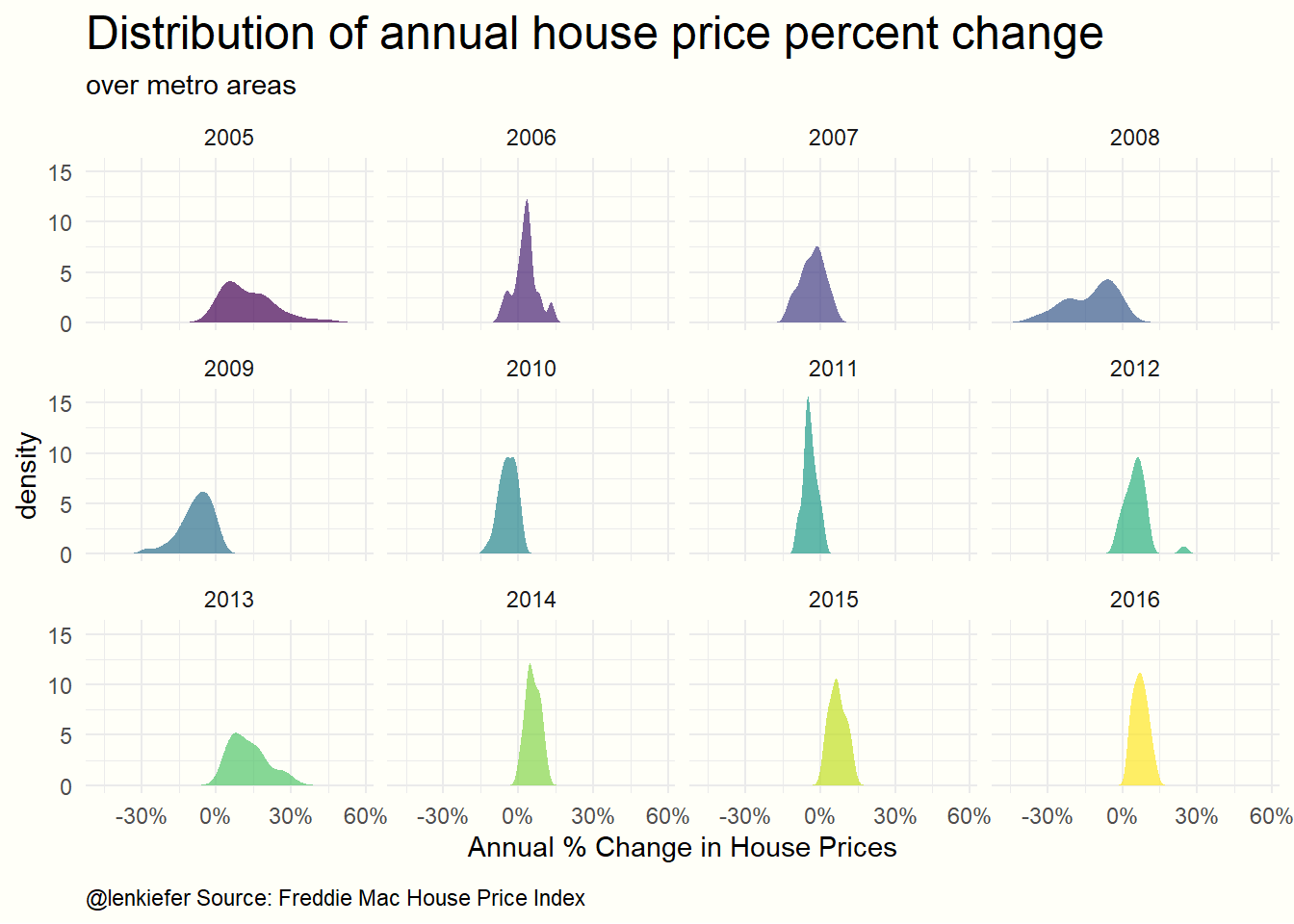
We can see from this graph that house price appreciation was was more dispersed from 2005-2010 than in recent years. Initially from 2005-2006 many metros had very high positive house price appreciation. Then, in the recession house prices fell quite a lot in mnay metros, but not all. In recent years house prices have tended to be positive, but we don’t see as many extremes as in 2005-2006.
The small multiple from using facet_wrap() with ggplot2 gives us one way of seeing this pattern. But an animation might also help us to better understand.
Animated density with plotly
We can modify this code slighlty to make a plotly animated chart. The following code using ggplotly to animate the house price densities we estimated above:
# Create a function to fit a kernel density to house prices over the metro areas:
g4<-
ggplot(data=myf2(2005,2016),aes(x=x,y=y,fill=factor(year),group=year,frame=year))+geom_area(alpha=0.7,position="identity")+
scale_color_viridis(discrete=T)+ theme_minimal()+
scale_fill_viridis(discrete=T)+scale_x_continuous(label=percent)+
geom_text(x=-.25,y=12,hjust=0,aes(label=paste0("Sep. ",year),color=factor(year)),
size=12,fontface="bold")+ theme(legend.position="none")+
labs(x="Annual % Change in House Prices",y="density",
title="Distribution of annual house price percent change<br>over metro areas<br>@lenkiefer Source: Freddie Mac House Price Index")
ggplotly(g4) %>% animation_opts(frame=1000,transition=600,redraw=T) ## Warning in p$x$data[firstFrame] <- p$x$frames[[1]]$data: number of items to
## replace is not a multiple of replacement length