IN THIS POST I WANT TO SHARE WITH YOU some code to create an animated plot of annual growth rates in U.S. Real Gross Domestic Product (GDP).
As in most of my posts, we’ll be creating these graphs in R.
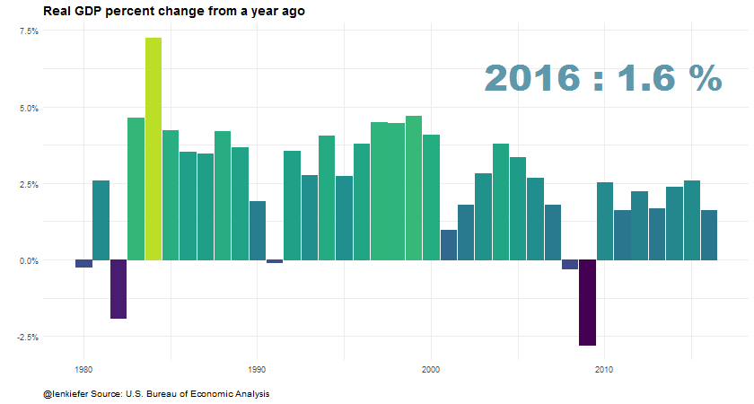
GDP Plot
On Friday the U.S. Bureau of Economic Analysis (BEA) released the “advance” or first estimate of GDP growth for the fourth quarter of 2016. With that advance estimate we now have estimates for full-year 2016 economic growth. For more on the GDP release, check out this article from the Wall Street Journal that has several interesting data visualizations.
Per the advance release, full year 2016 GDP growth was 1.6 percent. Note these calculations are made by comparing the average of GDP for each of the four quarters in 2016 to the average of GDP for each of the four quarters of 2015. Sometimes analysts like to compare Q4/Q4 measures, which will often give you different estimated growth rates.
If you go to text and full release you can find estimates for full year 2014, 2015 and 2016 GDP growth in Table 1. We could also download the GDP data for all years using the BEA’s interactive tables. However, for this exercise I decided to go a different route.
Get the data
For this plot, I chose to use the quantmod package to get the data from the St. Louis Federal Reserve Economic Database (FRED).
Getting the data into R is very straightforward using quantmod:
library(quantmod)
gdp = getSymbols('GDPC96',src='FRED', auto.assign=F)
gdp.df = data.frame(date=time(gdp), coredata(gdp) )
The quarterly Real GDP series is named GDPC96 and using getSymbols() we can download the data directly from FRED. Then we turn the returned data into a data frame.
Next we’ll need to compute the annual average growth rates. I’m going to do it using the data.table library:
library(data.table) #load package

dt<-data.table(gdp.df) #convert to data table

dt[,year:=year(date)]  # add year variable

dt.y<-dt[, lapply(.SD, mean, na.rm=TRUE), by=year ]  # compute annual average

dt.y[,gdp.g:=GDPC96/shift(GDPC96,1,fill=NA)-1] #compute annual growth rate
Let’s take a look at the GDP series and its annual growth rates:
library(tidyverse)## Loading tidyverse: ggplot2
## Loading tidyverse: tibble
## Loading tidyverse: tidyr
## Loading tidyverse: readr
## Loading tidyverse: purrr
## Loading tidyverse: dplyr## Conflicts with tidy packages ----------------------------------------------## between(): dplyr, data.table
## filter(): dplyr, stats
## first(): dplyr, data.table, xts
## lag(): dplyr, stats
## last(): dplyr, data.table, xts
## transpose(): purrr, data.tableggplot(data=dt.y,aes(x=date,y=GDPC96))+geom_line()+
scale_y_log10(label=scales::comma,breaks=c(2500,5000,7500,10000,15000))+
theme_minimal()+theme(plot.caption=element_text(hjust=0))+
labs(x="",y="",title="Real GDP (2009 $ Billions)",
subtitle="Annual Average, log scale",
caption="@lenkiefer Source: U.S. Burea of Economic Analysis via St Louis Fed FRED database")
library(tidyverse)
ggplot(data=dt.y,aes(x=date,y=gdp.g))+geom_col()+
  scale_y_continuous(label=scales::percent)+
  theme_minimal()+theme(plot.caption=element_text(hjust=0))+
  labs(x="",y="",title="Real GDP Growth",
       subtitle="Percent Change of Annual Average",
       caption="@lenkiefer Source: U.S. Burea of Economic Analysis via St Louis Fed FRED database")
## Warning: Removed 1 rows containing missing values (position_stack).
Add some stylin’ and some motion
Now we’re going to add a bit of styling and some animation to make the plot.
For smooth animations we’ll use tweenr. See my earlier post about tweenr for an introduction to tweenr, and more examples here and here.
library(animation)
library(tweenr)

# function to drop observations for all years by y
myf<-function(y){
  dt2<-copy(dt.y)[year>1979 & year<2017]
  dt2<-dt2[year > y ,gdp.g:=0]
  dt2$yearf<-factor(dt2$year)
  dt2$p<-factor(round(dt2$gdp.g*100,1))
  dt2$y<-factor(y)
  return(as.data.frame(dt2))
}

#use tweenr
my.list2<-lapply(c(2016,seq(1980,2016,1)),myf)

#my.list2<-lapply(c(2016,2008,2016),myf)
tf <- tween_states(my.list2, tweenlength= 2, statelength=3,
                   ease=rep('cubic-in-out',200), nframes=240)
tf<-data.table(tf)

#create animation:
oopt = ani.options(interval = 0.1)
saveGIF({for (i in 1:max(tf$.frame)) {
  g<-
    ggplot(data=tf[.frame==i],
           aes(x=year,y=gdp.g,frame=year,fill=gdp.g,color=gdp.g))+
    geom_col()+

    geom_text(data=tf[.frame==i & yearf==y,],x=2010,y=0.06,
              aes(label=paste(yearf,":",p,"%")),family="Arial Black",size=14,alpha=0.75)+
    scale_color_viridis(option="D",end=0.9)+
    geom_col(data=dt.y[year<2017 & year>1979,],alpha=0,color=NA)+
    theme_minimal()+scale_fill_viridis(option="D",end=0.9)+scale_y_continuous(label=percent)+
    labs(x="",y="",title="Real GDP percent change from a year ago",
         caption="@lenkiefer Source: U.S. Bureau of Economic Analysis")+
    theme(plot.caption=element_text(hjust=0),
          plot.title=element_text(face="bold",size=14),
          plot.subtitle=element_text(face="italic",size=12),
          legend.position="none")
  print(g)
  ani.pause()
  print(paste(i,"out of",max(tf$.frame)))
}
},movie.name="GDP growth.gif",ani.width = 840, ani.height =450)
Run that and you’ll get: