I’ve been thinking about distributional forecasts. In particular I’ve been considering Quantile Autoregressions (QAR) as defined in KOENKER AND XIAO 2006. There are some handy lecture notes I’ll borrow from at this link (pdf) in the exercise here.
This is all speculative, but I think this might be a useful way to think about the assymetry in likely outcomes given the uncertainty inherent in today’s economic forecasts.
Setup
Let’s define the QAR(1) model for quantile \(Q(\tau)\),
\[Q_{y_t}(\tau|y_{t-1}) - \alpha_0(\tau) + \alpha_1(\tau)y_{t-1},\] or with \(u_t \text{ i.i.d. } U[0,1]\).
\[ y_t = \alpha_0(u_t)+ \alpha_1(u_t)y_{t-1}.\] We can estimate the model above using standard quantile regression techniques.
Given the estimated QAR model we have,
\[ \hat{Q_{y_t}}(\tau|\mathcal{F_{t-1}})=x_t^\intercal\hat{\alpha}(\tau) \]
given \(y_t:t=1,2,..T\) we can forecast
\[ \hat{y}_{t+s} = \tilde{x}^\intercal_{T+s} \hat{\alpha}(U_s), s=1,...S, \]
where \(\tilde{x}^\intercal_{T+s} = [1,\tilde{y}_{T+S-1}]^\intercal\), \(U_s \sim U[0,1]\), and
\[ \tilde{y}_t = \begin{cases} y_t \text{ if } t \leq T, \\ \hat{y}_t \text{ if } t>T. \end{cases} \]
We can then simulate an ensemble of such forecasts paths to generate a conditional density forecast.
To do that we initialize the data at \(y_T\) and then draw a single uniform random variable \(U_{T+1} \sim U[0,1]\), we then plug that into the equation above and iterate forward. We do that for several different draws and average across all the draws to construct the conditonal denstiy forecast \(S\) periods into the future.
Data
We’ll begin by using the Freddie Mac House Price Index and transform it into annual growth rates. The latest available data is through August, so we’ll use August of each year to avoid overlapping time periods. We’ll have historical data from August 1976 through August 2020.
library(data.table)
library(forecast)
library(tidyverse)
library(quantreg)
library(gt)
dt <- fread("http://www.freddiemac.com/fmac-resources/research/docs/fmhpi_master_file.csv")
dt_us <- dt[GEO_Type=="US" ,   ]
dt_us[, hpa:=Index_SA/shift(Index_SA,12)-1, GEO_Name]
hpa <- ts(dt_us[Month==8& Year>1975,]$hpa,start=1976,frequency=1)
autoplot(hpa,color="dodgerblue",size=1.1)+scale_y_continuous(labels=scales::percent)+
theme_minimal()+
labs(x="date (August of each year)",
y="",
title="12-month Percent Change in US House Price Index",
caption="Source: Freddie Mac House Price Index")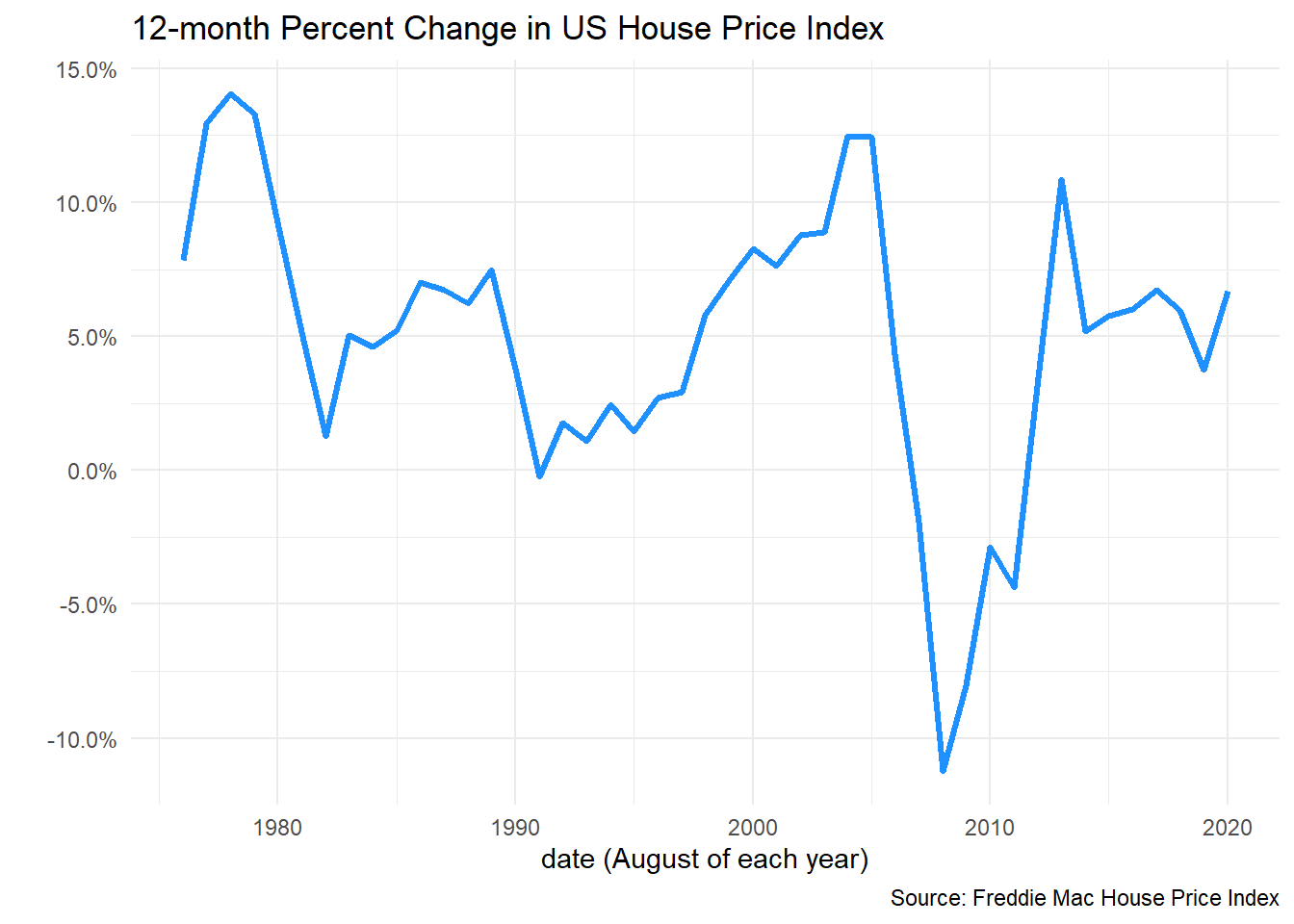 We want to account for varying rates of underlying inflation, so let’s deflate the index by the BEA’s Personal Consumption Expenditures: Chain-type Price Index.
dt_pce <- tidyquant::tq_get("PCEPI",get="economic.data",from="1975-01-01")
dt_pce <- data.table(dt_pce)[,pce:=price/shift(price,12)-1]
dt_pce <- data.table(dt_pce)[,pce3:=price/shift(price,36)-1]
dt_us2 <- left_join(dt_us,
dt_pce[,c("date","pce","price")][,":="(Year=year(date),Month=month(date))],
by=c("Year","Month"))
#create Real House Price Appreciation (rhpa) and its 12-month lag (rhpa12)
dt_us2[,rhpa:=hpa-pce][
,rhpa12:=shift(rhpa,12)]
ggplot(data=dt_us2[Month==8,], aes(x=date,y=rhpa))+
geom_path(color="dodgerblue",size=1.1)+
scale_y_continuous(labels=scales::percent)+
theme_minimal()+
labs(x="date (August of each year)",
y="",
title="12-month Percent Change in US Real House Price Index",
caption="Source: Freddie Mac House Price Index, deflated by Personal Consumption Expenditures: Chain-type Price Index")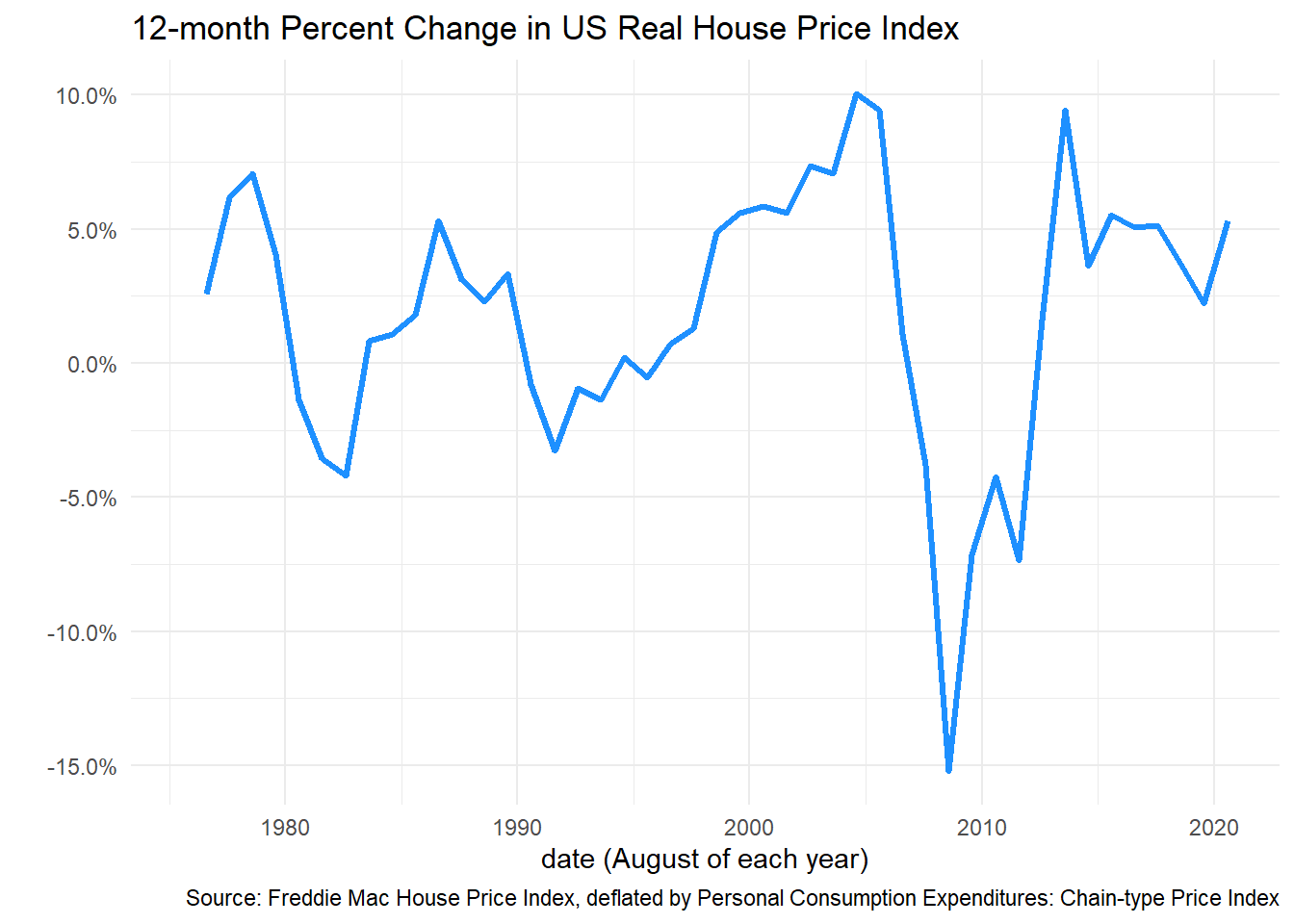 Now we can fit a quantile autoregression using one annual lag:
g.qr<-
rq(data=dt_us2,
tau= seq(0.1,0.9,0.1),
formula = rhpa ~ rhpa12 ) %>%
broom::tidy() %>%
#filter(term!="(Intercept)") %>%
mutate(term=ifelse(term=="rhpa12","Lagged real HPA",term)) %>%
ggplot(aes(x=tau,y=estimate))+
geom_point(color="#27408b")+
geom_ribbon(aes(ymin=conf.low,ymax=conf.high),alpha=0.25, fill="#27408b")+
geom_line(color="#27408b")+
theme_minimal()+
theme(text = element_text(color = "#27408b"))+
theme(plot.caption=element_text(hjust=0))+
scale_x_continuous(breaks=seq(0,1,.1))+
facet_wrap(~term,scales="free_y",ncol=2)+
labs(x="tau = quantile", y="coefficients",
title="Quantile AutoRegression (QAR) Results:\nrhpa ~ rhpa12",
caption="@lenkiefer Note: Quantile regresion coefficients for 12-month real house price growth with\n 12-month lag lags of real house prices. U.S. SA index (Aug 1976-Aug 2020)")
g.qr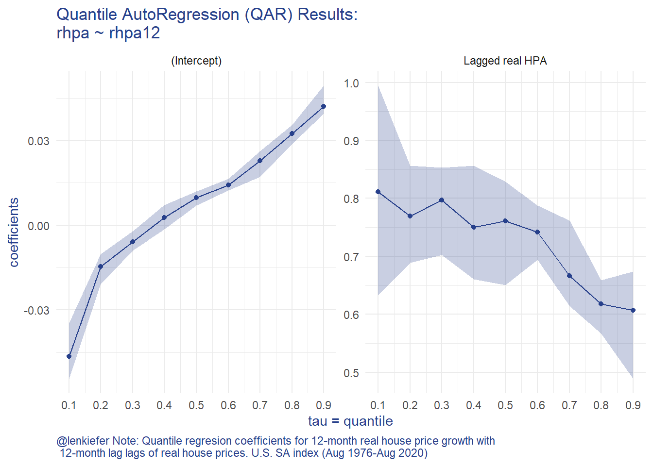 The QAR model results such asymmetry in the house price growth process. When you have a negative draw (tau is low) you tend to have more persistence in the process (the AR coefficient is bigger).
We can see that asymmetry by simulating house prices forward.
df <- dt_us2[Year>1975 & Month==8,]

df_quant <- rq(data=df,
               tau= seq(0.01,.99,.01),
               formula =  rhpa ~ rhpa12  )

# forecasting function

# three years out
N <- 3
Nsim <- 500
# initialize values
y0 <- matrix(NA,N+1,Nsim)
y0[1,] <- last(df$rhpa)
qs <- matrix(NA,N,Nsim)
set.seed(100161)
for (i in 1:N){
  for (j in 1:Nsim){
    # draw a quantile (1-100)
    qs[i,j] <- max(1,floor(runif(1)*100))
    y0[i+1,j] <- df_quant$coefficients[1,qs[i,j]]+df_quant$coefficients[1,qs[i,j]]*y0[i,j]
  }
}

# reshape2 deprecated?
# I had this
#y02 <- melt(y0)
#setnames(y02,c("Var1","Var2","value"),c("period","sim","rhpa"))
# melt throws warning about deprecated reshape2 going with:

y02 <-
data.table(
  period = rep(seq_len(nrow(y0)), ncol(y0)),
  year = rep(seq_len(nrow(y0)), ncol(y0))+2019,
  sim = rep(seq_len(ncol(y0)), each = nrow(y0)),
  rhpa = c(y0)
)


y02 <- data.table(y02)[,cumulative_hpa:=cumsum(rhpa)-first(rhpa),sim]
y02 <- data.table(y02)[,chpa:=cumprod(1+rhpa),sim][,cumulative_hpa:=chpa-(1+first(rhpa)),sim]
y02[,year:=period+2019]

data.table(y02)[, as.list(unlist(lapply(.SD,quantile,c(.1,.5,0.9)))),
                year,.SDcols="cumulative_hpa"] %>%
  mutate_at(c(2,3,4),scales::percent,accuracy=.1) %>%
  filter(year>2020) %>%
  gt(auto_align=FALSE) %>%
  tab_header(title="Cumulative Real House Price Growth (Aug Value/ Aug 2020 -1 )",
             subtitle="Quantile AutoRegressions\nFMHPI deflated by PCE Price Index") %>%
tab_source_note("10th, 50th, and 90th percentiles across 500 simulated QAR(1) forecasts\nForecasts Starting from August 2020 12, 24, 36 months foreward.")| Cumulative Real House Price Growth (Aug Value/ Aug 2020 -1 ) | |||
|---|---|---|---|
| Quantile AutoRegressions FMHPI deflated by PCE Price Index | |||
| year | cumulative_hpa.10% | cumulative_hpa.50% | cumulative_hpa.90% |
| 2021 | -4.8% | 1.1% | 5.3% |
| 2022 | -6.1% | 1.7% | 8.0% |
| 2023 | -7.0% | 2.5% | 10.5% |
| 10th, 50th, and 90th percentiles across 500 simulated QAR(1) forecasts Forecasts Starting from August 2020 12, 24, 36 months foreward. | |||
Here we can see the asymmetry manifest itself. Across 500 simulations, the median 3-year real house price growth rate is 2.5 percentage points. However, the upside is 8 percentage points higher (10.5%) while the downside (-7.0%) is 9.5 percentage points lower.
References
Koenker, R., & Xiao, Z. (2006). Quantile autoregression. Journal of the American Statistical Association, 101(475), 980-990.
Comments
I think this might be a useful way to think about some of these issues. The QAR model is quite tractable and lends itself immediately to a description of conditional forecast densities. However, it remains to be seen if forecasts from such a model would actually be any good compared to more traditional univariate approaches or more complex multivariate models.