Yesterday I announced that I wrote a simple R package darklyplot. This is a vignette I have built to help explain ways you can use the package.
The goal of darklyplot is to create simple time series plots with a dark background. The miniminum and maximum values are highlighted, and color coded along with the y axis and x axis labels. This vignette walks through basic usage and explores some of the package options.
darklyplot can be installed from GitHub with:
# install.packages("devtools")
devtools::install_github("lenkiefer/darklyplot")
A first plot
The darklyplot package comes with a dataset mtg_rate which contains a time series of U.S. weekly average 30-year fixed mortgage rates from Freddie Mac’s Primary Mortgage Market Survey. The following code constructs a time series plot of the weekly values from April 2, 1971 through July 2, 2020.
library(darklyplot)
darklyplot(df=mtg_rate,column="rate",labelx="roundx",n.decimals=3)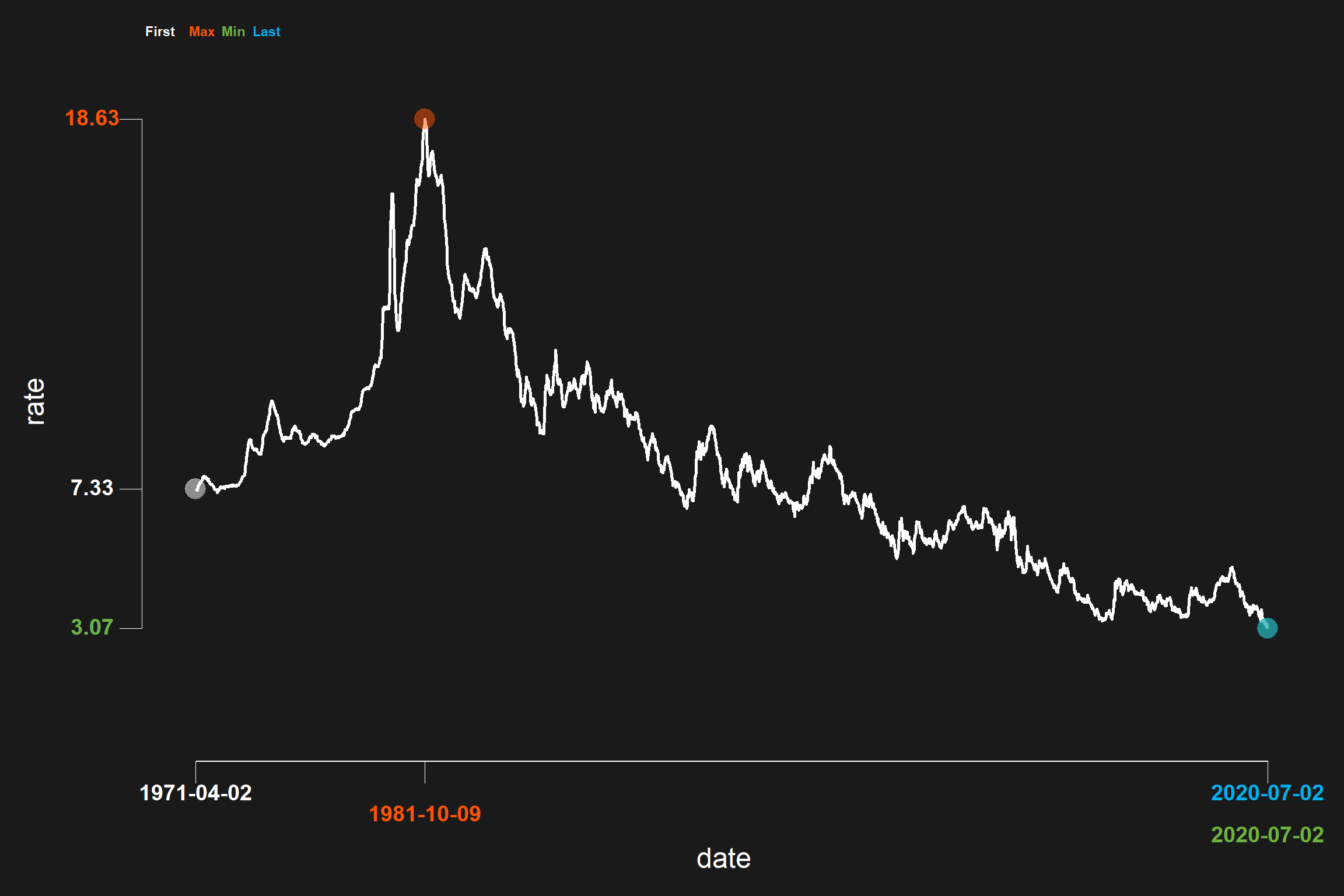
The darklyplot plot combines a dark theme with a minimalist aesthetic. Using geom_rangeframe from the ggthemes package we limit the axis to cover the minimum and maxiumum values. We also highlight the first, last, minimum and maximum value with separate axis ticks and different colors. The user can select the colors to highlight the values.
For example, you could force darklyplot to use only one color, white, to represent all values:
darklyplot(df=mtg_rate,column="rate",
           labelx="roundx",n.decimals=3,
           minCol="white",maxCol="white",
           firstCol="white",lastCol="white")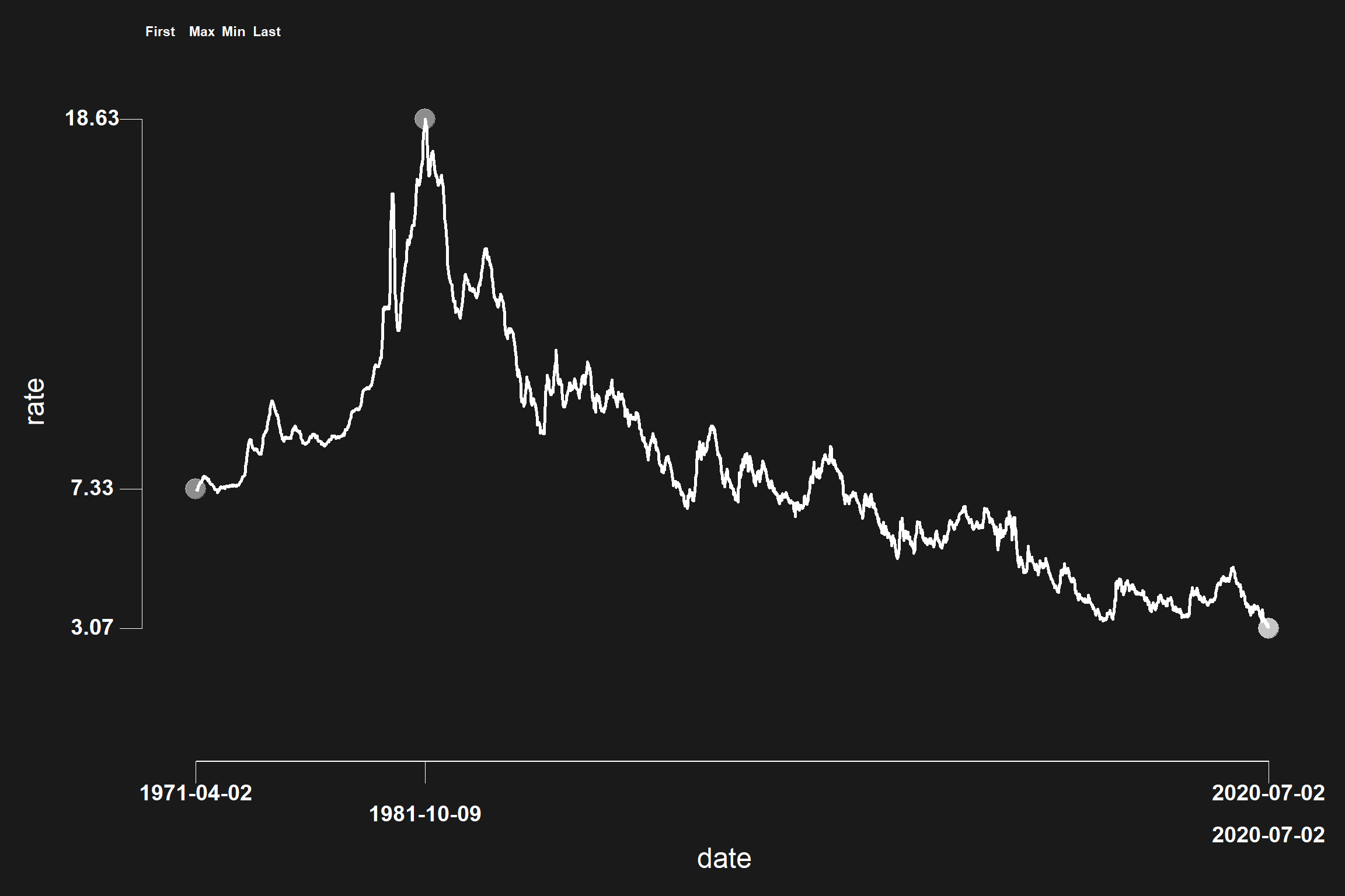
Shading and reference lines
The darklyplot packages allows you to add a reference line to your plot. By default the reference line is set to 0, but you can adjust it to any fixed value. For example, we can modify our mortgage rate plot to add a reference line at 5 percentage points.
darklyplot(df=mtg_rate,column="rate",labelx="roundx",n.decimals=3,
           refline=TRUE,refCol="yellow",refValue=5)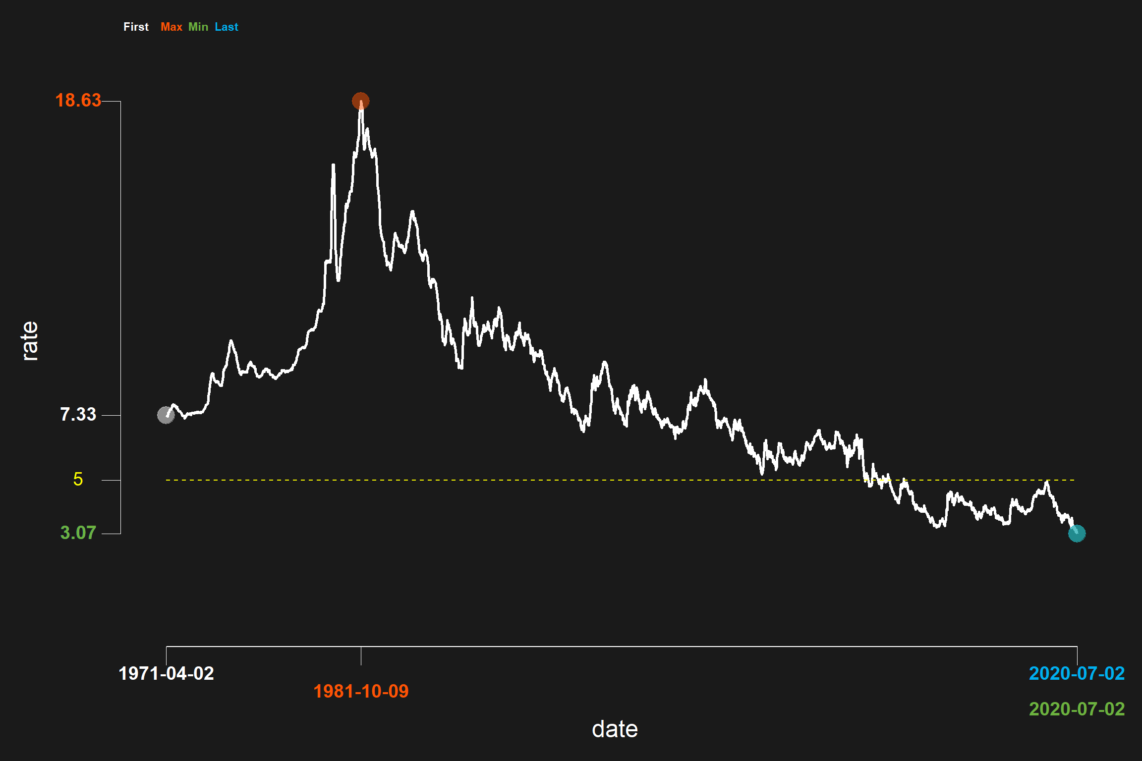
You can also shade between the reference line and the data by setting shade=TRUE. The default shading is dodgerblue with alpha set to 0.15, but you can adjust those values with the shadeCol and shadeAlpha parameters.
darklyplot(df=mtg_rate,column="rate",labelx="roundx",n.decimals=3,
           refCol="yellow",refline=TRUE,refValue=5,
           shade=TRUE,shadeCol="yellow",shadeAlpha=0.35)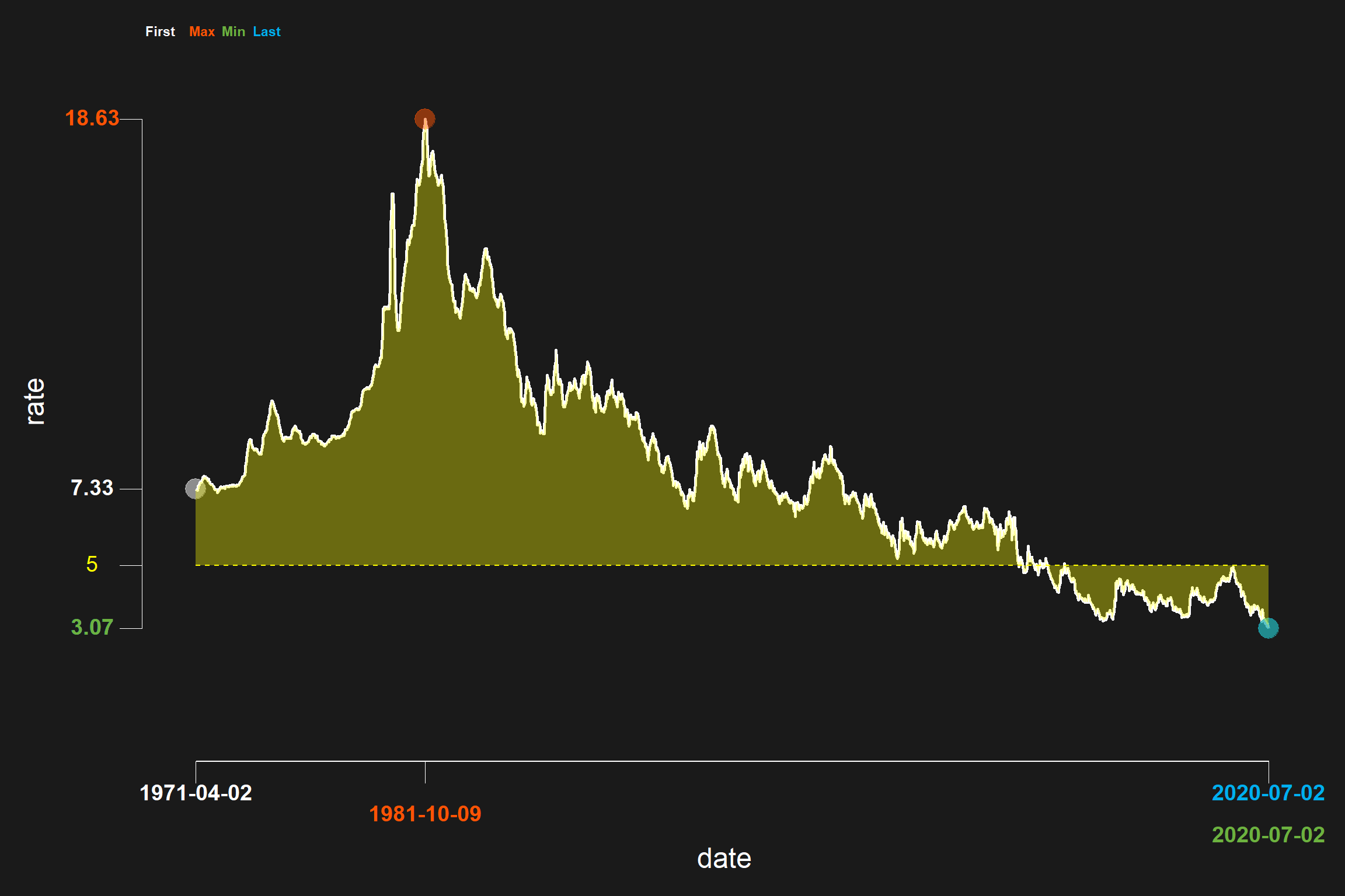
Use with any time series data
You can used darklyplot with any time series as long as the data is stored a dataframe with a date formatted column called date, and the desired column is numeric. The ggplot2 package comes with a dataframe called txhousing that has a column called date. However, it is a double not a date so if you tried to use it with darklyplot you would get an error.
In the example below we first filter txhousing to just the observations for Lubbock, Texas and try to plot sales with darklyplot. This code will result in an error
txhousing2 <- txhousing[txhousing$city=="Lubbock",]

darklyplot(df=txhousing2,column="sales",labelx="roundx",n.decimals=3,
           refCol="yellow",refline=TRUE,refValue=5,
           shade=TRUE,shadeCol="yellow",shadeAlpha=0.35)
#> Error: Invalid input: date_trans works with objects of class Date onlyIf we convert the date column to date format the plot will work:
txhousing2 <- txhousing[txhousing$city=="Lubbock",]
txhousing2$date <- as.Date(ISOdate(txhousing2$year, txhousing2$month,1))

darklyplot(df=txhousing2,column="sales",labelx="roundx",n.decimals=3)+
  labs(title="Monthly home sales in Lubbock, Texas")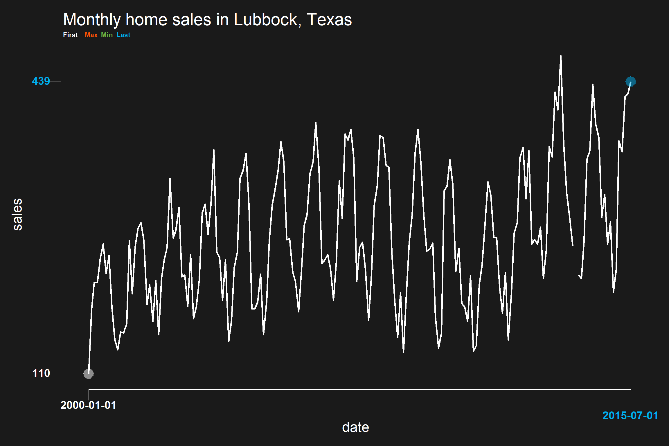
Where is my min/max?
The plot above lacks a min/max. That is because the dataframe we created has some missing observations. Future versions of darklyplot may adjust for this, but for now we have to work around that issue:
# filter out months with missing sales data
txhousing2 <- txhousing2[!is.na(txhousing2$sales),]

darklyplot(df=txhousing2,column="sales",labelx="roundx",n.decimals=3)+
  labs(title="Monthly home sales in Lubbock, Texas")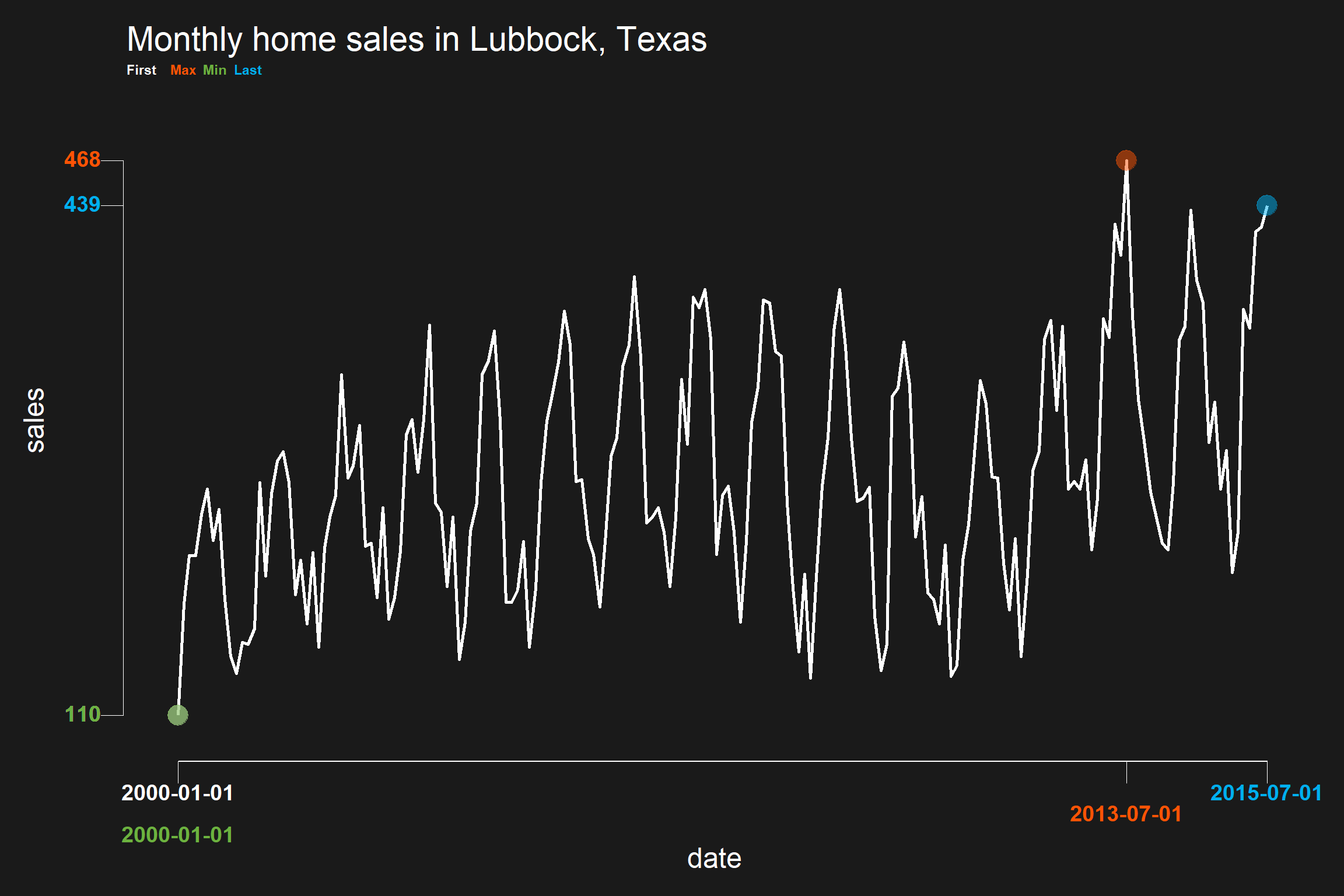
Using percent formats
It’s often the case that you want plot data with percentage changes. We can use darklyplot’s labelx parameter to format percents on the axis labels with scales::percent.
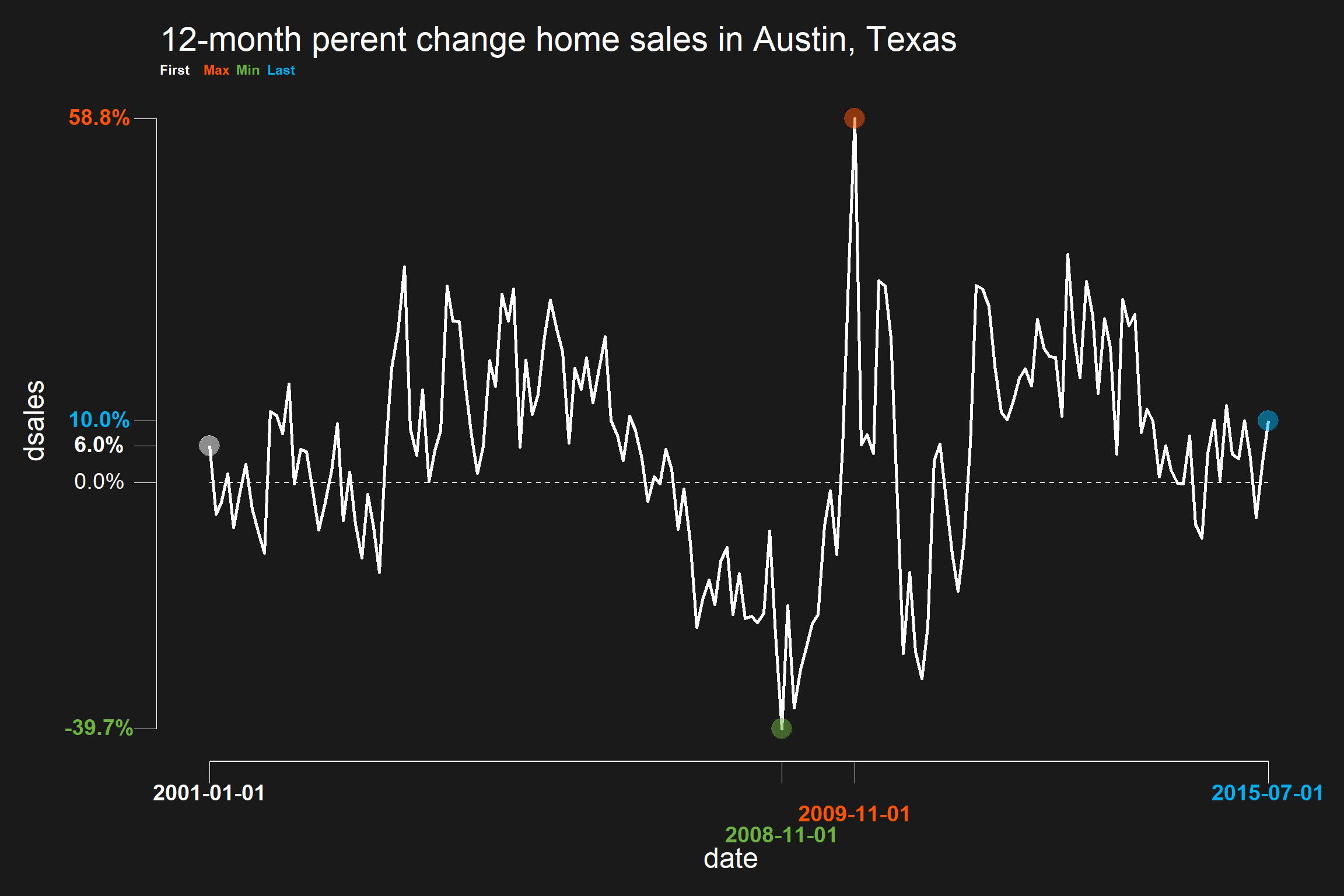
# compute monthly percent changes for Austin Texas
txhousing3 <- txhousing[txhousing$city=="Austin",]
txhousing3$date <- as.Date(ISOdate(txhousing3$year, txhousing3$month,1))
txhousing3$dsales <- (txhousing3$sales/lag(txhousing3$sales,12) -1 )
txhousing3 <- txhousing3[!is.na(txhousing3$dsales),]

darklyplot(df=txhousing3,column="dsales",
           refline=TRUE,
           labelx="percent",
           #n.decimals corresponds to accuracy in scales::percent when labelx="percent"
           n.decimals=.1)+
  labs(title="12-month perent change home sales in Austin, Texas")