On Friday a colleague showed me an interesting chart, a map of maps. I believe the original was made in Tableau, but I decided to spin one up in R. I tweeted out the picture:
A map of maps, showing the correlation between state house price growth rates
— 📈 Len Kiefer 📊 (@lenkiefer) March 6, 2020
You see pretty strong spatial correlation, with some interesting exceptions. Florida correlated with AZ, NV pic.twitter.com/9hzwZLkb41
In this post I will supply the R code to make one.
# load required libraries ----
library(data.table)
library(tidyverse)
library(geofacet)
Data wrangling code
We will go and get the Freddie Mac House Price Index for the 50 states and DC. We’ll also create a function to create bivariate correlations. Finally, we’ll create a tibble that has all pairs of states and calculates the bivariate correlation in 12-month house price appreciation (monthly) from January 1990 through January 2020.
# get data ----
dt <- fread("http://www.freddiemac.com/fmac-resources/research/docs/fmhpi_master_file.csv")

dt[,date:=as.Date(ISOdate(Year,Month,1))
   ][,hpa:=Index_SA/lag(Index_SA,12)-1,by=.(GEO_Type,GEO_Name,GEO_Code)]


# function to compute bivariate (state-to-state) correlation in 12-month house price appreciation rate

corf <- function(s1="CA",s2="AZ"){
  cor(dt[GEO_Name==s1&!is.na(hpa) & Year>1989,]$hpa,dt[GEO_Name==s2 &!is.na(hpa) & Year>1989,]$hpa)
}


# create correlation matrix

df <-
  expand_grid(state1=unique(dt[GEO_Type=="State",]$GEO_Name),
              state2=unique(dt[GEO_Type=="State",]$GEO_Name)) %>%
  mutate(correlation=map2(state1,state2,corf)) %>%
  unnest(correlation)

df <-left_join(df,us_state_grid1,by=c("state1"="code"))
Now with the data we can make a chart. FIrst, let’s use geofacet to display a grid of line charts arranged on a grid that resembles the United States.
# plot timelines

ggplot(data=filter(dt,GEO_Type=="State",Year>1989), aes(x=date,y=hpa))+
  geom_line()+
  geom_area(fill="dodgerblue",alpha=0.25)+
  theme_minimal()+
  scale_y_continuous(labels=scales::percent)+
  scale_x_date(guide=guide_axis(check.overlap = TRUE))+
  facet_geo(~GEO_Name)+
  theme(plot.title=element_text(face="bold",size=rel(1.2)),
        plot.caption=element_text(hjust=0))+
  labs(x="",y="",
       subtitle="12-month percent change in house price index",
       title="State house price growth rate Jan 1990 - Jan 2020",
       caption="@lenkiefer Source: Freddie Mac House Price Index")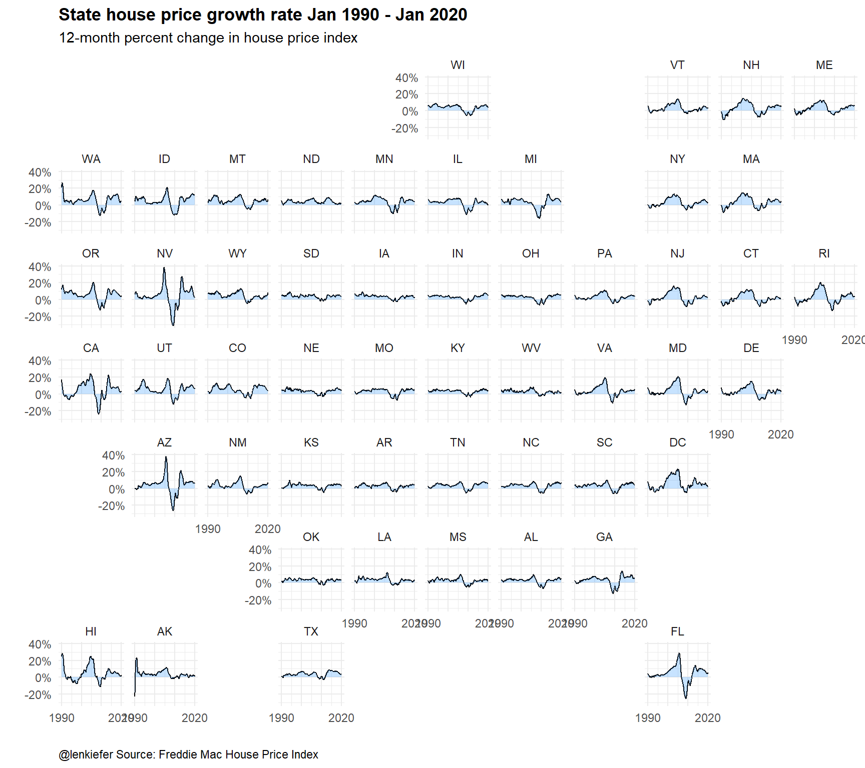
The geofacet makes it clear that there is correlation across space. The coasts tend to be more volatile.
Let’s try to visualize the correlation matrix. We will take advantage of some new ggplot2 features, including putting the axis labels on two lines and automagically creating a discrete color scale by binning a continuous variable.
# plot correlation matrix

ggplot(data=df, aes(x=state1,y=state2,fill=correlation))+
  geom_tile()+
  scale_x_discrete(guide = guide_axis(n.dodge = 2))+
  scale_y_discrete(guide = guide_axis(n.dodge = 2))+
  scale_fill_binned(type="viridis",n.breaks=9)+
  theme_minimal()+
  geom_tile(color="black",size=0.3,fill="transparent",data=filter(df,state1==state2))+
  theme(plot.title=element_text(face="bold",size=rel(2)),
        legend.position="top",
        legend.direction="horizontal",
        legend.key.width=unit(2,"cm"),
        panel.grid=element_blank(),
        plot.caption=element_text(hjust=0))+
  labs(x="",y="",
       title="State-to-State house price correlation",
       subtitle="correlation in states' 12-month percent change in house price index: Jan 1990-Jan 2020\nown state correlation (=1) denoted by black border",
       caption="@lenkiefer Source: Freddie Mac House Price Index")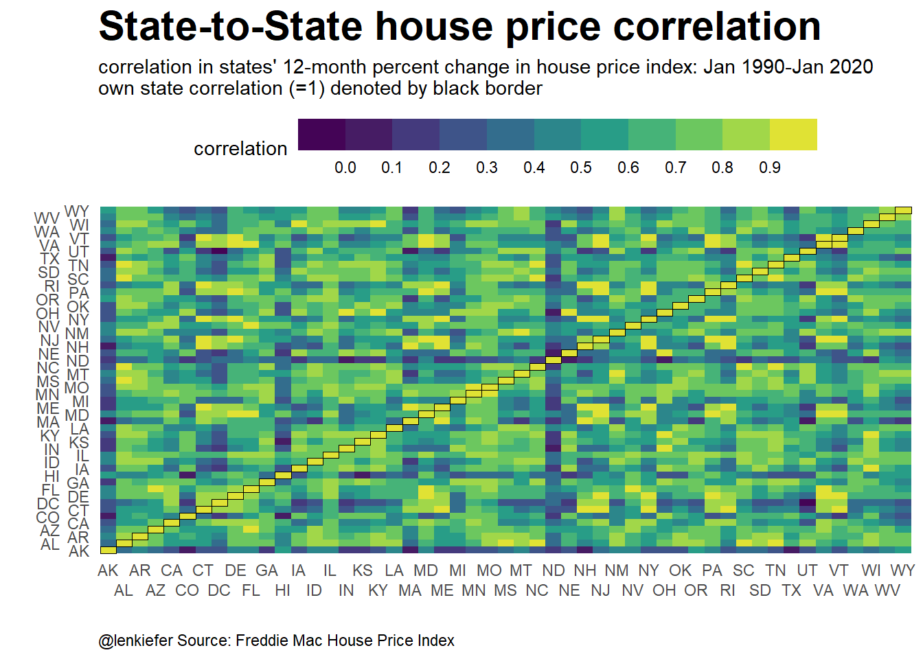
That’s quite hard to decipher. Instead we could make a geofacet map to show how one state correlates to others. Effectively we are taking one column, Florida in the example below, and plotting it as a geofacet.
I first tried to use @hrbrmstr Bob Rudis’ statebin package, but he hasn’t pushed the latest updates to CRAN. While I could get the development version, I found that geom_statebin didn’t have all the flexibility I wanted. Turns out, I can use a use the state grid (us_state_grid1) from the geofacet package and plot with geom_tile. Then I could wrap that within a call of facet_geo(). See the code below.
ggplot(data=filter(df,state2=="FL"), aes(y=-row,x=col,fill=correlation,label=state1))+
  geom_tile(color="white",size=0.7)+
    scale_fill_stepsn(colors=viridis::viridis(12),
                      breaks=seq(-0.2,1,0.1),
                      limits=c(-0.2,1))+
  geom_text(color="white",fontface="bold")+
  facet_wrap(~state2)+
  theme_minimal()+
  theme(plot.title=element_text(face="bold",size=rel(2)),
        axis.text=element_blank(),
        legend.position="top",
        legend.direction="horizontal",
        legend.key.width=unit(2,"cm"),
        panel.grid=element_blank(),
        plot.caption=element_text(hjust=0))+
  labs(x="",y="",
       title="Florida State-to-State house price correlation",
       subtitle="correlation in states' 12-month percent change in house price index: Jan 1990-Jan 2020\nown state correlation (=1) denoted by black border",
       caption="@lenkiefer Source: Freddie Mac House Price Index")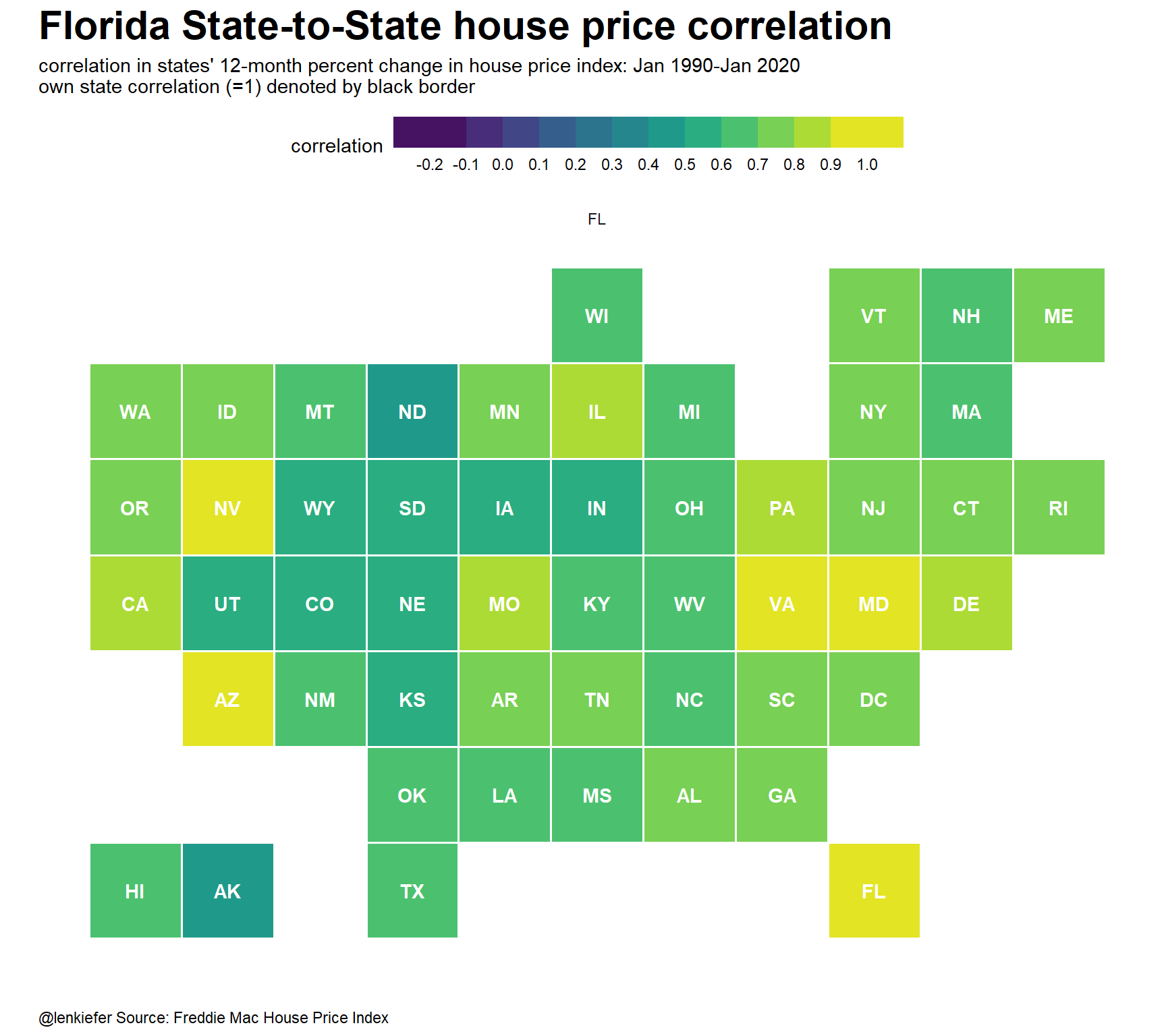
Now we can make one of these maps for each of the states and stick it into a geofacet grid. Then we’ll have a map of maps:
ggplot(data=df, aes(y=-row,x=col,fill=correlation,label=state1))+
  geom_tile(color="white",size=0.7)+
  scale_fill_binned(type="viridis",n.breaks=9)+
  geom_tile(color="black",size=0.3,fill="transparent",data=filter(df,state1==state2))+
  facet_geo(~state2)+
  theme_minimal()+
  theme(plot.title=element_text(face="bold",size=rel(1.5)),
        axis.text=element_blank(),
        legend.position="top",
        legend.direction="horizontal",
        legend.key.width=unit(2,"cm"),
        panel.grid=element_blank(),
        plot.caption=element_text(hjust=0))+
  labs(x="",y="",
       title="State-to-State house price correlation",
       subtitle="correlation in states' 12-month percent change in house price index: Jan 1990-Jan 2020\nown state correlation (=1) denoted by black border",
       caption="@lenkiefer Source: Freddie Mac House Price Index")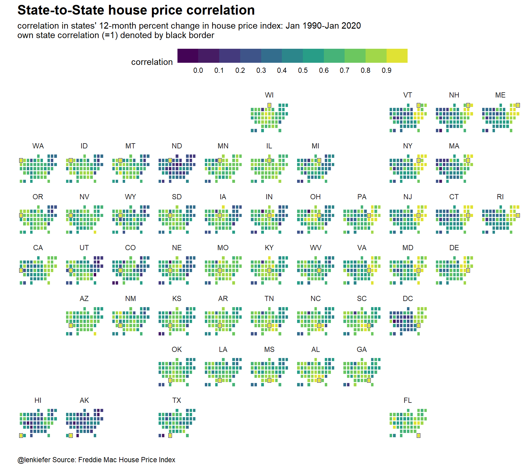
Following a helpful suggestion from Twitter, I highlighted each state within its own cell with a black grid.