I have been exploring some visualizations for housing seasonality. In recent days I’ve tried out various ways of using tile plots to display seasonal patterns in home sales and other related data. In this post I want to share some of the R code I used to wrangle data and generate those plots.
You can see some for example, in this thread (and others):
though outside there's blistering heat
— 📈 Len Kiefer 📊 (@lenkiefer) July 23, 2019
home sales are barely warming up pic.twitter.com/efpkr3nWyP
First check this out
But first a quick note. If you like some of the animations we have made here see the tag animation or are interested in using animation for data visualization, see this nice post by Jon Schwabish. I make a small cameo, but stay for the interesting discussion.
Housing heat maps
Let’s make some housing heat maps. For this post, we will use data from the U.S. Census Bureau’s new residential sales series link. These sales data are widely cited in the media and give some sense of where residential investment is going in the U.S. As Bill McBride pointed out in his Calculated Risk blog, the recent new home sales data through June 2019 are not pointing to an imminent recession.
Details on getting data
A couple years ago in my post Visualizing uncertainty in housing data I described how to get the new home sales data easily from Census. Click the post for more details, but the quick version is this:
Go to this page link
Click “Download all data for this report/survey”
The file will be called RESSALES-mf.zip, unzip
extract the text file
RESSALES-mf.csvand save it
We’ll pick it up from there.
Now that we have the data (if not see the details above) we can proceed to make our charts.
Wrangling data
#####################################################################################
## Load libraries ----
#####################################################################################
suppressPackageStartupMessages({
library(data.table)
library(lubridate)
library(tidyverse)
library(extrafont)  # We'll need that for font stuff
}
)

#####################################################################################
# wrangle data ----
#####################################################################################

# first, we'll need some dates.
# this bit depends on the date, but since it's July 2019, we'll use 678 periods (Jan 1963-Jun 2019)

# run something like
# dt <- fread("data/RESSALES-mf.csv",skip=723)

df.dates <- data.frame(per_idx=1:678, date=seq.Date(from=as.Date("1963-01-01"), by= "1 month", length.out=678))
dt<- left_join(dt, df.dates, by="per_idx")


# get sales data

df_sales <- filter(dt,
              cat_idx==1,  # NSA home sales
              dt_idx==1,   # All houses
              geo_idx==1   # Just usa
)

df_sales <- mutate(df_sales,
              mname=fct_reorder(as.character(date,format="%b"),month(date)),
              yearf=fct_reorder(factor(year(date)),-year(date)))


# get months' supply data

df_ms<- filter(dt,
                 is_adj==1,   # seasonally adjusted
                 cat_idx==3,  # Months' supply
                 dt_idx==7,   # All houses
                 geo_idx==1   # Just usa
)

df_ms <- mutate(df_ms , mname:=fct_reorder(as.character(date,format="%b"),month(date)),
                yearf=fct_reorder(factor(year(date)),-year(date)))
Some charts
Now we can make some charts. The first chart will be a heatmap. For this, we’ll set up a custom color palette like we did before. Then we’ll arrange each year on the y axis and month on the x axis, filling each tile based on the value of home sales for that month. We’ll see a seasonal pattern emerge.
Code for custom color scales
# Function for colors ----
# adapted from https://drsimonj.svbtle.com/creating-corporate-colour-palettes-for-ggplot2
#####################################################################################
## Make Color Scale ----  ##
#####################################################################################
my_colors <- c(
  "green"      = rgb(103,180,75, maxColorValue = 256),
  "green2"      = rgb(147,198,44, maxColorValue = 256),
  "lightblue"  =  rgb(9, 177,240, maxColorValue = 256),
  "lightblue2" = rgb(173,216,230, maxColorValue = 256),
  'blue'       = "#00aedb",
  'red'        = "#d11141",
  'orange'     = "#f37735",
  'yellow'     = "#ffc425",
  'gold'       = "#FFD700",
  'light grey' = "#cccccc",
  'purple'     = "#551A8B",
  'dark grey'  = "#8c8c8c")


my_cols <- function(...) {
  cols <- c(...)
  if (is.null(cols))
    return (my_colors)
  my_colors[cols]
}


my_palettes <- list(
  `main`  = my_cols("blue", "green", "yellow"),
  `cool`  = my_cols("blue", "green"),
  `cool2hot` = my_cols("lightblue2","lightblue", "blue","green", "green2","yellow","gold", "orange", "red"),
  `hot`   = my_cols("yellow", "orange", "red"),
  `mixed` = my_cols("lightblue", "green", "yellow", "orange", "red"),
  `mixed2` = my_cols("lightblue2","lightblue", "green", "green2","yellow","gold", "orange", "red"),
  `mixed3` = my_cols("lightblue2","lightblue", "green", "yellow","gold", "orange", "red"),
  `mixed4` = my_cols("lightblue2","lightblue", "green", "green2","yellow","gold", "orange", "red","purple"),
  `mixed5` = my_cols("lightblue","green", "green2","yellow","gold", "orange", "red","purple","blue"),
  `mixed6` = my_cols("green", "gold", "orange", "red","purple","blue"),
  `grey`  = my_cols("light grey", "dark grey")
)


my_pal <- function(palette = "main", reverse = FALSE, ...) {
  pal <- my_palettes[[palette]]

  if (reverse) pal <- rev(pal)

  colorRampPalette(pal, ...)
}


scale_color_mycol <- function(palette = "main", discrete = TRUE, reverse = FALSE, ...) {
  pal <- my_pal(palette = palette, reverse = reverse)

  if (discrete) {
    discrete_scale("colour", paste0("my_", palette), palette = pal, ...)
  } else {
    scale_color_gradientn(colours = pal(256), ...)
  }
}


scale_fill_mycol <- function(palette = "main", discrete = TRUE, reverse = FALSE, ...) {
  pal <- my_pal(palette = palette, reverse = reverse)

  if (discrete) {
    discrete_scale("fill", paste0("my_", palette), palette = pal, ...)
  } else {
    scale_fill_gradientn(colours = pal(256), ...)
  }
}
Plot code:
Plot 1 (kinda tall)
ggplot(data=df_sales, aes(y=yearf,x=mname,fill=val, label=val))+
  scale_fill_mycol(palette="cool2hot",discrete=FALSE,reverse=FALSE,
                   name="New Home Sales (1000s,not seasonally adjusted)")+
  geom_tile(color="white",size=1.1)+
  geom_text(color="white")+
  theme_minimal()+
  theme(legend.position="top",
        legend.direction="horizontal",
        plot.caption=element_text(hjust=0),
        panel.grid.major.y=element_blank(),
        legend.key.width=unit(1.5,"cm"))+
  labs(x="",y="",title="The long thaw in new home sales",
       subtitle="U.S. new home sales by month",
         caption = "@lenkiefer Source: U.S. Census Bureau and \ U.S. Department of Housing and Urban Development")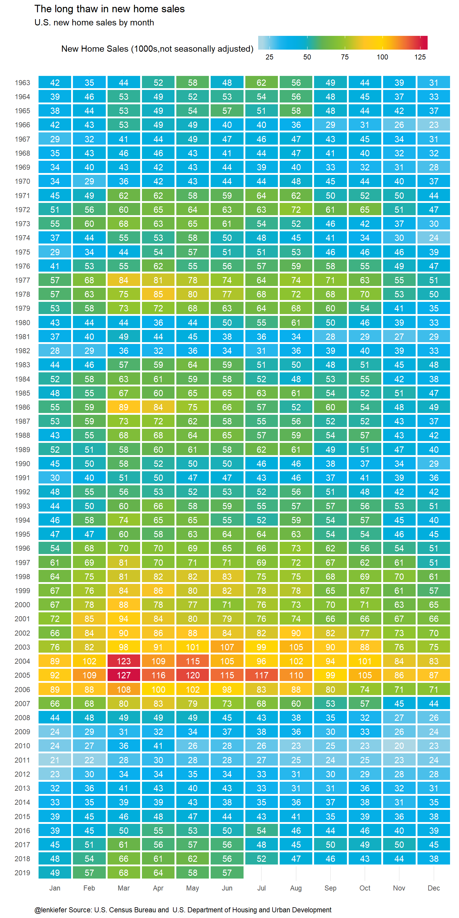
We could also look at months’s supply of homes for sale. So it fits in easier, we will truncate it start at the year 2000.
ggplot(data=filter(df_ms,year(date)>1999), aes(y=yearf,x=mname,fill=val, label=val))+
  scale_fill_mycol(palette="cool2hot",discrete=FALSE,reverse=TRUE,limits=c(0,13),
                   name="Months (seasonally adjusted)")+
  geom_tile(color="white",size=1.1)+
  geom_text(color="white",size=3)+
  theme_minimal()+
  theme(legend.position="top",
        legend.direction="horizontal",
        panel.border = element_rect(fill = NA, color = NA),
        panel.grid.major.y=element_blank(),
        legend.key.width=unit(2,"cm"))+
  labs(x="",y="",title="Months' supply of new homes for sale at current sales pace",
                caption = "@lenkiefer Source: U.S. Census Bureau and \ U.S. Department of Housing and Urban Development")
I also experimented with a dark theme.
Plot 3 (dark theme)
# dark theme ----
theme_dark2 = function(base_size = 12, base_family = "Courier New") {

  theme_grey(base_size = base_size, base_family = base_family) %+replace%

    theme(
      # Specify axis options
      axis.line = element_blank(),
      axis.text.x = element_text(size = base_size*0.8, color = "white", lineheight = 0.9),
      axis.text.y = element_text(size = base_size*0.8, color = "white", lineheight = 0.9),
      axis.ticks = element_line(color = "white", size  =  0.2),
      axis.title.x = element_text(size = base_size, color = "white", margin = margin(0, 10, 0, 0)),
      axis.title.y = element_text(size = base_size, color = "white", angle = 90, margin = margin(0, 10, 0, 0)),
      axis.ticks.length = unit(0.3, "lines"),
      # Specify legend options
      legend.background = element_rect(color = NA, fill = " gray10"),
      legend.key = element_rect(color = "white",  fill = " gray10"),
      legend.key.size = unit(1.2, "lines"),
      legend.key.height = NULL,
      legend.key.width = NULL,
      legend.text = element_text(size = base_size*0.8, color = "white"),
      legend.title = element_text(size = base_size*0.8, face = "bold", hjust = 0, color = "white"),
      legend.position = "right",
      legend.text.align = NULL,
      legend.title.align = NULL,
      legend.direction = "vertical",
      legend.box = NULL,
      # Specify panel options
      panel.background = element_rect(fill = " gray10", color  =  NA),
      #panel.border = element_rect(fill = NA, color = "white"),
      panel.border=element_blank(),
      panel.grid.major = element_line(color = "grey35"),
      panel.grid.minor = element_line(color = "grey20"),
      panel.spacing = unit(0.5, "lines"),
      # Specify facetting options
      strip.background = element_rect(fill = "grey30", color = "grey10"),
      strip.text.x = element_text(size = base_size*0.8, color = "white"),
      strip.text.y = element_text(size = base_size*0.8, color = "white",angle = -90),
      # Specify plot options
      plot.background = element_rect(color = " gray10", fill = " gray10"),
      plot.title = element_text(size = base_size*1.2, color = "white",hjust=0,lineheight=1.25,
                                margin=margin(2,2,2,2)),
      plot.subtitle = element_text(size = base_size*1, color = "white",hjust=0,  margin=margin(2,2,2,2)),
      plot.caption = element_text(size = base_size*0.8, color = "white",hjust=0),
      plot.margin = unit(rep(1, 4), "lines")

    )

}

# Plot ----
ggplot(data=filter(df_ms,year(date)>1999), aes(y=yearf,x=mname,fill=val, label=val))+
  scale_fill_mycol(palette="cool2hot",discrete=FALSE,reverse=FALSE,limits=c(0,15),
                   name="Months (seasonally adjusted)")+
  geom_tile()+
  geom_tile(color="white",size=2.5)+
  geom_tile(color="black",size=1.2,fill=NA)+
  geom_text(color="white",size=3)+
  theme_dark2(base_family="Courier New")+
  theme(legend.position="top",
        legend.direction="horizontal",
        panel.border = element_rect(fill = NA, color = NA),
        panel.grid.major.y=element_blank(),
        legend.key.width=unit(2,"cm"))+
  labs(x="",y="",title="Months' supply of new homes for sale at current sales pace",
                caption = "@lenkiefer Source: U.S. Census Bureau and \ U.S. Department of Housing and Urban Development")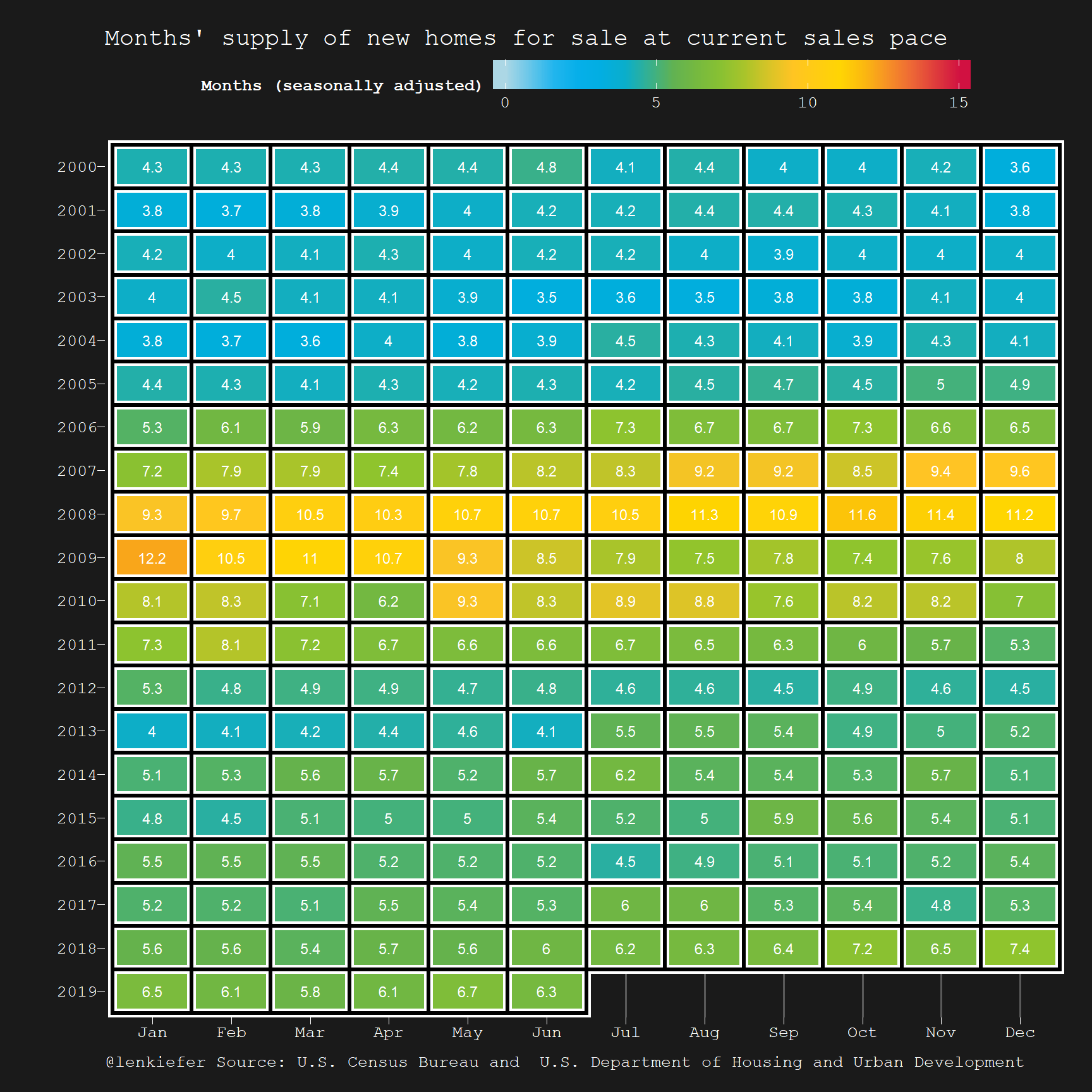
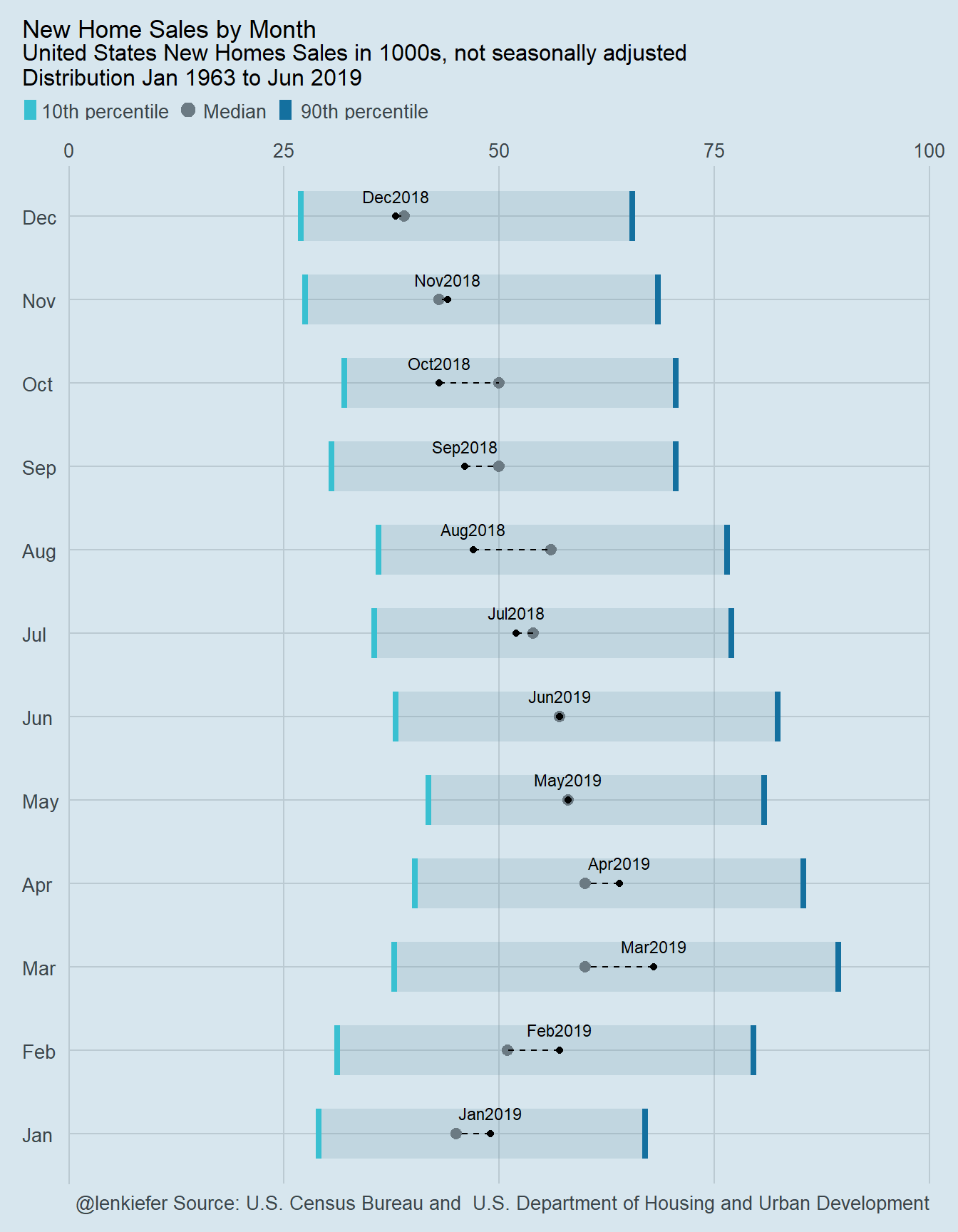
Econodist
Bob Rudis [at]hrbrmstr has something new. He produced a nice R package to replicate a unique boxplot aesthetic from the Economist magazine: ggeconodist. Let’s take it for a spin.
I added my own little embelishment, a dotted line from the last observed monthly value to the historical median:
econodist code
# run install.packages("ggeconodist", repos = "https://cinc.rud.is") to install
library(ggeconodist)
df3 <-
  df_sales %>% group_by(mname) %>%
  summarize(median=median(val),
            p10=quantile(val,0.1),
            p90=quantile(val,0.9),
            last=last(val),
            date=last(date)) %>%
  ungroup()

gg<-
  ggplot(data=df3)+
  geom_econodist(aes(x=mname,ymin = p10, median = median, ymax = p90),
         stat = "identity", show.legend = TRUE) +
  scale_y_continuous(expand = c(0,0), position = "right", limits = range(0, 100)) +
  geom_point(aes(x=mname,y=last),color="black")+
  geom_segment(aes(x=mname, xend=mname,y=last,yend=median),linetype=2)+
  geom_text(aes(x=mname,y=last,label=as.character(date,format="%b%Y")),vjust=-1.1, size=3)+
  coord_flip() +
  labs(
    x = NULL, y = NULL,
    title = "New Home Sales by Month",
    subtitle = "United States New Homes Sales in 1000s, not seasonally adjusted\nDistribution Jan 1963 to Jun 2019",
    caption = "@lenkiefer Source: U.S. Census Bureau and \ U.S. Department of Housing and Urban Development"
  ) +
  theme_econodist()


grid.newpage()
left_align(gg, c("subtitle", "title", "caption")) %>%
  add_econodist_legend(econodist_legend_grob(), below = "subtitle") %>%
  grid.draw()