My recent economic and housing market talks see for example here have been titled: “Will the U.S. housing market get back on track in 2019?”. My general conclusion has been cautiously optimistic. There is enough strength in the broader economy and enough of a tailwind from demographic forces to push the U.S. housing market to modest growth next year.
I still think that’s true, but as I have said in my talks, risks are weighted to the downside. But what does that economisty phrase weighted to the downside mean? Can we make sense of it? In this post I want to lay out some analysis that suggests this term has a lot of salience, particularly at this point in time.
Vulnerable Growth
In this post I’m going to base my analysis on the techniques laid out in the forthcoming American Economic Review paper Vulnerable Growth by Adrian, Boyarchenko and Giannone. You can find a blog post summarizing the key results on the New York Fed’s Liberty Street blog here and a working paper version of the text (pdf) here.
We’ll then apply some of those techniques to housing data using R.
Application to Housing Data
We will use housing data to walk through an application of the vulnerable growth approach.
In 2018, U.S. housing market activity softened. After a strong start to the year, housing starts, home sales, and the growth rate of single-family house prices all declined. The decline in activity has persisted into the fall.
In this post, I’m going to focus on new single-family houses sold in the United States. Data for new home sales can be found on the U.S. Census Bureau’s webpage here though in this case I will be using the Federal Reserve Bank of Saint Louis’s FRED because I want to grab a couple other variables that are conveniently available on FRED.
Getting data, summarizing data
Throughout the post (in most browsers) I will hide the R code in an expandable window like so:
Click
CODE WILL BE IN HERE
Here is the setup code we’ll need along with grabbing the data we will need from FRED.
Click
# standard libraries for data manipulation and plotting
library(tidyquant)
library(tidyverse)
library(ggridges)
library(extrafont)
# other libraries we will use, will explain in text
library(quantreg)
library(sn)
library(cvar)

tickers <- c("HSN1F",        # US new single-family home sales (1000s, SAAR)
             "HNFSEPUSSA",   # number of new single-family homes for sale (1000s, SAAR)
             "MSACSR",       # Months supply of new single-family homes for sale
             "HOUST1F",      # single-family housing starts
             "TB3MS",        # 3-month US Treasury Rate
             "GS10"          # 10-year US Treasury Yield
             )

df_in <- tq_get(tickers, get="economic.data",from="1963-01-01")

# convert to quarterly data
df2q <-
  df_in %>%
  mutate(year=year(date), q=(month(date)-1) %/% 3 + 1) %>%
  group_by(year,q, symbol) %>%
  summarize(val=mean(price,na.rm=T)) %>%
  ungroup() %>%
  mutate(date=as.Date(ISOdate(year,q*3,1))) %>%
  group_by(date) %>% spread(symbol, val) %>%
  ungroup() %>%
  # make some transformations
  mutate(
    lsales          = log(HSN1F),
    lsales_lag4     = lag(lsales,4),
    lstarts         = log(HOUST1F),
    lstarts_lag4    = lag(lstarts,4),
    slope           = GS10 - TB3MS,
    slope_lag1      = lag(slope),
    slope_lag4      = lag(slope,4),
    msupply_lag4   = lag(MSACSR,4)
  )

# only keep complete cases (no missing data allowed)
df <- df2q[complete.cases(df2q),]
In the code above we converted the data from monthly to quarterly averages. In addition to data on single-family home sales, months supply and single-family starts we also grabbed the U.S. Treasury 3-month and 10-year constant maturity yields. This will allow us to construct a measure of the slope of the yield curve.
First, let’s make some simple time series plots of our data. Code for plots
# code for graphs

# recession indicators

recessions.df = read.table(textConnection(
"Peak, Trough
1969-12-01, 1970-11-01
1973-11-01, 1975-03-01
1980-01-01, 1980-07-01
1981-07-01, 1982-11-01
1990-07-01, 1991-03-01
2001-03-01, 2001-11-01
2007-12-01, 2009-06-01"), sep=',',
colClasses=c('Date', 'Date'), header=TRUE)

g.sales <-
    ggplot(data=df, aes(x=date,y=HSN1F))+
    geom_rect(data=recessions.df,inherit.aes=FALSE, aes(xmin=Peak, xmax=Trough, ymin=-Inf, ymax=+Inf), fill='gray', alpha=0.4)+
  geom_line(color = "#27408b")+
  scale_y_continuous(sec.axis=dup_axis())+
  theme_minimal()+
  theme(plot.caption=element_text(hjust=0))+
  scale_x_date(date_breaks="5 years",date_labels="%Y")+
  theme(text = element_text(color = "#27408b"))+
  labs(y="",x="date (quarterly average of monthly estimates)",
       title="New single-family homes sold",
       subtitle="1000s, seasonally adjusted annual rate",
       caption="@lenkiefer Source: U.S. Census Bureau and U.S. Department of Housing and Urban Development\nretrieved from FRED, Federal Reserve Bank of St. Louis;\nhttps://fred.stlouisfed.org December 12, 2018.\nShaded bar NBER recessions")

# close up of sales 2016-2018

g.sales2 <-
    ggplot(data=filter(df,year(date)>2011), aes(x=date,y=HSN1F))+
  geom_line(color = "#27408b")+
  scale_y_continuous(sec.axis=dup_axis())+
  theme_minimal()+
  theme(plot.caption=element_text(hjust=0))+
  scale_x_date(date_breaks="1 years",date_labels="%Y")+
  theme(text = element_text(color = "#27408b"))+
  labs(y="",x="date (quarterly average of monthly estimates)",
       title="New single-family homes sold,\nFalling in 2018 after years of recovery",
       subtitle="1000s, seasonally adjusted annual rate",
       caption="@lenkiefer Source: U.S. Census Bureau and U.S. Department of Housing and Urban Development\nretrieved from FRED, Federal Reserve Bank of St. Louis;\nhttps://fred.stlouisfed.org December 12, 2018.\nShaded bar NBER recessions")


g.supply <-
    ggplot(data=df, aes(x=date,y=MSACSR))+
      geom_rect(data=recessions.df,inherit.aes=FALSE, aes(xmin=Peak, xmax=Trough, ymin=-Inf, ymax=+Inf), fill='gray', alpha=0.4)+
  geom_line(color = "#27408b")+
  scale_y_continuous(sec.axis=dup_axis())+
  theme_minimal()+
  theme(plot.caption=element_text(hjust=0))+
  scale_x_date(date_breaks="5 years",date_labels="%Y")+
  theme(text = element_text(color = "#27408b"))+
  labs(y="",x="date (quarterly average of monthly estimates)",
       title="Months' supply of new single-family homes",
       subtitle="Months (Houses for sale/houses sold per month)",
       caption="@lenkiefer Source: U.S. Census Bureau and U.S. Department of Housing and Urban Development\nretrieved from FRED, Federal Reserve Bank of St. Louis;\nhttps://fred.stlouisfed.org December 12, 2018.")

g.supply2 <-
    ggplot(data=filter(df,year(date)>2011), aes(x=date,y=MSACSR))+
  geom_line(color = "#27408b")+
  scale_y_continuous(sec.axis=dup_axis())+
  theme_minimal()+
  theme(plot.caption=element_text(hjust=0))+
  scale_x_date(date_breaks="1 years",date_labels="%Y")+
  theme(text = element_text(color = "#27408b"))+
  labs(y="",x="date (quarterly average of monthly estimates)",
       title="Months' supply of new single-family homes\nRising in 2018",
       subtitle="Months (Houses for sale/houses sold per month)",
       caption="@lenkiefer Source: U.S. Census Bureau and U.S. Department of Housing and Urban Development\nretrieved from FRED, Federal Reserve Bank of St. Louis;\nhttps://fred.stlouisfed.org December 12, 2018.")


g.scatter <-
  ggplot(data=df, aes(x=HNFSEPUSSA, y=HSN1F))+
  geom_point(alpha=0.25)+
  # hight 2005-2006 in blue, 20018 in purple
  geom_point(data = .%>% filter(year(date) %in% c(2005,2006)), color="red")+
  geom_path(data = .%>% filter(year(date) %in% c(2005,2006)), color="red",alpha=0.25)+
  geom_text(data = .%>% filter(year(date) %in% c(2005,2006)) %>% head(1), color="red", label="2005Q1")+
  geom_text(data = .%>% filter(year(date) %in% c(2005,2006)) %>% tail(1), color="red", label="2006Q4")+


  geom_point(data = .%>% filter(year(date) %in% c(2018)), color="purple")+
  geom_path(data = .%>% filter(year(date) %in% c(2018)), color="purple",alpha=0.25)+
    geom_text(data = .%>% filter(year(date) %in% c(2018)) %>% head(1), color="purple", label="2018Q1")+
  geom_text(data = .%>% filter(year(date) %in% c(2018)) %>% tail(1), color="purple", label="2018Q4")+

  theme_minimal()+
  theme(plot.caption=element_text(hjust=0))+
  theme(text = element_text(color = "#27408b"))+
  labs(y="New single-family homes sold",x="New single-family homes for sale",
       title="New homes for sale and homes sold",
       subtitle="(each dot a quarterly average of monthly estimates 1963Q1:2018Q4)",
       caption="@lenkiefer Source: U.S. Census Bureau and U.S. Department of Housing and Urban Development\nretrieved from FRED, Federal Reserve Bank of St. Louis;\nhttps://fred.stlouisfed.org December 12, 2018.\n2018Q4 uses data through October 2018")

g.starts <-
    ggplot(data=df, aes(x=date,y=HOUST1F))+
      geom_rect(data=recessions.df,inherit.aes=FALSE, aes(xmin=Peak, xmax=Trough, ymin=-Inf, ymax=+Inf), fill='gray', alpha=0.4)+
  geom_line(color = "#27408b")+
  scale_y_continuous(sec.axis=dup_axis())+
  theme_minimal()+
  theme(plot.caption=element_text(hjust=0))+
  scale_x_date(date_breaks="5 years",date_labels="%Y",expand=c(0,0))+
  theme(text = element_text(color = "#27408b"))+
  labs(y="",x="date (quarterly average of monthly estimates)",
       title="Single-family housing starts (1-unit structures)",
       subtitle="1000s, seasonally adjusted annual rate",
       caption="@lenkiefer Source: U.S. Census Bureau and U.S. Department of Housing and Urban Development\nretrieved from FRED, Federal Reserve Bank of St. Louis;\nhttps://fred.stlouisfed.org December 12, 2018.")

g.slope <-
  ggplot(data=df, aes(x=date,y=slope))+
      geom_rect(data=recessions.df,inherit.aes=FALSE, aes(xmin=Peak, xmax=Trough, ymin=-Inf, ymax=+Inf), fill='gray', alpha=0.4)+
  geom_area(color=NA,fill="#27408b",alpha=0.25)+
  geom_line(color = "#27408b")+
  scale_y_continuous(sec.axis=dup_axis())+
  theme_minimal()+
  theme(plot.caption=element_text(hjust=0))+
  scale_x_date(date_breaks="5 years",date_labels="%Y")+
  theme(text = element_text(color = "#27408b"))+
    labs(y="percent",x="date (quarterly average of monthly estimates)",
         title="Slope of U.S. Treasury Yield Curve (10-year minus 3-month yield)",
         subtitle="difference in yields (percentage points,quarterly average)",
         caption="@lenkiefer Source: Board of Governors of the Federal Reserve System (US) H.15 series\nretrieved from FRED, Federal Reserve Bank of St. Louis;\nhttps://fred.stlouisfed.org December 12, 2018.")
Let’s first consider what is happening in with new home sales, new home construction and housing supply measured by the months’ supply (new homes for sale / new homes sold per month).
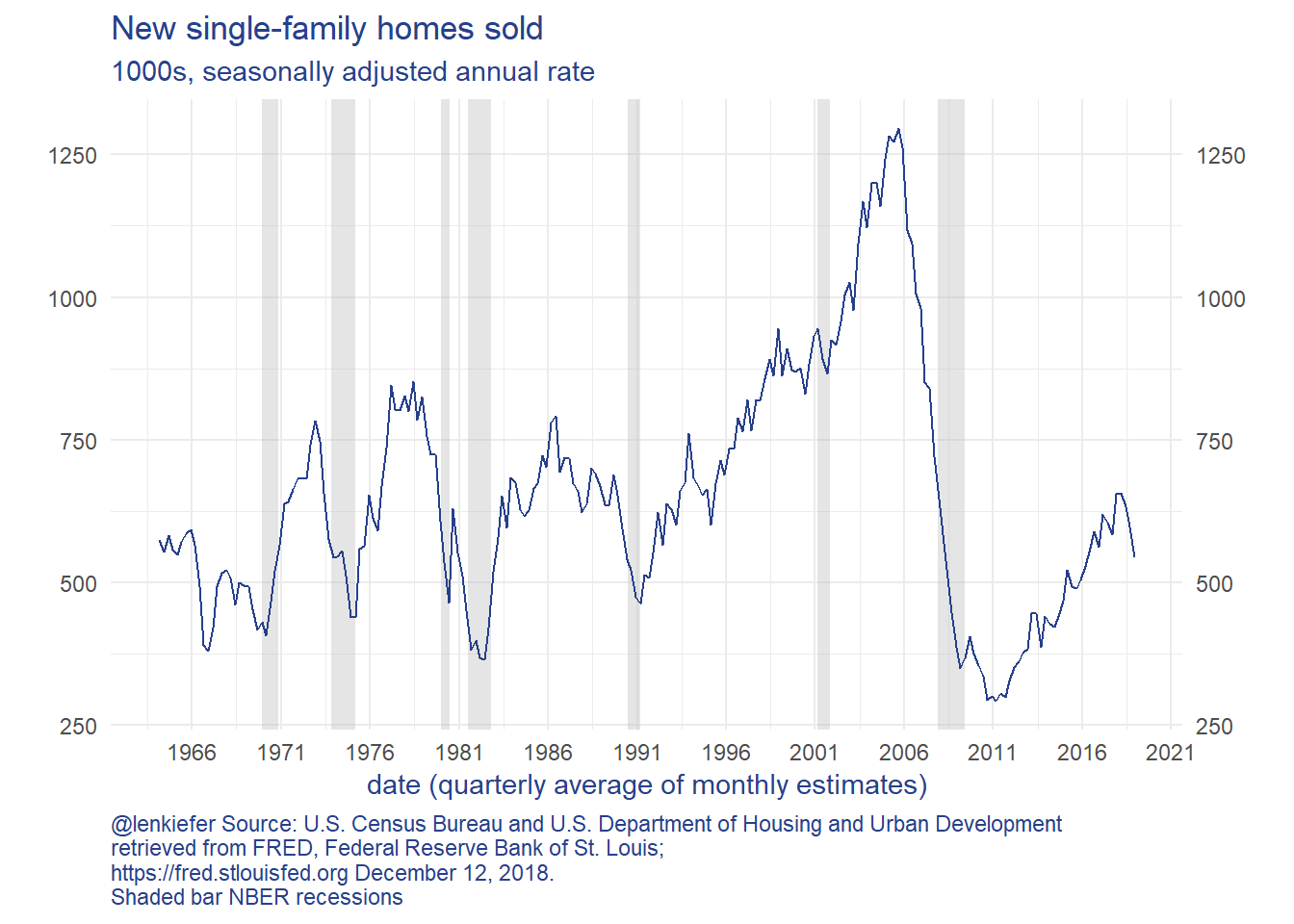
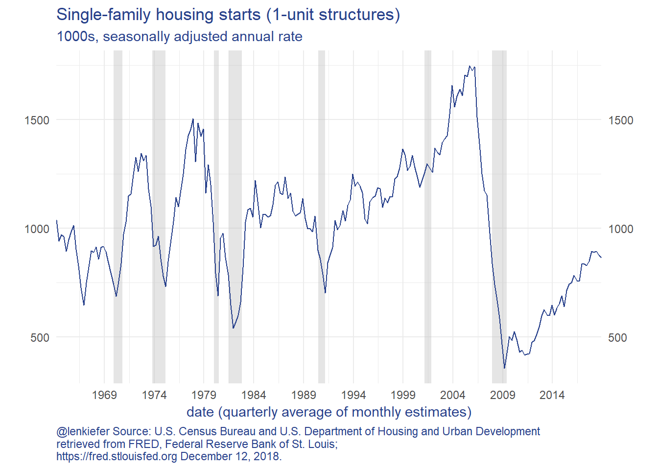
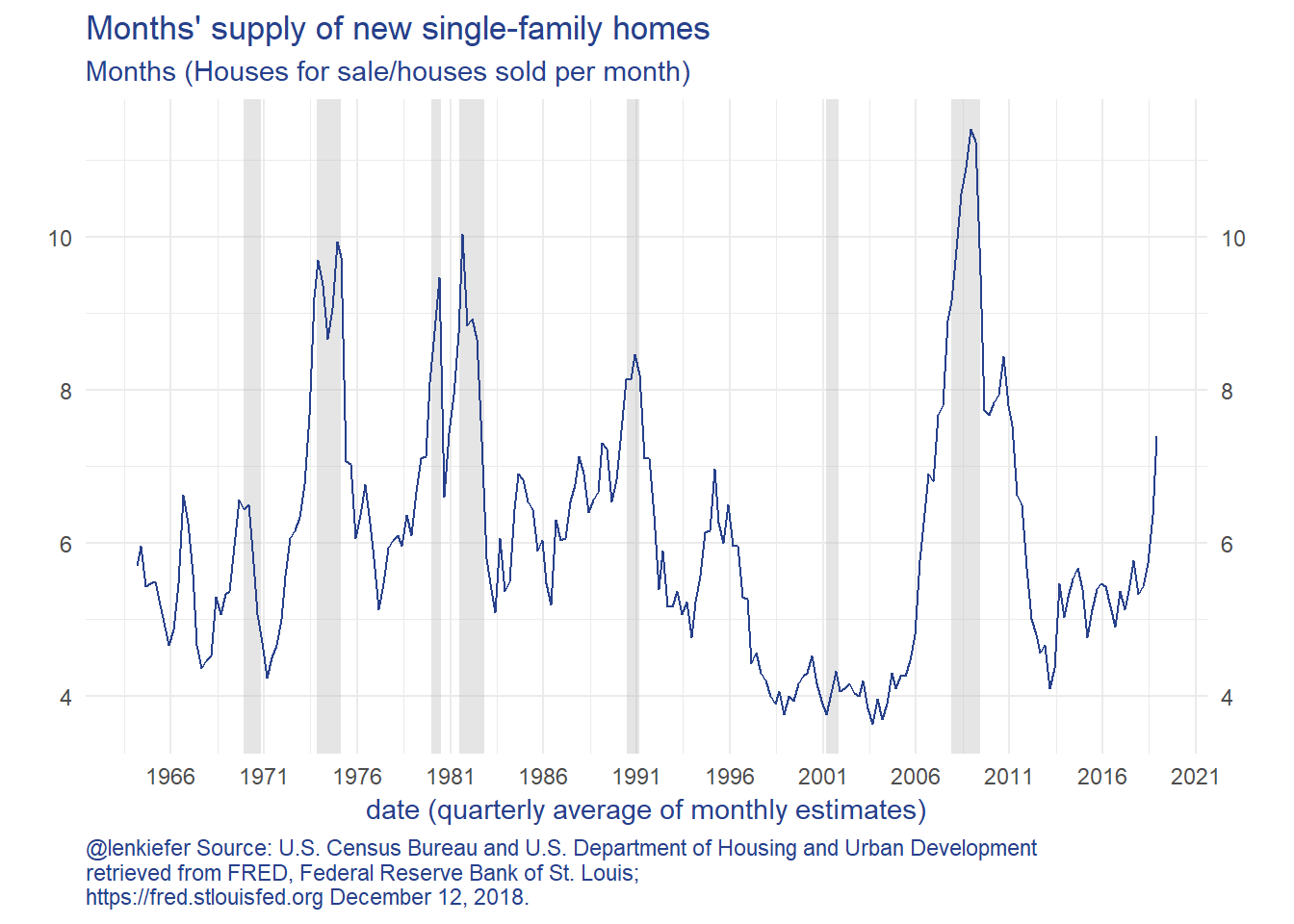
The charts show that new home sales and new home construction have been trending higher since 2010, but have reversed course in 2018. New home sales fell faster than construction, so the inventory of unsold homes has increased. The months’ supply measure is now over 7 months, which is a high rate.
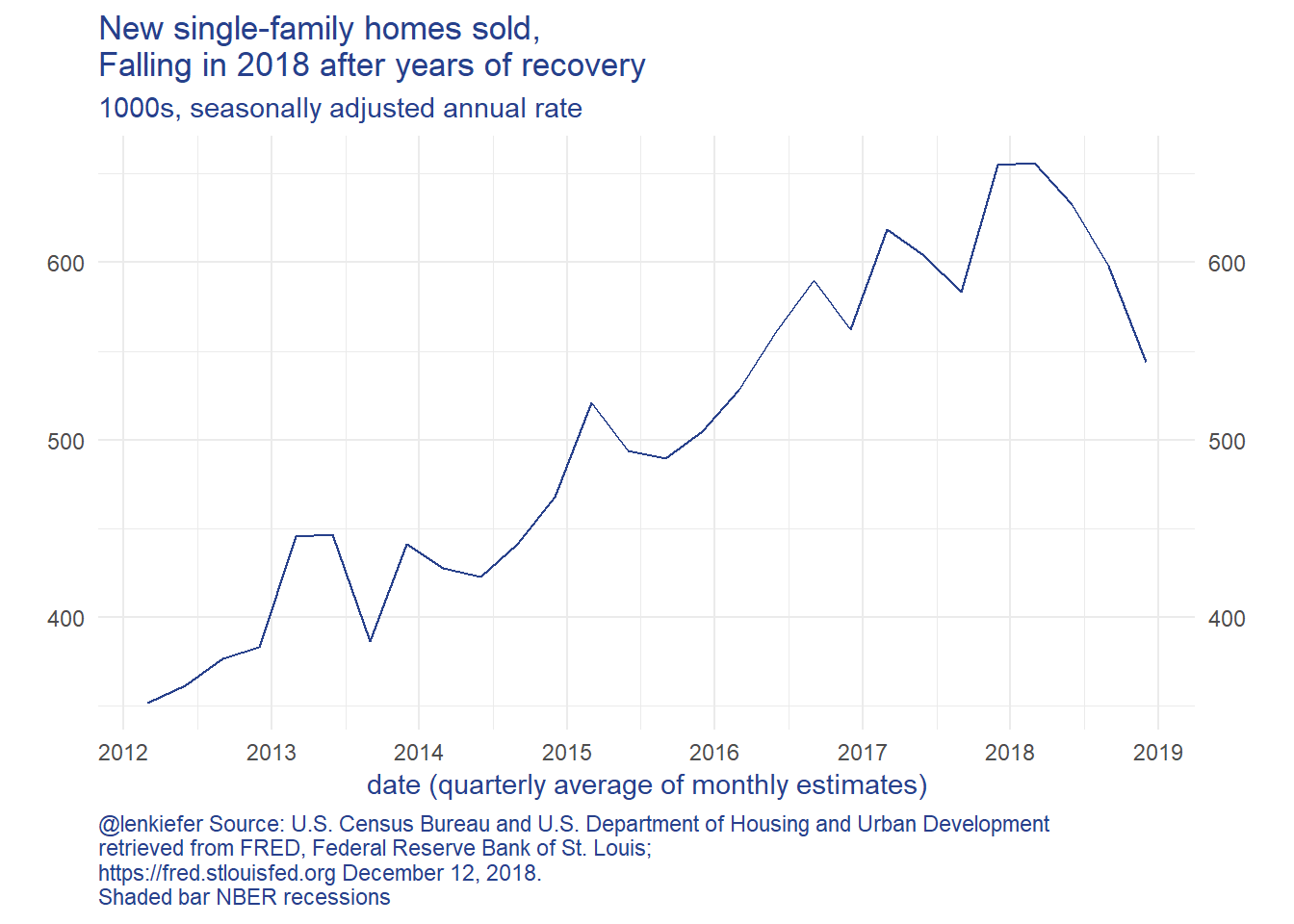
Let’s zoom in on new home sales and months’ supply:
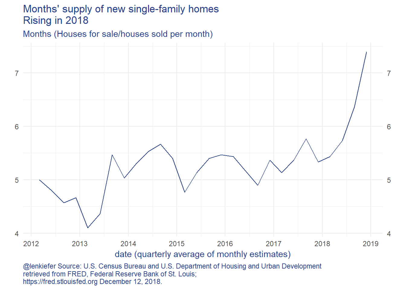
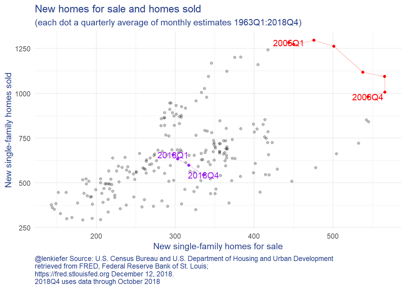
What is going on? Well, a lot. In general home sales and homes for sale (the numerator in the month’s supply measure) move together. Their correlation is positive. But in periods where the correlation becomes negative, as highlighted in the scatterplot below… that’s not a great sign for the housing market.
That negative slope between inventory of for sale homes and homes sold we saw from 2005-2006 and 2018 is not the only negative sign we are seeing. The slope of the U.S. Treasury Yield curve has flattened considerably. Here’s one way to look at it:
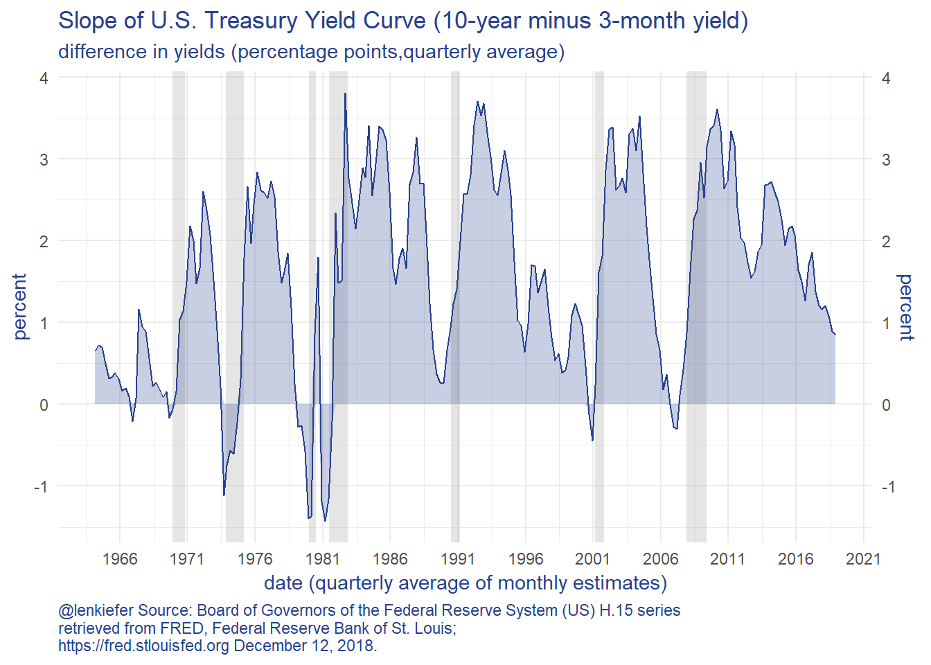
While the yield curve slope (as measured by the 10-year minus the 3-month yield) is still positive, it is trending sharply down. This is a signal that risks may be rising.
Let’s try to apply the vulnerable growth approach to these data to see what they might say about future housing market activity.
Note: This exercise is for fun and learning, not meant to be a true serious forecast. There’s no guarantee any of what follows would be suitable for anything.
Forecasts and characterizing risks
Let’s start with some simple forecasts. From here on out we’re going to take as our target the (log) level of home sales 4 quarters ahead. We’re going to try a set of simple models to characterize both the expectation of future home sales, and the distribution around that approach.
OLS and Discussion
First a simple linear regression (OLS):
lm(data=df, formula= lsales ~ lsales_lag4 +msupply_lag4 + slope_lag4 ) %>%
      stargazer::stargazer(type="html",
                           covariate.labels=c("Log of New Home Sales (lagged 4Q)",
                                              "Months' Supply (lagged 4Q)",
                                              "Yield Curve Slope (lagged 4Q)"),
                           dep.var.labels=("Log of New Home Sales"),
                           dep.var.caption=("1964Q4:2018Q4"),
                           title="Linear Regression New Home Sales 4-quarters ahead"
)| 1964Q4:2018Q4 | |
| Log of New Home Sales | |
| Log of New Home Sales (lagged 4Q) | 0.739*** |
| (0.040) | |
| Months’ Supply (lagged 4Q) | -0.036*** |
| (0.008) | |
| Yield Curve Slope (lagged 4Q) | 0.045*** |
| (0.009) | |
| Constant | 1.827*** |
| (0.286) | |
| Observations | 220 |
| R2 | 0.744 |
| Adjusted R2 | 0.740 |
| Residual Std. Error | 0.164 (df = 216) |
| F Statistic | 208.872*** (df = 3; 216) |
| Note: | p<0.1; p<0.05; p<0.01 |
These results tell us that 4-quarter ahead new home sales are quite sensitive to both Months’ Supply and the Yield Curve Slope. If Months’ supply of new home sales increases 1 month this quarter, then new home sales 4 quarters from now tend to decline 3.6% (in logs). If the yield curve slope increases 100 basis points (1 percentage point) then new home sales tend to increase 4.5 percent.
So maybe we are done. One way to explain the “risks are to the downside” would be to say that while the yield curve isn’t inverted today, there’s an increased chance that it would invert (lowering the yield curve slope) and home sales would decline.
But there’s much more to explore.
We want to talk about distributions. One way to do it is to apply a quantile regression (see Koenker and Hallock 2001).
We can use the quantreg package to estimate quantile regressions of the same form as above. This is what Adrian, Boyarchenko and Giannone (2016) do with their vulnerable growth analysis. We’ll apply it to housing.
Vulnerable Housing
Quantile regressions
I’ve developed a compact way of generating useful quantile regression plots using quantreg and magrittr pipes and broom::tidy. Code for plot
g.qr<-
rq(data=df,
   tau= seq(0.1,0.9,0.1),
   formula = lsales ~ lsales_lag4 +msupply_lag4 + slope_lag4 ) %>%
  broom::tidy() %>%
  filter(term!="(Intercept)") %>%
  ggplot(aes(x=tau,y=estimate))+
  geom_point(color="#27408b")+
  geom_ribbon(aes(ymin=conf.low,ymax=conf.high),alpha=0.25, fill="#27408b")+
  geom_line(color="#27408b")+
  theme_minimal()+
    theme(text = element_text(color = "#27408b"))+
  theme(plot.caption=element_text(hjust=0))+
  facet_wrap(~term,scales="free_y",ncol=1)+
  labs(x="tau = quantile", y="coefficient",
       title="Quantile Regression Results:\nlsales ~ lsales_lag4 +msupply_lag4 + slope_lag4",
       caption="@lenkiefer Note: Quantile regresion coefficients for (log) new home sales regressed on 4-quarter lags of \n(log) sales, months' supply, and the slope of the U.S. Treasury yield curve (10-year minus 3 month).\nData is quarterly 1964Q1:2018Q4 (using Oct 2018 for 2018Q4). \nBands are confidence intervals around estimates. Sources described above.")
g.qr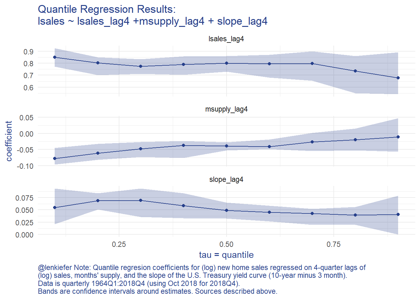
The graphs shows an asymmetric response in terms of months’ supply and to a lesser degree the slope of the yield curve. This implies that when months’ supply is high, the likelihood of a very bad outcome has increased.
Following Adrian, Boyarchenko and Giannone (2016) we can use the estimated coefficients from the quantile regression to a skewed t distribution (using the sn package), to analyze how downside risks have evolved given the trends in home sales, months’s supply, and the slope of the yield curve.
Fitting the quantile regression results to a skewed t distribution
Follwing Adrian, Boyarchenko and Giannone (2016) we are going to take estimated conditional quantile for each quarter and fit a skewed t distribution for each quarter. We’re going to need 4 parameters, so we’ll used 4 quantiles (the 5th, 25th, 75th, and 95th). Then we’ll use the optim function to minimize a squared loss between the estimated quantile (based on the quantile regression coefficients and the observed variables) and the skewed t distribution.
To do this, we’ll use some custom functios and a liberal dose of purrr::map.
First, let’s construct conditional quantiles for each quarter in our data.
Code detail
# run quantile regression, save results

df_quant <- rq(data=df,
               tau= c(0.05,0.25, 0.75, 0.95),
               formula = lsales ~ lsales_lag4 +msupply_lag4 + slope_lag4 )

# get conditional quantiles for each period
# we're going to slide everything 4 quarters ahead
df_predict <-
  dplyr::select(df,date,lsales,lstarts,slope,MSACSR) %>%
  # going to rename my current quarter variables as lagged 4 quarter variables for prediction
  rename(lsales_lag4  = lsales,
         lstarts_lag4 = lstarts,
         slope_lag4   = slope,
         msupply_lag4 = MSACSR)

dfp <- predict(df_quant,
               newdata=df_predict,
               interval="none"
               )
# plot results
g.cq <-
  data.frame(date=df$date,p5=dfp[,1], p25=dfp[,2],p75=dfp[,3],p95=dfp[,4]) %>%
  ggplot(aes(x=date, ymin=p25,ymax=p75))+
  geom_ribbon(alpha=0.15,aes(ymin=p5,ymax=p95), fill="#27408b")+
  geom_ribbon(alpha=0.25, fill="#27408b")+
  geom_line(aes(x=date,y=df$lsales),color="#27408b")+
  theme_minimal()+
  theme(text = element_text(color = "#27408b"))+
  theme(plot.caption=element_text(hjust=0))+

  labs(x="date (quarterly)", y="log new home sales",
       title="Quantile Regression Results:\nshaded area conditional quantiles",
       subtitle="(5th/95th and 25/75th) for 4-quarter ahead forecast of (log) new home sales\nsolid line realized new home sales estimate",
       caption="@lenkiefer Note: Quantile regression for (log) new home sales regressed on 4-quarter lags of \n(log) sales, months' supply, and the slope of the U.S. Treasury yield curve (10-year minus 3 month).\nData is quarterly 1964Q1:2018Q4 (using Oct 2018 for 2018Q4). \nBands are confidence intervals around estimates. Sources described above.")
g.cq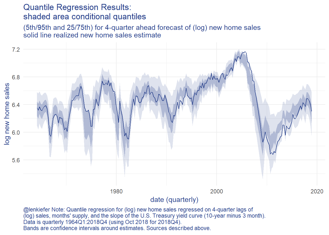
Next, we’ll need a loss function. This function will penalize our parameters by giving us quantiles far away from ones we plotted above. Then we will feed this loss function into the optim function to seek a minimum. We’ll use purrr::possibly to have the function skip cases where they routine doesn’t find a minimum. Then we’ll solve the optimization step for each date, fitting a different distribution to the conditional quantile for each period.
Code detail
myloss <- function(par, x){
  myq = qst(p=c(0.05,0.25, 0.75, 0.95),
            xi=par[1],
            omega=par[2],
            alpha=par[3],
            nu=par[4]
  )
  loss= sum((myq-x)**2)
}

# intialize parameters
# use unconditional mean and sd of log sales for xi and omega, set alpha to 0 and nu at 30
par_init=c(xi=mean(df$lsales),omega=sd(df$lsales),alpha=0,nu=30)

# function which takes a date as an input and estimates
myf <- function(dd=min(df$date),par0=par_init){
  # find date
  i=which(df$date==dd)
  # solve best fit to skew-t distrubtion
  # do this for row i (corresponding to date dd) of predicted quantiles
  p1 <- optim( par0, myloss, x=dfp[i,])$par
}

possible_myf <- possibly(myf, otherwise="error")

# map over each quarter, fitting the skewed t distribution by minimizing loss
# (you don't want to know about df2, df3 or their cousins df2a, df2b, ... , df3x5)
df4 <-
  df %>%
  mutate(par=map(date,possible_myf))
With these results in hand, we can draw the distributions for each quarter and compare how they have shifted over time.
Below I’m going to create a function that draws the skew t distribution for each quarter. I’ll draw (prettily) 200 values of (log) sales and the distribution using our fitted parameters. I’ll also use extendrange so that the distribution extends beyond the historical range of estimates.
Code detail
myp <- function(par){
  par0 <- unlist(par)
  data.frame(x=pretty(extendrange(df$lsales,f=c(.5,.1)),200),
             d=sn::dst(pretty(extendrange(df$lsales,f=c(.5,.1)),200),
                    xi=par0[1],
                    omega=par0[2],
                    alpha=par0[3],
                    nu=par0[4]))
}

df4p <- filter(df4, par!="error") %>% mutate(data=map(par,myp))

g.dens<-
  ggplot(data=df4p %>%
           select(date,data) %>% unnest(data),
         aes(x=x,y=d,group=date))+
  geom_line(alpha=0.2,color="gray")+
  theme_minimal()+
  theme(text = element_text(color = "#27408b"))+
  theme(plot.caption=element_text(hjust=0),
        axis.text.y=element_blank())+
  geom_line(data= .%>% filter( date==max(date) %m+% years(-1)), color="blue")+
  geom_text(data= .%>% filter( date==max(date)%m+% years(-1)) %>%
              filter(d==max(d)), color="blue",
            label="2017Q4",nudge_y=0.15)+

  geom_line(data= .%>% filter( date==max(date)), color="purple")+
  geom_text(data= .%>% filter( date==max(date)) %>% filter(d==max(d)), color="purple",
            label="2018Q4",nudge_y=0.15)+
  geom_vline(xintercept=tail(df$lsales,1),linetype=2)+
  geom_text(data=tail(df,1), aes(x=lsales),y=6, label="  October 2018 value", hjust = 0)+

  labs(x="4-quarter ahead new home sales forecast (1000s, log)",y="density",
       title="Forecasted 4-quarter ahead new single-family home sales distribution",
       subtitle="Gray lines all in-sample forecasts 1963Q1:2018Q4",
       caption="@lenkiefer Skewed t distribution fit to quantile regression results,\nfollowing approach outlined in Adrian, Boyarchenko and Giannone (2016) Vulnerable Growth\nData and methodology described in blog post: Vulnerable Housing http://lenkiefer.com/2018/12/12/vulnerable-housing/")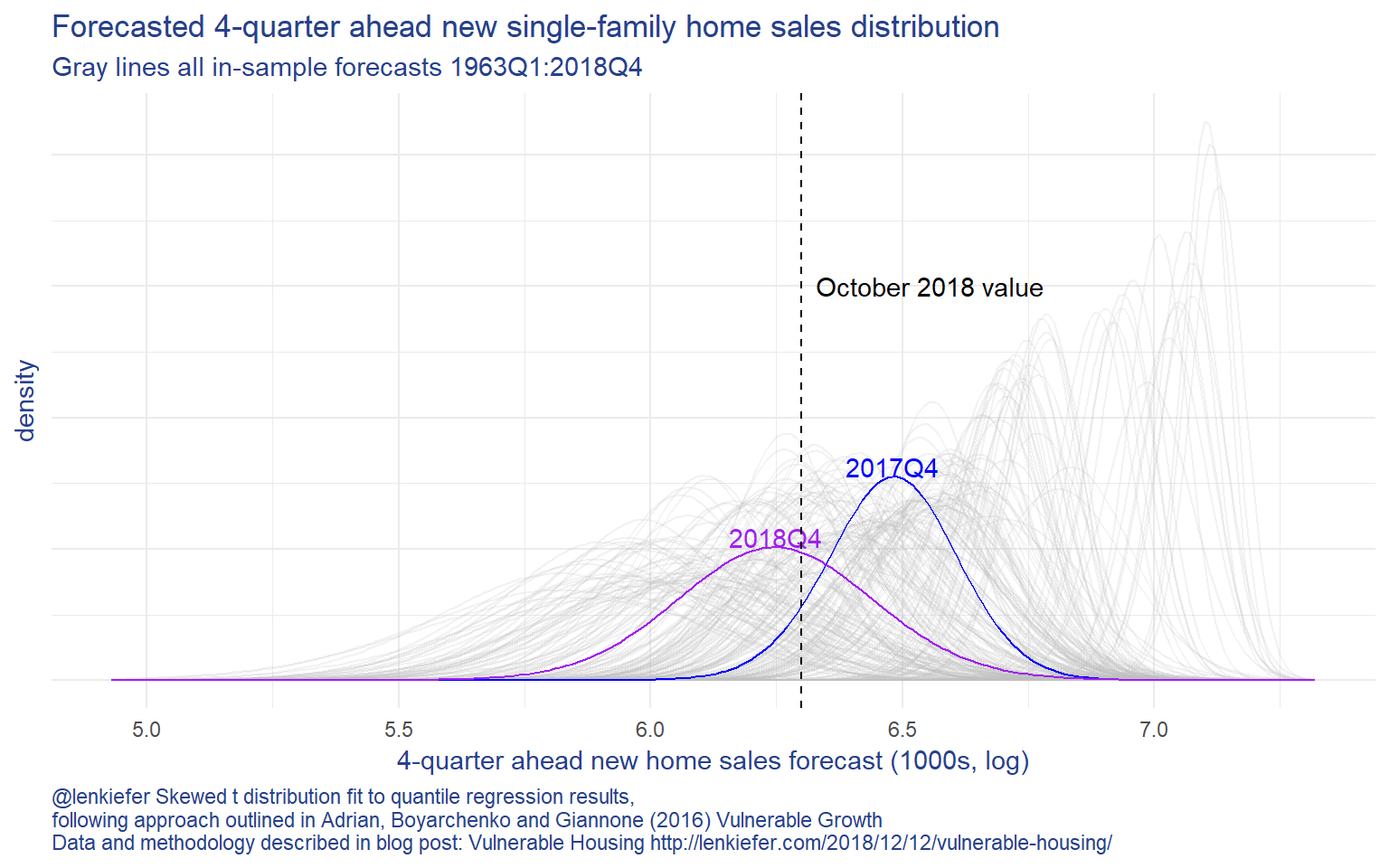
The plot above shows that the forecast distribution for new home sales has shifted negatively since 2017Q4. Based on this (relatively) simply model, home sales are forecasted to decline into 2018. Note, a more sophiticated approach might arrive at an alternative forecast. This post is just applying the Vulnerable Growth approach to housing.
But based on this model we can say more about how the distributions are shifted. We can compute the expected shortfall of new home sales. In our case the expected shortfall for home sales would be the average number of new single-family home sales in the worst 5% of outcomes.
By analyzing trends in the expected shortfall we can quantify how downside risks to the forecast may have evolved.
Expected shortfall in R
There’s a variety of packages that can compute the expected shortfall given our estimated skew t distribution. I found the cvar package to be useful here. Feeding the estimated skew t distribution into cvar, we can compute the expected shortfall for each period. Once again we’ll use a heavy dose of purrr::map.
Expected shortfall calculations
my_es <- function(par){
  cvar::ES(qst, x=0.05,xi=par[1],omega=par[2],alpha=par[3],nu=par[4])
}

my_es2 <- function(dd){
  par0<-unlist(filter(df4,date==dd)$par)
  my_es(par0)
}


df4_es <-
  filter(df4, par!="error") %>%
  select(date,par) %>%
  mutate(es=map(date,my_es2)) %>%
  unnest(es) %>%
  select(date,es)
g.sf <-
ggplot(data=df4_es, aes(x=date,y=-es))+
geom_rect(data=recessions.df,inherit.aes=FALSE, aes(xmin=Peak, xmax=Trough, ymin=-Inf, ymax=+Inf), fill='gray', alpha=0.4)+
geom_line(color="#27408b")+
theme_minimal()+
theme(text = element_text(color = "#27408b"))+
scale_y_continuous(sec.axis=dup_axis())+
scale_x_date(date_breaks="5 years",date_labels="%Y")+
theme(plot.caption=element_text(hjust=0))+
labs(x="date (quarterly)",
y="log new home sales",
title="4-quarter ahead expected shortfall in new home sales",
subtitle="expected number of sales in worst 5% of outcomes",
caption="@lenkiefer Methodology described in post Vulnerable Housing http://lenkiefer.com/2018/12/12/vulnerable-housing/ \nbased on Adrian, Boyarchenko and Giannone (2016) Vulnerable Growth")Then we can plot it against realized home sales:
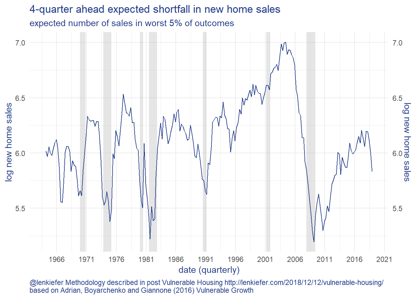
With the new home sales slacking, the slope of the yield curve falling and months’ supply of new homes for sale increasing in recent months, the expected shortfall in the 4th quarter of 2018 has declined 31% relative to the value in 2017Q4. Using the same quantile regression based forecasting model, the median (50th percentile) forecast for new home sales has only declined 22%. This modeling approach shows the risks to the downside have increased.
Some thoughts
This is a (very rough) look at what I think could be a useful modeling approach. I wouldn’t take the particular model forecast results too seriously. I tried to restrict myself to a relatively simple model specification. The goal here wasn’t to produce the best forecast, but rather to try to characterize the shifting distribution. And to that end I think this is an excellent start.
I look forward to exploring these techniques more in future.
References
Adrian, T., Boyarchenko, N., & Giannone, D. (2016). Vulnerable growth. link to working paper pdf
Azzalini, A. (2018). The R package ‘sn’: The Skew-Normal and Related Distributions such as the Skew-t (version 1.5-3). URL http://azzalini.stat.unipd.it/SN
Georgi N. Boshnakov (2018). cvar: Compute Expected Shortfall and Value at Risk for Continuous Distributions. R package version 0.3-0. https://CRAN.R-project.org/package=cvar
Koenker, R., & Hallock, K. F. (2001). Quantile regression. Journal of economic perspectives, 15(4), 143-156. Link to pdf
Roger Koenker (2018). quantreg: Quantile Regression. R package version 5.36. https://CRAN.R-project.org/package=quantreg