LET US REVIEW HOUSING MARKET TRENDS in the United States through the first three quarters of 2017.
Economic background
The overall economic environment remains favorable for housing. Interest rates are low, the labor market has been solid and income growth, while modest, has begun to tick up.
Low mortgage rates
For most of 2017 mortgage rates have declined. Rates entered the year above 4 percent for the 30-year fixed rate mortgage, but after peaking in March, declined through September. In recent weeks rates have ticked up modestly, but are still quite low by historical standards.

The chart below shows historical mortgage rates going back to 1971.

Solid labor market
Job growth has been solid, and the unemployment rate is down to 4.1 percent.

Following revisions to the September employment data, payroll employment has increased for 85 consecutive months.

Housing supply not keeping pace with demand
Housing supply is having trouble keeping pace with demand. As we talked about housing starts are only gradually increasing and may have stalled in recent months.

House price trends
Partially due supply outpacing demand, house prices are increasing across the United States. Let’s take a look. We’ll present some visualizations using the Freddie Mac House Price Index.
The plot below shows trends in the 12-month percent change U.S. house prices.

How do house price trends compare across states? The table below shows 12-month appreciation by state in September of 2017.
| House price appreciation by state in September 2017 | ||
| State | 12-month percent change in house prices | |
|---|---|---|
| 1 | WA | 12.8% |
| 2 | NV | 11.3% |
| 3 | CO | 9.4% |
| 4 | UT | 9.2% |
| 5 | ID | 9.1% |
| 6 | MI | 8.9% |
| 7 | FL | 8.4% |
| 8 | CA | 8.2% |
| 9 | OR | 8.0% |
| 10 | AZ | 8.0% |
| 11 | GA | 7.9% |
| 12 | MT | 7.9% |
| 13 | TN | 7.6% |
| 14 | NE | 7.4% |
| 15 | DC | 7.2% |
| 16 | KY | 7.0% |
| 17 | SC | 6.7% |
| 18 | RI | 6.7% |
| 19 | MA | 6.5% |
| 20 | DE | 6.3% |
| 21 | TX | 6.2% |
| 22 | OH | 6.2% |
| 23 | NC | 6.1% |
| 24 | NH | 6.1% |
| 25 | AR | 6.1% |
| 26 | ME | 6.1% |
| 27 | VT | 5.9% |
| 28 | MN | 5.8% |
| 29 | WI | 5.7% |
| 30 | KS | 5.6% |
| 31 | MS | 5.6% |
| 32 | IN | 5.5% |
| 33 | NY | 5.3% |
| 34 | LA | 5.3% |
| 35 | SD | 5.2% |
| 36 | MD | 5.1% |
| 37 | MO | 5.1% |
| 38 | NJ | 5.0% |
| 39 | OK | 4.6% |
| 40 | PA | 4.5% |
| 41 | NM | 4.4% |
| 42 | IA | 4.4% |
| 43 | IL | 4.2% |
| 44 | CT | 4.1% |
| 45 | VA | 3.8% |
| 46 | AK | 2.6% |
| 47 | AL | 2.2% |
| 48 | HI | 2.2% |
| 49 | WV | 2.1% |
| 50 | WY | 1.7% |
| 51 | ND | 0.8% |
| Source: Freddie Mac House Price Index | ||
Let’s use a geofaceted plot to show the trends in 12-month house price appreciation by state.

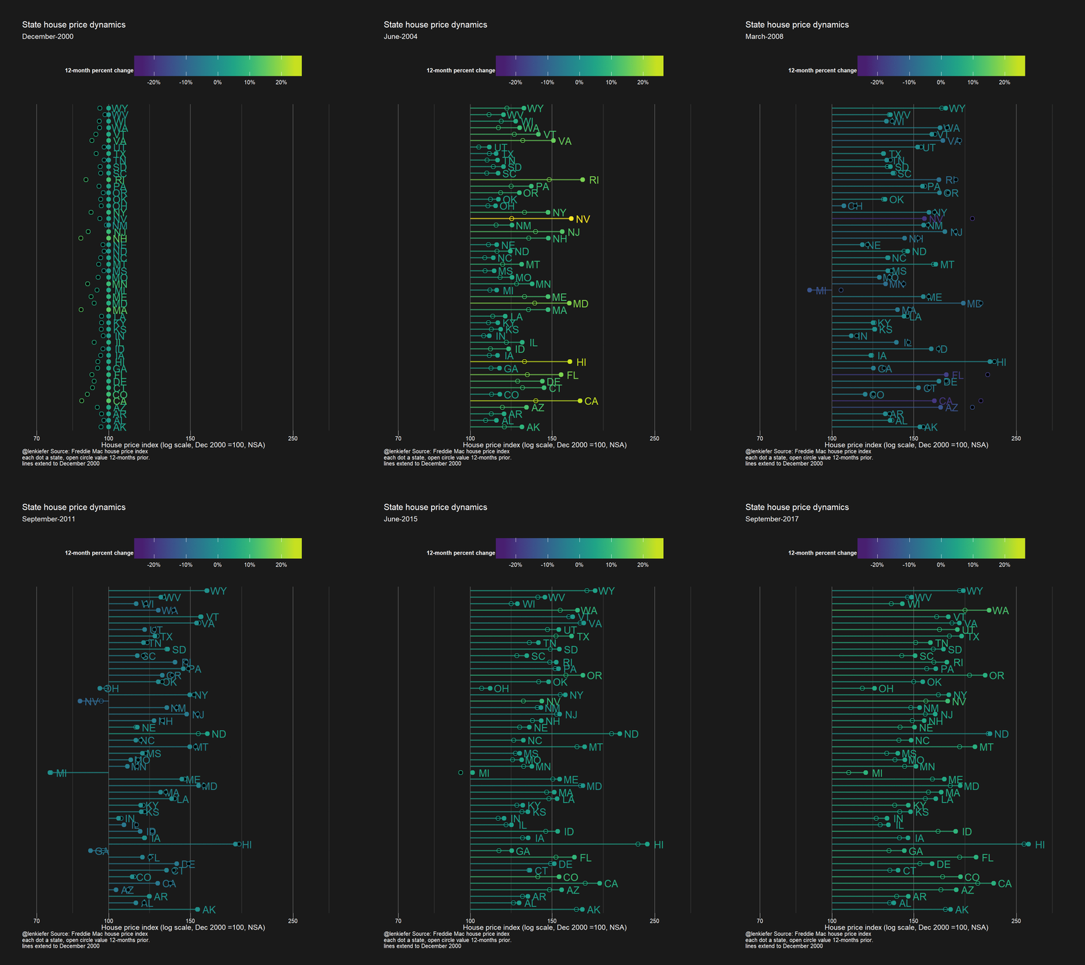
How do prices compare over the long run? Let’s look at the index for each state relative to December 2000.

What factors contribute to differences in house prices across areas? One important factor is local demand. We can compare price growth by state to employment growth.

States with strong employment growth tend to have higher rates of house price appreciation. We can trace out the pattern over time. First, for one state, and then for all.


Comparing house price growth to permits
Let’s also compare state house price appreciation to housing construction. The chart below is a scatterplot like the ones above, but it compares the house price appreciation to the annual difference in a 12-month rolling average of building permits for 1-unit properties.

And across years:

Finally, consider this animation showing house price trends by state.
